FOXi is a startup from Florida. It's a peer-to-peer boat-sharing app, that connects owners willing to rent out their boats with clients searching for a watercraft in their location.
About the task
Do you like boating? FOXi's founders certainly do. At the same time, they were surprised by how slow and old-fashioned was the process of booking a boat in Florida. And this is where they came up with the idea of digitalising the conservative world of boat rental.
They contacted me in the middle of 2021 with an early prototype made in Figma and a list of additional features that needed to be implemented in the design. But instead of polishing the UI and adding new functionality, I ended up with more than 110 hours of engaging and challenging work on a brand new design for both owner and client apps.
My clients wanted to release the app the following autumn, but the development was blocked due to the lack of many important mockups. So I had a tight timeframe for a quite time-consuming job. I decided to work in short iterations of 2–4 days, during which I design just one feature and then present the results to the team. After discussing and making any necessary edits, I proceed to the next feature, while the team takes the finished piece to work on.
This gradual approach had made the dev team less dependent on my pace. All presentations were made in FigJam, and here is what we've got in the end:
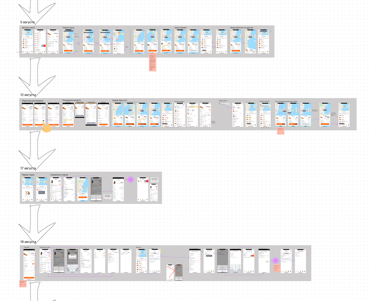
A small piece of the presentation file
Overall style
As stated earlier, I was provided with an early prototype. It was raw, lacked contrast and relied on web-technology rather than iOS guidelines:
Early mockups I was provided with
But there were also nice things! For example, I decided to keep the color scheme and those sleek 3D models of the boats. But other all other parts, like controls, layout and iconography, had to be refined.
I started by looking for references, trying to get inspiration from other sharing services and taxis:
A part of my moodboard. All screens are grouped by functionality
Finally, I came up with this refreshed and minimalist style:
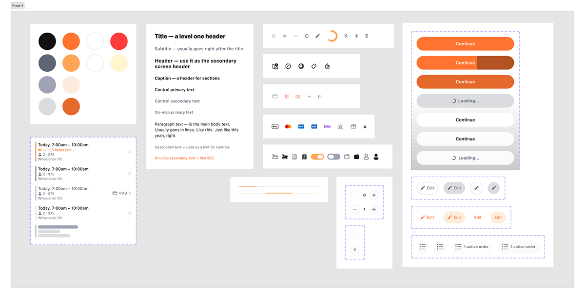
The app is map-based, so I wanted to try different map styles. I put to a vote 5 different options — as you can see, the leftmost had won:

Voting results for map style
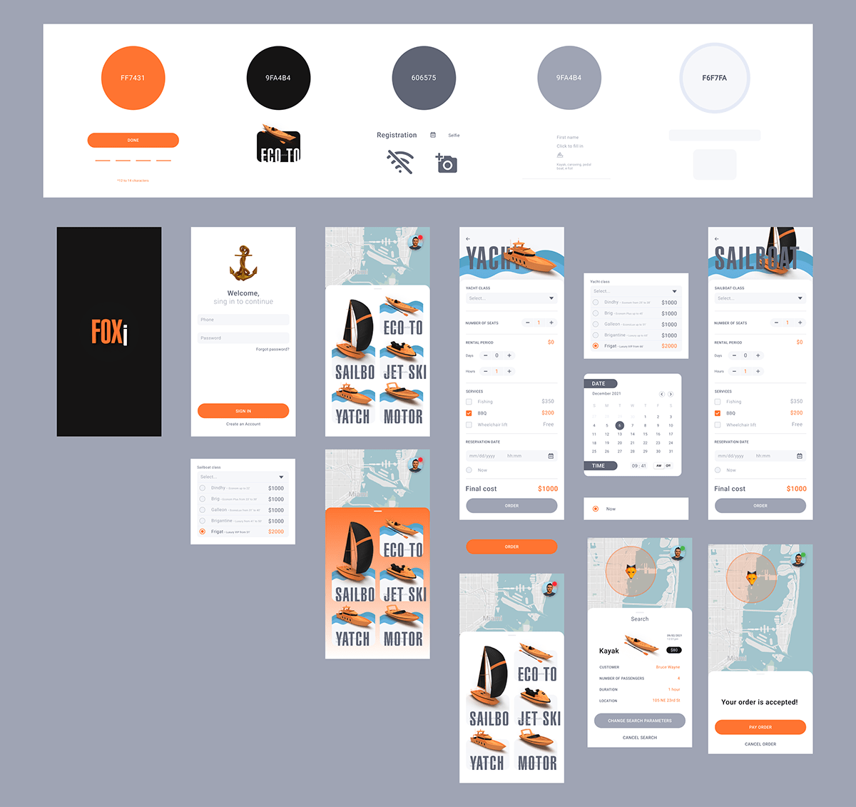
Client app
We wanted to make client's workflow as smooth as possible. They login with their phone and then get straight to the map:
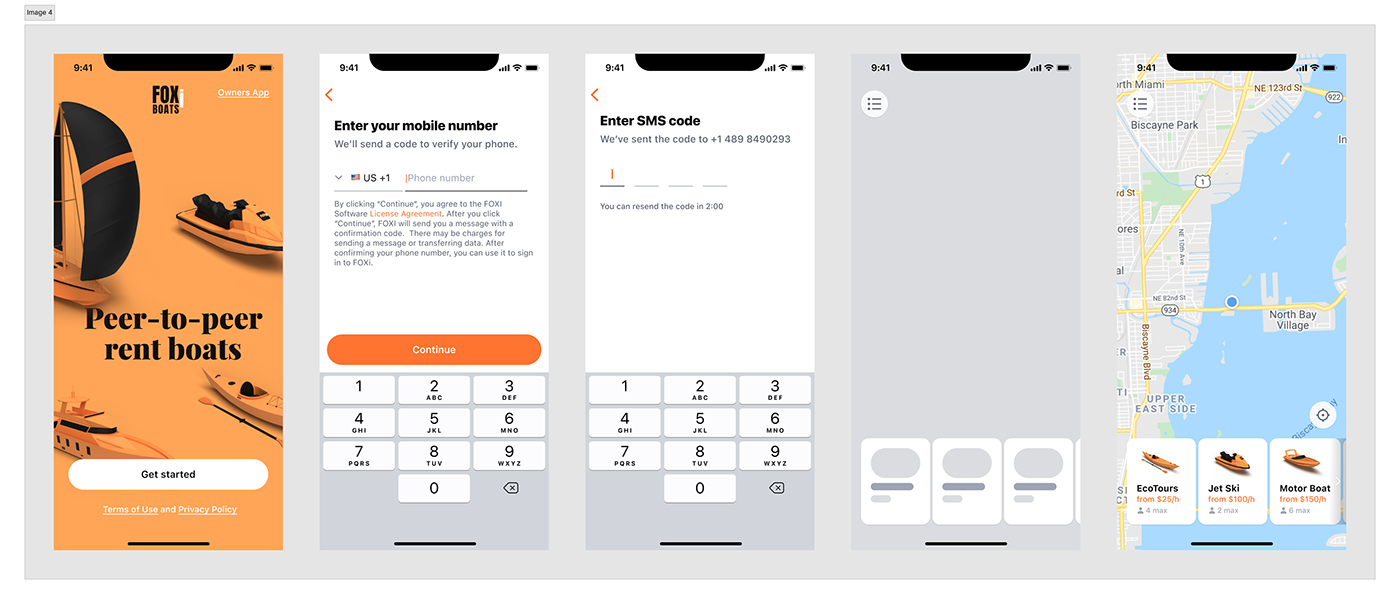
Signing in
Clients can choose from a variety of boats. I prepared starting screens for each type:

Screens for ordering different types of boat
After setting up all parameters required for their ideal boat, we take clients to the search screen. Meanwhile, their order is being offered to boat owners. Once the right one is accepted by an owner, clients have 5 minutes to pay the order. And after successful payment — voila! — they see that their order is confirmed. Now both parties can discuss further details in chat or by voice:
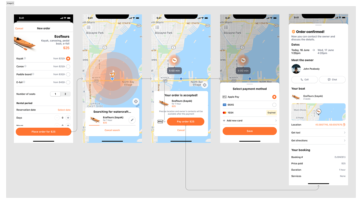
Searching and paying for an order
And that's the whole idea of the app — to make ordering a boat as easy as ordering pizza!
Clients can book more than one watercraft, and manage upcoming and active orders on the home screen:
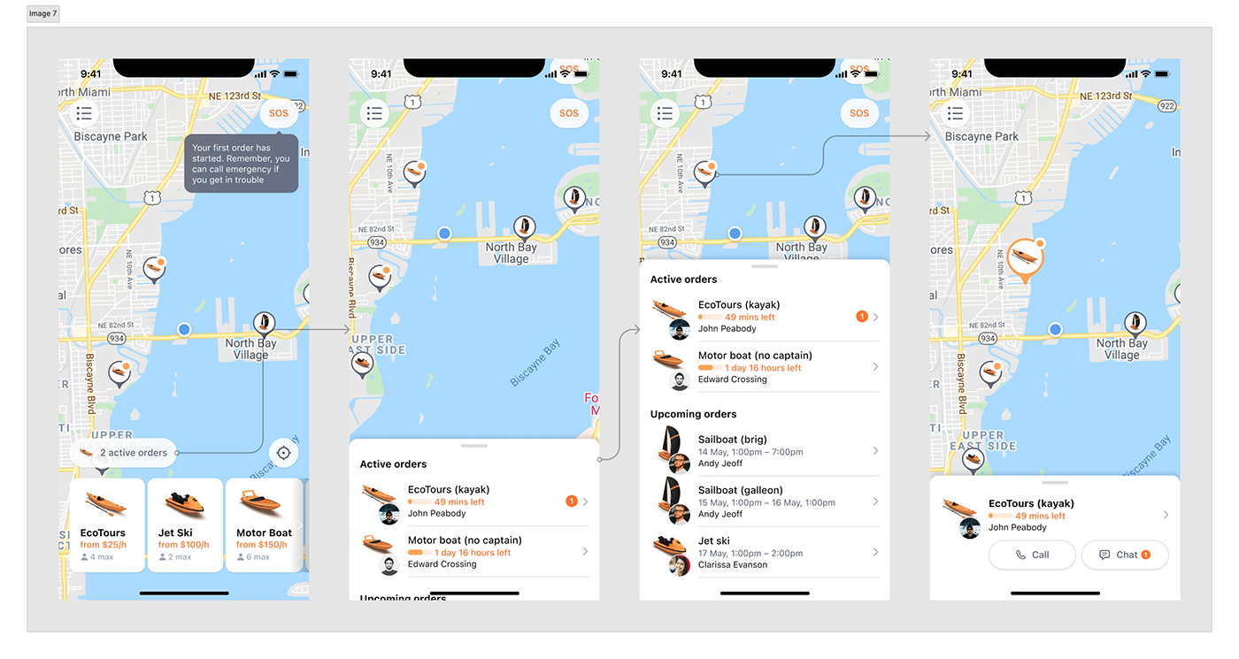
Active and upcoming orders
What about that burger menu button in the top-left corner? Well, it opens a side menu, expectedly. Why not use a tab bar since burger menus are a bad UX choice generally? We decided so because the options it contains would rarely be used by the client. Therefore the tab bar would take up precious space with no real value.
Anyway, in the menu clients, for instance, can access their order history:
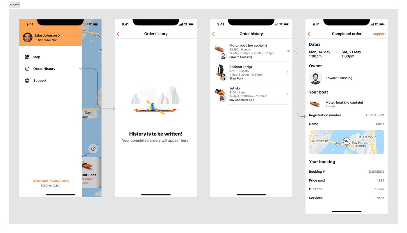
Order history
There's also a user profile where they can change their personal information and fill in their Boating safety certificate details. It's required by US laws for operating certain kinds of boats:

User profile
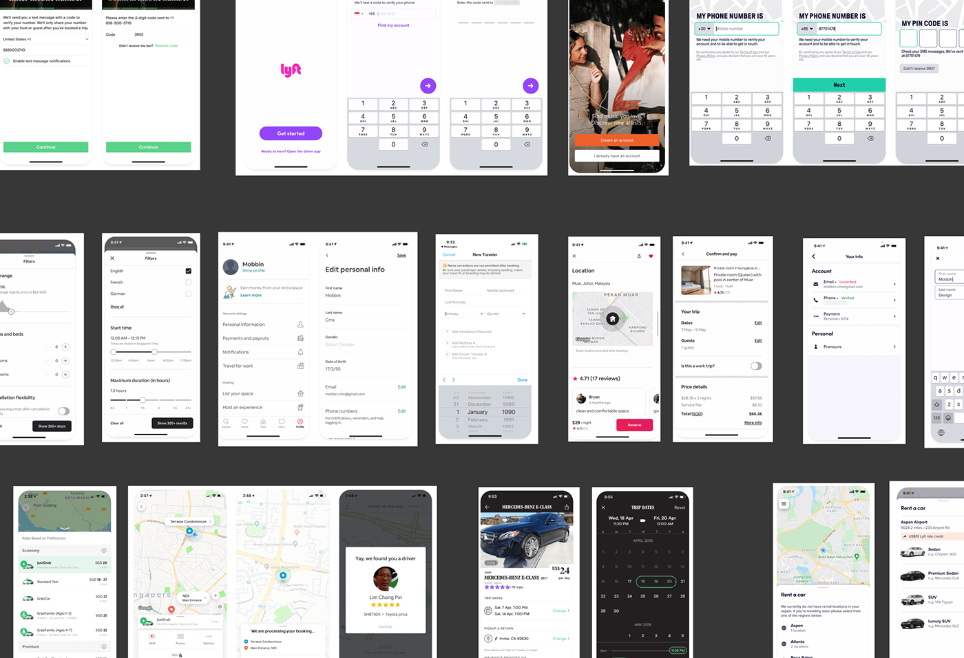
Owner's app
This part of the project was less elaborate and gave me many more design challenges.
Owner's onboarding looks pretty much the same as the client's, except they are required to send us their driving license and all personal info to prove their identity:
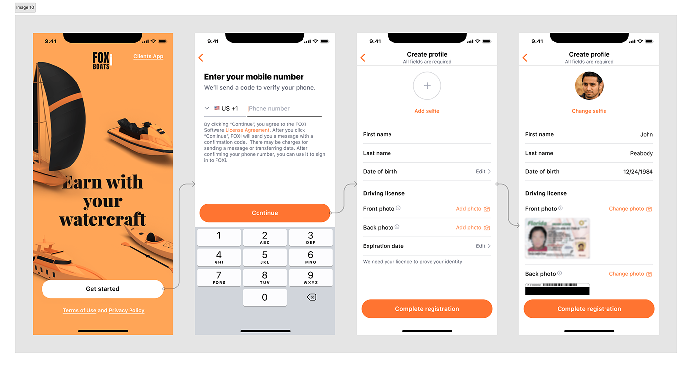
Owner's onboarding
They then move on to the home screen — a dashboard connecting their boats and orders. We'll talk about it later. From now on, their profile is on moderation, so they can explore the app and do everything but add new boats. By the way, the current moderation status can be seen by tapping the switcher in the tab bar. Once the profile has been approved, this switch can be used to start and end the rental.
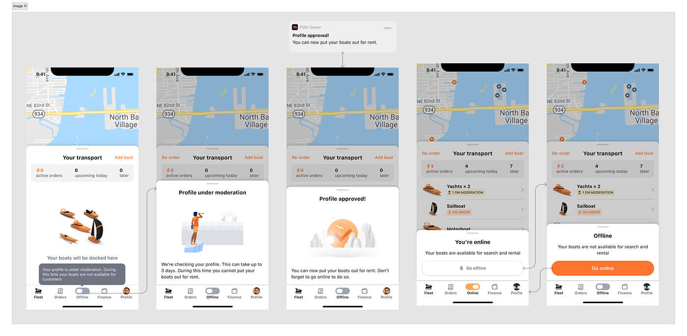
Profile in moderation
Owners are now free to populate their fleet. They must fill in a form for each watercraft, choose its location an the map and then wait a couple of days for it to pass moderation:
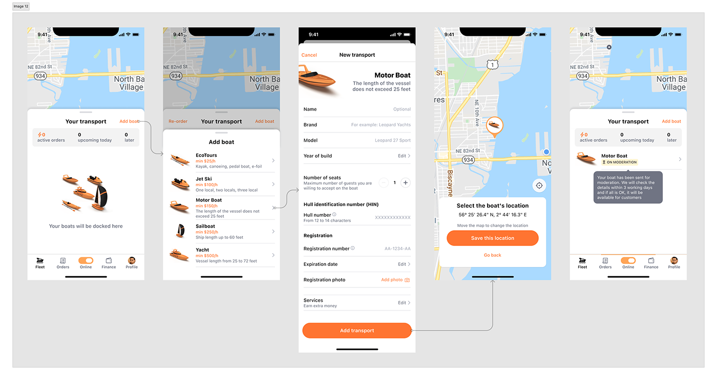
Adding a boat
After successful moderation, the boat becomes available for booking. The owner receives a push notification when their boat meets the client's booking requirements. They then open the app and have 30 seconds to accept the order. The accepted order still needs to be paid by the customer, and only after payment does it appear on the owner's dashboard:
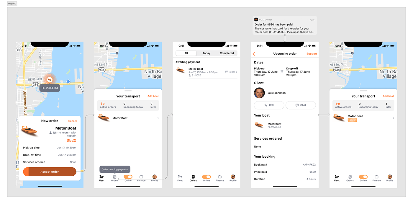
Receiving an order
And now it's time to talk about the dashboard in more detail.
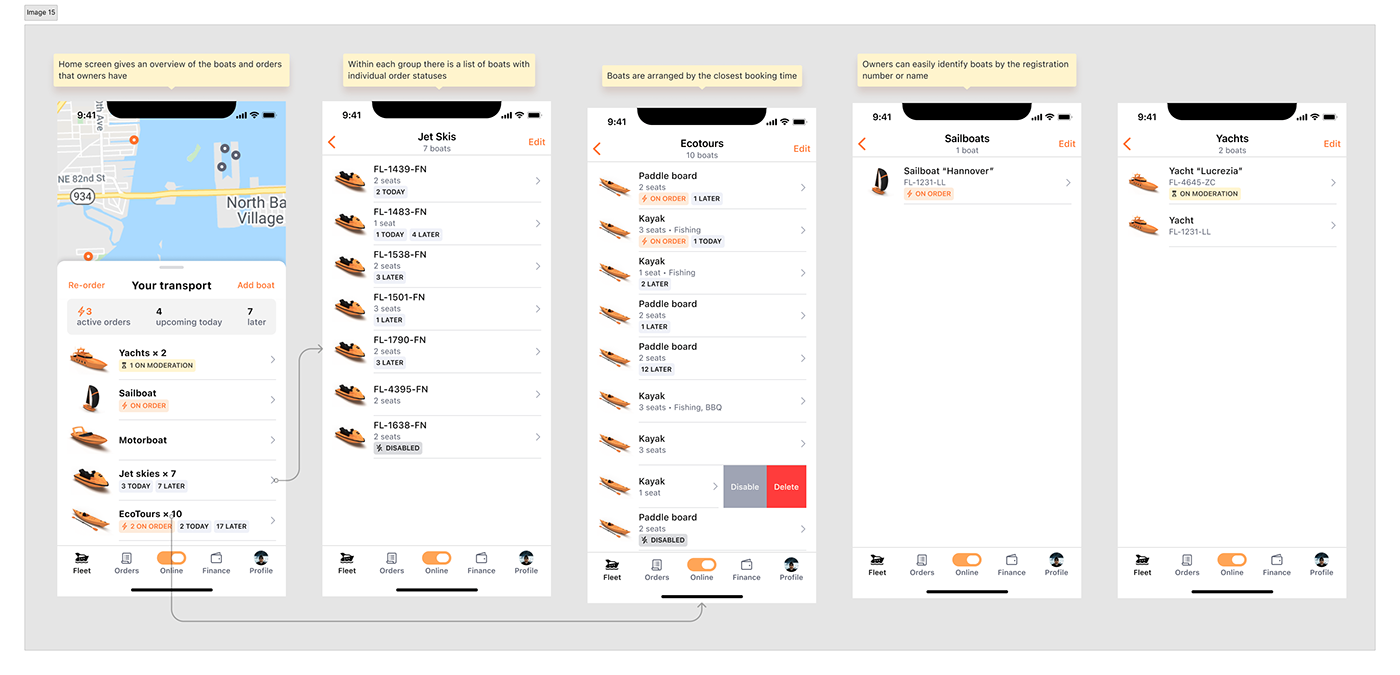
Owner's dashboard
In the example above, the owner had only one boat, so the dashboard could be a simple list of their watercraft. But real owners have hundreds of kayaks, dozens of jet skies, complemented with several yachts and sailboats… or some might have just 5–10 units overall. How to display their boats and their bookings on the same screen?
First of all, we found that owners tend to divide their orders into the following groups in terms of importance:
1. Orders carried out right away are the most important, because owners want to stay in control of their boat, and know when to pick it up.
2. Booked for today — to prepare the watercraft beforehand.
3. Booked for tomorrow and later are less important, but still useful for planning.
1. Orders carried out right away are the most important, because owners want to stay in control of their boat, and know when to pick it up.
2. Booked for today — to prepare the watercraft beforehand.
3. Booked for tomorrow and later are less important, but still useful for planning.
Then I came up with order statuses that look like tags and give a nice overview of the booking for each boat:

Order statuses overview
It was a big step in the right direction but we still had to do something with the potentially huge list of owners' watercraft. I tried to just put all boats in one list along with order statuses. It's possibly the best decision when you have 3–6 vessels because you can see them all at once and manipulate them directly. But if you have a larger fleet, management becomes a nightmare — you have to scroll the list with hundred cells back and forth.
Then I realised, that maybe as an owner you don't need an instant access to each boat but rather you want to see the big picture — what's going on with the entire fleet right, what is going to happen today and later on. So I grouped all vessels on the home screen but let owners tap each group to see all boats if they needed direct access. Each group now displays a summary order statuses, making the list the real dashboard.
Owner's dashboard
Owners can access each boat to see its current orders and upcoming bookings:
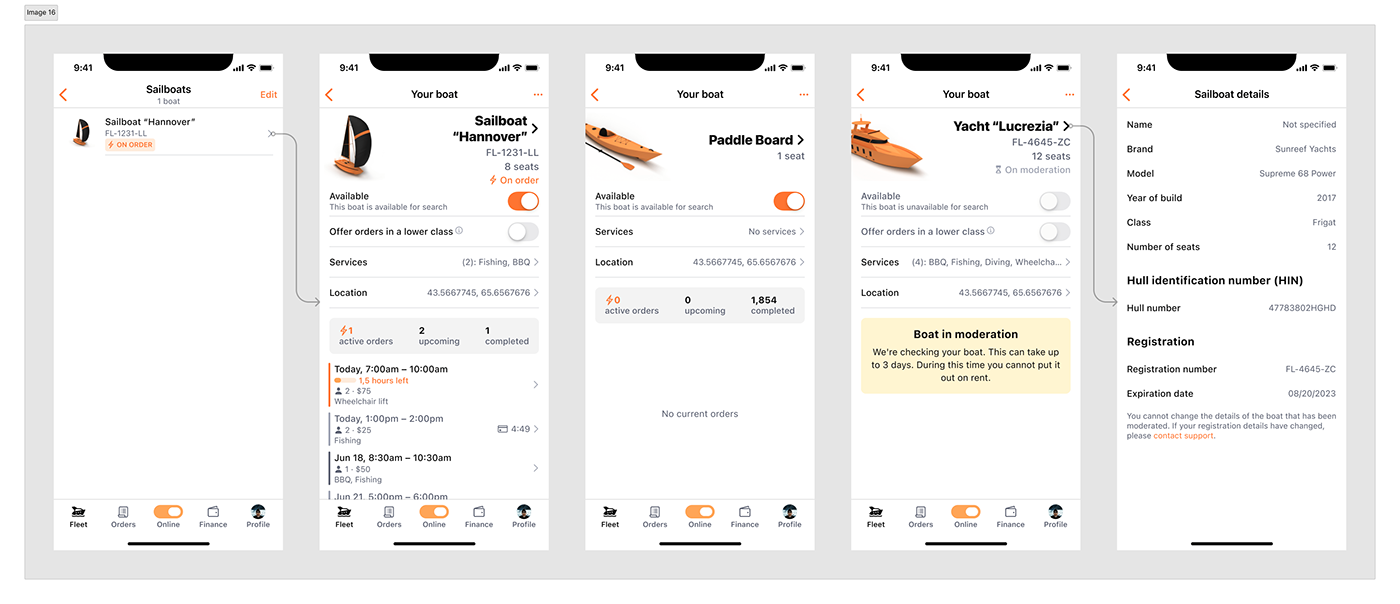
Boat details
Our owners might want to see all orders separated from the boats — we have a dedicated place for that. Initially, it was designed as a visual timeline but it was difficult to implement so, for now, we ended up with a simple list of orders:
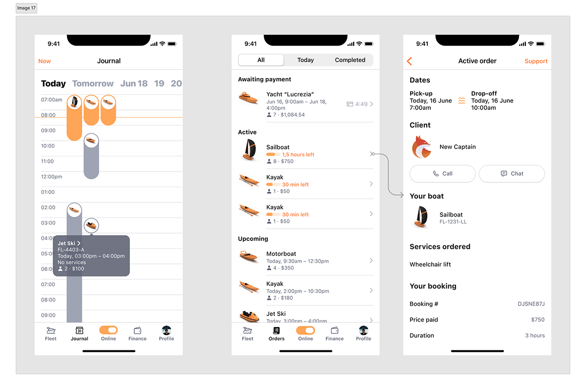
Initial timeline vs actual list views of orders
Finance, profile and error screens
There's a Finance tab where owners track how much they earn, do payouts, and enter their tax information. The profile tab is not much different from the client's profile:
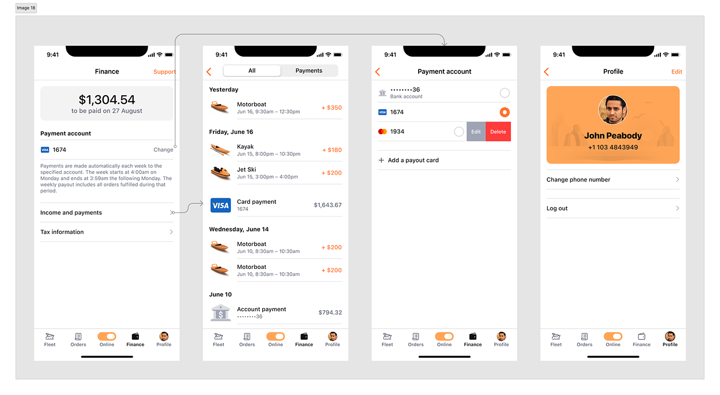
Finance and profile tabs
As a thorough designer I always strive to cover edge cases that may happen in the app:

Error states
Links
You can find the client's app on Appstore. The owner's app is under development now.
