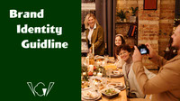
Brand Identity Guide

About Us
We are a company that makes and distributes healthy finger-food. PickMeGreen wants to change a conception towards healthy food, like healthy meals are bored, and flavourless. But it is not true at all after you taste our foods! You will look forward to be delivered healthy foods by us every week.
The most important for us is having fun! We believe that foods are the best way to connect and have fun with people who you care a lot about especially friends. Our staffs are all engaging to deliver playfulness with foods to you. Our main target is young adult who hosts party on regular basis. Let’s go have fun with your friends by enjoying our healthy foods!
The most important for us is having fun! We believe that foods are the best way to connect and have fun with people who you care a lot about especially friends. Our staffs are all engaging to deliver playfulness with foods to you. Our main target is young adult who hosts party on regular basis. Let’s go have fun with your friends by enjoying our healthy foods!

Our Concept
PickMeGreen, is all about fun! We prioritize to convey a sense of being fun, energetic. Since we are a young, modern brand, so we use a sense of youth, and playfulness to be present in each designs we make related to our brand. We are all about being fun, connected, and playful.
It is also very important to have the common understanding of our brand among our staffs. Our team strives for engaging, and bright marketing to communicate our energy!
It is also very important to have the common understanding of our brand among our staffs. Our team strives for engaging, and bright marketing to communicate our energy!

Services
We deliver healthy finger-foods, snack, and light meal every week to our clients. Our products are made fresh and in-house and shipped directly to the home of our client weekly.
Everything is prepared from scratch – we bake our own bread, grow our own greens and package it all fresh! Each week our clients receive a box which contains a curated selection of snacks and foods that adds more fun for their parties. Our boxes, have a cooling insert to keep food fresh that can be reused or sent back to us to recycle.
Everything is prepared from scratch – we bake our own bread, grow our own greens and package it all fresh! Each week our clients receive a box which contains a curated selection of snacks and foods that adds more fun for their parties. Our boxes, have a cooling insert to keep food fresh that can be reused or sent back to us to recycle.

Colour Palette
We use two green colors representing this brand. Green shows healthy concept, but also fun and playful atmosphere by using Mantis. And as an accent color, we use Mandy. Mantis, Mandy, and Myrtle are inspired by authentic vegetable colors.

Shapes
Some of these shapes are inspired by vegetables or fruits. And stars and shiny shapes will add the playful atmosphere for the party. Overall, they can express healthy food, and fun party.


Flyer Mockup


Business Card Mockup


Typefaces
These typefaces represent fun and playful vibes. So, we do not want to use elegant typefaces. When you want to emphasize something, use Wigwag bold.
Therefore, we use Wigwag Bold as a headline/title, Komet Regular as a sub-headline, and Century Gothic Pro to describe other details.
Therefore, we use Wigwag Bold as a headline/title, Komet Regular as a sub-headline, and Century Gothic Pro to describe other details.


Logo Elements

This element expresses party vibes, and thing that pick something up such as chopsticks or tongs.

This element shows “G” shape from our brand name. This is inspired by leafy vegetables and also use similar shape of another element above.

Box Design (49 x 49 x 50 cm)


Box Mockups

Box Design (10.5 x 30 cm)

Box Design Mockup


Uniforms (Hoodie)


Hoodie Mockups


Uniforms (Helmet)

Thank You for Joining Us to Deliver Fun!!


