


The Mena Kaho Winery was established in the 20th century and is based in Rio Grande do Sul, Brazil. The winery preserves its character in the introduction of each product, despite the upgrading of its equipment and production method.


The name DiDio, which alludes to the wine god Bacchus , was given to the Trebbiano Toscano. Its label was intended to indicate value addition and make reference to divinity.


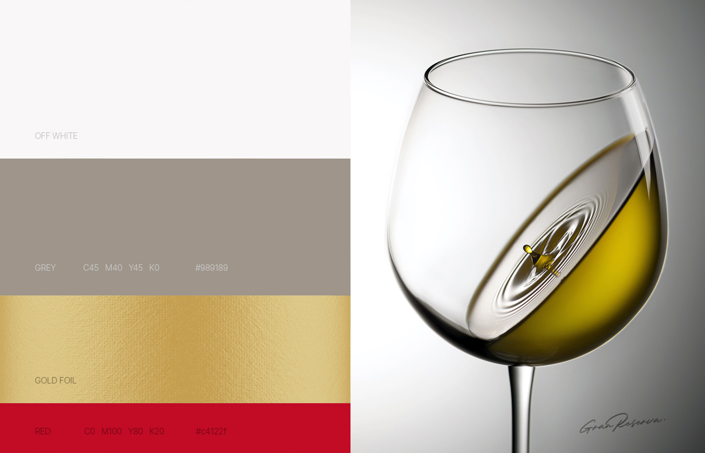
The label's graphics was organized based on an illustration of Bacchus that has elements that invoke classical aesthetics. The name was given a unique typography made up of serif letters that go well with the refined content, as well as an iconographic element made up of the duplicated initial D, which stands for a glass of wine. The word "Gran Reserva" is written in cursive, which adds to the product's distinctiveness.


The label is designed in a unique manner with cuts that refer to papyrus and unusual textured paper. Finally, the developed art's embellishments are highlighted by the golden hotstamping finish.

Conception and Art Direction: Ricardo Heiderscheidt


