


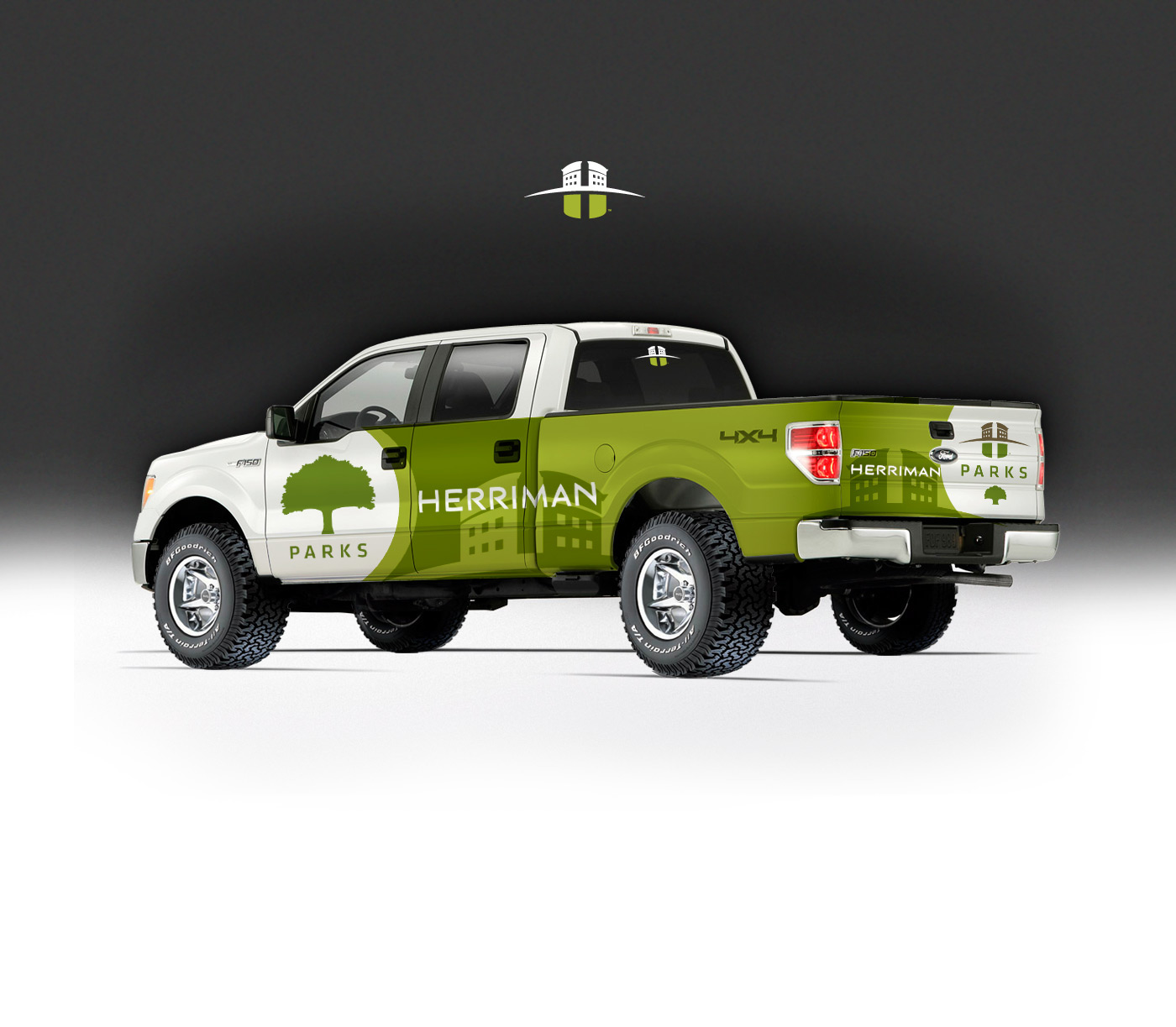
Rebrand :: Herriman City
Another of the Salt Lake Valley's expanding metropolitan areas, Herriman City has been experiencing extraordinary growth in both residential and business arenas. Looking to keep up with that growth, the city council understood they needed to update their brand to appeal to a much broader market and people looking to find better values in housing and business to get better and nicer properties for their dollar. Herriman is well-known for its ample open spaces and scenic beauty, near mountain vistas and now they want to also be known for the modern community they have built. To reflect this in the city's logo, the green bottom of the H is to represent the many parks and outdoor facitities in the community and the top portion of the H is the modern architecture of the new business parks and office spaces rising above the horizon toward the future.
Before & After

Custom Designed Typeface :: Using Circles


Early Logo Concepts


Large Services Icons


CUSTOM :: GRAPHIC DESIGN :: LOGOS :: BRANDING :: ILLUSTRATION :: ADVERTISING
ROD@HELIUSCREATIVE.COM Email, Text or Call +1 801 673 4199


