


_
Context
Two architects got together to create Toca. Their vision is that architecture works as the articulator among other activities like design, art, woodwork, etc, bringing them together in one unique project. Their aim for the future is to have a space, like a house, that feels comfortable and where this atmosphere of partnerships and diversity could exist.
Role
I created their logo, visual identity, collateral and lading page.
Solution
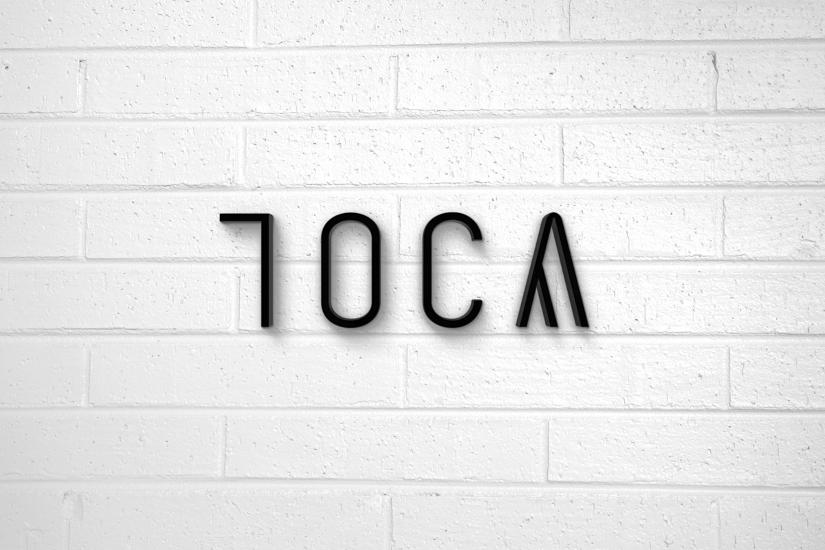
Toca means “burrow” in Portuguese, so the concept was directed to the question: what is there inside Toca? The logo communicates this space of comfort and the letter A will work as the element that will identify all the services and partnerships offered by Toca. The identity style communicates the way they create their projects: clean and sophisticated.
Go to Toca instagram profile to know more about their projects.


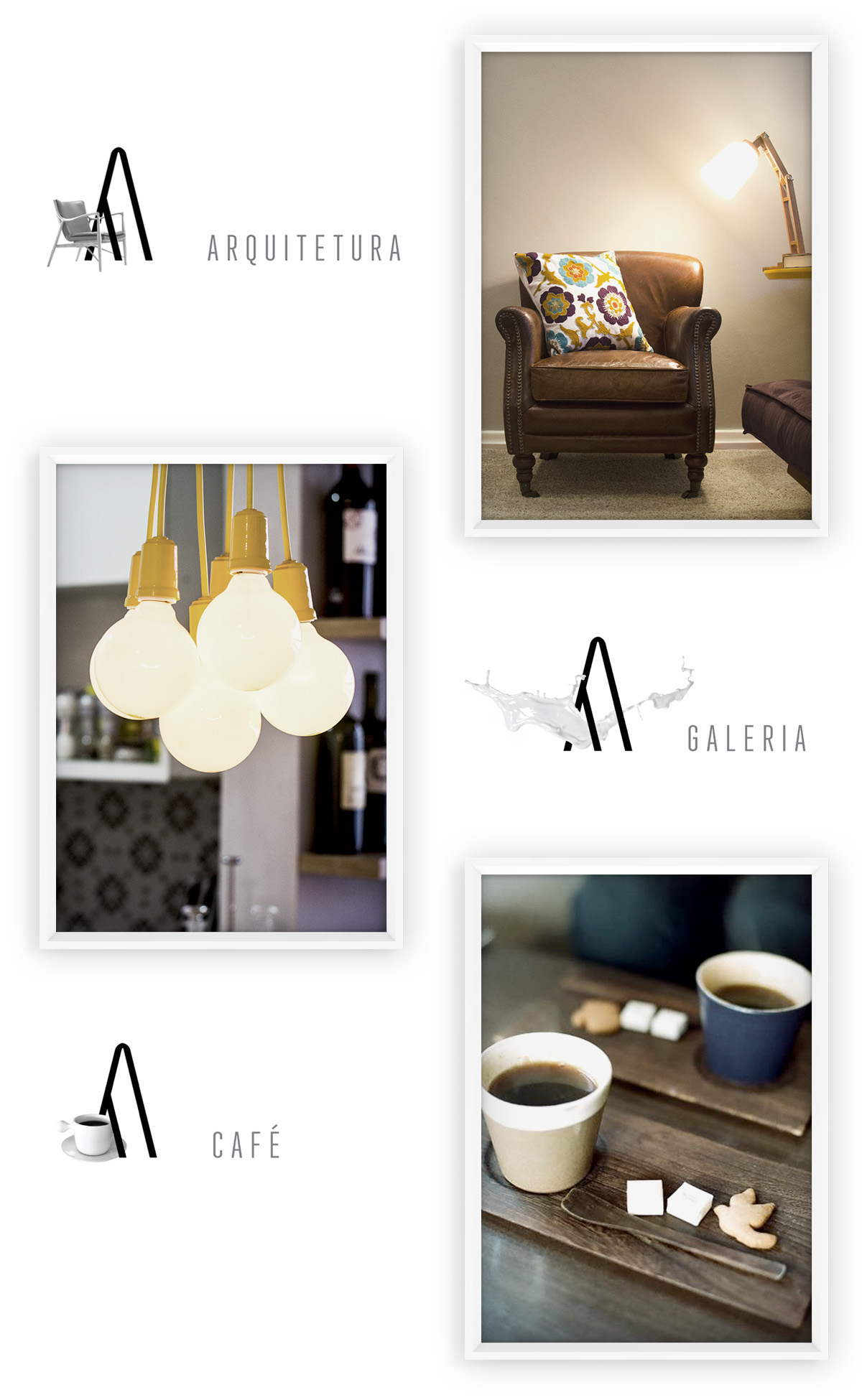
As fotos de sala de jantar e sala de estar usadas nos exemplos não pertencem a mim nem à Tocaa.
Todas as fotos usadas no site pertencem à Tocaa.
Neither me or Tocaa own the dining room and the living room pictures used on the examples.
Tocaa owns every photo used on their website.


