


tBE / Rebranding / M M X X I I
The Brand
Revelwear is a groundbreaking brand in the fashion and wellness industry, providing diabetics with freedom and discretion along with the luxury of being comfortable and fashionable. You no longer have to choose health needs over style.
The Mission
To bring the brand into the 21st century with a cohesive, memorable and powerful brand that reflects the innovation, quality and style of Revelwear, while also transmitting the message of freedom and wellbeing. We wanted your customer to know that your products aren’t just products they need but they are styles they want.


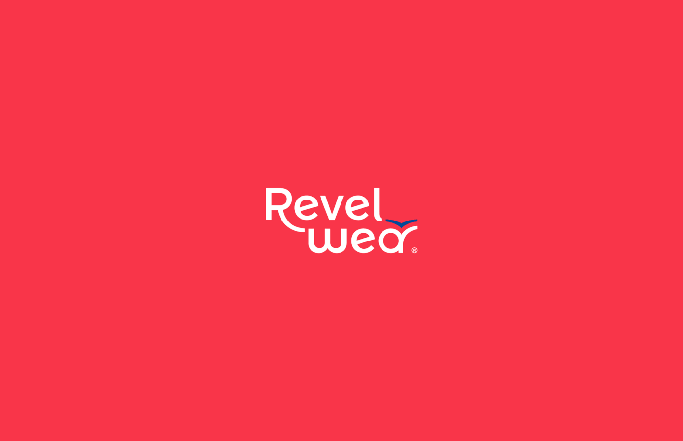
The Revelwear Logo
Our goal was to communicate a strong solid brand with a message. We want the brand to be memorable both in name and in look.
We achieved this by first combining Revel Wear into one word, Revelwear. This works to solidify the brand identity.
We simplified the logo to make it more friendly. A customized, bold and unified typeface with both uppercase and lowercase letters is both friendly and memorable.


The Colors
We chose the use of colors that represent both lifestyle as well as innovation.
The blue tones speak to lifestyle and wellbeing.
The cherry red tones invoke innovation and technology.
The Icon
We chose to connect to the heritage of the Revelwear origins by integrating the bird in a much more subtle yet striking way, alluding to the freedom Revelwear provides diabetics.


tBE / M M X X I I
Special thanks to the people involved
Aaron Weinreich
Carlos Manzo Creative Director
Jaime Martínez Design & Project Manager
Rafael Saldaña Sr. Graphic Designer
Bianca Narvaez Graphic Designer
Anaid Campos Project Manager
Jaime Martínez Design & Project Manager
Rafael Saldaña Sr. Graphic Designer
Bianca Narvaez Graphic Designer
Anaid Campos Project Manager


