


ViiVConnect
Brand Style Guide and Brand Identity Design | Instructional Videos | Mobile & Web Banner Advertising | HCP & Patient Brochures
Helping patients get ground-breaking HIV medications
ViiVConnect is an online portal for ViiV Healthcare, and provides comprehensive info on benefits, access and coverage for prescribed HIV medications.

Art Direction, Cohesive Messaging, and Client Presentation
As art supervisor at Area 23 / FCB Health, I manage ViiVConnect's brand identity and advertising materials, ensuring consistency across touchpoints with patients and healthcare professionals (HCPs). I supervise art directors to resolve creative problems and maintain quality control over branded pieces, providing cohesive messaging and ensuring team members are working towards a common goal.
I present our designs to the client, and review and approve pieces through all stages of design to production, verifying each is on strategy and on brand. Projects range from brand style guide creation, to an informational video series (which won bronze at the 2022 MM+M Awards), to HCP and patient brochures, to mobile and web banner advertisements.
NOTE: The ViiVConnect website is managed by another agency and uses an outdated brand identity. The web layout and designs should not be used to reference this project. Additionally, the ViiVConnect logo is a previous design, not created by Area 23.

Distinct, Ownable Branded Elements
When I first began working on ViiVConnect, I wanted to create ownable elements that would make the brand easily recognizable and stand out in a sea of pharma materials. I felt this was especially important considering how similar—and often generic and clinical-looking—other brands are in the market.
Rounded Corners (see above)
My first suggestion was for all projects to have a rounded edge in the upper right corner to directly tie-in to the arc in the ViiVConnect logo. Softening the hard edge gave each piece a bit more personality and levity, and made them instantly identifiable. For printed materials, this was literally achieved with a die-cut. For digital pieces, we visually created a rounded corner with color or drop shadows.
Colored Tabs (see below)
My second suggestion was to incorporate the ViiVConnect colors in a unique way. For multi-page pieces that could be broken out into different sections, I created a stepped-out tab treatment, and used the brand colors to differentiate each section. In addition to the visual aesthetic of a stripe pattern that framed the piece, another benefit was ease of use, allowing the reader to quickly access desired content.
The client agreed that both treatments helped make ViiVConnect pieces immediately identifiable by providing a clear brand distinction. We then applied the features to all projects going forward.

. . .
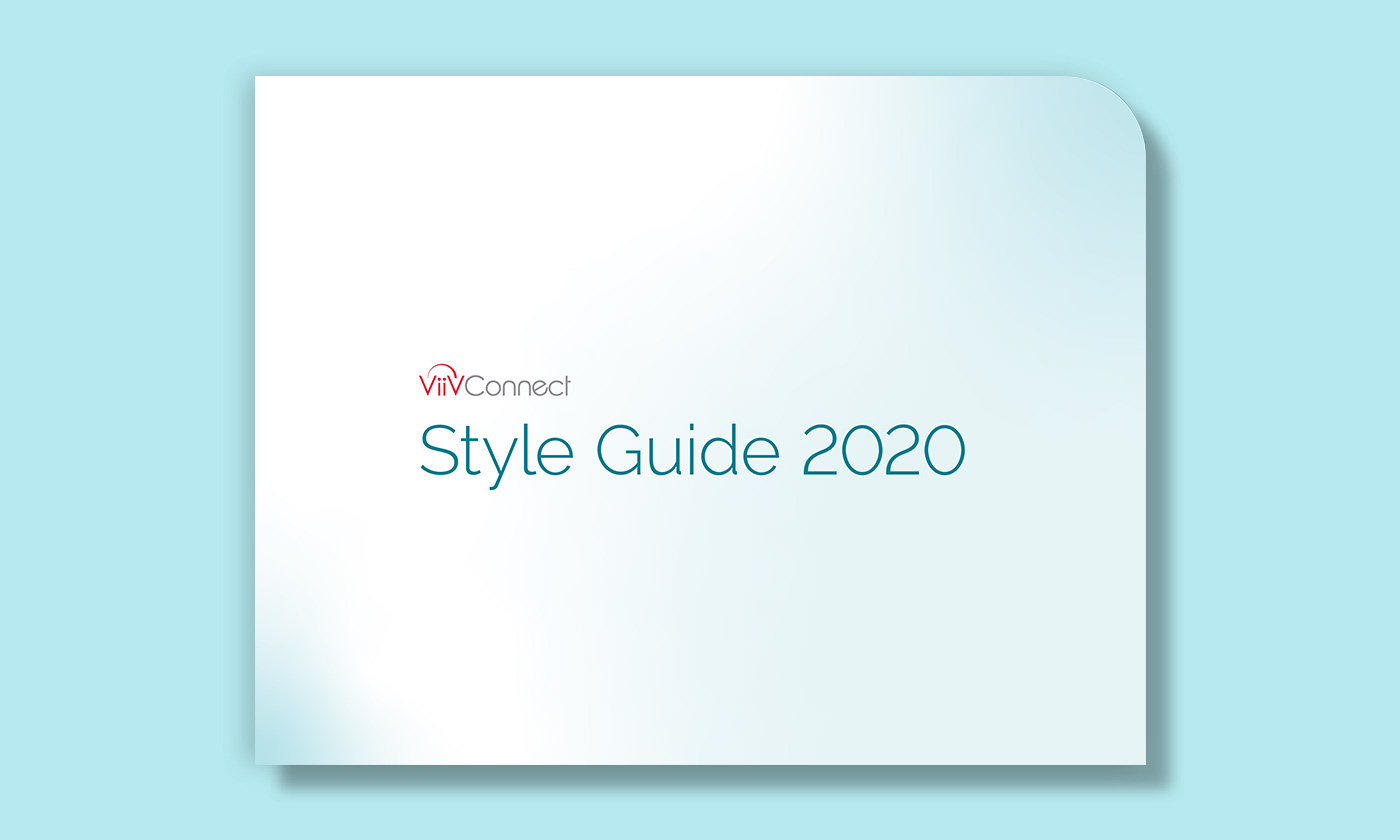
ViiVConnect Brand Style Guide
After we rebranded ViiVConnect and began applying the treatments to new pieces, it was important to have an official, comprehensive guideline for anyone that touches future projects.
I created the brand style guide using the general look and feel of our new visual identity, but in a minimalist way to allow the content to shine. The guide displays all of our brand identity elements, including color palette, iconography, typography and treatments, as well as the new signature rounded-corner feature, tying in with the arc of the ViiVConnect logo.

Breadcrumb System
The bottom of each page features a subtle, color-coded graphic treatment that works as both a visual element, as well as a functional breadcrumb system.


. . .

ViiVConnect Services & Support Brochure
I designed this piece as a high-level overview of the program offerings. Internally, we came to refer to it as the "brand bible" for look & feel. This became the new ViiVConnect style, and was used as a jumping off point for future projects, as well as the brand style guide shown above. This was the first project to feature the stepped-out tab structure.


. . .

ViiVConnect Guides video series:
How to Fill Out the CABENUVA Enrollment Form
How to Fill Out the CABENUVA Enrollment Form
This project was the first in a new series of educational videos, known as ViiVConnect Guides. Each instructs HCPs on a different facet of the ViiVConnect program. The purpose of this video was to provide step-by-step instructions for completing the CABENUVA (HIV medication) enrollment form.
Dealing with what could easily be dry, text-heavy and repetitive info, our goal was to create something friendly, straightforward, and easy-to-follow for HCPs and office staff. We wanted to avoid a pitfall of many other instructional videos that are often too clinical or overwhelming.


Video Branded Look
It was important that the video framework have a distinct branded look that could later be applied to future videos. It needed to compliment the new ViiVConnect branding, while allowing the content to stand out and shine. The key was striking the right balance between having a distinct look, while also ensuring it was clearly a ViiVConnect piece.
Shown above are video screenshots. Shown below are initial storyboard pages with placeholder treatments, followed by the video with final visual treatments, VO, sound effects, and music.


Storyboard layouts used to guide animation vendor.
Storyboards
I created storyboards to outline all content and flow. This included visual and audio descriptions, general treatments, movement and transitions, as well as VO and Super copy.
We then worked closely with an animation studio to bring it to life in a modern, approachable style. I art directed throughout all stages of the video creation. To compliment the visual tone, we carefully selected the music, as well as the voice talent from a wide range of people, and directed her in the VO recording sessions.
Final video.
2022 MM+M Awards
After creating several videos for the ViiVConnect Guides series, we won bronze in the 2022 MM+M Awards for Best Use of Market Access Marketing.
The goal of Medical Marketing + Media (MM+M) is to recognize, champion, and celebrate creativity and effectiveness in healthcare marketing and communications. The MM+M Awards is one of the biggest and most prestigious events of the year. It honors the year’s leading health-tech innovators and healthcare marketers, and is highly valued, because recognition comes from industry peers.
See below for two other videos in the series: Welcome to ViiVConnect and Welcome to the Provider Portal.
. . .

ViiVConnect Guides video series:
Welcome to ViiVConnect
Welcome to ViiVConnect
The third video in our series was Welcome to ViiVConnect, which provided a high-level overview of services and offerings.
At this point, we had gone through another branding refresh. Colors, typography, and basic treatments remained the same, but we introduced photography, and moved away from the dark blue gradient background, in favor of a cleaner light grey. As a nod to the original dark background, we incorporated a thin, elegant, red-to-teal gradient line as a holding device for headlines.


Brand Consistency
Maintaining consistency was extremely important for brand recognition. Since the refresh was within the same family as the prior look and feel, with a few tweaks we were able to preserve the video framework design and treatments established previously. The most notable changes were to the intro and outro frames, as well as section title screens, where you'll see photos and the new background color.
For a cohesive brand identity, both the visuals and audio components needed to match. We worked with the same voice talent for VOs, and used the same animation studio to execute our vision. We then selected music that was different, but similar in style and overall tone.
As with the previous videos, I created storyboards to outline all content and basic flow, and then art directed the animation studio through all stages of video production. Shown below is the final Welcome to ViiVConnect video.
Final video.
. . .

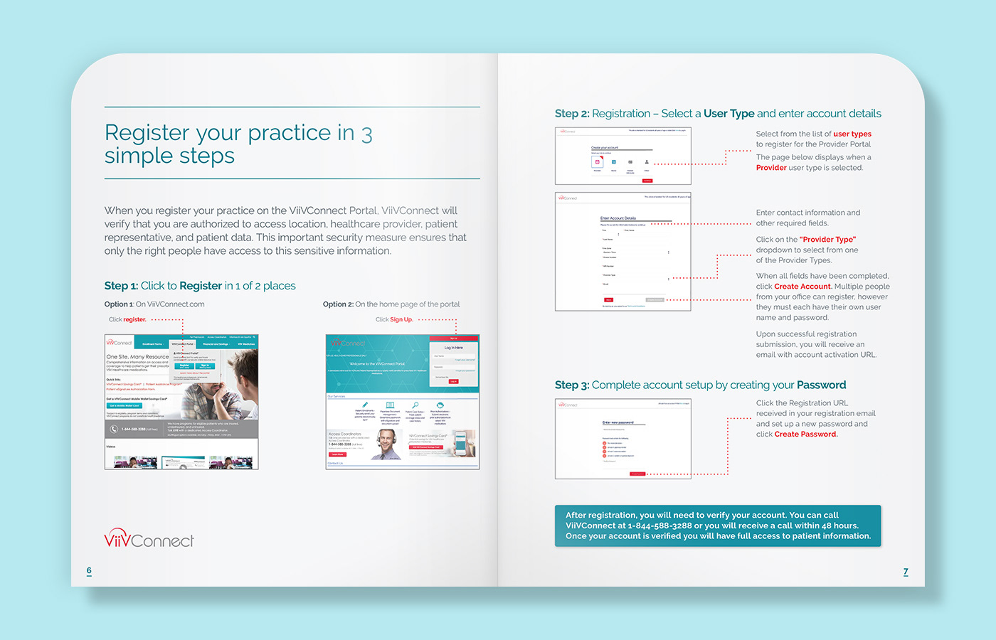
ViiVConnect Portal Brochure
The ViiVConnect portal is a centralized online tool for HCPs to register, set up user affiliations, enroll patients, and more. It provides a streamlined process, patient coverage status and history, real-time alerts, and easy documentation uploading.
I was tasked with creating a brochure that provides HCPs with an overview of the portal, and details the services offered. Ultimately it's a guide to help patients get their prescribed HIV medications.


Step-by-Step Instructions and Insert Pocket
Using screenshots from the portal itself, we gave step-by-step instructions and highlighted key points in the process for a smooth experience. The brochure also featured an FAQ and insert pocket for more specifics on enrolling patients receiving HIV medication CABENUVA.


Insert pocket with pull-out that provides info on enrolling patients in CABENUVA.

In addition to this printed piece, we also created a video walk-through of the portal. Scroll down to see details of that project below.
. . .


ViiVConnect Banner Ads
To promote the access coordinator reps, as well as ViiVConnect overall, we created digital campaigns for desktop and mobile devices, featuring a series of banner ads in multiple sizes. Shown are two campaigns in various sizes, as well as banners in context on mobile, desktop web and email placements.

Mobile and desktop web placements.


Email placement.
. . .

CABENUVA Approval Flow Viewer
We created this piece to help HCPs and office staff better understand the steps in the CABENUVA prescription approval process. It also serves as a handy, educational reference tool when discussing the process with patients.
The goal was to provide a visual to convey that the process is manageable and easy to follow. We presented the flow from enrollment to medication injection, and highlighted each stage along the way with timing and relevant info.
Shown above is the digital version. Below is the print version that folds up to a 10" square, showing the first and last steps in the process. When opened up, the full approval flow is displayed top to bottom.

Print version front, folded.

Print version front, fully opened.
Process Flow Graphic
The main process flow is the focus of the piece, and was brought to life with our ViiVConnect colors and icons. Secondary copy stems from the main flow and is similarly color-coded. Gradating from light to dark teal, the final stage of the process (medication administration) is then displayed in CABENUVA orange, which is fitting and also compliments the ViiVConnect palette.


Print version back, folded and fully opened.
. . .

FRM Flashcard with ClingZ
One-sided quick reference flashcard, serving as a reminder about the importance of Field Reimbursement Managers (FRMs), and providing space for HCPs and office staff to fill in their FRM's contact info. For ease of use and damage-free application, the back features ClingZ, an adhesive-free, electrically charged graphic film that adheres to any dry interior surface.
This piece was a slight departure from our standard look & feel. Though only 6x9" in size, the client ask was for it stand out and differentiate from other pieces. We treated it more like a small poster with limited copy, a bolder headline, and the FRM icon displayed as a hero graphic. Our goal was to tweak the branded elements enough to differentiate, while still keeping in line with our brand identity.
. . .

Co-branding with CoverMyMeds
I was tasked with creating this brochure to promote an online Prior Authorization process through CoverMyMeds. FRMs deliver these leave-behinds to HCPs and office staff to build awareness and educate about the resource.
The project features our secondary light background on the covers. For the co-branding aspect, it was important to find the right visual balance as a delicate marriage of the two brands. Overall the piece displays the ViiVConnect look and feel, but we integrated subtle CoverMyMeds graphic elements in a way that both compliments our identity and differentiates the piece.

Combining Branded Elements


. . .

CABENUVA Bridge Program Flashcard
The CABENUVA Bridge Program helps patients get their medication before insurance is approved. I designed this two-sided flashcard to educate HCPs and patients on the program, eligibility criteria, and enrollment procedures.
It features a detachable tear-off bottom section, which serves as a discreet, foldable reference card for patients. The card describes the program and provides ViiVConnect contact info for additional help.

Detachable patient reference card.
. . .

ViiVConnect Guides video series:
Welcome to the Provider Portal
Welcome to the Provider Portal
This project was the second in our educational video series. Similar to the portal brochure above, the purpose of this video was to walk through the main portal features and highlight services offered.


Storyboards and Art Direction
Shown above are video screenshots. Shown below are initial storyboard pages with placeholder treatments, followed by the final video.

Storyboard layouts.
Final video.
. . .
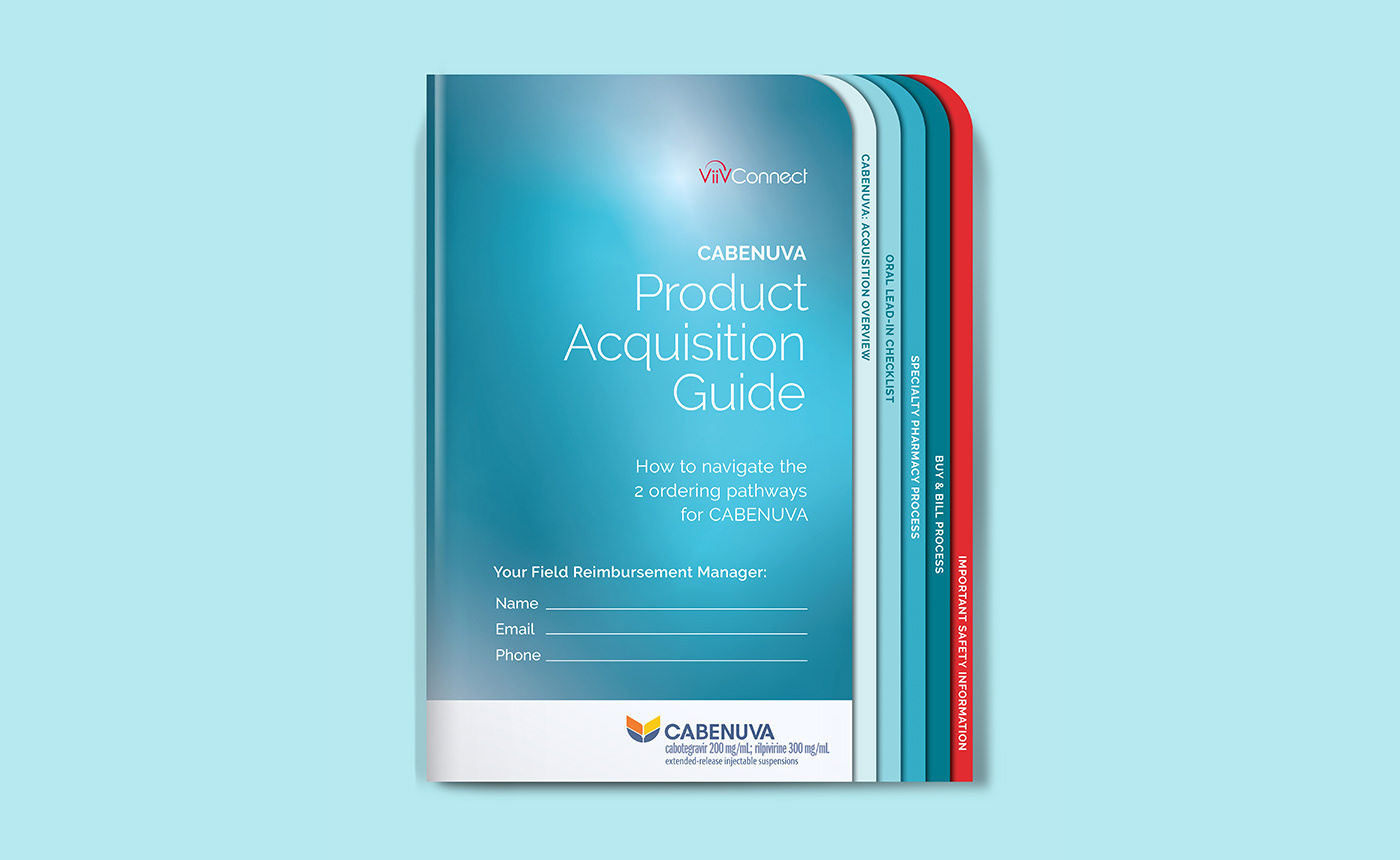
CABENUVA Product Acquisition Guide
There are different options for acquiring CABENUVA, which trigger different reimbursement needs. The goal of this brochure was to create an optimal customer experience through a clear set of ordering steps, ultimately ensuring successful product delivery to patients.


Stepped-out Tab Structure and Insert Pocket


Insert pocket for specialty pharmacy ordering checklist pull-out.


. . .

ViiVConnect Access Barrier Flashcard with ClingZ
One-sided quick reference flashcard, describing the actions that office staff can take to overcome access barriers, in order to help patients get their medications through ViiVConnect.
For ease of use and damage-free application, the back features ClingZ, an adhesive-free, electrically charged graphic film that adheres to any dry interior surface.
. . .


