Bohemia Tea & Tonics - Branding & Packaging Design
Bohemia, a small New Zealand-based sanctuary of high-grade tea + tonic blends, embarked on a branding journey driven by a clear purpose and vision. The challenge was to fiercely capture the essence of balance, mind, mood, brightness, cleansing, and refreshment in their tea + tonic blends, while creating a vibrant sensory experience that resonates with the target audience — open-minded individuals seeking balance, self-care and wellness.


The Creative Approach:
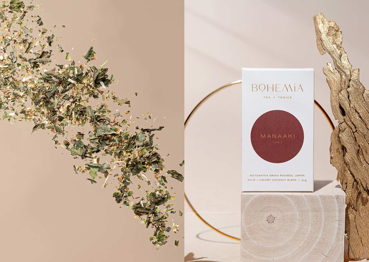
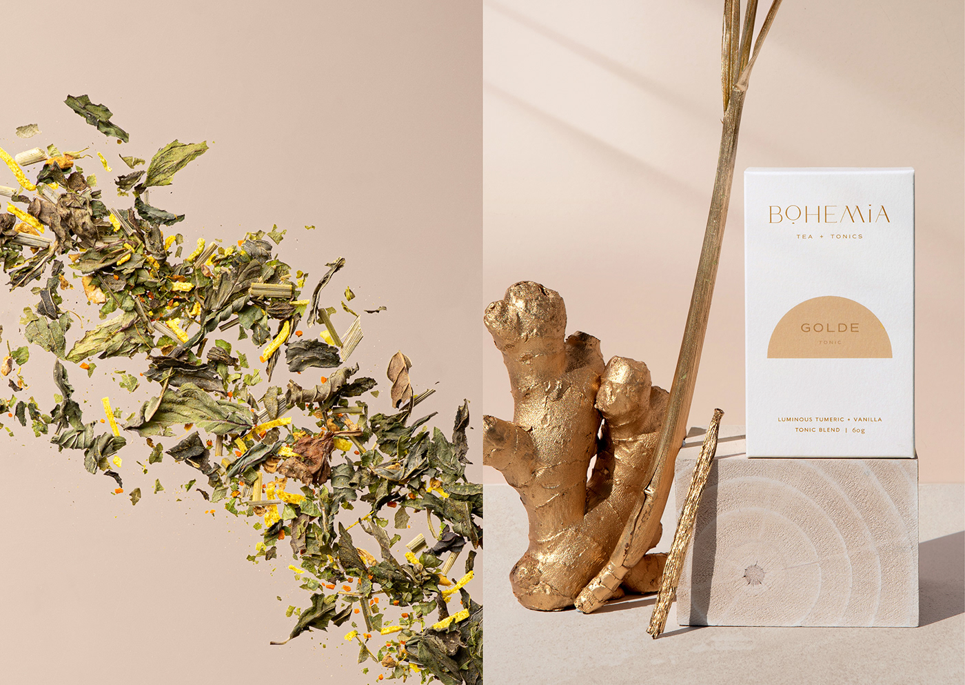
The brand name itself, Bohemia, references a state of being associated with Bohemianism — a movement focused on peace, simplicity, ritual, and balance. This served as a guiding principle for our creative direction. The visual system took inspiration from beautifully balanced simple circles and semi-circles, representing harmony and wellbeing. The choice of shapes was influenced by the tea blends' encouragement of ritual, with the addition of the moon motif — both full and half moons — symbolising the cosmic connection to the brand's ethos.
The fully custom typographic logo and complimentary brand marks were carefully crafted to embody the brand's origin and provide a fresh perspective for tea lovers. Minimalistic yet infused with a touch of cosmic allure, the design and art direction captures attention and conveys the brand's unique identity.
The heart and soul of the branding effort lay in the development of a beautiful and cohesive colour palette. The colours were meticulously chosen, taking inspiration from the aroma and ingredients of each tea blend. The intention was to create a visual connection between the label and the taste or feeling that the audience can expect from each blend. The resulting palette is not bound by passing trends but stands the test of time, offering a timeless appeal.
Despite having an “out of pocket” budget, we were committed to craft a beautiful and timeless product that didn't rely on expensive printing techniques. With a step up from their previous plastic pouch packaging to move to something more thoughtful and sustainable, we’ve opted for eco-friendly paper for the boxes and compostable bags for the tea, whilst promoting reuse, return, and recycling.
Bohemia's branding journey exemplifies clear thinking, a compelling strategy, and a deep understanding of the brand's purpose and target audience. The resulting design not only expanded their network of local and international boutique stockists, but it also brought about tangible change by inspiring individuals to embrace balance, self-care, and wellness through the delightful ritual of tea enjoyment in Aotearoa and beyond.
Packaging photography captured by Paxton Kellaghn (@paxtonkellaghn) and Roz Mcintosh (roz_mcintosh)
See more at galeriedesignstudio.com