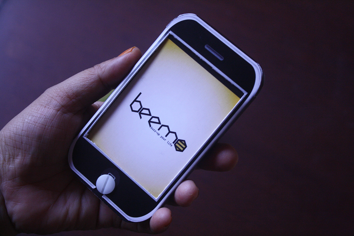
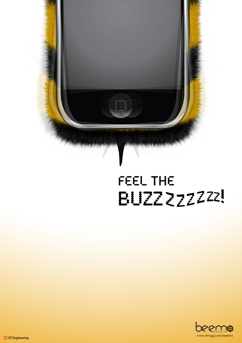
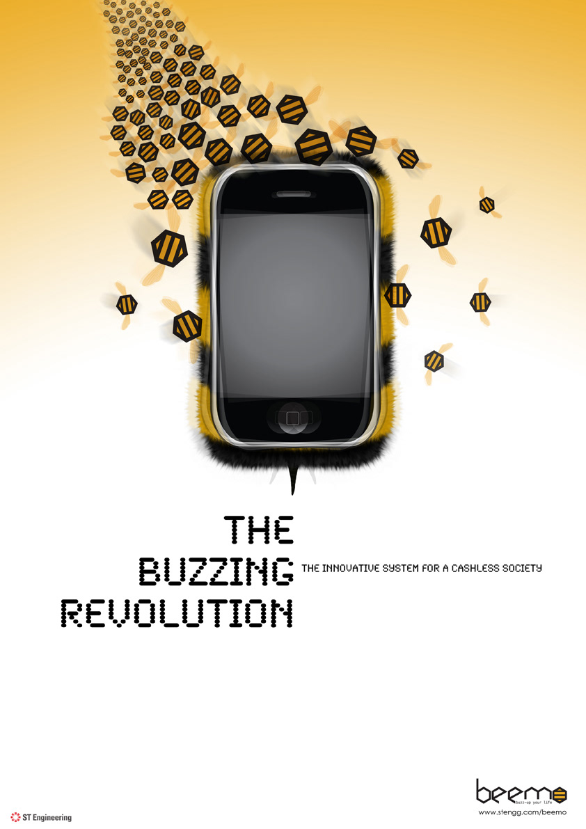
The brand is called Beemo - acronym for BEE mobile. Typography created with inspiration from the honeycomb hexagonal shape with the letter 'o' symbolizes the stripes of bee. use of solid black and yellow.
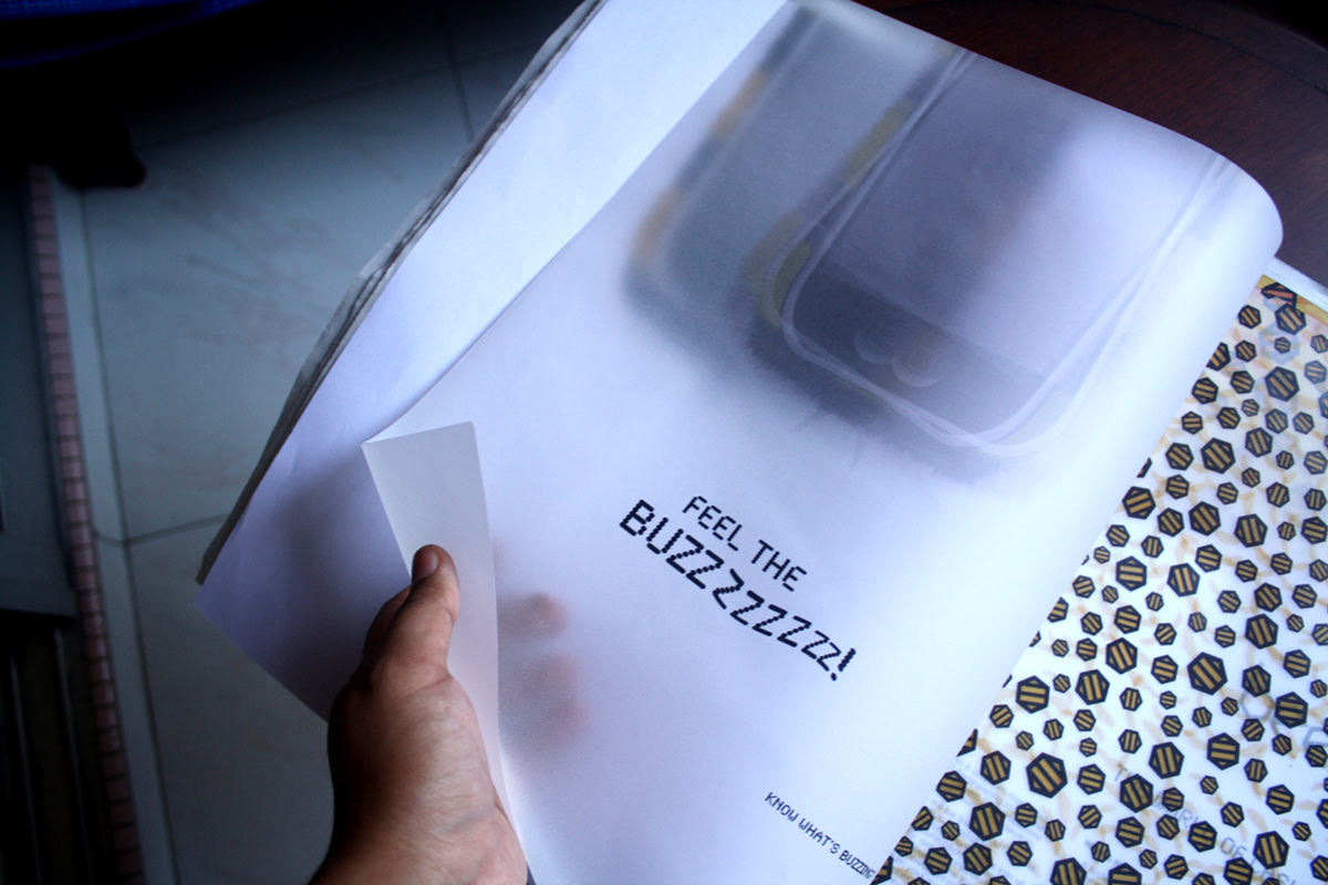
TEASER 1. Launched earlier in December 2011. concept is to excite people with the idea of something buzzy is coming.
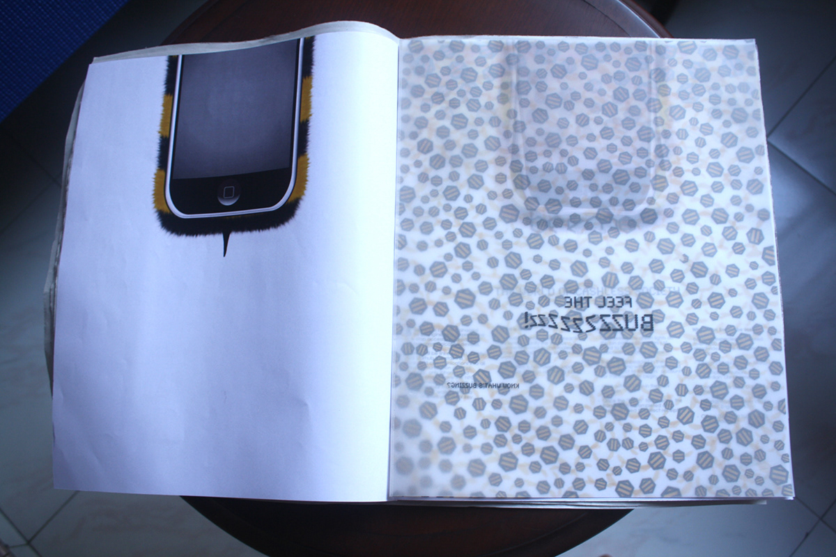
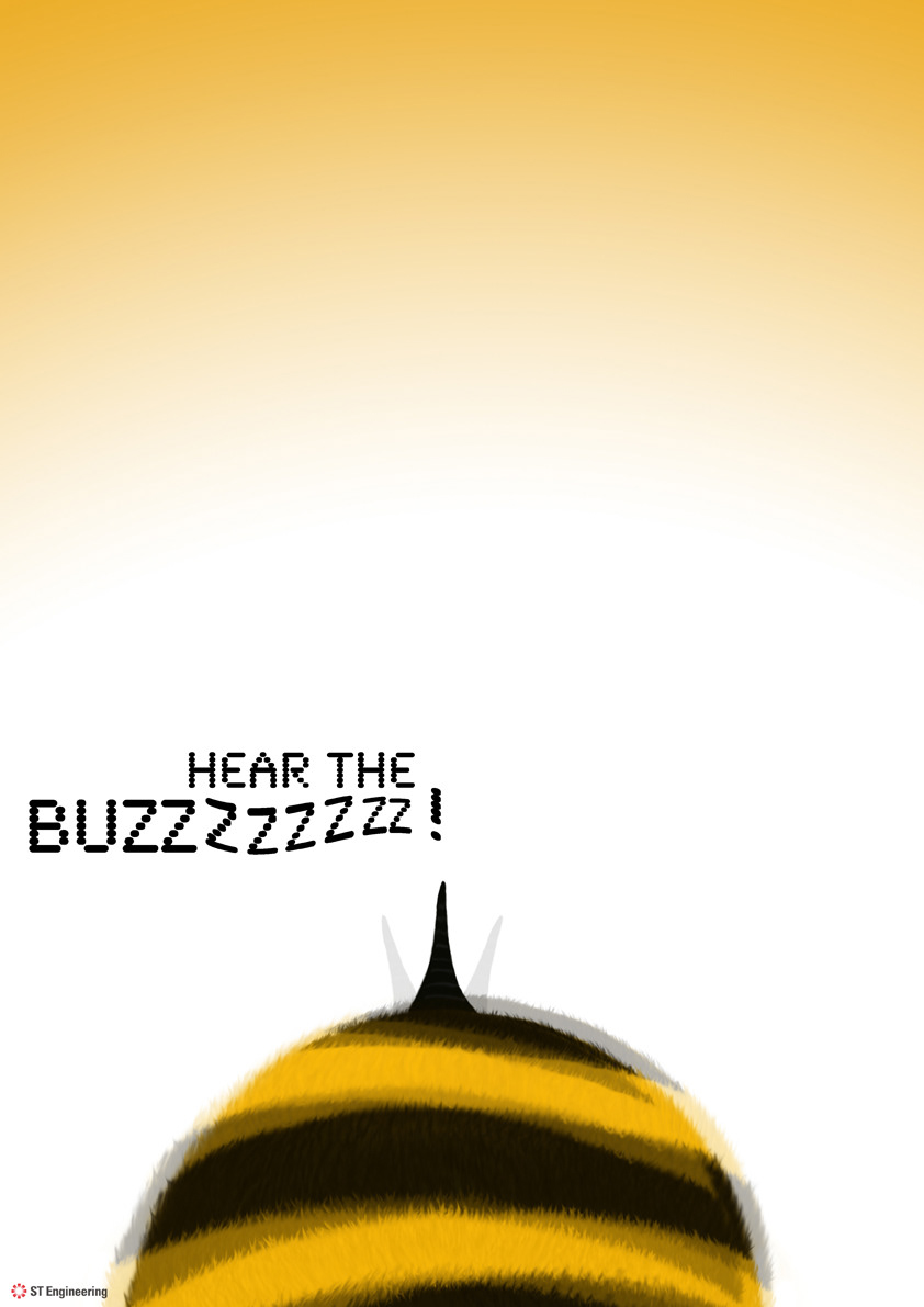
Teaser 2. Launched in January 2012. related to the first teaser, people will now know that this thing has got something related to a phone.
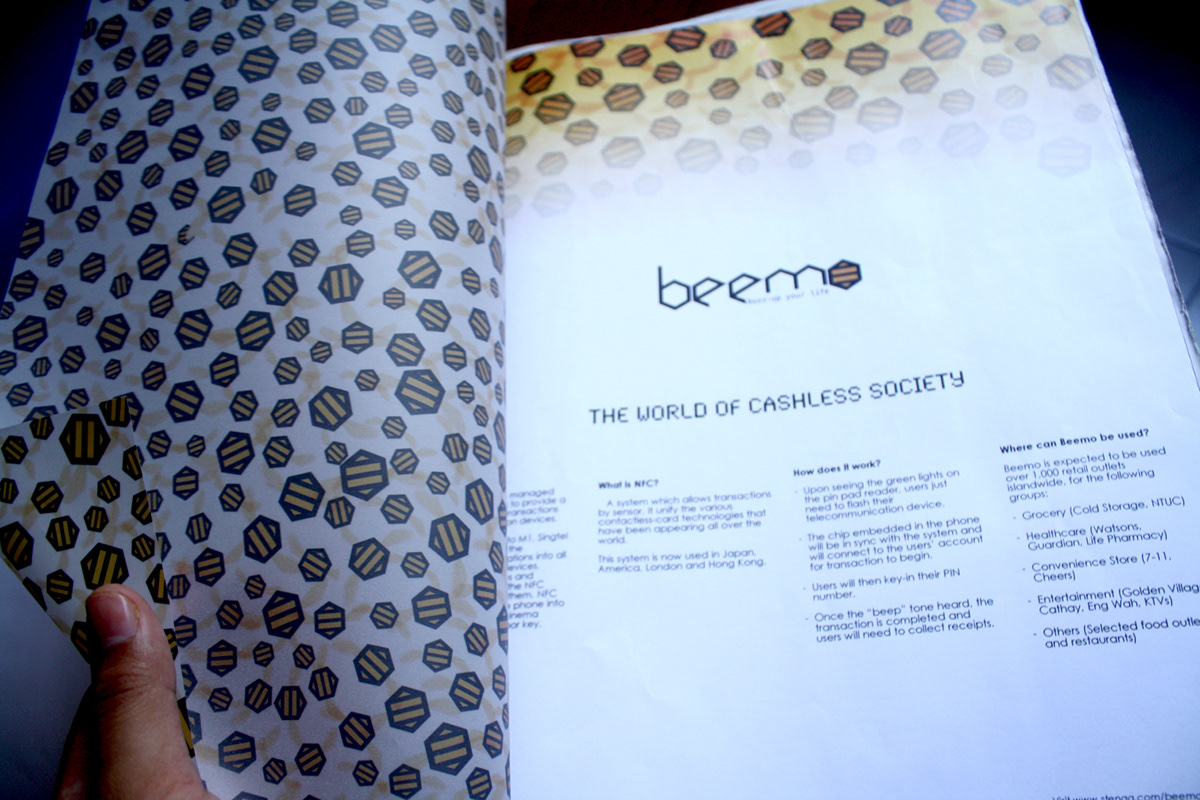
Final launching poster. Launched in February 2012. Explains to people what's the project is all about. Tagline explains that it is all about being cashless by using your handphone. To find out more on the info, people will then visit the beemo website.


These are the 2 consecutive posters that will explain on the main usage of the system. For travel, and shop.
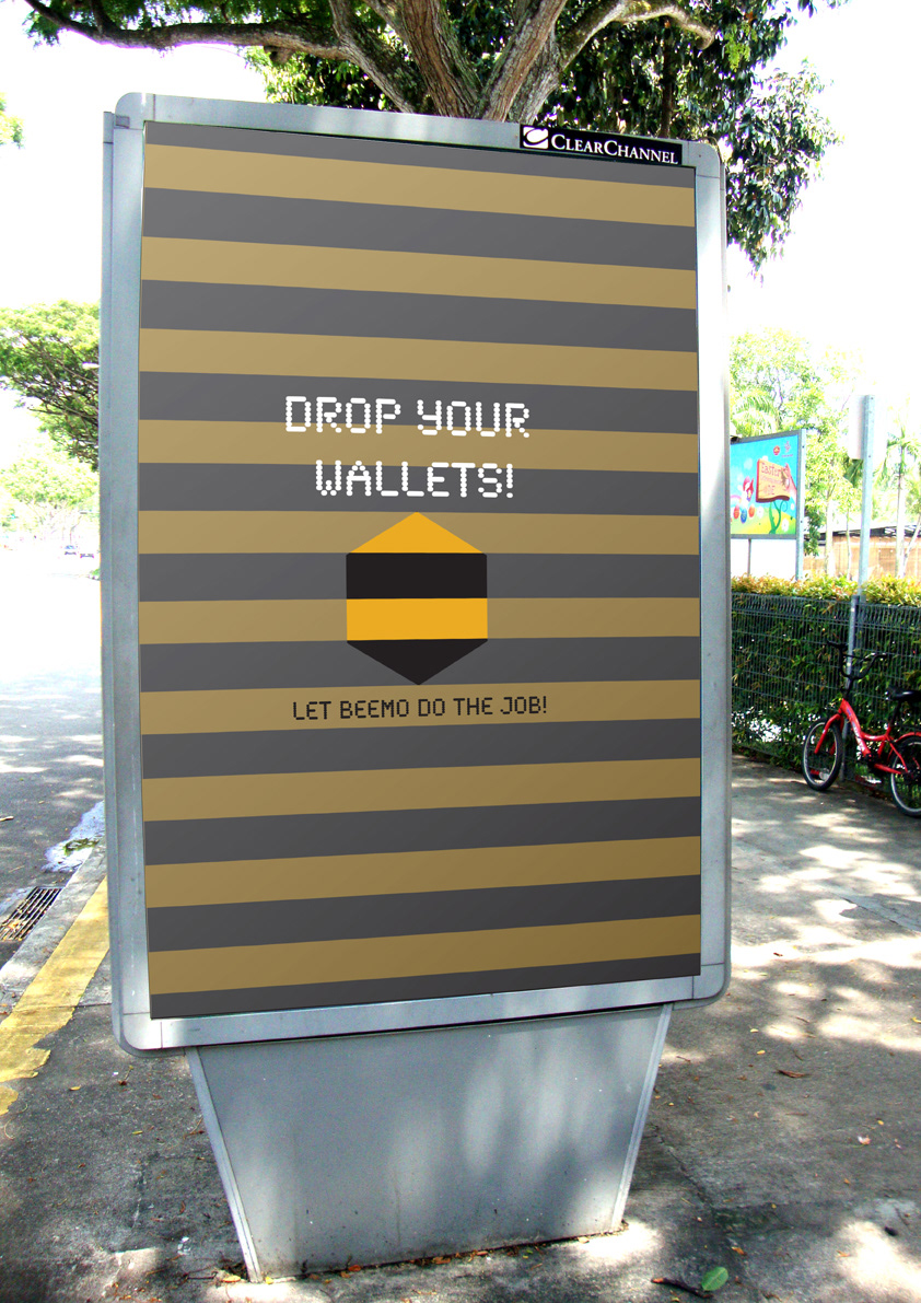
Front of JC Decaux.
Concept: the idea of "DROP YOUR WALLETS" - act of throwing their wallets, tells people that they no longer need their wallets. Therefore giving them the idea thar something else can be use as an alternative to payment.
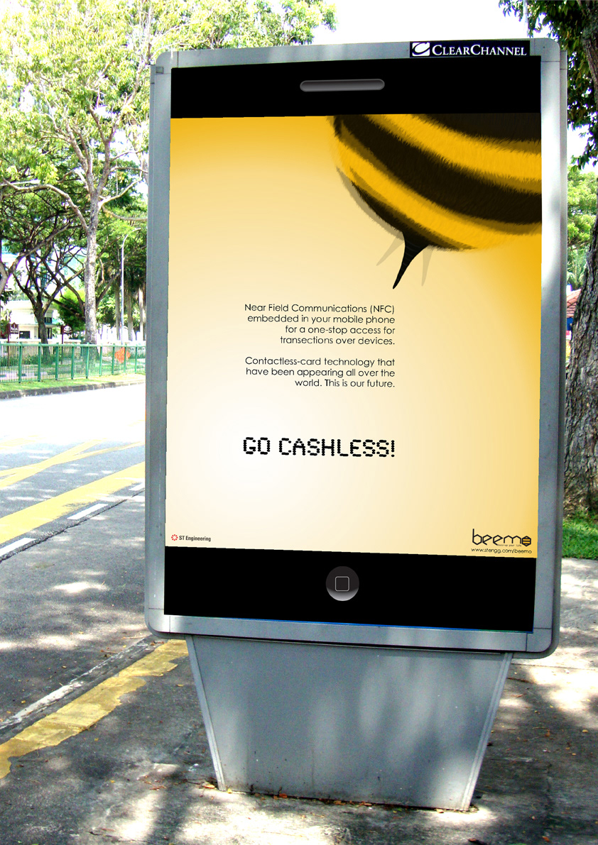
Back of JC Decaux
Concept: Short information of the system. The panel acts as the phone. and the information is read from the phone screen.
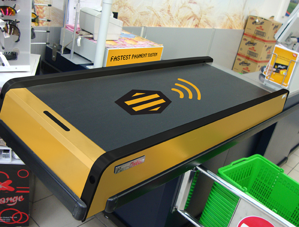
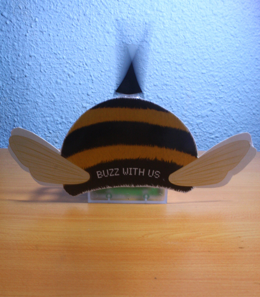
Body of conveyor belt for counters carries the concept of Beemo. The colour scheme of yellow and black symbolizes the brand of Beemo.