

CANTAVIL
Named after the musical term “CANTAVIL” meaning “Singingly,” CANTAVIL is an apartment brand dedicated to building happy homes that make people sing.
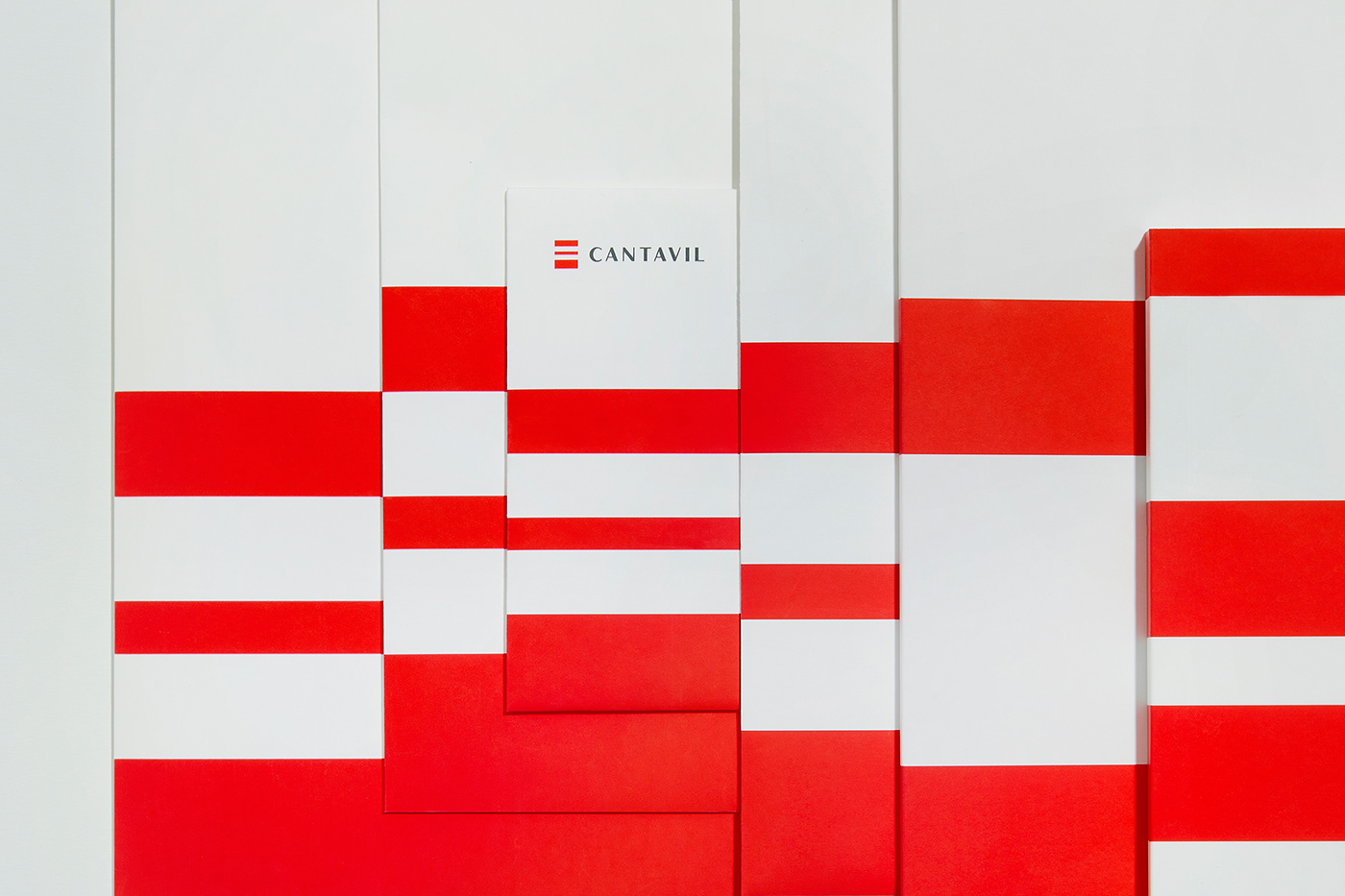
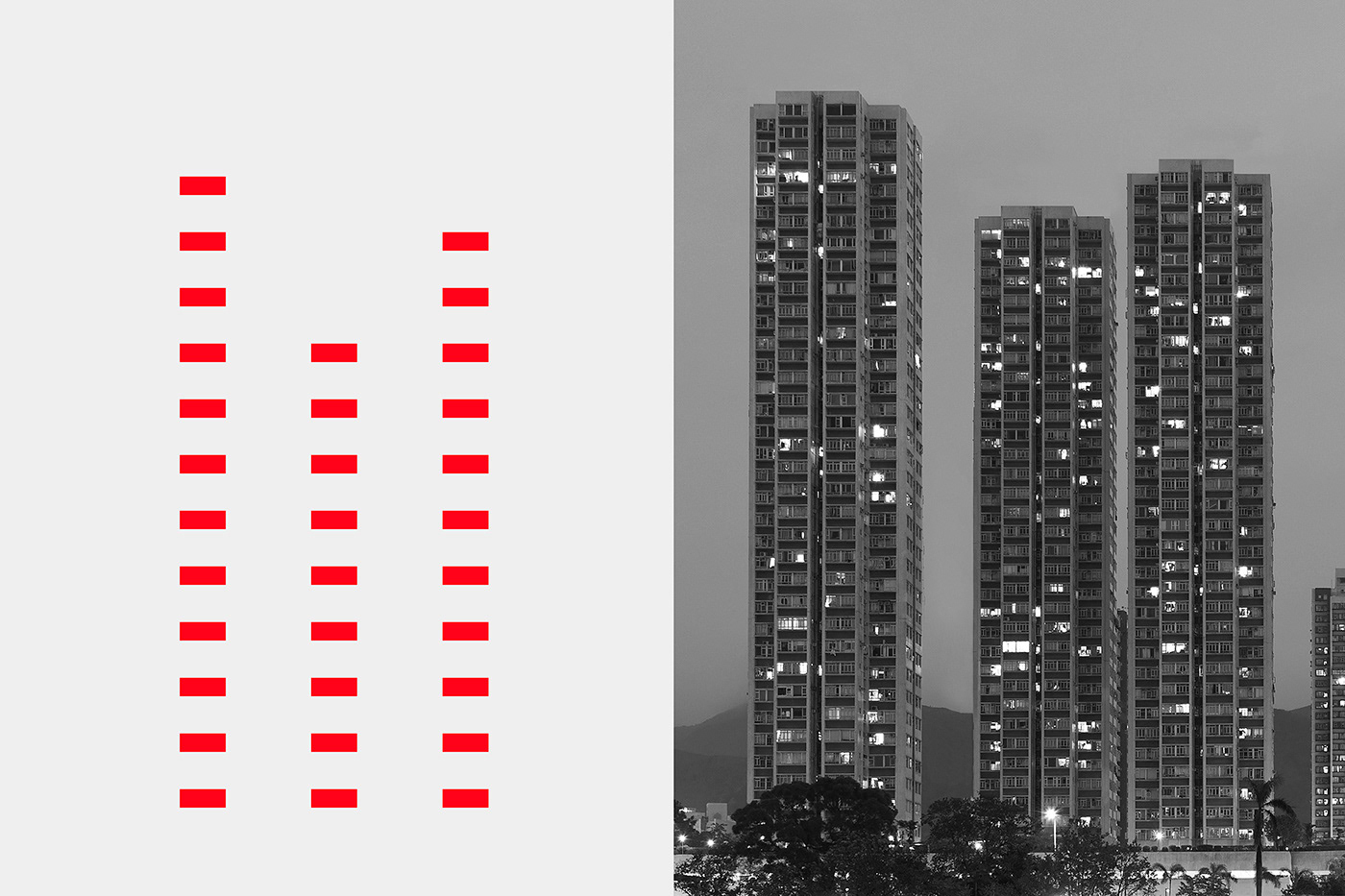
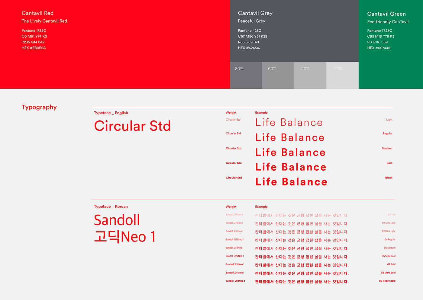
In rebranding its identity as a lifestyle brand that advocates comfortable and well-balanced living spaces, CANTAVIL has redesigned its logo and signages under the concept of “life balance” to visualize the “harmonious balance between the spatial and activity-accommodating qualities of an apartment” as a characteristic symbolic of the brand. The signages are flexibly applied within the organic system of lines and planes, and the main color, “CANTAVIL Red,” is used as a consistent visual element to provide customers with a coherent brand experience.
Named after the musical term “CANTAVIL” meaning “Singingly,” CANTAVIL is an apartment brand dedicated to building happy homes that make people sing.
In rebranding its identity as a lifestyle brand that advocates comfortable and well-balanced living spaces, CANTAVIL has redesigned its logo and signages under the concept of “life balance” to visualize the “harmonious balance between the spatial and activity-accommodating qualities of an apartment” as a characteristic symbolic of the brand. The signages are flexibly applied within the organic system of lines and planes, and the main color, “CANTAVIL Red,” is used as a consistent visual element to provide customers with a coherent brand experience.


Client DAEWON
Description Brand Identity Relaunch
Project Lead team DAEWON(Yongseok Kim, Yeonwoo Choi)
Description Brand Identity Relaunch
Project Lead team DAEWON(Yongseok Kim, Yeonwoo Choi)
Design Direction maum studio(Dalwoo Lee), Garam Kim
Graphic Design maum studio(Yoonji Lee, Hyunjin Lee, Jaewon Chung, Kyungryun Ju Han, Jaewon Chu
Space Design Eunhye Oh, Munho Choi, Youngbak Jeong, Hanwool Kim
Date of completion 2022. 4
Photo Juyeon Lee
Space Design Eunhye Oh, Munho Choi, Youngbak Jeong, Hanwool Kim
Date of completion 2022. 4
Photo Juyeon Lee
-
ⓒ 2022. maumstudio. All rights reserved


