Searching for the Exceptional: Tapir Type Family.
Designed by Hannes von Döhren. Support Bernd Volmer.
Designed by Hannes von Döhren. Support Bernd Volmer.
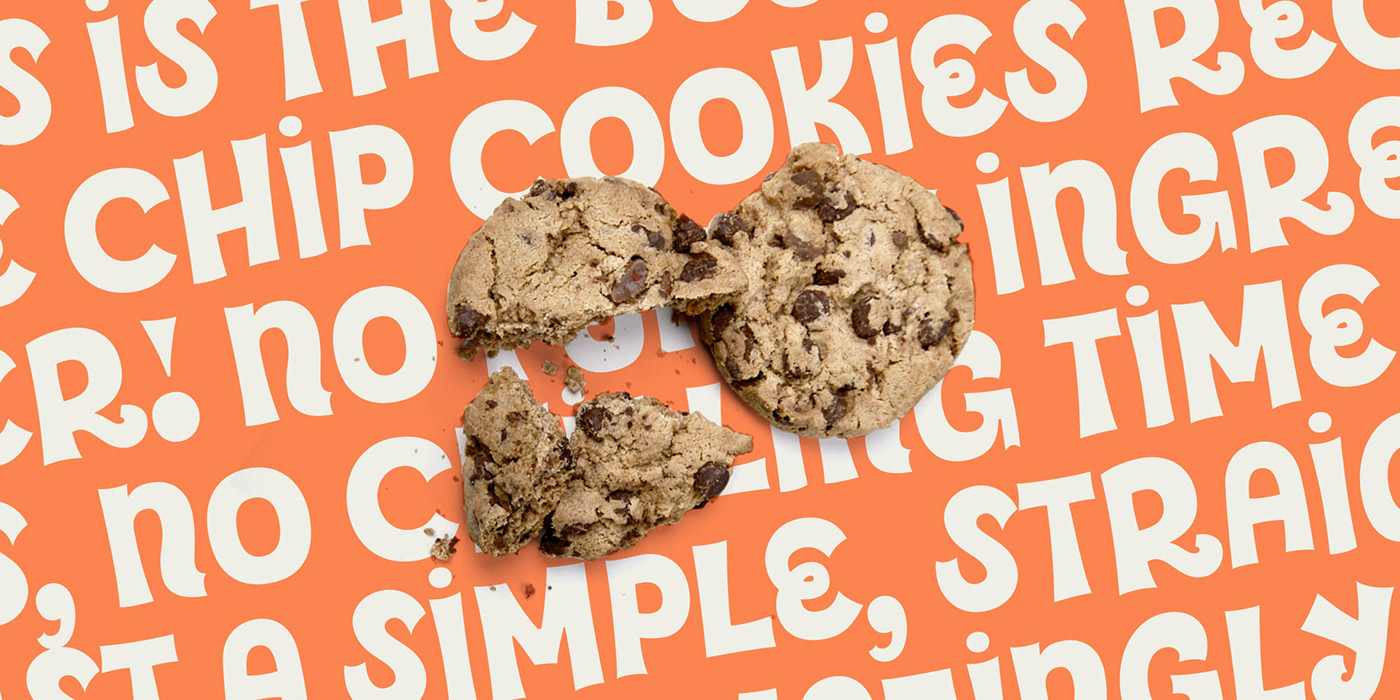
Designing Tapir was driven by the search for a display typeface which is doing something different than the rounded and bouncy fun faces – the letterforms should stand out with a slight touch of weirdness, creating attention and recognizabilty. A big character set, optimized spacing & kerning and lots of features make Tapir a good choice for professional usage between games, toys and skateboards.

Make it Concave!
It is a challenge to draw letters with concave curves and keep a distinctive aesthetics. Sharp forms have a special character: They can quickly feel aggressive, but they can also feel friendly and playful. The stems of Tapir feel like a deflated box with spiky endings, while the architecture of the characters has a dynamic nature, quoting elements of a script face (e.g. the nose of the 1 or the different height of the stem endings).

While the bolder weights are more extroverted for headlines and big uses, creating extra attention. The thinner weights (Light, Regular & Medium) are designed to work even in longer texts in small sizes – especially with the simplified “Stylistic Set 1 for Text”. These weights deliver text ability.

This is an overview of the basic characters of the Tapir Black weight. You can use the default set up, but you can also activate the scripty ligatures to add an even more playful and scripty appearance or you can get a less curly version e.g. for longer texts through activating the Stylistic Set 1 for Text.
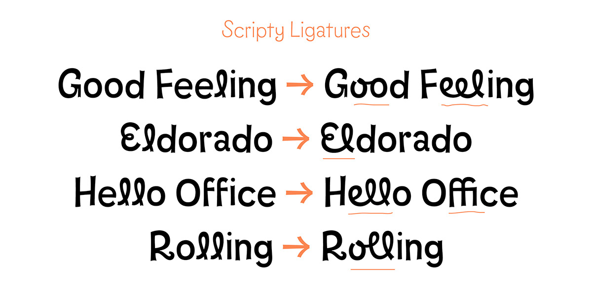
Ligatures
To push the look even more into the script direction, I added a big set of curly ligatures of letter combinations to the basic characters. Although the typeface works well without them, they can be activated to add another layer of quirkiness. When the ligatures are activated they create an interesting mix of connected and non connected letters resulting in a dynamic, spontaneous image.

Display vs. Text Settings
As fun as all these curly forms are, we also needed to think about different usage fields. Big headlines and logos are covered either with curly or more straight forms, but when it comes to text passages the focus is on reading rhythm and fluid text dynamic.

It makes sense to reduce the quirkiness for these applications. The result was a set of alternate letters which are more straight than the default ones, tested in the environemt of text blocks. This text-flavoured Tapir can be activated with one click through the OpenType features (Stylistic Set 1) and is ready to perform in explanations for games or in short manuals.