

Visualizing the alumni of an institute is not an easy task. The numbers that go through the hallowed portals of any institute number in hundreds. I thought on what data would be with the institute that can be used in the visualization. After much thought I had to fore go adding information like current profession, current location as well as interests. I focused therefore on creating an unique visualization of every batch.

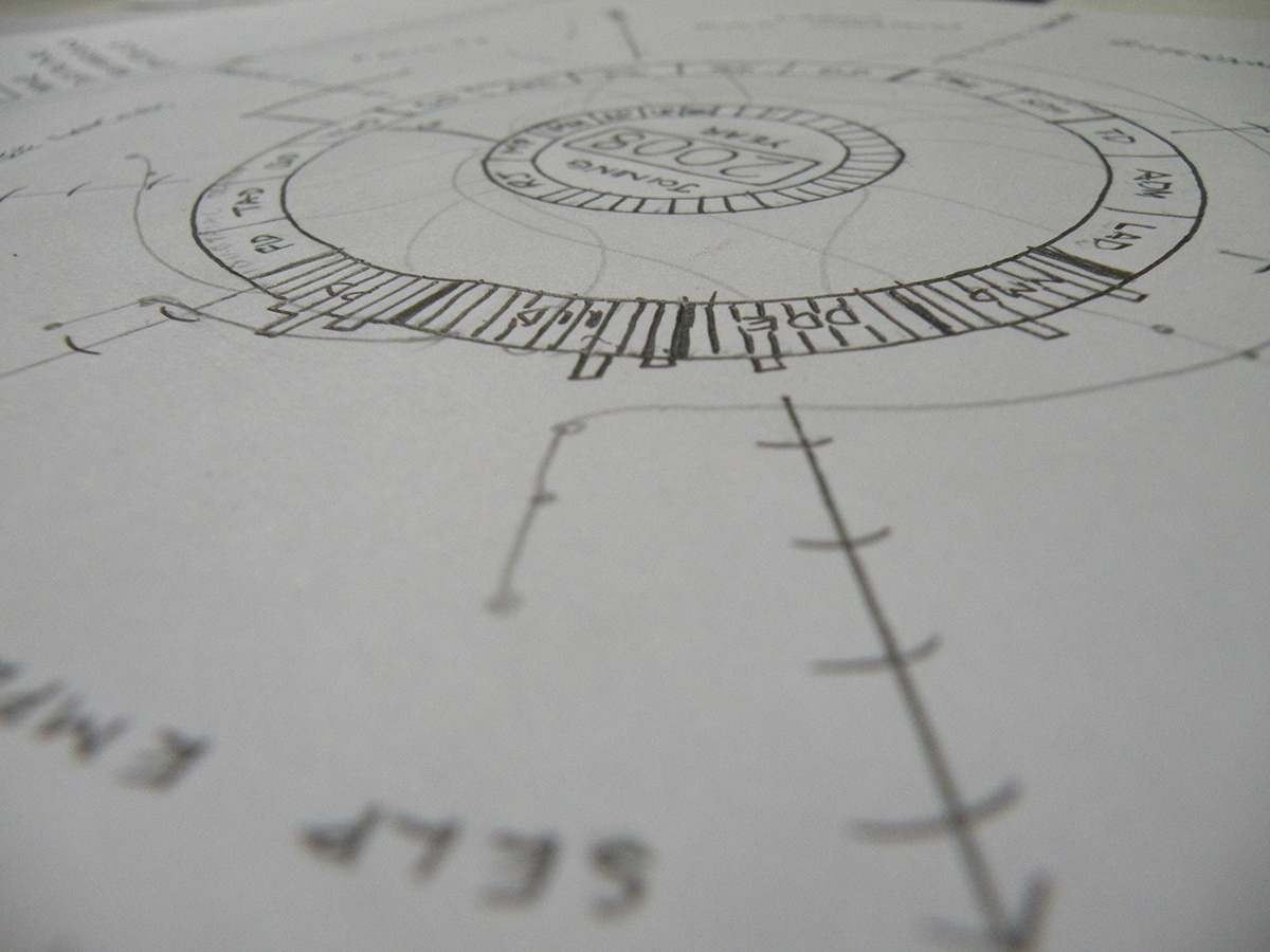
Sketching the idea made it clearer. Since this visualization was to be interactive, I decided that each batch's dataset would generate a unique 'organism'. The input needed was the year as well as whether you wanted to have a look at the undergraduate or the graduate visualization and the associated dataset would be loaded via a csv sheet or a JSON file.
This project was just a concept and did not end up being realized as an interactive one.
This project was just a concept and did not end up being realized as an interactive one.


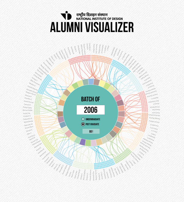
Interactivity of the organism. Hovering over the name on the periphery will create a hover effect, clicking on the higlighted name will produce a tooltip with additional information. Click and hold will allow you to turn the circle so as to enable people to read names that might be difficult to be read in their current orientation.


