In 2019 I was approached by the Beijing based instrumental prog-rock outfit, Macondo, to develop and design their new release entitled "2". Their sound is has many post-apocalyptic, sci-fi undertones that became the main inspiration for the concept. To give a bit of perspective, Macondo is made up of 4 members all hailing from different parts of the world - South Africa, USA, England and China. This is what makes up their unique approach to their music.
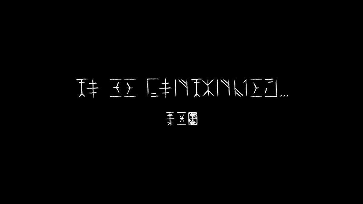
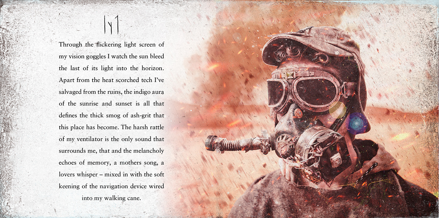
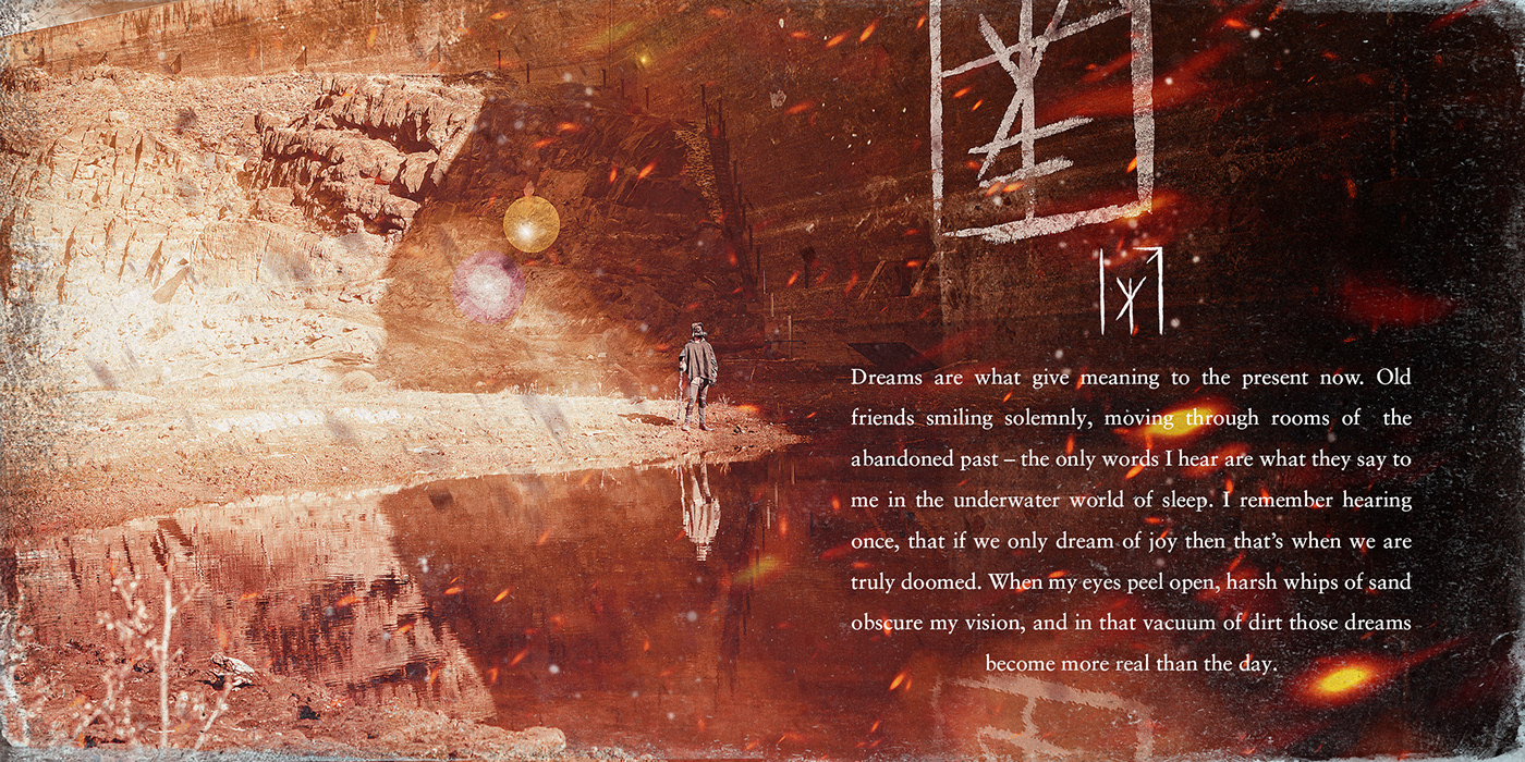
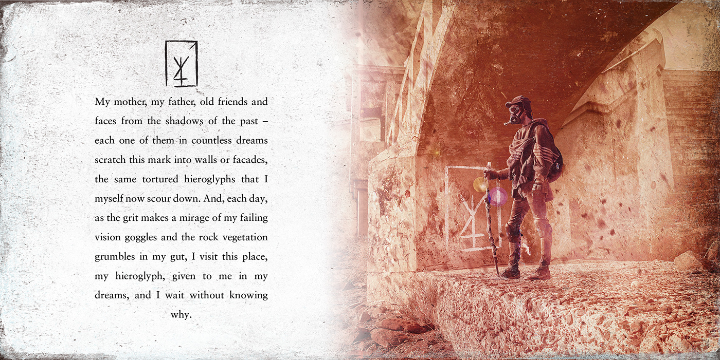
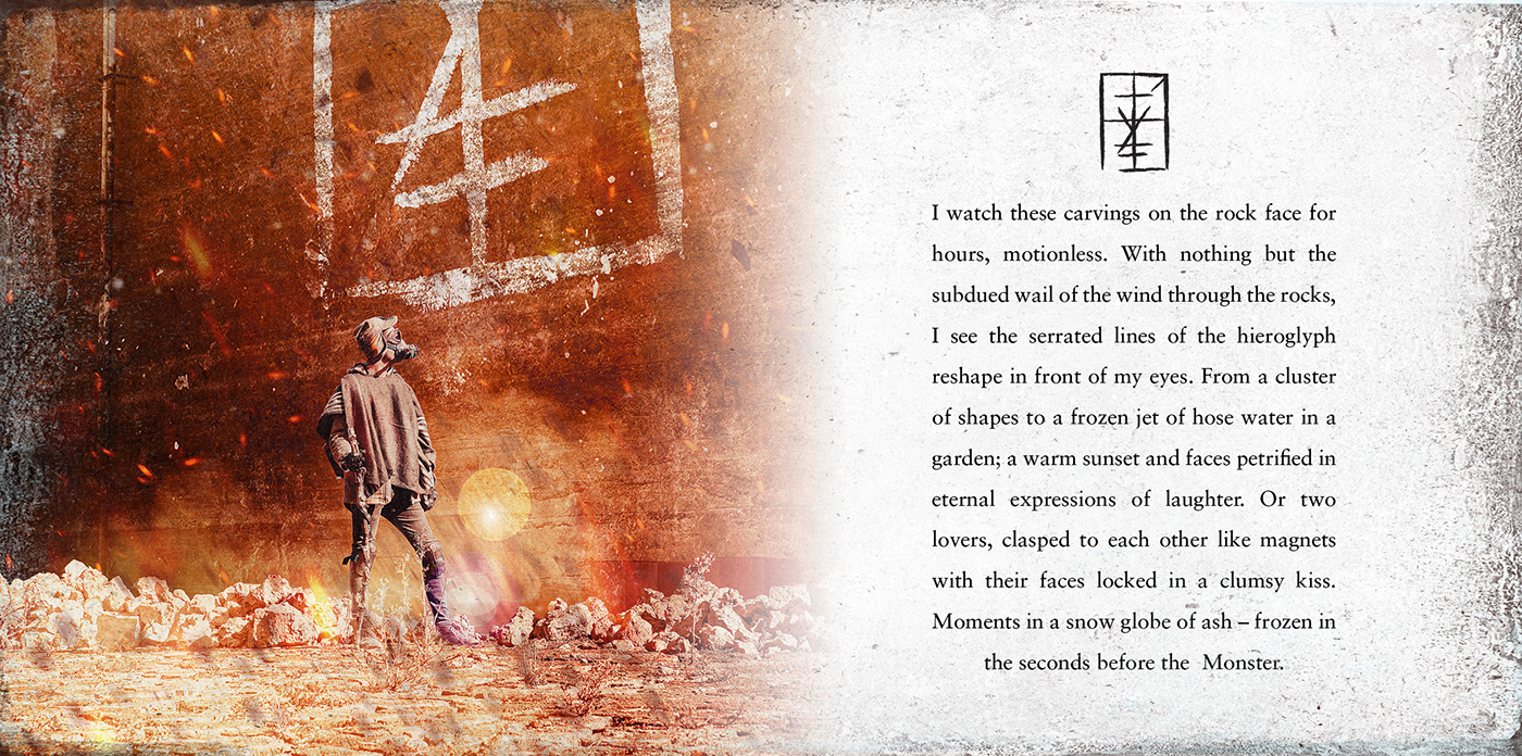
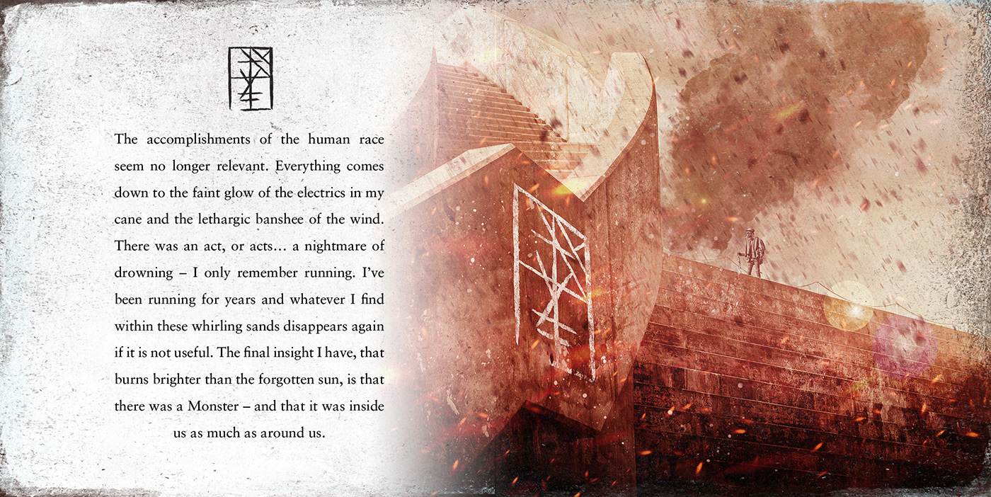
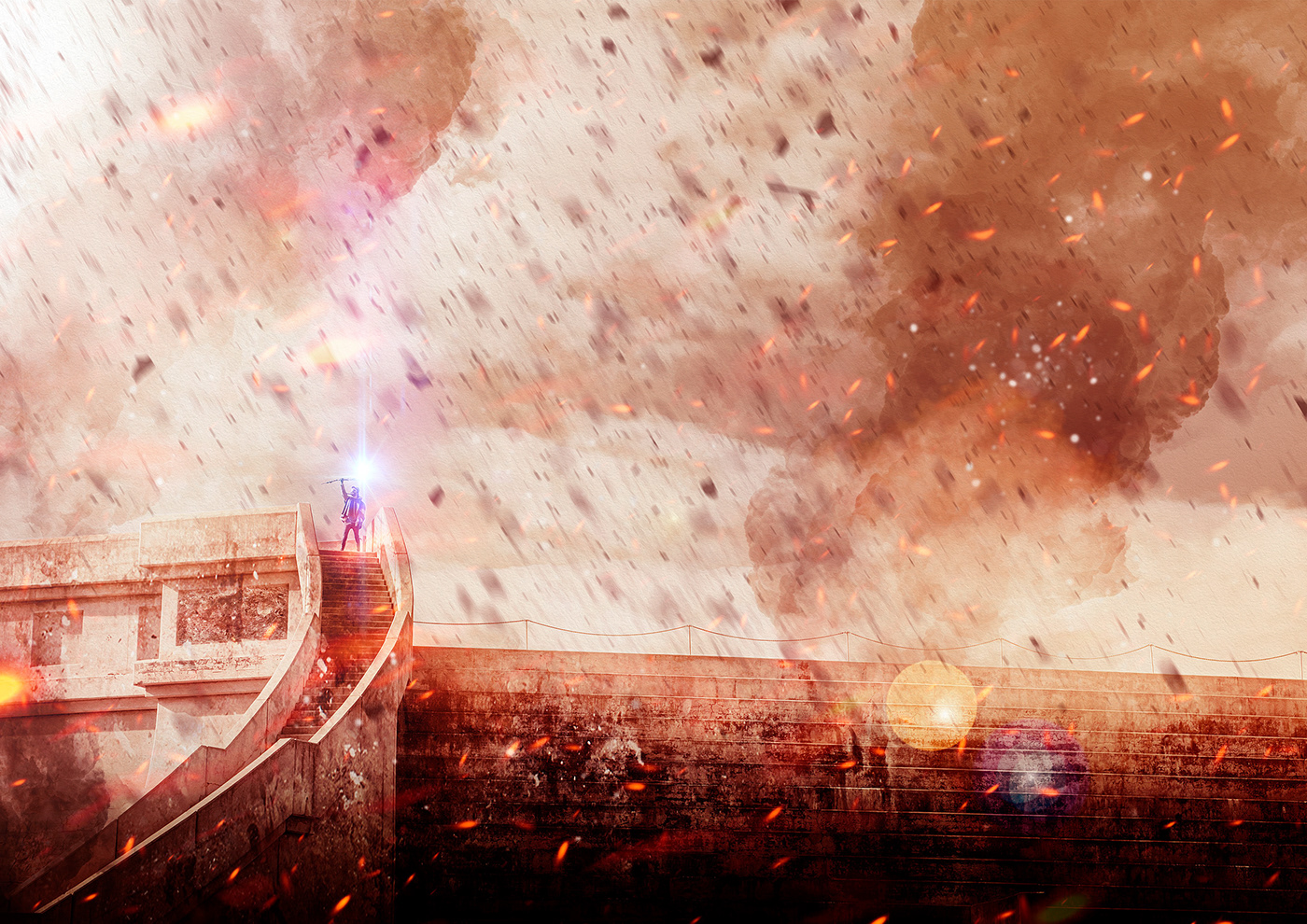
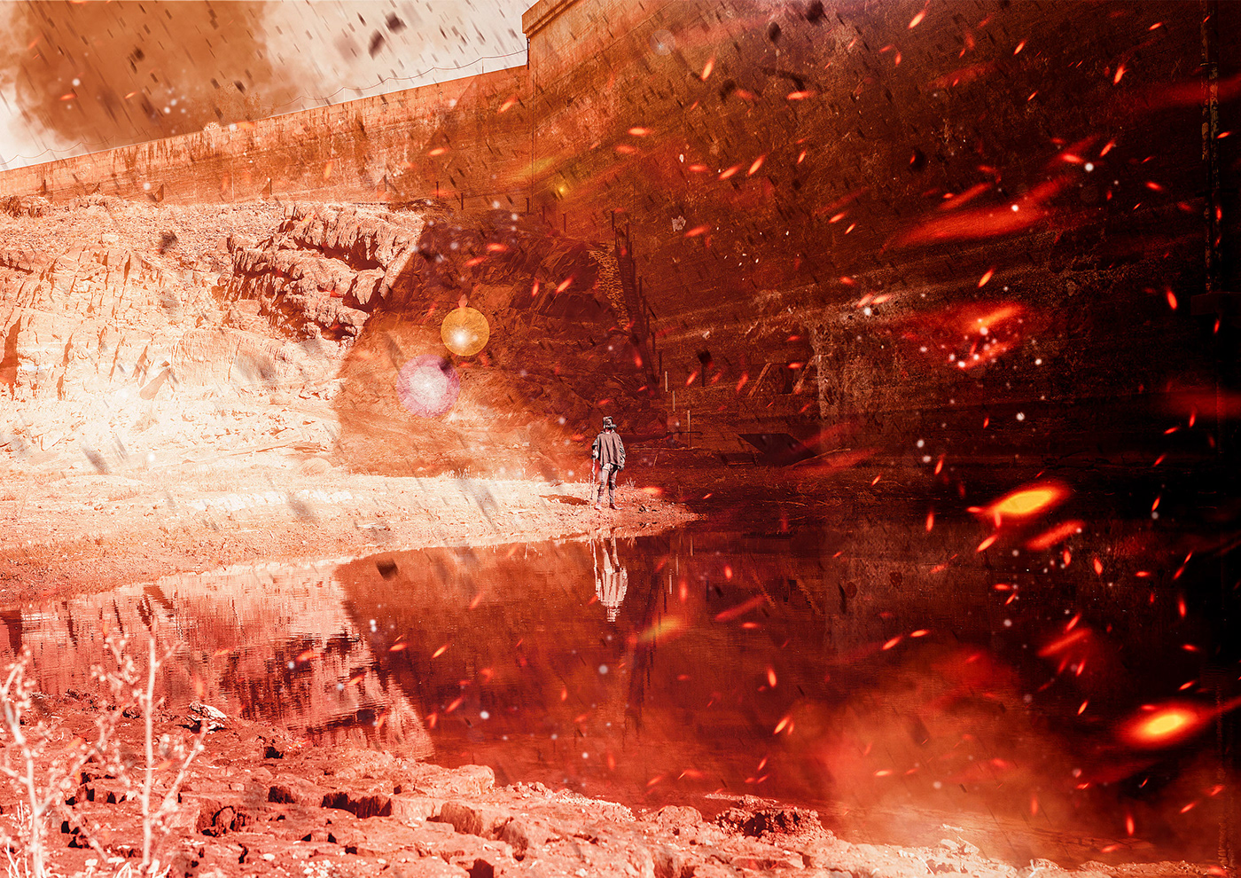
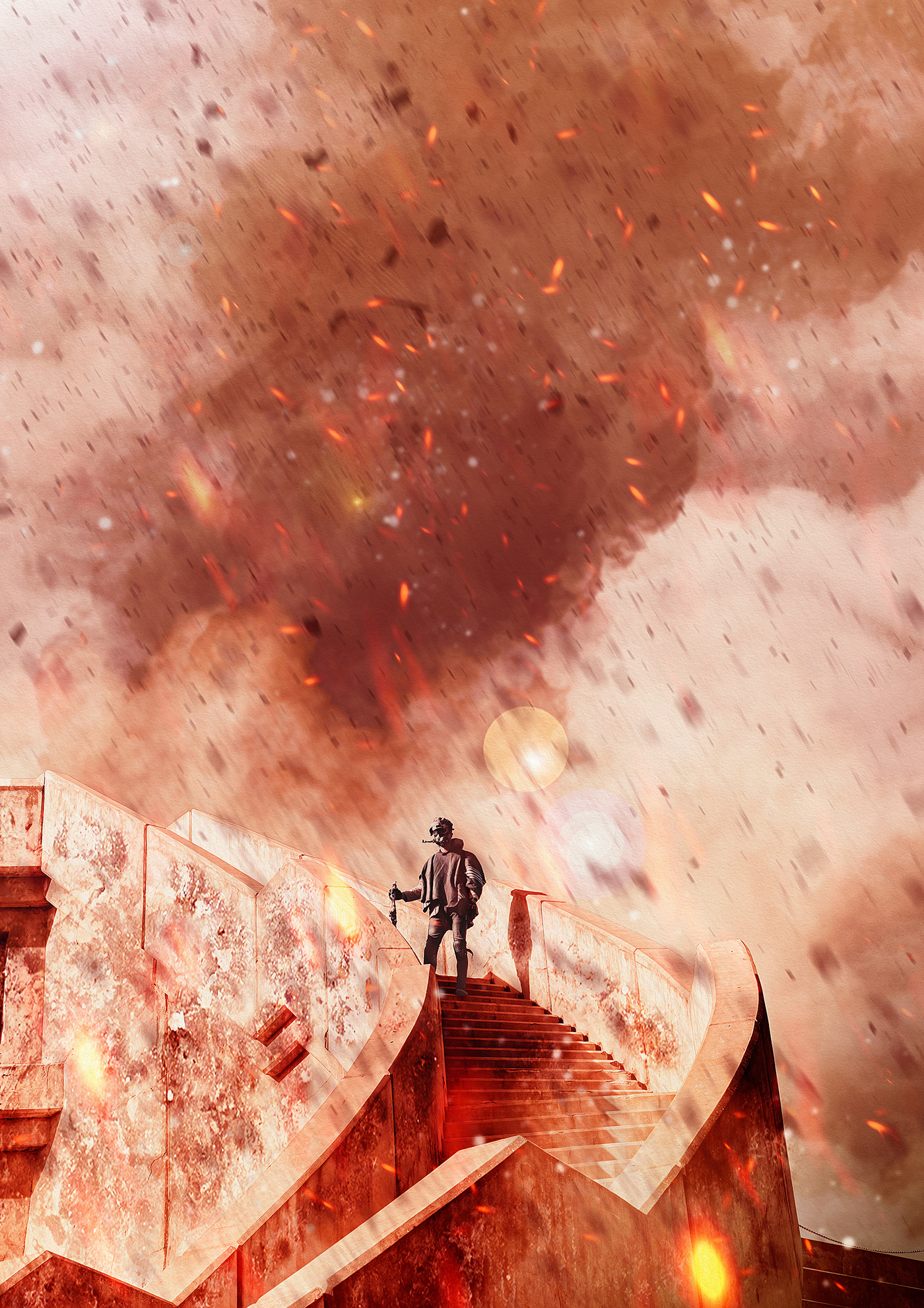
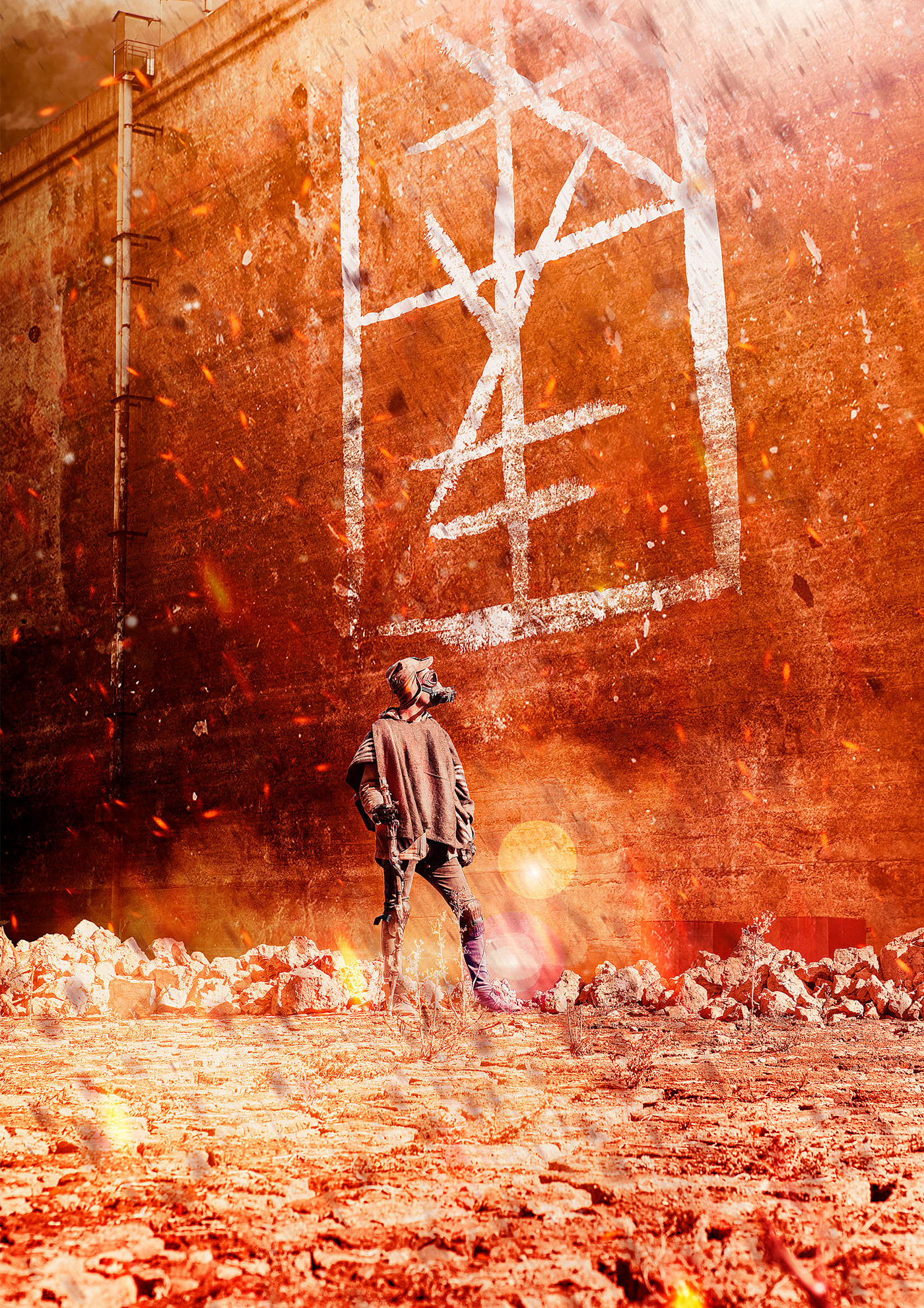
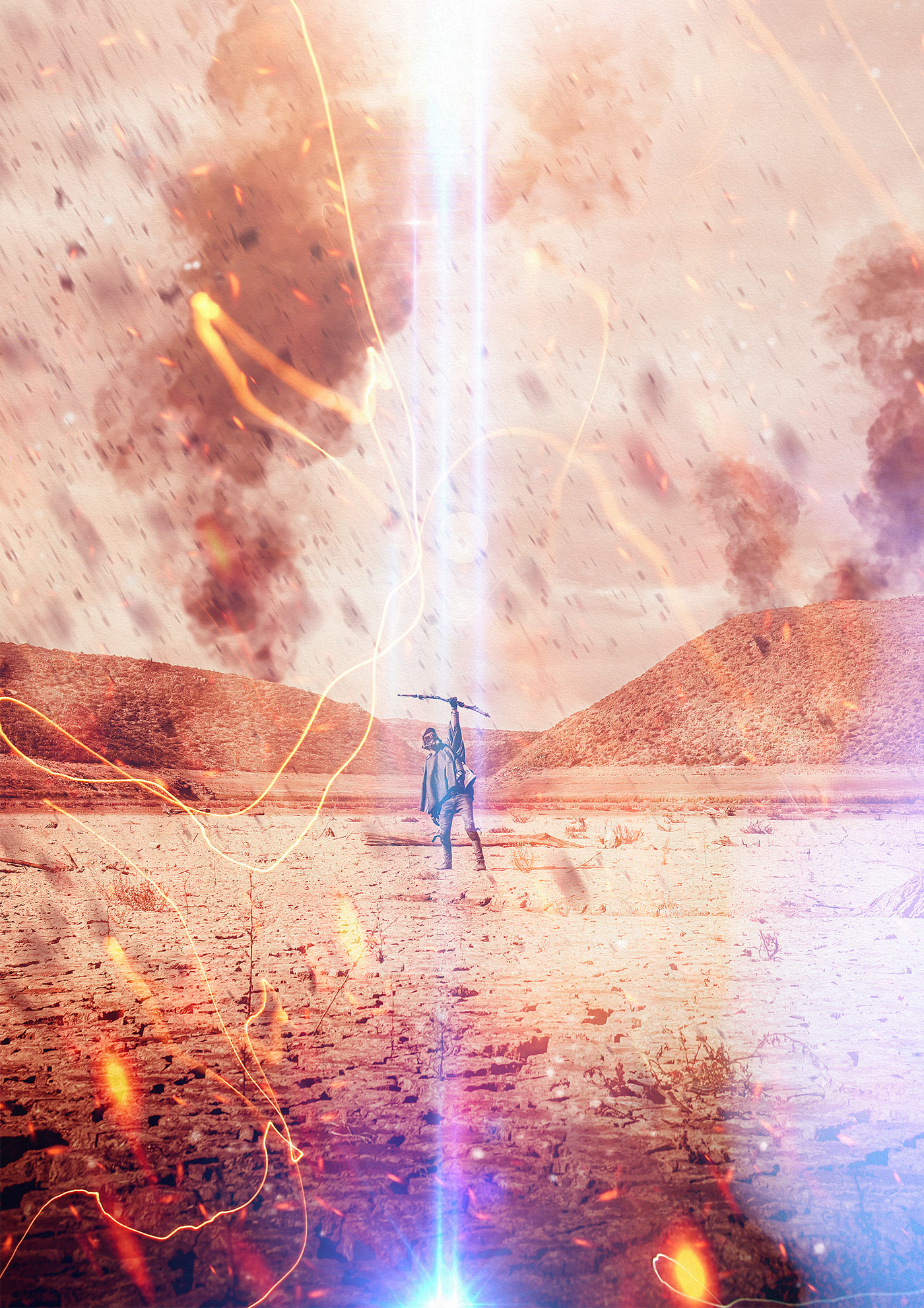
The idea was to come up with a story based around a main character traversing a baron wasteland in search of any signs of survivors or a glimmer of salvation. Throughout his journey he comes across what appears to be hieroglyphic icons, probably left behind by a forgotten civilisation, but what do they mean. Is it a secret code that will lead to salvation or worse... a warning.
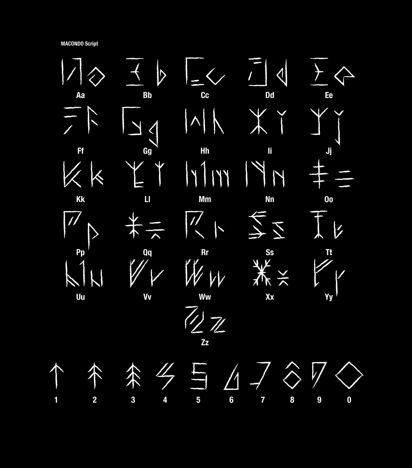
I set out to develop an identity based around this supposed lost civilisation. Because this story plays out many years in the future, we can conclude that somewhere in the timeline the world came to an abrupt end and all but a few forms of language were lost as time went by, causing language and script to evolve into what would seem to be a new dialect. The letter forms were inspired by both the English alphabet as well as some ancient letter forms such as Mesopotamian and Norse.
I wanted the script to be readable in more than one way. When written left to right the words read as normal, but if you stack the characters on top of each other, they create the hieroglyphic icons our character finds during his travels. This is possibly due to the fact that our lost civilisation had to communicate in secret because of a force threatening their existence. Below is a breakdown of this mechanic.
Logo Design

How it works

Alphabet
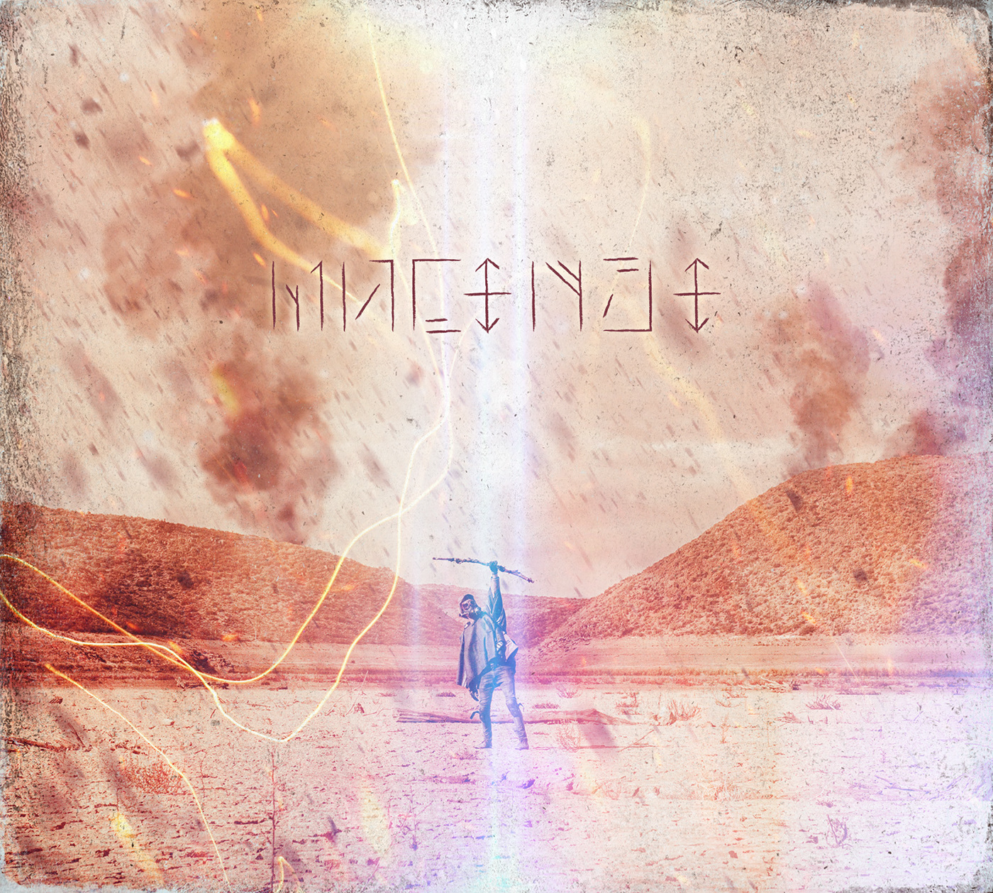
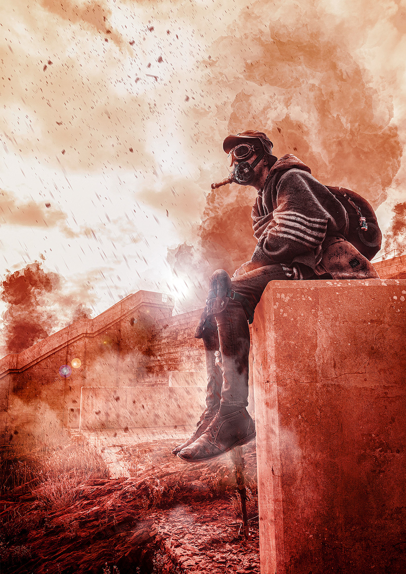
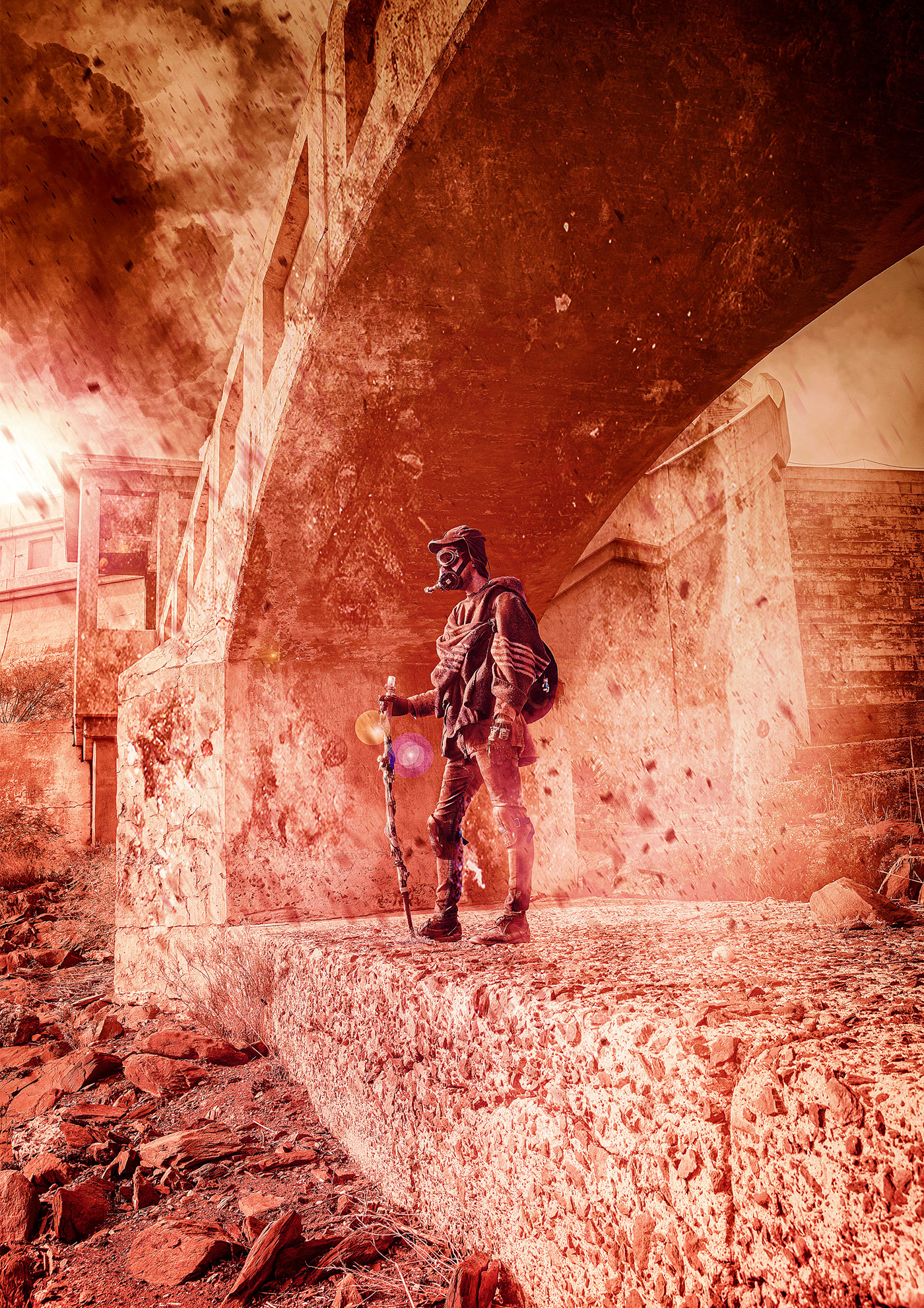
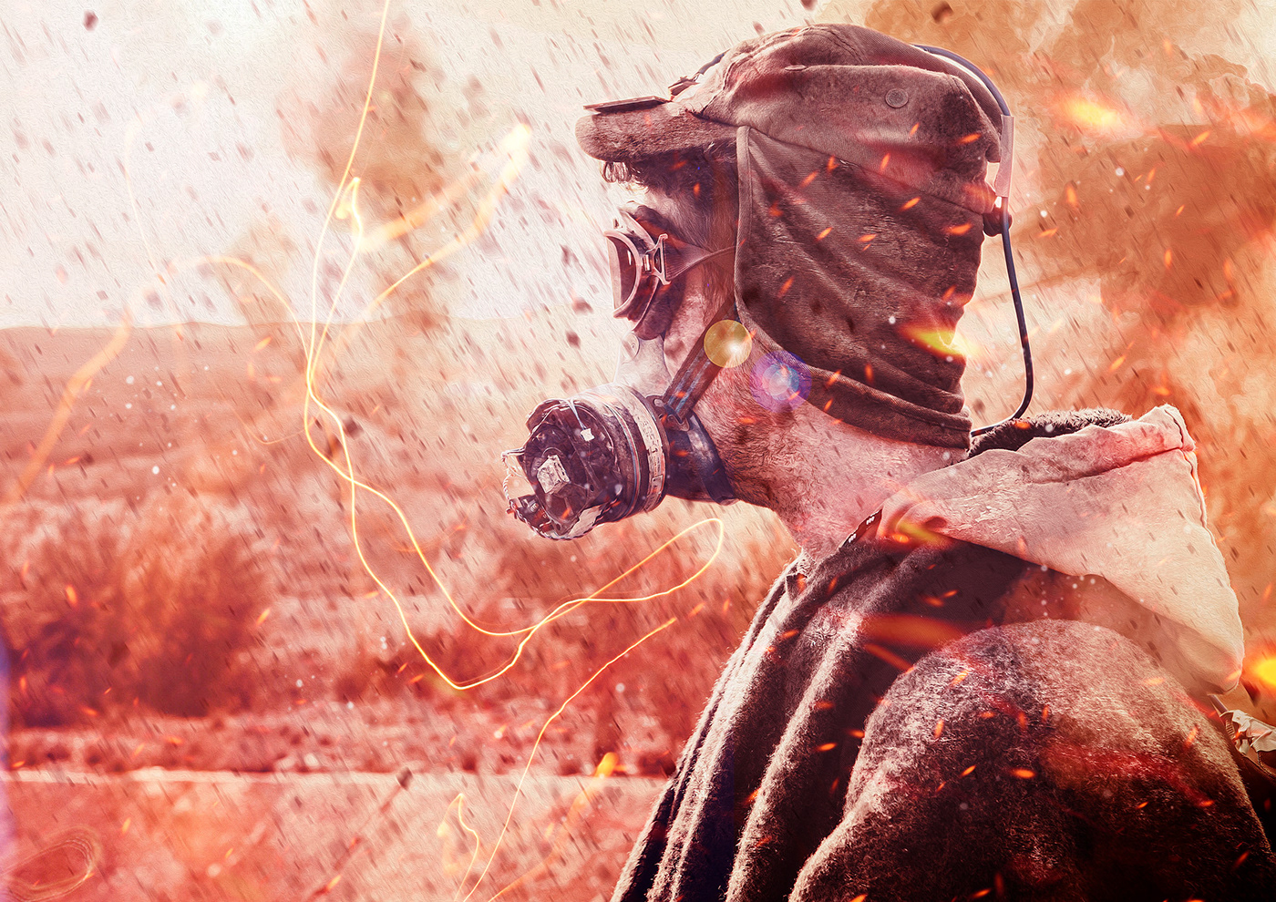
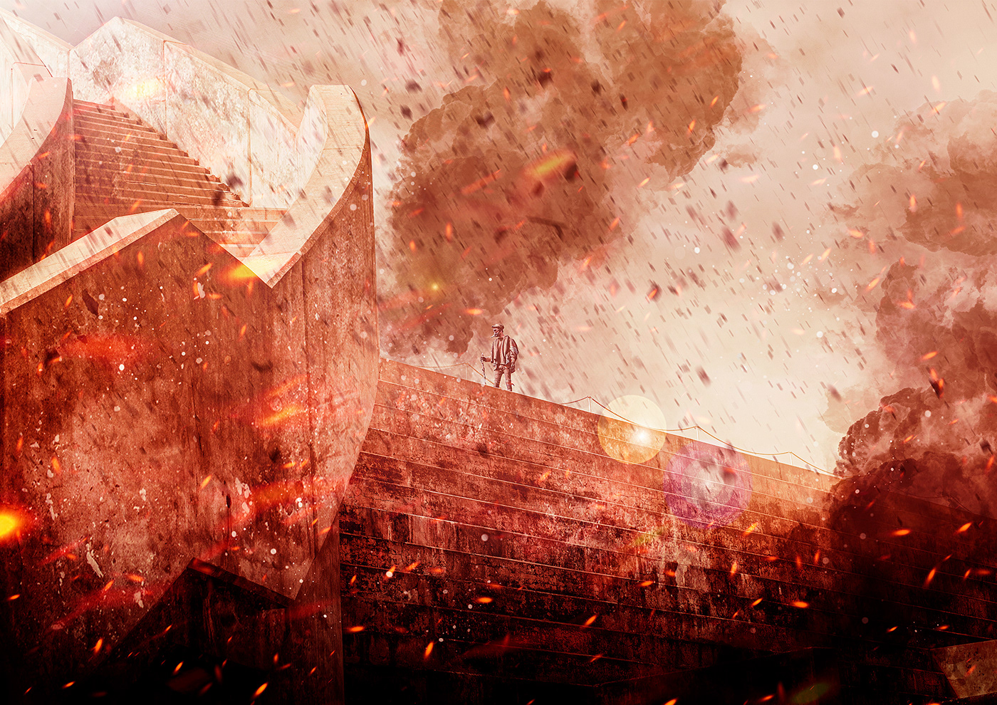
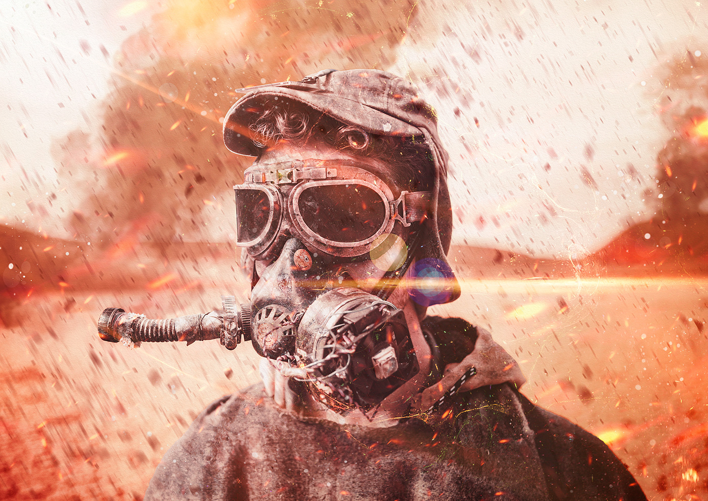
Once the identity was created I moved on to the artwork. I created an outfit for our main character using old blankets, worn clothes and various found objects so he could be photographed on location. The location was an old abandoned dam build in the early 1920's somewhere in South Africa. This is quite fitting as these dams were build during the Great Depression where people worked for food and not a lot of it. The following is the story of our hero's journey.
Album Cover
Booklet Spreads

The creative direction was to give the images a graphic novel feel while still maintaining a sense of reality. These are some of my favourite compositions.


Digi pack


Vinyl Cover


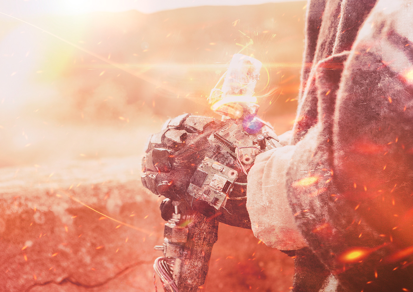
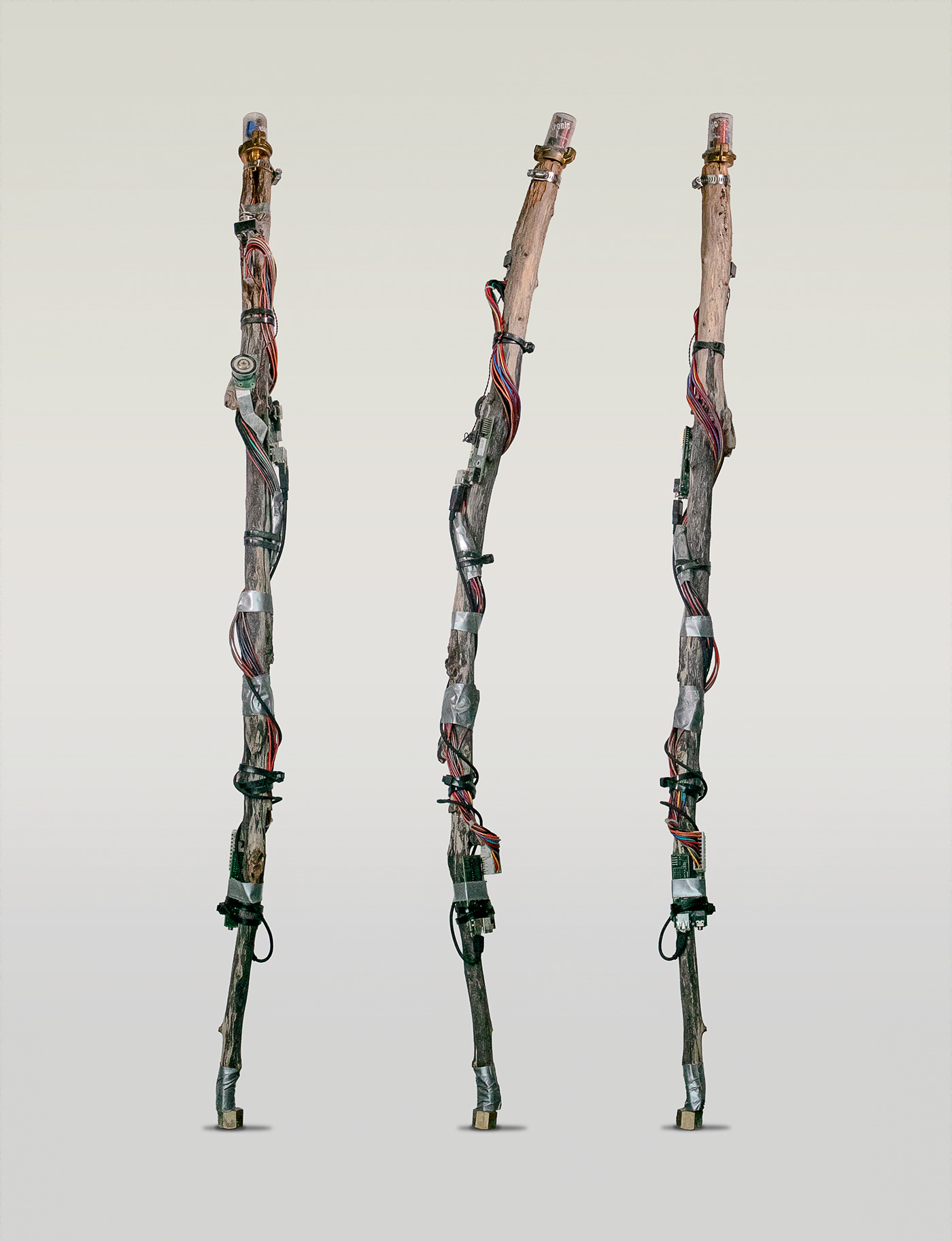
Here are some of the props I build using junk I found in scrapyards.
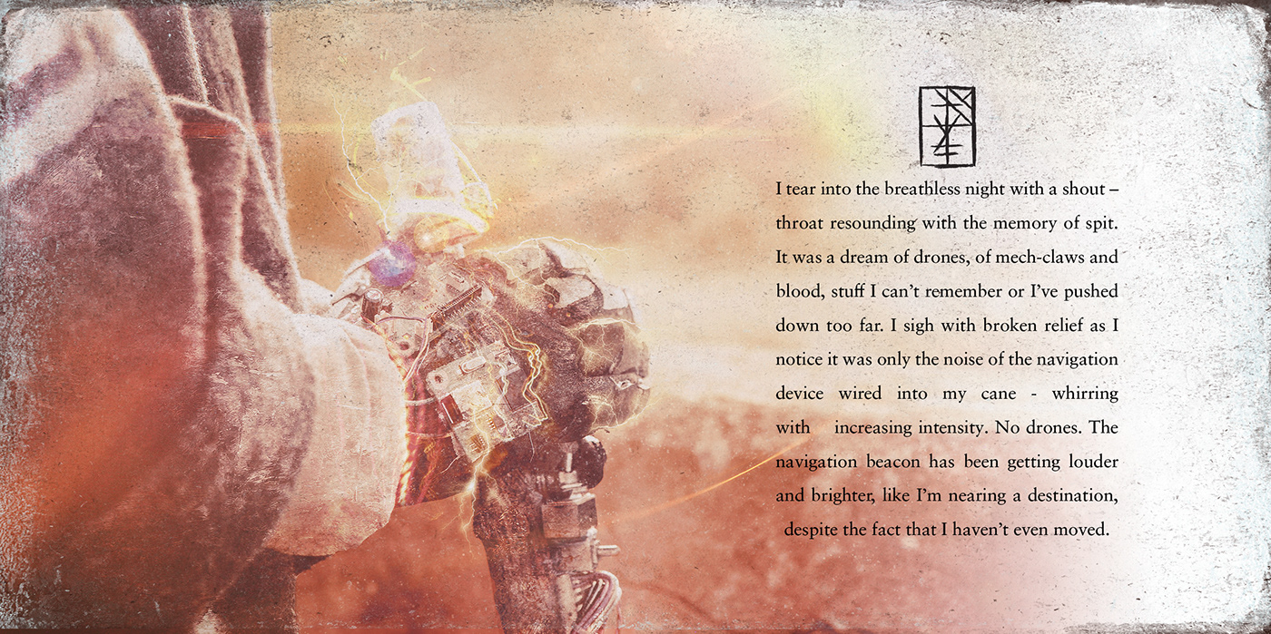
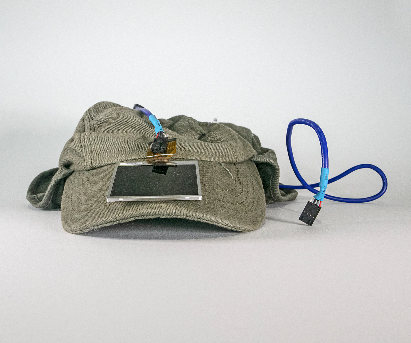
Power Source: Because of all the nuclear wars and fallout, the air is filled with some sort of hybrid particles that can be absorbed and manipulated by using technology build from left over scrap parts from the old world. The hat has been fitted with a modified solar panel that enables the user to absorb these particles as power and store it in a battery pack inside the characters backpack that is connected with the blue cable.
Staff: This is mainly some sort of compass, but can serve as a light source, help to move heavy objects or a basic weapon.


Gloves: These are also modified like the staff in order to channel the converted particle energy, giving its user amplified strength.

Breather: Because of the radiation, a special breathing device was created to filter the air to a sub-standard, but breathable quality.


Some raw shots on location


Creative Direction & Design
Chris Slabber
Copy Writing
Matthew Byrne
Model
Ronald Stevens
Macondo
Matthew Byrne – Drums
Fred Shi – Bass, Trumpets, Vocals, Programming
Scott Slepicka – Guitars, Vocals, Programming
Gerald Van Wyk – Programming and Synth