The Big Idea
The logo designs of the Polish Hockey League over this weekend inspired me to create a rebranding concept for individual teams.
I noticed that some clubs use old coats of arms from years ago, so I decided on refreshing these signs while still paying attention and remembering their history with each club in order not disrupt anything too much--keeping only what is necessary from previous identities without sacrificing creativity or uniqueness!
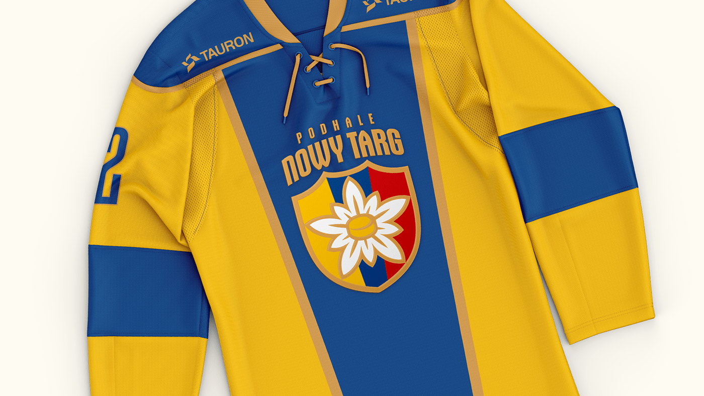
Edelweiss flower has been a symbol of Podhale since forever, so I knew that it was going to be an essential part in my design. But with the addition of hockey puck as opposed to just having a stick randomly placed in the original logo.
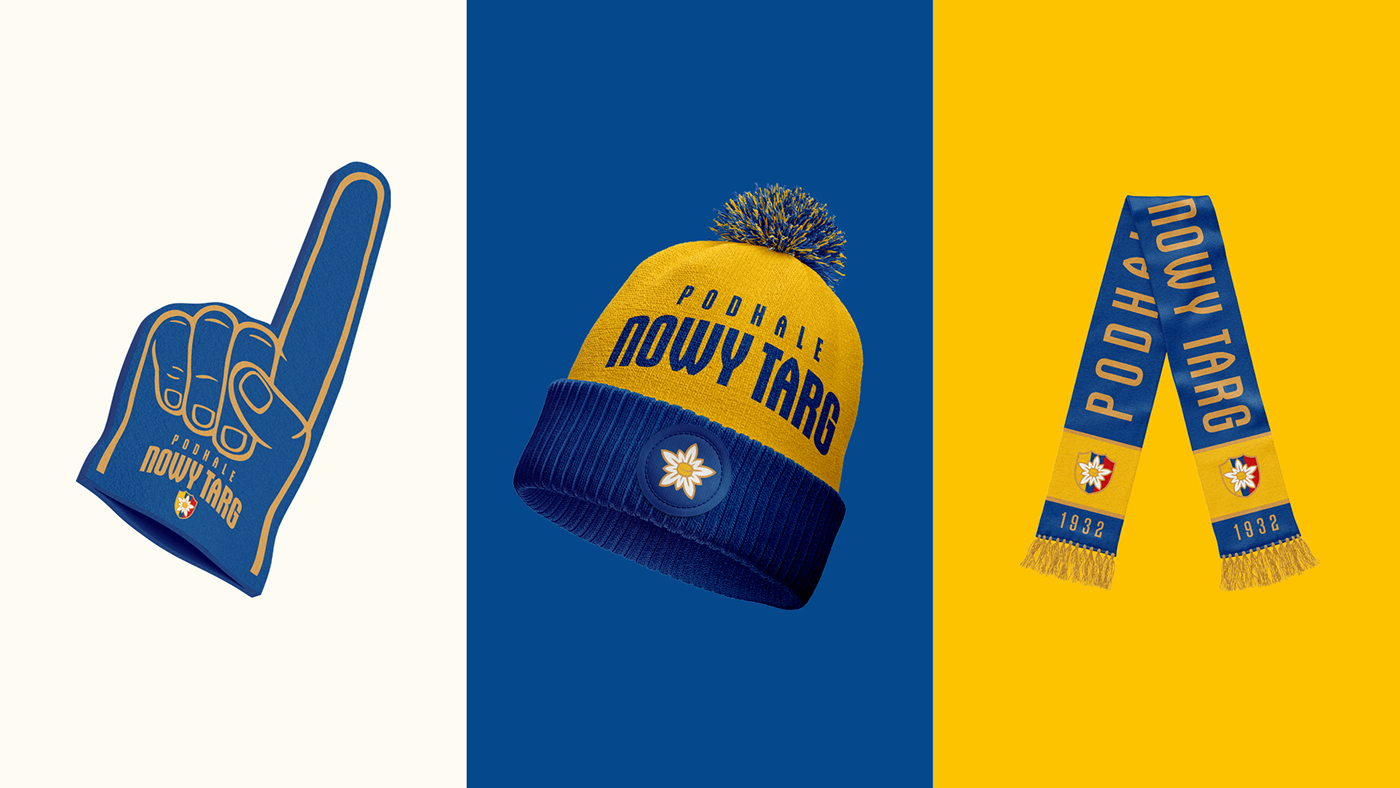
To make the concept more presentable, I decided to expand on the rebranding idea and incorporate new logo concepts across additional elements such as jerseys, fan gadgets or posters.