Photo Styling
Art Direction and styling for Stampin' Up! Catalogs
Art Direction and styling for Stampin' Up! Catalogs
My favorite part of the job is styling photos. Over the years I've done hundreds, but here are some of my all-time fave suites.
...
...
Weathered wood, yep, one of my favorite surfaces. I remember making this map look old and legit, we folded it, mucked up the edges, tore it, and rubbed some classic ink on it. We found some antique looking binoculars, compass, net and anchor to help put you in the scene of an old nautical seaside dock. Pretty good, eh?

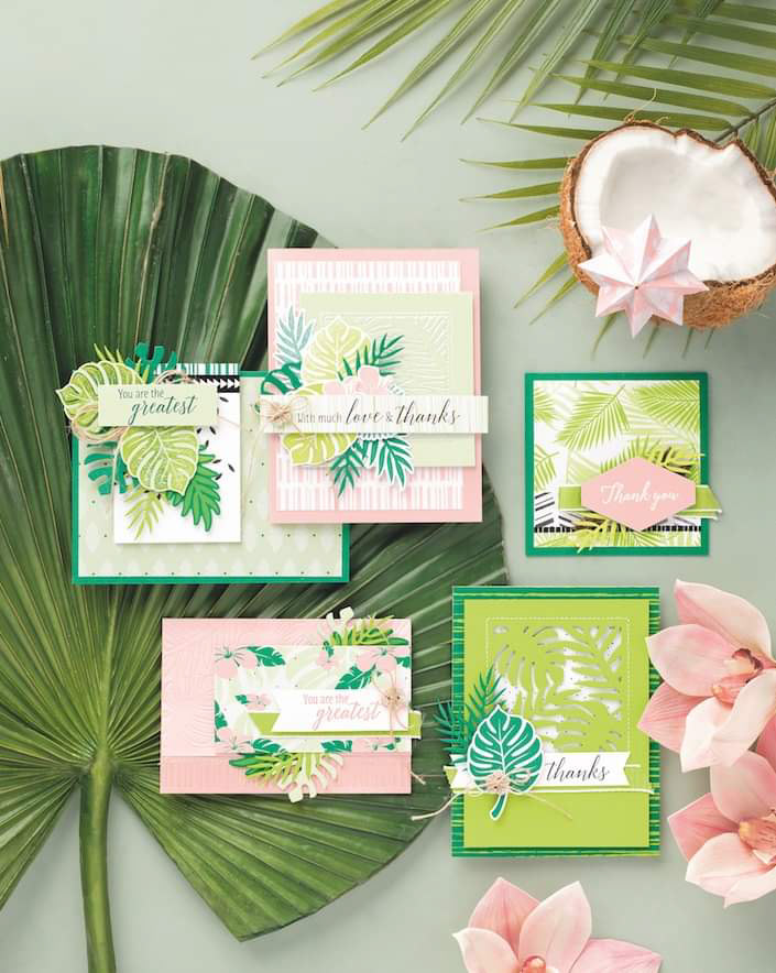
This gets a top chart place for obvious reasons: TROPICAL EVERYTHING. I remember buying some tropical foilage to use in this photo and someone seeing that giant green leaf and doubting it would ever fit in a photo. I grabbed that little doubt and ran with it, I made it my goal to make that giant leaf work no matter what. I'm happy to say I think I proved them wrong.
NA.STAL.GI.A When I was little we had those little wood ornaments on our Christmas tree, made gingerbread houses with that gorgeous old not-really-that-good candy, and always baked shortbread & other cookies for the neighbors. Arranging this shot made me absolutely giddy and took me straight back to 1995. Please pass the shortbread :).

This photo scarred me...literally. The amazing photographer I was working with on this shot had a cool idea to shoot on glass that was covered in some mixture of salt and stuff to make it look like ice. We ended up layering 2 pieces of glass together to get the frozen pond look, but in doing so my finger got a nice kiss on the sharp corner of the glass. After a quick 30 minute intermission of holding my hand above my head to stop the bleeding, and a brave coworker who fetched my skin remains off of the glass, we were back in business. To this day I have a nice diamond shaped scar on my finger, but it was so worth it.

This photo was in my pre-scarred-hand days. Being a hand model is one perk of the job ;). The reason I love this photo is because as a catalog designer I feel like I fall into doing 2 types of shots: gridded or perfectly messy. This suite was an instance of going gridded..but WONKY. I love the organic shake of the grid. I also love how it's nestled with the typography. Something about it just makes me want to watercolor and pick some peonies, ya know?

I love how the little sprinkle of sand and the real seashells really enhance the product rather than detracting. It's styled to have just a hint of the beach. Fun fact: this was taken in the depths of covid. I had to digitally mock it up with lots of detail, then video call the photographer during the shoot to give some further guidance while it was on set. Hashtag Collaboration!


This isn't even a suite but still makes it into the top 10. A good pink surface makes my heart flutter. It acts as a neutral while still adding some fun color. The product is complimented and the machines really pop off the pink. I give it 5 gold stars...or pink.

Basically I raided the Tub & Tile department. I wanted neutral layers and layers of texture, with just a little touch of organic. OPA! and gave some of the tiles and bricks a nice broken edge...and that's how you make a mosaic I hear.

I don't always shoot people, but when I do it's in a photo. This suite wins the award for Most Hardworking. Not only did we have to set up a forest of birch trees in the studio, but we had the complexity of working with people. I love the color scheme of this suite and it was so fun to style the models for a festive holiday gathering. I am most proud of the problem solving that went into this suite. After the shot was all done, edited, and beautiful the product team worried that it didn't give the message of "handmade cards". After playing around with the design of the layout, I landed with adding the 3 photos to the bottom which illustrates the raw product you need to make the beautiful cards. I think it was a great compromise that solved all the teams' worries.
*No halls or coworkers were decked in the making of this suite*
*No halls or coworkers were decked in the making of this suite*

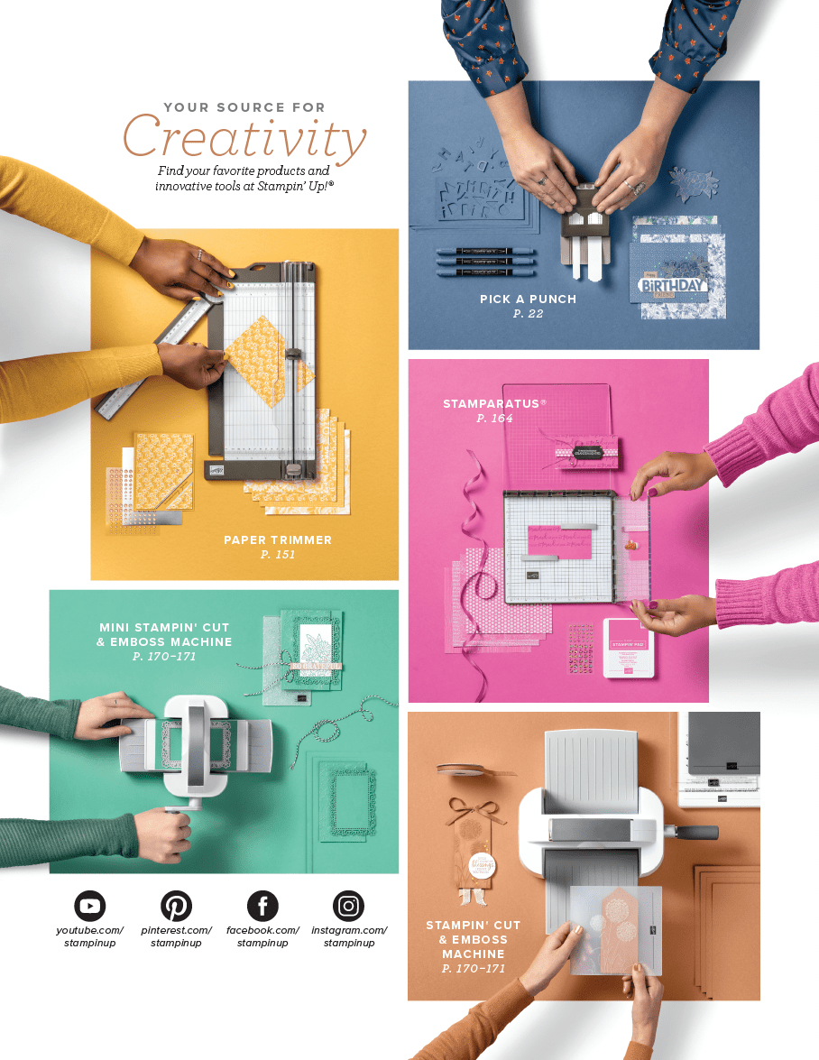
I am a sucker for a good series and a good monochromatic moment. This shot was the inside of the front cover, introducing the 5 new colors of the year as well as showing off new tools and products. I love how it turned out, I love the dimension that happens with tone-on-tone paper being stacked, the colored ribbon popping off the page organically and, of course, the coordinating nails and clothing of the people.