Branding and interface design for my own version of a Portfolio app on mobile
Personal project

Concept + Design
These days designers need to contend with the fact that often times, their portfolios will be browsed on tiny mobile devices. This opens up a host of usability issues that need to be addressed to make for an optimum viewing experience - after all, portfolios are a designer's bread and butter. As a user of some of the popular portfolio apps, I created this project as a way to address the pain points, as well as create features that I would like to see in a portfolio app.
Categories
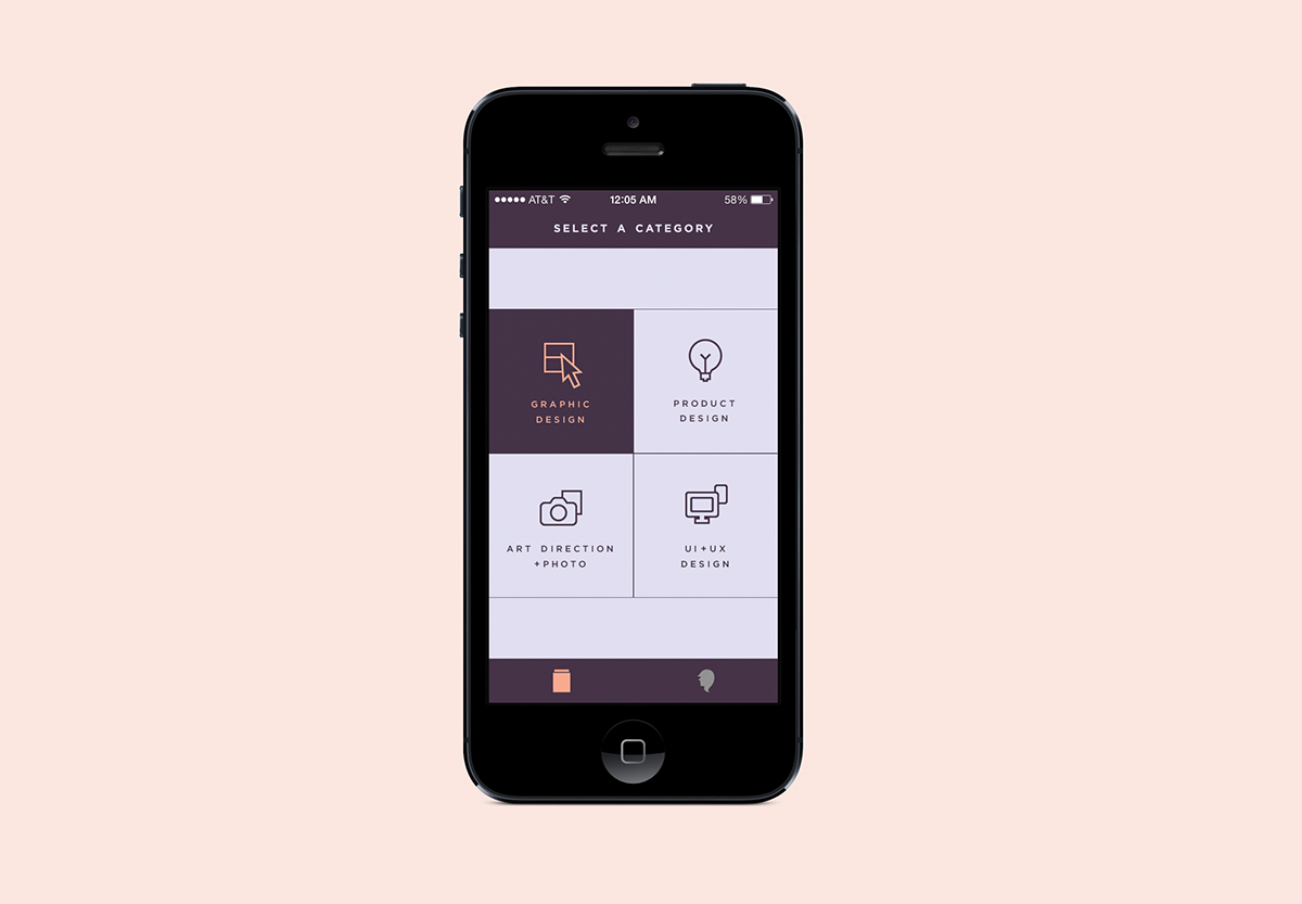
Most portfolio apps have a single gallery for all projects, lumping disparate projects together. This is also problematic for use cases where users have multiple projects - necessitating a lot of scrolling on tiny screens to get to different projects. My solution is to allow users to select one or more categories to organize different kinds of projects in their own galleries.


Image Viewer
Images are the most important part of a portfolio. Popular portfolio apps present projects as pages, with margins and vertical scrolling - essentially a mobile version of a portfolio site. The pain points I identified with a scaled-down version of a website portfolio are: 1) smaller image size, 2) a lot of scrolling for large projects. This also means a lot of scrolling back up to the top of the page if you want to view another project.
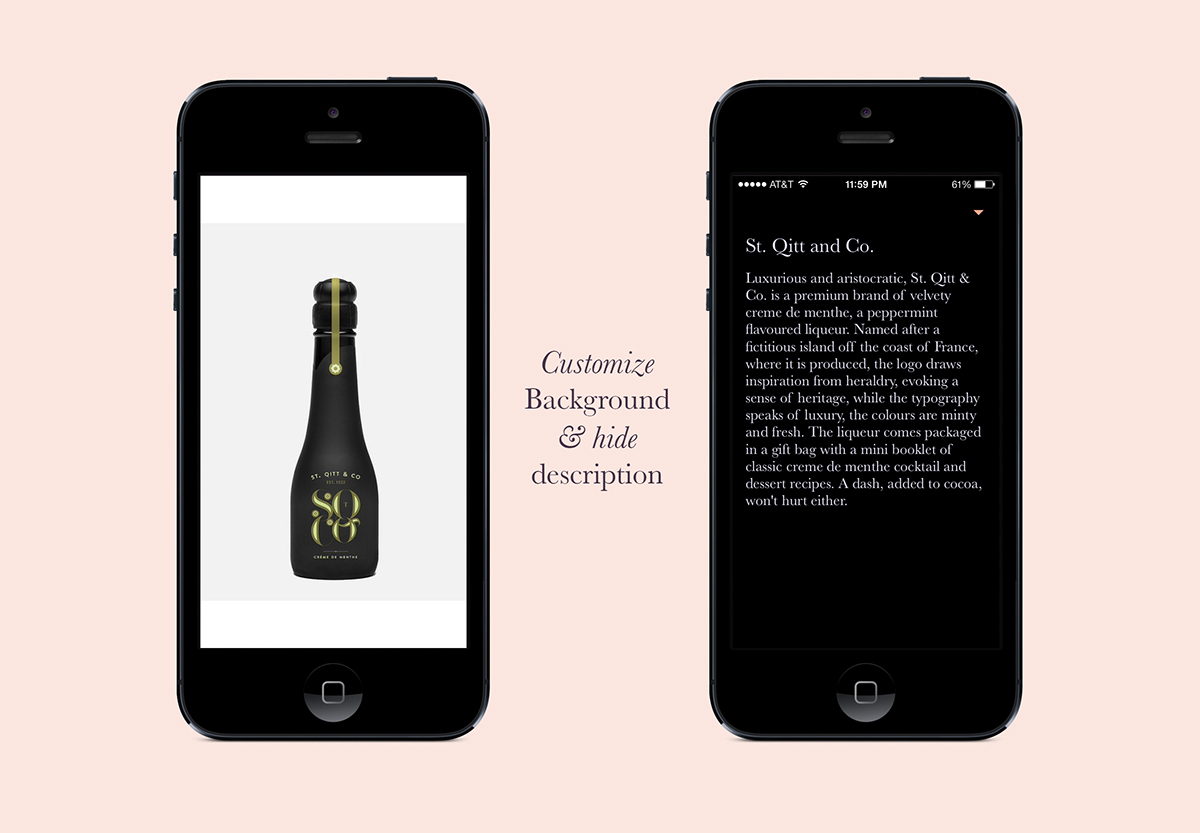
Instead, I opted for a iPhone Photos-style image viewer to showcase images in a project. This removes margins and scrolling and allows images to take up maximum space in both portrait and landscape orientation, optimizing the limited screen real estate. The image background can be toggled from white and black for flexibility in presentation. The project description and captions appear as an overlay when clicked and the font size is optimized for reading on mobile.


