Product Design Case Study · Feb 2020 – Feb 2022
HOW ALMS TRIED TO MAKE PEOPLE DO GOOD EVERY DAY
Alms is a well-being app that aims to inspire everyone to better themselves, and the world around them through simple IRL action ideas and challenges. It was given birth in the dark times of early 2020 when everyone was at the breaking point about their physical and mental health, economic and environmental future. And most importantly—suddenly had too much free time combined with ambitions for personal growth and helping others.
The product went through multiple strategy changes: first starting just as a quirky content app with course-like plans to improve yourself and learn how to help others, but then moved on to be a vertical social network around the same idea. In the latest version, we used creators as the main growth vehicle, hence, aiming to become a default platform for other people who want to "teach people positivity through challenges".
The challenge
Although specifics changed at every stage, in general, the goal of Alms was always to motivate people to do positive stuff, no matter how big or small or to whom.
Our high-level goals were to:
1. Show that "doing good" increases your own happiness in general.
2. Help proactive people discover other ways they can make a social impact.
3. Create a safe space to share impactful stories and inspire others.
2. Help proactive people discover other ways they can make a social impact.
3. Create a safe space to share impactful stories and inspire others.
My role
I was the first and the only Product Designer in Alms, collaborating closely with CEO, Product Manager and shipped all the ideas with 2 iOS Engineers. I've delivered all the wireframes, mockups, prototypes, dev handoff specs, brand assets and managed design system. During later stages I've also helped contractors and graphic designers to do their best.
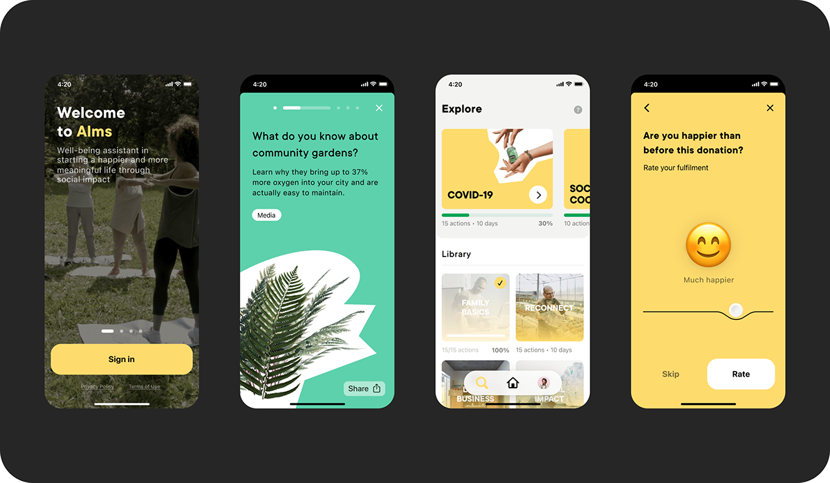
Alms 1.0
Your guide to becoming happier through everyday impact
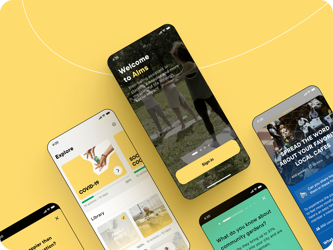
Initial goals
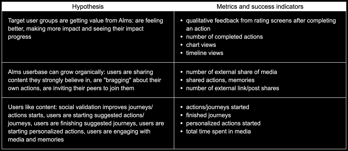
Since this was the first stage of our project we aimed to basically deliver an MVP of the app in 5 months. We formulated basic hypothesis and success metrics, which we then integrated into the app as analytics events.
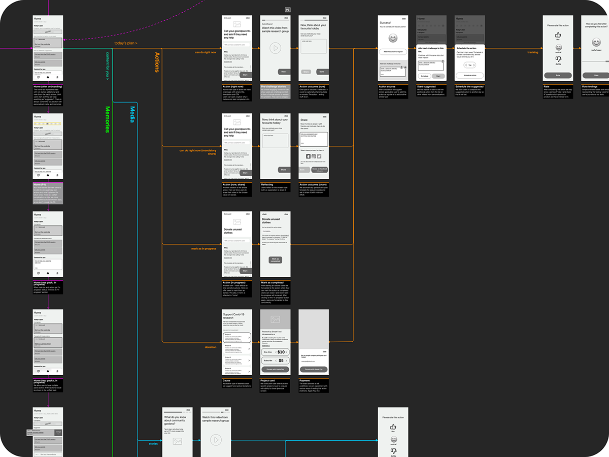
Preliminary research and wireframing
The initial brave idea was to be not only a habit content app with positive habits, but to hand pick charity foundations and process donations as well. I guess you can see where I'm going with this – the finance part was too much for us to take at this stage and we quickly went back to just the positive habit part.
Quite quickly we arrived at 3 main screens as the app's structure:
1. Plan – where all the suggested and planned actions are;
2. Discover – a library of all challenges/journeys/packs (the same thing);
3. Profile/Me – all the basic you love with some custom graphs on top.
After some simple idea viability tests with "quick and dirty" prototypes, we managed to raise funding and get to "actual" work.
Initial style concept
Having analyzed our target audience mix (half gen Z, half really mature guys), I've decided to start building the product based on the following style principles:
1. Progressive but accessible;
2. Yellow for happiness;
3. Bold in accents but neutral in general;
4. Realistic but positive photos and videos;
5. Informal but safe tone of voice.
Setting the right mood while facing reality
During the implementation process, I've faced various problems:
1. Fancy custom font I've chosen was too expensive for our specific needs;
2. Fixed height layout for the Home/Today tab was straight-up lunacy considering dynamic content and resolutions;
3. Horizontal scroll of actions was confusing to users in both tests and reality;
4. Realistic stock photos were creating generic and darkish vibe instead of boosting positivity and uniqueness;
5. Noise-to-signal ratio wasn't ideal — users simply didn't know what they are supposed to do and what are the key elements on the the screen.
6. Users didn't understand the conceptual difference between single actions and challenges (packs of them).
To address all of this I've moved to a system font, worked with a professional illustrator to create characters with a "straightforward feel" to them, scaled back the use of complementary colors, and started limiting the use of primary accent color only to CTA's. A bit later we also switched the main screen to a more recognizable vertically scrolling layout to distribute the user's attention more evenly and also showed action-to-challenge relation with containers.
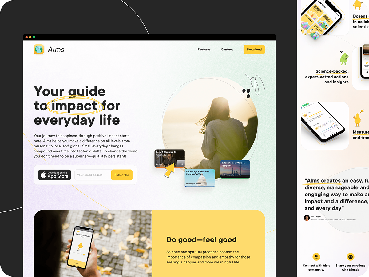
Landing page
Celebrating the launch
A few weeks after the soft launch of Alms I created a landing page: sketched and approved the basic layout with the team, designed the desktop version, added responsive mobile and tablet versions, and helped a front-end engineer to implement it nicely.
Outcomes
Good results and so much more to do
As planned, we launched our first MVP version in October of 2020 with 12K+ installs, and 250+ custom-made "Alms actions". Although we've got healthy metrics on all fronts — it wasn't the explosive growth we'd hoped for initially. There were several reasons: first session UX problems, vague positioning, specifics of purely content apps, as well as our high expectations from users to do stuff in real life.
I can't tell you specific numbers but it was clear to us that we needed to steer our strategy towards something else, get more focused as a product and rethink main userflows. The good news is that now we've had a good foundation for the further development of the platform.
Alms 2.0
well-being social app focused
on real-life actions
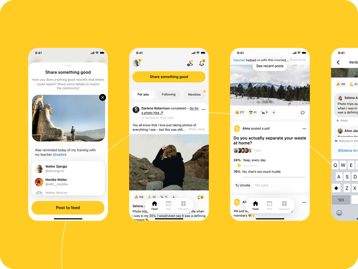
New goals
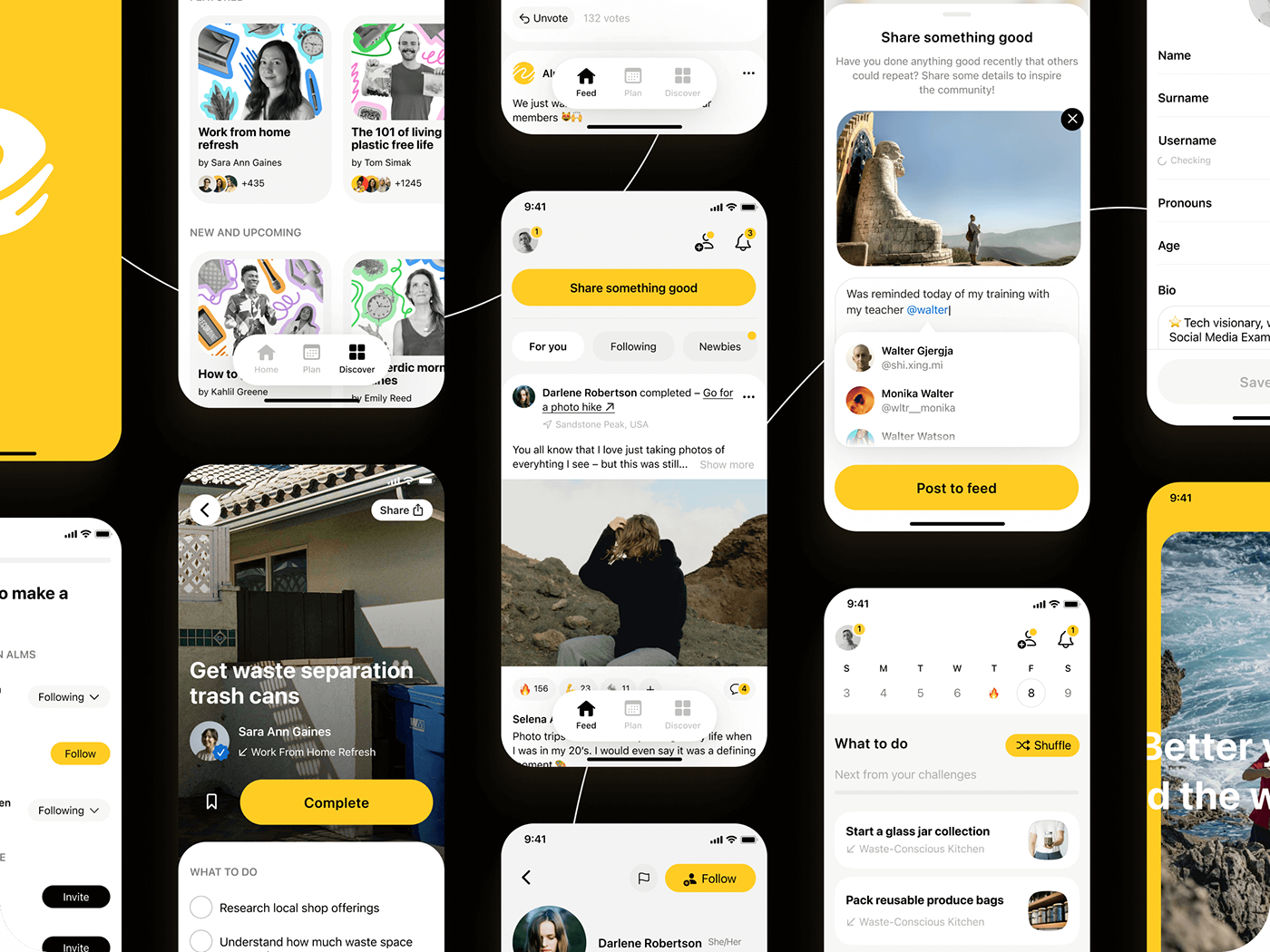
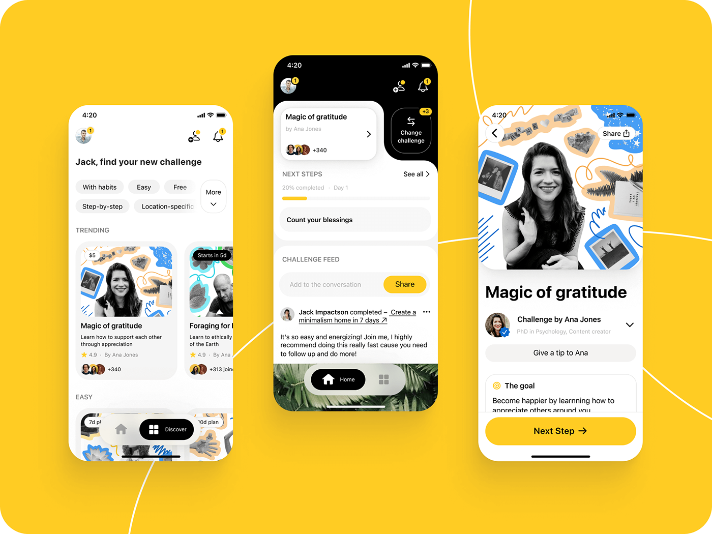
We took the core of our first MVP – content app and reimagined it as a vertical social network. Much like Strava for cyclists, we decided to be the social network for "do-gooders" keeping most of the content and action-challenge mechanic we've developed. But now the main focus became the social feed where people would post the results of the action they've done and how they've done it to inspire others to "do the same content".
Style evolution
Sketch, get feedback, iterate, repeat
Although the first mockups for Alms 2.0 were rough, we iterated and tested them to find the proper solution. During that period, I've also managed to get feedback from a few truly amazing art directors from Flo, W1D1, and Zing Coach, which helped me to see and fix visual problems faster.
As a result, I've radically simplified the UI style: reduced the number of fonts and colors used, streamlined and expanded the color palette, reduced the use of lines and containers to the minimum, and left custom controls only where it is actually necessary. Feedback from the usertests and stakeholders helped us choose the right metaphor for the main screen layout and remove unnecessary features, reducing the implementation estimates.
Design system
Formalizing the new style
I've already had a fancy UI Kit for the Alms 1.0, but it had a lot of craft from the previous versions and wasn't really relevant anymore.
For Alms 2.0 I've kept only the most-used components, streamlined and created much more versions for them, developed a wide primitives palette, updated colors, and relinked all relevant documents to this new system. As the result, the UI style of the app wasn't fluctuating anymore and we were much more productive with engineers.
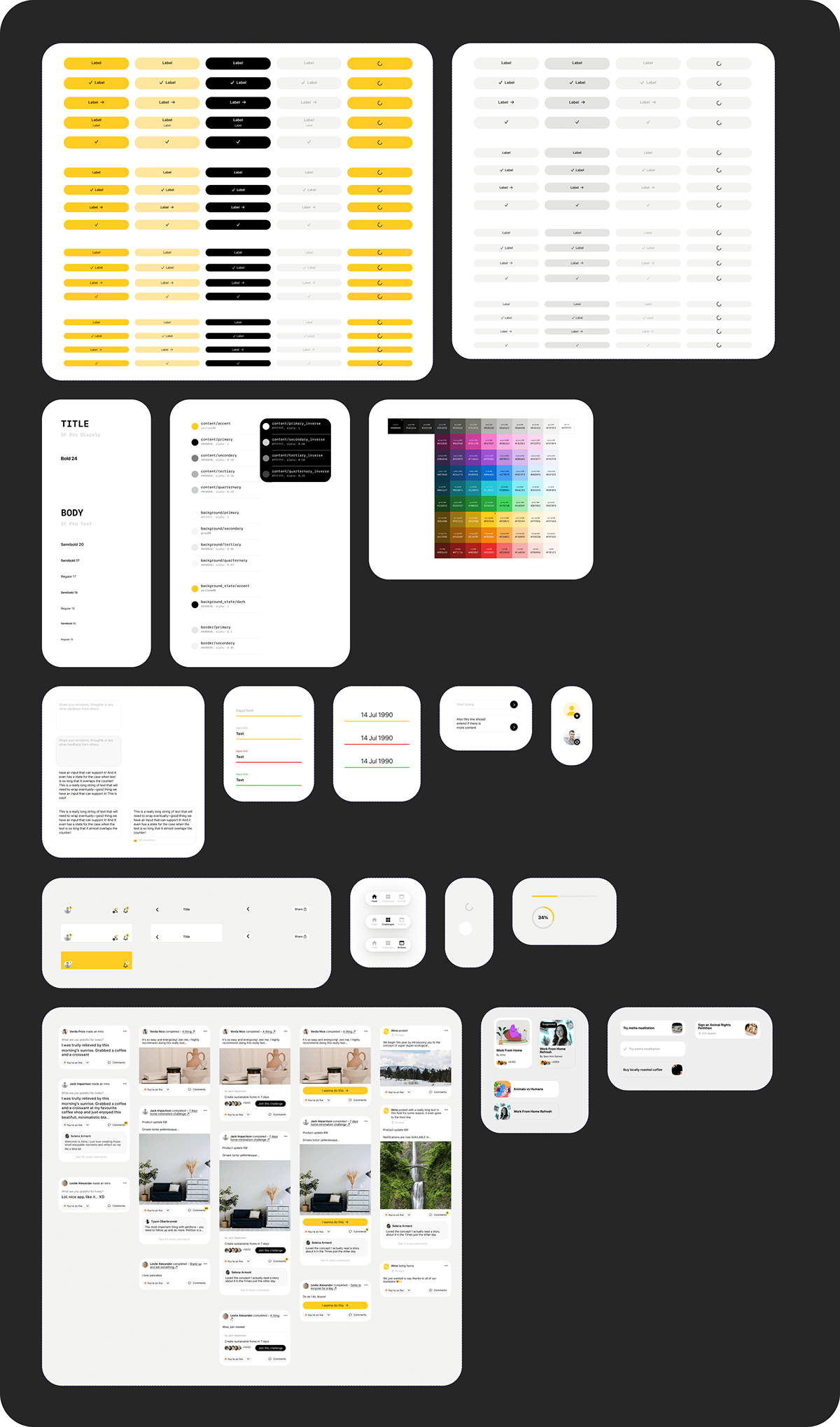
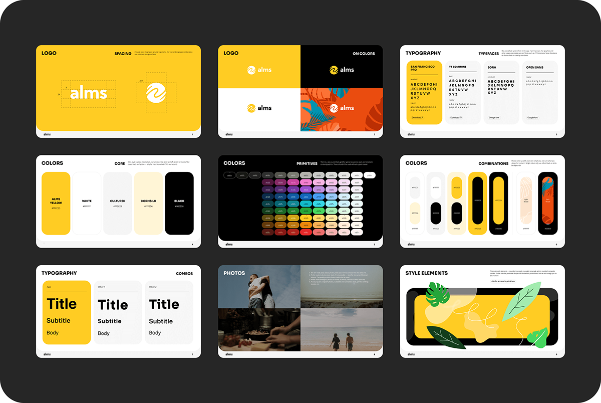
A bit later I worked with a brand designer on the new app icon and logotype.
Apart from the use in UI Kit, I've converted the new visual rules into a style guide which improved communication with other contractors and graphic designers.
Updated landing page
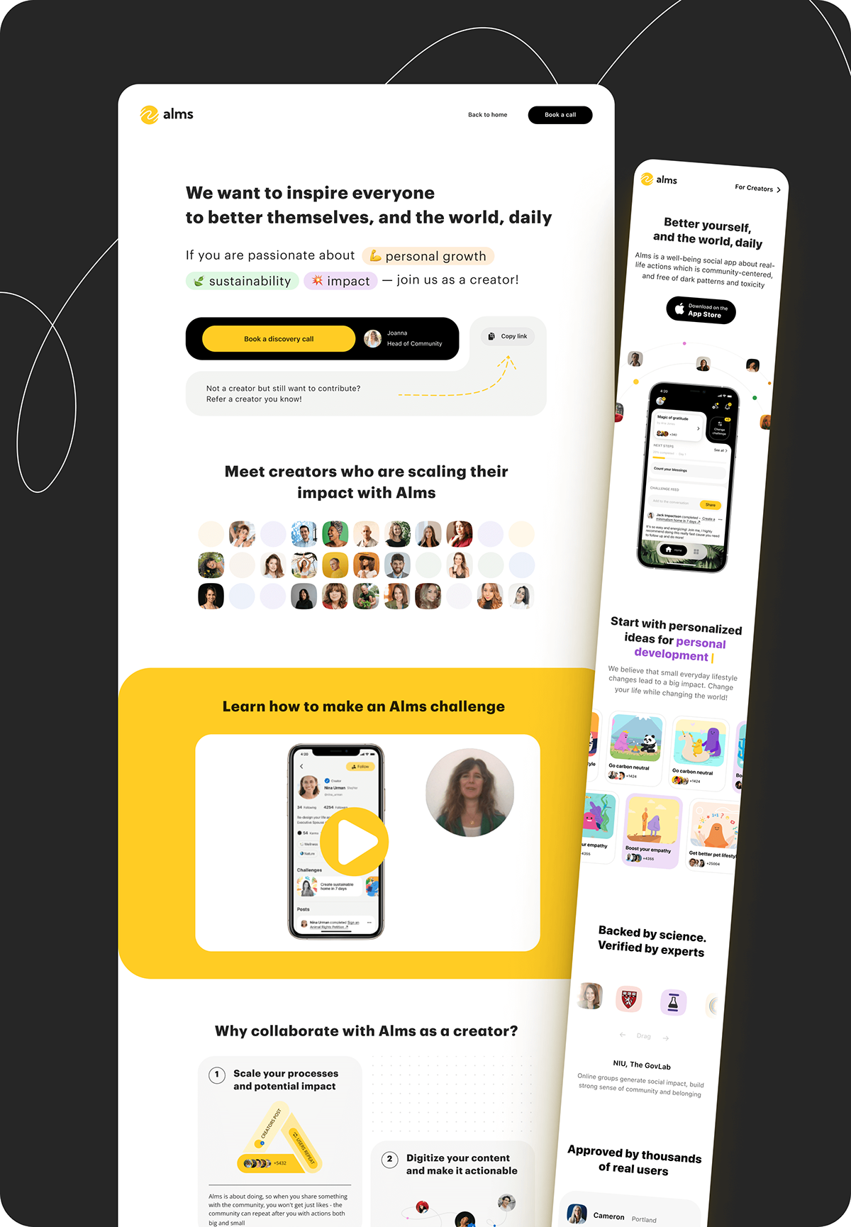
New audience to design for
All the new styles and product strategy pivot meant that I also needed to update our landing page. But since we were now also working with creators directly, I've designed and assembled a custom page for them as well.
While working on that I've developed a strong love-hate relationship with Readymag... :)
Now with creators!
One of the latest design and product changes was our focus on creators in Alms – on finding them, working with them on content for Alms, and seeing how it would influence general Alms user number and metrics. For design, it meant walking back the use of illustrated characters, developing content filtration tools, returning the explore tab, looking at the app invite funnel, and what can be improved there.
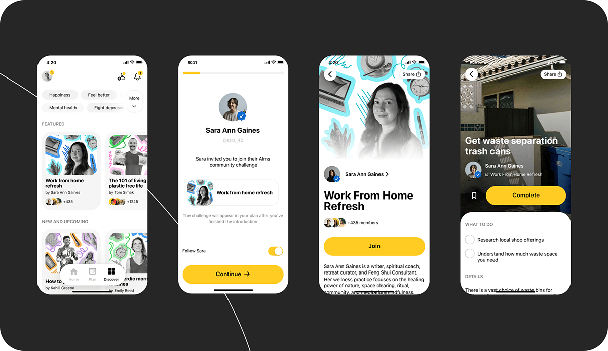
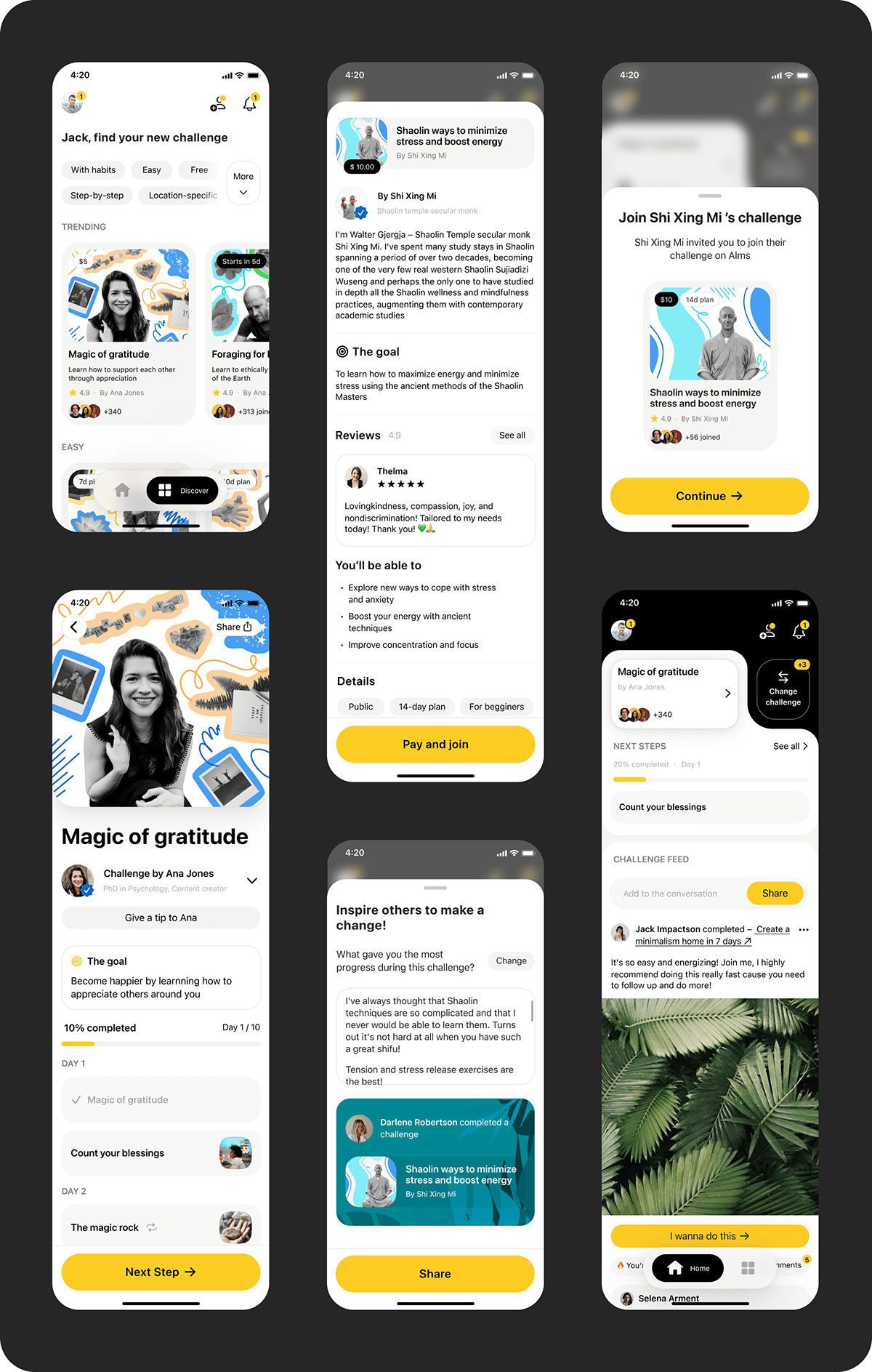
I've worked with a graphic designer on a new format for challenge (packs) covers. To replace outdated characters we came up with a simple collage idea – it utilized a new extended color palette and new simplified style, allowed us to signify the topic of the challenge with "cut out" objects, and was easily scalable.
Outcomes
Creator focus highlighted problems with core mechanics
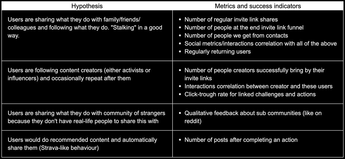
The qualitative tests and metrics showed that 2 out 4 hypotheses we've formulated for Alms 2.0 are true:
1. Creators as a new go-to-market strategy brough their audience into the app;
2. Users actually valued a safe space to share their positive stories;
The combined MVP feed didn't work: the low perceived value of random posts directly influenced "clickthrough rates" to the linked content and too few users were actually discovering and doing challenges from the feed.
Our interviews and real content from 50+ creators made apparent that the core of Alms – challenges flow is now lackluster for users as well as limiting for creators. Our old one-screen implementation was reasonable for the very first MVP, but now it prevented Alms from moving further and becoming a full-on platform for any actionable positivity content.
Moreover, our struggles to make people "do good stuff IRL every day", not just consume didn't go anywhere — users did not retain in the challenges they've joined for long enough, barely finished the longer ones, and the whole invite mechanic still required a lot of work.
Future plans
twitch for wellbeing challenges
Fix what's broken first
After seeing some luck with creators strategy, we've set a direction to morph our "social content app" into the default platform for anyone who wants to run a well-being challenge on any topic and using any medium. But before that we had a few glaring problems to solve:
1. Decreasing the loss of people in the challenge invite funnel;
2. Getting people to actually finish longer challenges;
3. Balancing making the feed relevant to the user and the ease of implementation.
Optimizing challenge flow
The main problem with challenges in Alms is that the inside content by nature is difficult to do and requires as much effort as an online course. That's why only a few people are ever finishing them.
To address this I've decided to first break down the user journey into steps (before, during after) and check all the contexts the challenge can be in as an entity. Then, to look at what products with similar mechanics (course platforms) do to address user churning.
Although it's yet to be properly tested and implemented we've brainstormed and sketched a few ideas for the future:
1. Further improve challenge invite funnel – allow to preview challenge before a user joins it and provide meaningful bite-sized blocks which would help to make a decision;
2. Redesign the challenge screen – turn the wall of text that we had for description into digestible blocks. Base those blocks on the questions users are usually asking during our tests and interviews;
3. Add metadata from those new blocks into the discover screen;
4. Integrate a preview of the next step directly into the feed screen.
Making feed more relevant
To make the feed more relevant we've decided to link the specific posts you see to the challenge selected — so users perceive each challenge as a small community of people that are all doing the same stuff and are much more interested in the posts they see. The main challenge here is to still be able to attract attention to the other, unselected challenges and updates in them.
We've already tested and shipped the first implementation of this feature in the app, but the impact of this is yet to be measured.
Conclusion
Alms aims to do a really difficult thing — to make people do stuff instead of just thinking about it. And to do it on a recurring basis. Although the most obvious strategies and hypotheses still haven't brought insane results, we as a team verified that there is a huge hidden demand for such products and there are still a lot of ideas to test and explore.
I grew immensely during this long project — from just a general digital designer to a product designer, who understands the reality of development, the importance of explaining every element on the screen, the difference between idealistic mockups and real use, and what it takes to actually validate that your interface works.


