
Brand Kupilek / Jambrešić has been operating successfully on the market for 30 years, with its production and retail outlets. It is the largest producer of blackberry products in Croatia.
The redesign aims to increase the brand’s visibility on the market and bring the products closer to younger generations and those not so familiar with the beneficial properties of natural blackberry products. The primary objective of rebranding Kupilek blackberry wine and raspberry wine is a clearer positioning of these products in the wine market segment since they are produced the same way as wine from grapes. Most other producers process this culture as liqueurs. Unlike liqueurs, blackberry wine has less sugar and is rich in iron and vitamins.
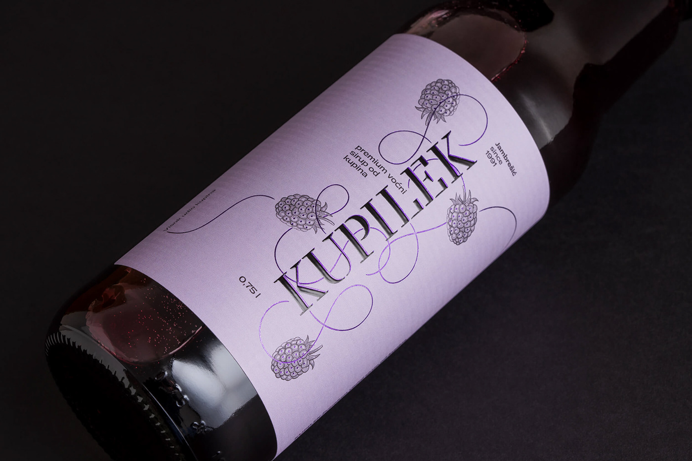
Rebranding puts the brand name – Kupilek in the foreground. The surname Jambrešić is secondary and will function as a personal “signature” behind the brand in future communication. It has been noticed that users are not aware of the brand name since the surname Jambrešić and the brand name are almost equally represented on the previous packaging.


The brand slogan “Zdravica od bobica” (which can be loosely translated as “A healthy salute made from berries”) has also been designed to creatively communicate the health benefits of products within the legal restrictions of such communication.
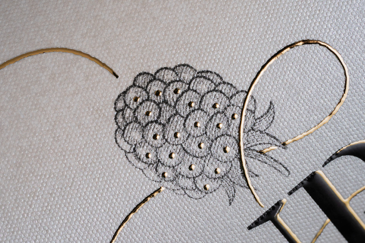
Fruits and tendrils are the foundation of visuals. They are symbols of the richness of fruits and flavors and stem from the centrally positioned brand name. Thus designed, the visual motif communicates the product’s high fruit content and its top quality.


before / after

The blackberry motif and the basic tonal scale – primarily black and white and gold, and secondarily green were kept as a link to the previous identity.
Illustrations of blackberries and raspberries and the colors are the basis for coding products and product sublines. Green is used as the umbrella color of the Kupilek brand, gold is for blackberry wine, red is for raspberry wine, and purple is for other blackberry products.


The economy of production was considered in designing the labels. The same label size for different bottle sizes and the same manufacturing tools reduce the total cost of production. On the other hand, high-quality materials and specific printing techniques have achieved the required appearance of premium products.
Paper texture and 3D printing elements bring a unique product experience through the tactile component.


Designed in 2021
CLIENT: Ida Nova
DESIGN STUDIO: Design Bureau Izvorka Juric
CREATIVE and ART DIRECTION: Izvorka Juric / VERBAL COMMUNICATION: Igor Poturic
DESIGN: Izvorka Juric, Jurica Kos / BRAND ANIMATION and PRESENTATION PHOTOGRAPHY: Jurica Kos
DESIGN: Izvorka Juric, Jurica Kos / BRAND ANIMATION and PRESENTATION PHOTOGRAPHY: Jurica Kos
*
THANK YOU!
*


