Company
TEC Systems is the largest privately owned independent Building Automation and System Integration Contractor in the New York Metropolitan area, creating custom designs state-of-the-art control solutions to the most challenging of building automation needs. They also offer initial system design, engineering, commissioning and maintenance, software development, and panel fabrication services.
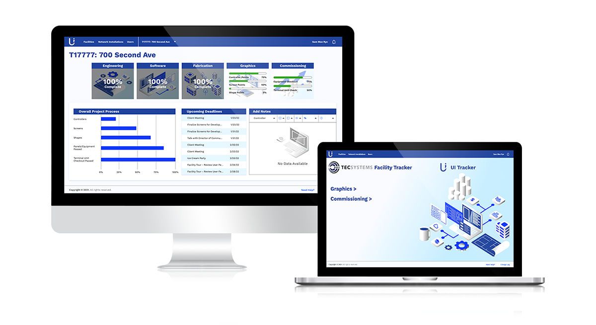
The UI Tracker product (also called Point Tracker), is an internal tool to help organize and oversee projects and buildings contracted through TEC Systems.
The UI Tracker product (also called Point Tracker), is an internal tool to help organize and oversee projects and buildings contracted through TEC Systems.
Challenge
Redesign the UI Tracker to make it more user-friendly and organized while also updating the overall UI.
Team
Team consists of Graphics Manager, UX Engineer, 5 developers, several others on the Technical - Graphics & Programming team, and myself.
UX/UI Audit
Members of the team have complained that, although it's a helpful product, it's still not as effective as it could be.
The first step of the project is to conduct an audit of the current site and identify elements that work and what aren't. The primary pain points I found were the following:
The first step of the project is to conduct an audit of the current site and identify elements that work and what aren't. The primary pain points I found were the following:
UX Pain Points
• No indications of actions and purpose
• Uncertainty on product use without prior manager instructions
• Struggle to navigate site when completing tasks/flow
• Completing certain tasks did not indicate success or completion
• No indications of actions and purpose
• Uncertainty on product use without prior manager instructions
• Struggle to navigate site when completing tasks/flow
• Completing certain tasks did not indicate success or completion
UI Pain Points
• Colors, typography, buttons, and layout are not consistent throughout the product
• No defined UI Kit or Design System
• Colors, typography, buttons, and layout are not consistent throughout the product
• No defined UI Kit or Design System


Proposed Changes
After conducting the audit, I put together ideas and recommendations on how to improve on some of the issues the team and I struggled with.
UX Changes
• Redesigned screen layouts for easier scan-ability, continuous flow, and prioritizing data
• Reworked menus and displays to help navigate more efficiently
• Added icons and reworked certain actions to indicate success or completion
• Redesigned screen layouts for easier scan-ability, continuous flow, and prioritizing data
• Reworked menus and displays to help navigate more efficiently
• Added icons and reworked certain actions to indicate success or completion
UI Changes
• Created a defined UI Kit similar to TEC Systems branding while keeping its own style
• Fixed color contrast issues
• Created logo for said product
• Created a defined UI Kit similar to TEC Systems branding while keeping its own style
• Fixed color contrast issues
• Created logo for said product


UI Kit
One of the points in question that can fix the issues within the product was not having any sort of UI Kit or Design System to pull from. So I put one together that met the requirements the team and company had come to an agreement (i.e. working with blues and whites, using Work Sans, keeping UI as simple as possible).


Logo Exploration
After defining a UI Kit, it was time to develop the product logo. I *explored a bunch of options but narrowed it down to 4 ideas/concepts. Some of the ideas were inspired by the idea of "Point Tracker", the original name for the product, and "UI Tracker", the new-ish name.


Final Logo
In the end, the third option was selected. I changed the shape of the logo to match the primary typeface used throughout the product, which is Work Sans (Semi Bold).

Final Product
After the logo was created, I proceeded with creating the final screens and UI design.