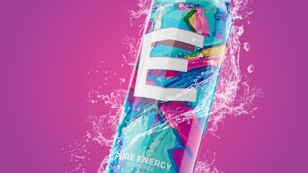
PURE ENERGY
Packaging Design
Client: USN Spike Energy Drink
Job: Rebrand, Packaging Design
Team: Individual
Role: Concept, Art Director, Designer
Job: Rebrand, Packaging Design
Team: Individual
Role: Concept, Art Director, Designer
Story: The idea behind the re-branding of Spike Energy Drink was to base it on the concept of pure energy. Thus the imagery used as part of the packaging revamp was microscopic images of pure caffeine crystals. This was used to emphasise the idea of purity and of pure energy withing one small package.
As the Energy drink market is quite saturates and the main reasons to purchase varies. Through this unique packaging re-brand, it already creates a slight point of difference as it aims to create a certain on-shelf presence that will attract consumer attention and create a visually appealing brand presence.


