
The National Center on Deaf-Blindness, housed at The Teaching Research Institute, has used the web extensively since the mid-1990's to provide their constituents access to the largest collection of material on deaf-blindness in existence.
In June of 2013, the NCDB released an impressive new update to their website. Previous versions of the site had been "read only" in nature. This new version included many collaborative and social features including forums, wikis, groups, social media sharing and much more.
As one of the primary developers on the project, I was interested in comparing traffic and use stats of the new site compared to its previous version, mostly to get an idea of user engagement. I collected my findings in the following inforgraphic.
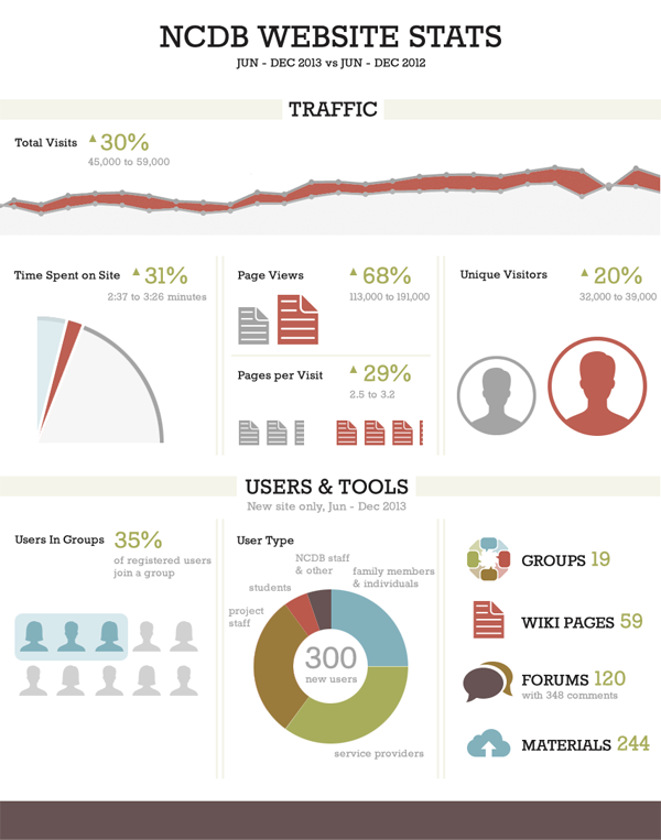
The Traffic portion of the infographic compares website traffic from two time periods: 6 months before and after the launch of the new site. Traffic data was obtained from the Google Analytics account for the site.
The Users & Tools section is simply a count of new user signups and of how many times the various website tools have been used to date. Since the previous site did not have user accounts, groups, or tools, a comparison in use cannot be made.

