Formations Infopresse
For more than 35 years, Infopresse has been acting as an aggregator in the field of communications and marketing by publishing articles and advice in its very popular magazine. Today, it focuses its energies on what it does best: helping professionals develop their skills through innovative, practical and high-quality training solutions.
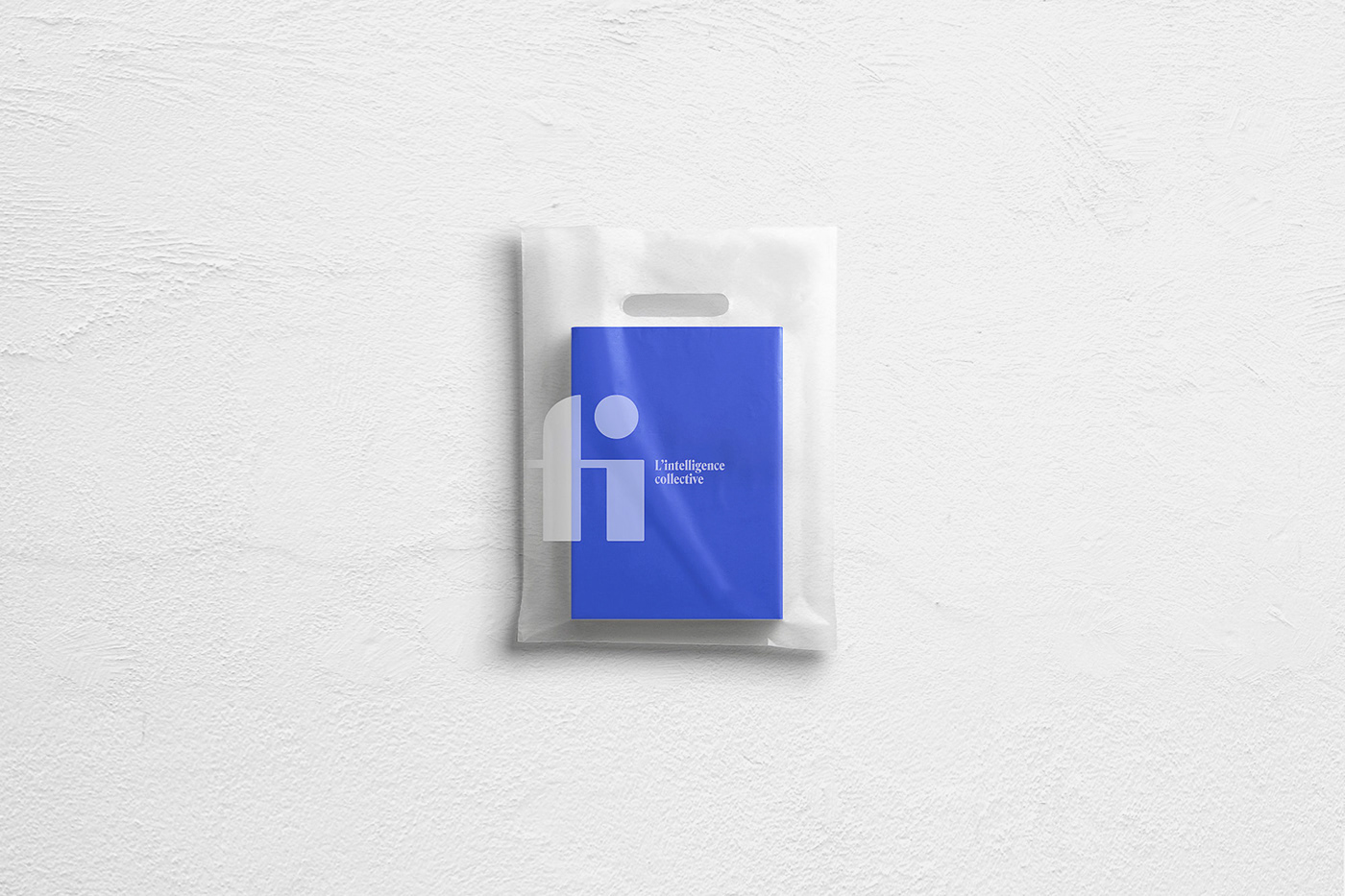
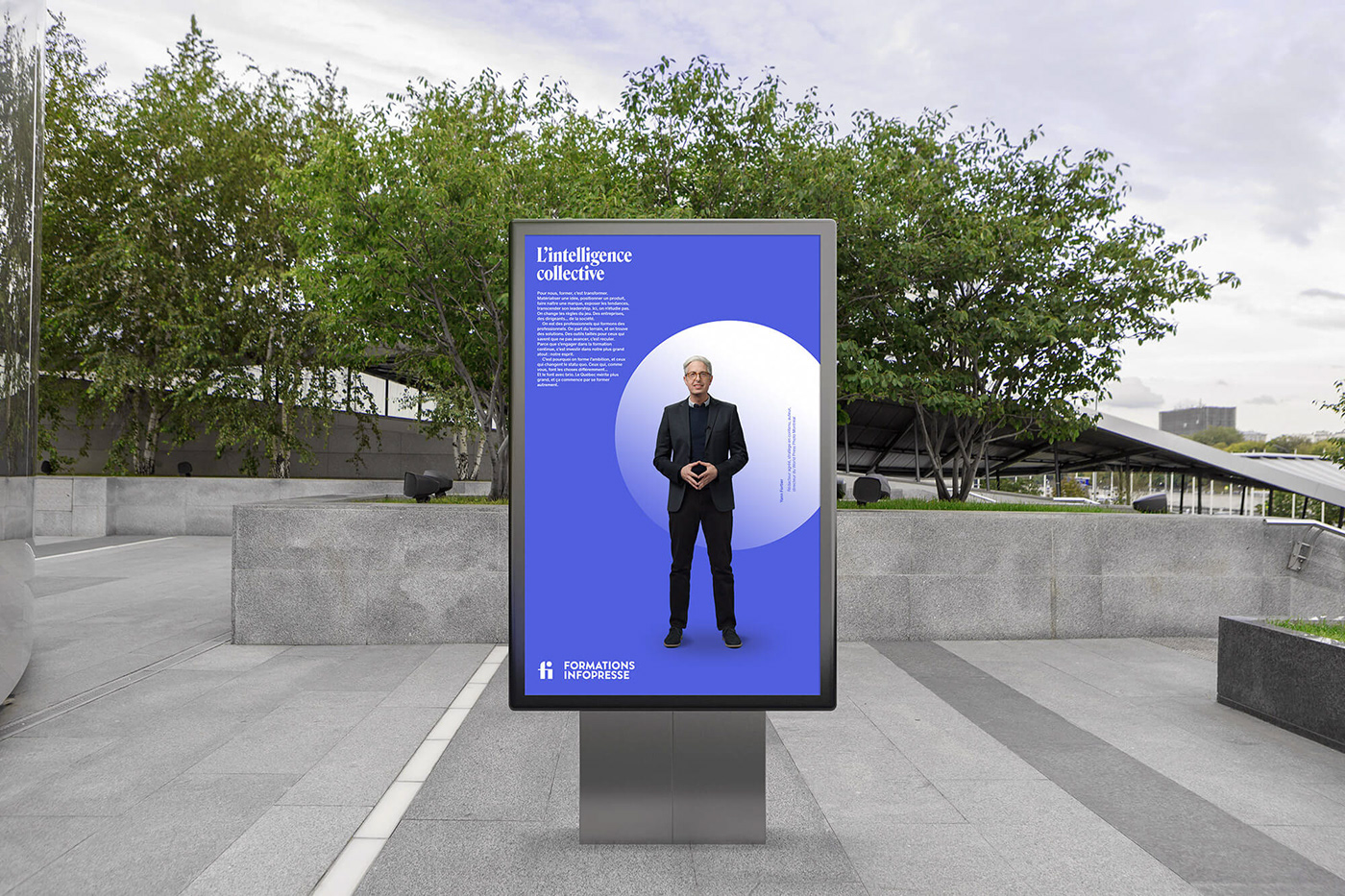
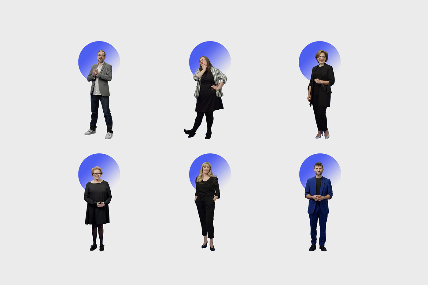
Now operating under the single name of Formations Infopresse, we were mandated to mark this breakthrough and develop a brand identity capable of embodying the renewal. The initials of the name were amalgamated through a simple monogram that exploits the natural ligature between the two letters. Thus, the link of interrelation, so dear to the company, is manifested even in the layout of its symbol. To add graphic substance, gain recognition and influence the animated behavior of the brand, we invested the dot present in the monogram by breaking it up into overlapping translucent layers - schematizing the accumulation of one's knowledge hidden in one big whole. We named this ensemble, Collective Intelligence (L’intelligence collective, in french). First adopted as a tagline, we then articulated it through a heartfelt and galvanizing brand manifesto. Recited by various trainers in an energetic clip, the manifesto introduces the brand and its unique way of doing things. In order to maintain consistency across the visual identity, the dot in the monogram is also used in certain communication tools. For example, by associating it with trainers, it symbolizes a fragment of collective intelligence, where each individual contributes to the scaffolding of the knowledge of all.