OPPORTUNITY
Rebrand all components of an existing company.
Rebrand all components of an existing company.
SOLUTION
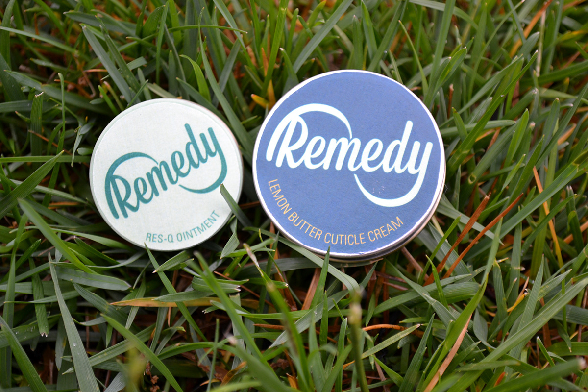
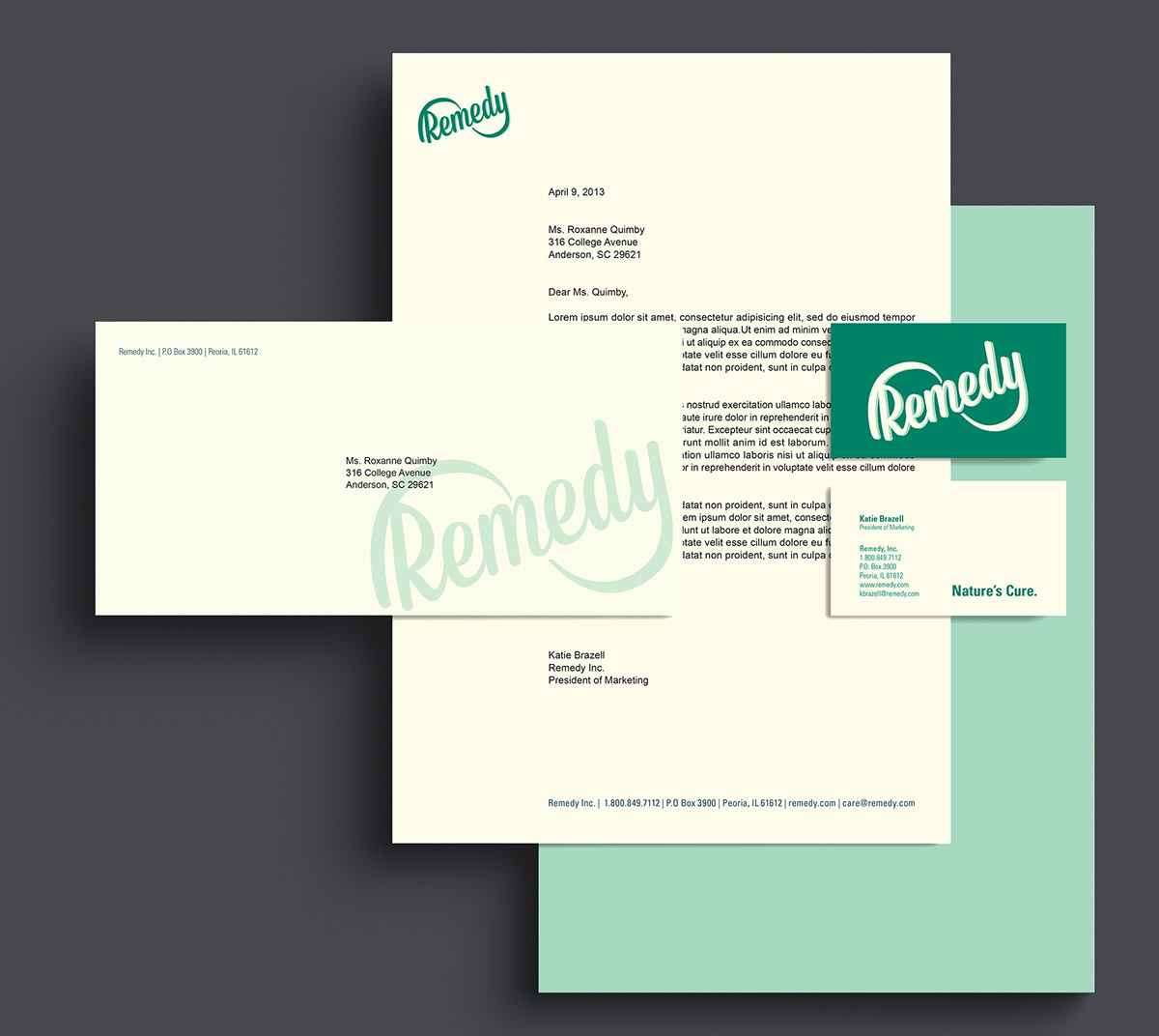
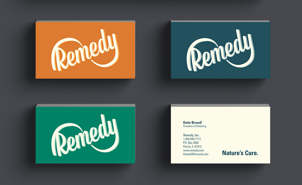
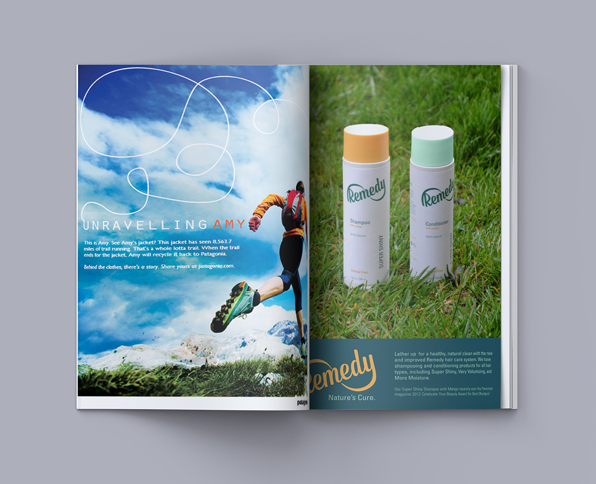
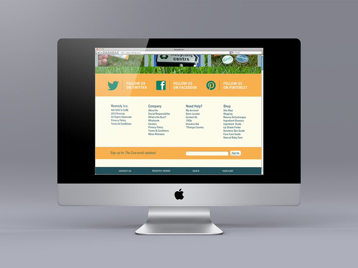
The Burt’s Bees company was given a fresh look and feel. The process began with thorough research, combined with weeks of sketching, designing, and refining. The company was renamed Remedy, complete with a new brandmark. Since the company is founded on using natural ingredients, curing aliments, and dependability, the infinity symbol was implemented in the wordmark. This was combined with a vintage typeface and the use of overprinting. Several touchpoints were created, including labels for chapstick, shampoo and conditioners, tins for several natural products, and a website.
The Burt’s Bees company was given a fresh look and feel. The process began with thorough research, combined with weeks of sketching, designing, and refining. The company was renamed Remedy, complete with a new brandmark. Since the company is founded on using natural ingredients, curing aliments, and dependability, the infinity symbol was implemented in the wordmark. This was combined with a vintage typeface and the use of overprinting. Several touchpoints were created, including labels for chapstick, shampoo and conditioners, tins for several natural products, and a website.


To view the Brand Standards Manual:
issuu.com/ekbraz/docs/remedy_bsm?e=4946713/6319834

