


EN
MUTUKA is a clothing brand based in Amsterdam, created by Brazilian artist Lucas Caldaña and “inspired by a universe where action sports, music and the arts are unified by creativity and eternalized by people and their movement”, according to its own definition. I was invited by the brand to participate in a project towards a formalization of its visual identity, developing the lettering that would be used as the main signature, in a process that had the artistic direction of Lucas Caldaña himself, also directly responsible for the formulation of the identity.
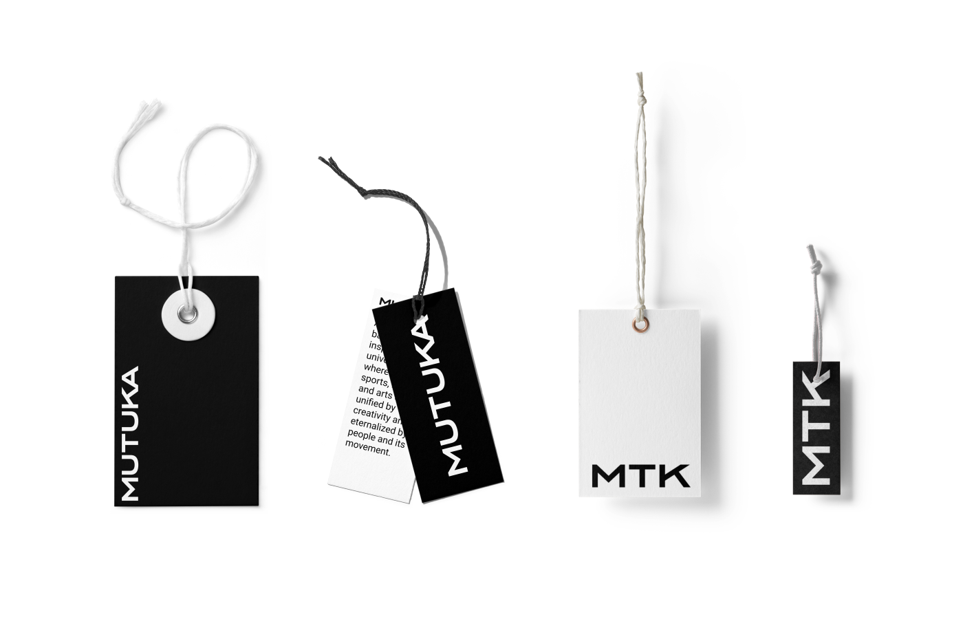
The general guideline is that the signature should be legible, easy to understand and flexible enough to be applied to different supports and materials. At the same time, it should have a neutral characteristic, in order to differentiate itself from expressive calligraphic elements (linked to manifestations of urban arts such as graffiti and pixação) already used by the brand, whose aesthetic language should be responsible for converging the sobriety of the modern and the relaxation of contemporary style. The word should be composed of capital letters and also allow the use of a reduced form, with the acronym MTK.
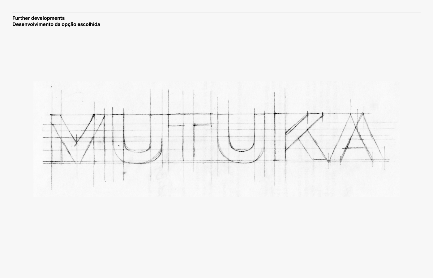
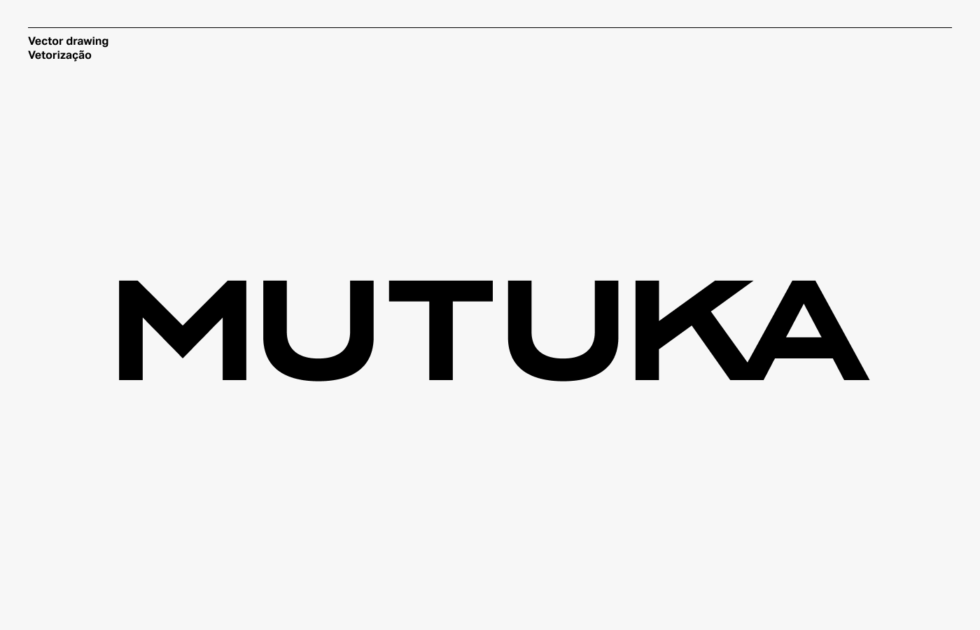
Based on the client's guidelines and a reference search, I developed a series of sketches so that it was possible to analyze options, still within the same initial proposition. The option chosen was the grotesque version, which was later worked on in a vectorization process in six versions: Light, Regular, Bold, Expanded Light, Expanded and Expanded Bold. The signature variations were intended to provide the necessary flexibility for the applications, allowing the use within a variable system.


PT
MUTUKA é uma marca de roupas situada em Amsterdã, criada pelo artista brasileiro Lucas Caldaña e “inspirada em um universo onde esportes de ação, música e artes são unificados pela criatividade e eternizados pelas pessoas e seu movimento”, segundo sua própria definição. Fui convidado pela marca para participar do projeto de formalização da identidade visual, desenvolvendo o lettering que seria utilizado como assinatura principal, num processo que teve direção artística do próprio Lucas Caldaña, também responsável direto pela formulação da identidade.
A orientação geral é que a assinatura fosse legível, de fácil compreensão e flexível o suficiente para que fosse aplicada em diferentes suportes e materiais. Ao mesmo tempo, deveria possuir uma característica neutra, de forma a se diferenciar de elementos caligráficos expressivos (ligados a manifestações de artes urbanas como graffiti e pixação) já utilizados pela marca, cuja linguagem estética deve ser responsável por convergir a sobriedade do estilo moderno e a descontração do estilo contemporâneo. A palavra deveria ser composta por letras em caixa alta e possibilitar também a utilização de uma forma reduzida, com a sigla MTK.
A partir das orientações do cliente e de uma pesquisa de referências, desenvolvi uma série de esboços para que fosse possível analisar opções, ainda dentro da mesma proposição inicial. A opção escolhida foi a versão grotesca, tendo sido posteriormente trabalhada num processo de vetorização em seis versões: Light, Regular, Bold, Expanded Light, Expanded e Expanded Bold. As variações da assinatura tiveram como objetivo proporcionar a flexibilidade necessária para as aplicações, possibilitando a utilização dentro de um sistema variável.


CRÉDITOS
Direção de arte e fotografias Lucas Caldaña
Lettering Werllen Castro


