B R A N D I N G
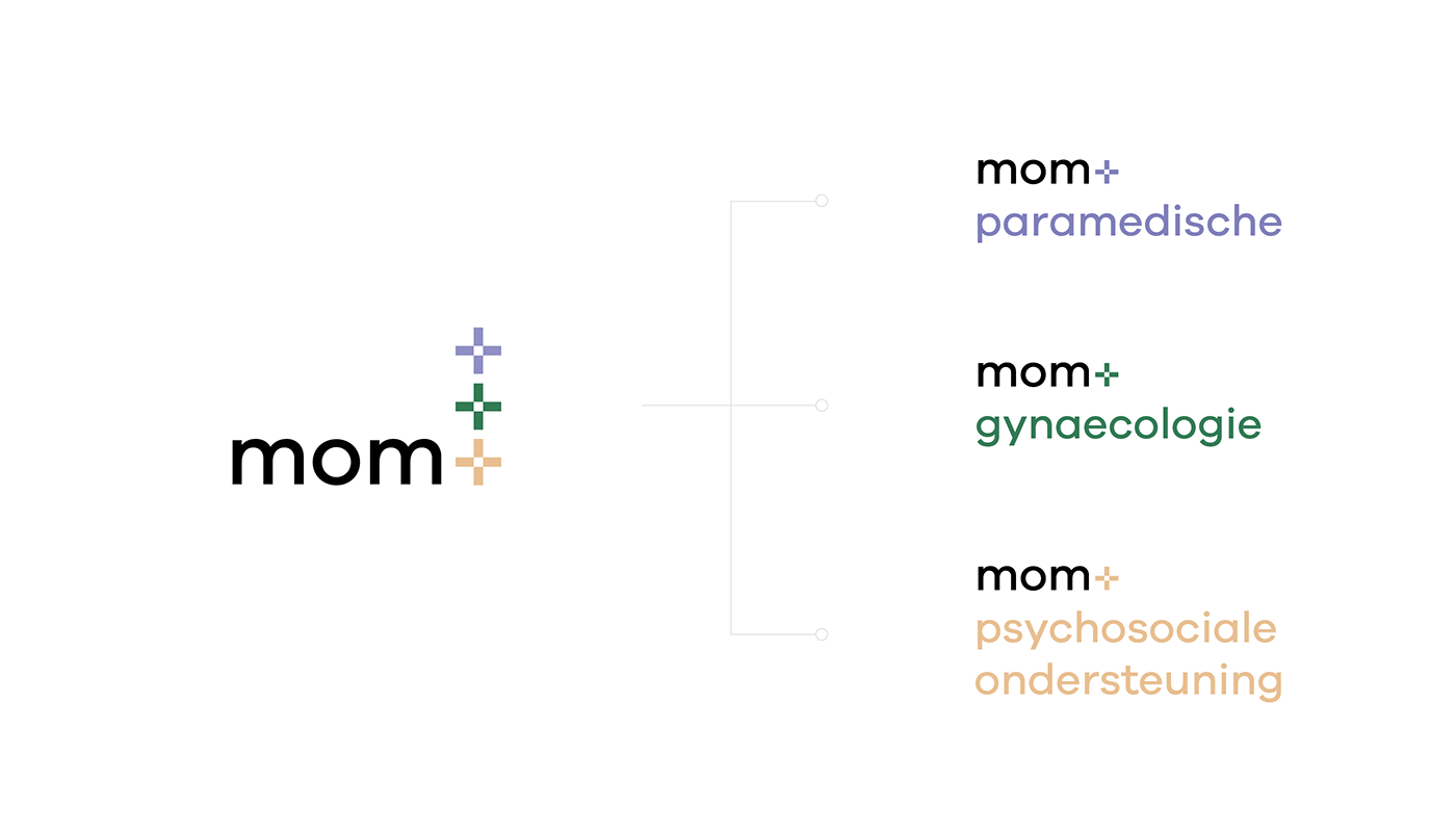
mom+
Center of expertise for contemporary (wish) moms.
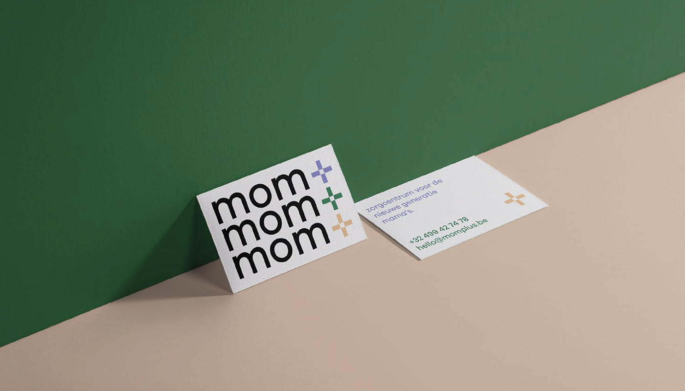
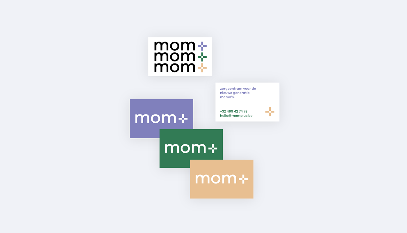
We designed a modern and clear wordmark and symbol. There's more to the plus symbol than meets the eye. Through the white square in the middle, we generate an open sense and by using this style of plus symbol, we convey a medical connotation. To soften the logo, we use lower case letters rather than capitals.
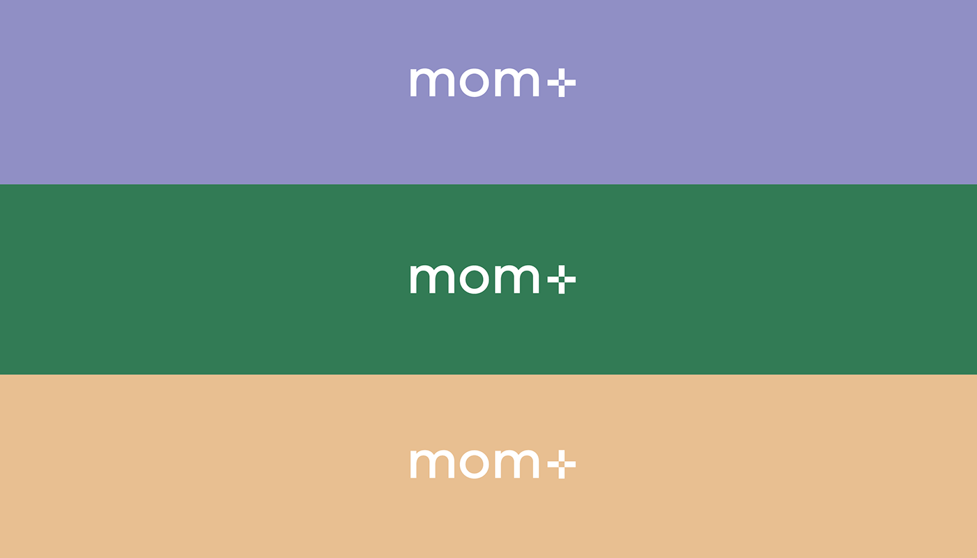
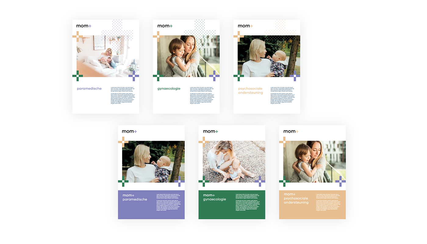
We applied three colours throughout the brand, each representing a different expertise within the company and it's approach.