Illustrations for Philanthropy and Digital Civil Society: Blueprint 2021
Philanthropy and Digital Civil Society: Blueprint 2021 is an annual industry forecast by Lucy Bernholz (senior research scholar at Stanford PACS and Director of the Digital Civil Society Lab) about the ways we use private resources for public benefit in the digital age. Each year, it includes provocative ideas about the intersections of technology, privacy, philanthropy, and those that pull the strings and have the keys to the gates.
This is the fourth year that I've done the illustrations for Blueprint, to help bring those ideas to life on each page. This was also the first Blueprint after a full year of the pandemic, so there was much to say about how COVID-19 has exposed the most brittle, fragile parts of the systems that most of us are blissfully ignorant about, take for granted, and yet rely on every day.

This illustration captures the way that many people are already under many stresses and burdens, on top of which arrived the pandemic
Concepts and early sketches
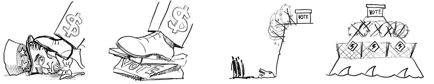
As I read the initial draft, I made loose sketches of whatever came to mind, to explain and amplify the various concepts and ideas. As you can see in the sketches below, I'd riff on each particular concept, e.g. money interfering with democracy, surveillance capitalism, or the difficulties and inaccessibility of voting for some in the US.

Some of the concepts were just a bit too raw and emotive, like the foot of money on the neck of Uncle Sam (recalling the tragic death of George Floyd at the hands of police, or just the over-militaristic excessive force of the police), so some needed to be toned down.
As I discussed these early concept sketches with Lucy and the team, they were really drawn to the rougher, black and white rough-sketch aesthetic, rather than the more refined illustrations I'd done in the past. This rough black and white (or one-colour) treatment heightened the raw stress and urgency of a lot of the concepts in Blueprint.
Visual tone and colour
Stanford's brand includes a neat cardinal red, which I've used in previous editions of Blueprint, but this rougher black-and-white treatment called for something a little less assertive than that red, so I opted for a desaturated tint of the Stanford green.

This illustration uses the metaphor of a tree to show how a corrupt and poisoned soil yields a corrupt and poisoned tree and fruit
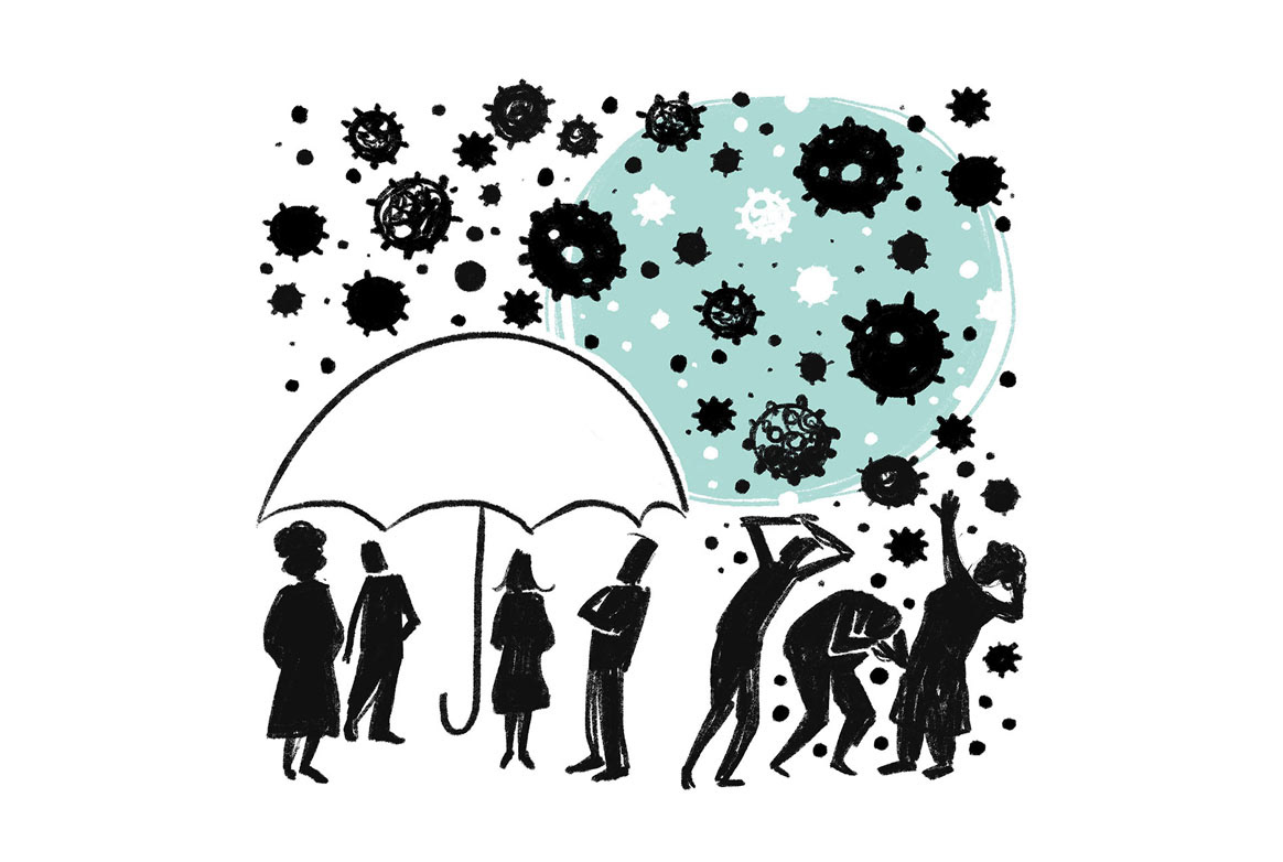
Even though COVID is everywhere, the privileged naturally have more protection than others

This illustration uses the 'social distancing' graphics we all know so well, to show how many in our communities are too separated from some aspects of society that many of us take for granted

This illustration was probably the one that was most like its very first rough conceptual sketch

This was one of the more emotive illustrations: a hand trying to escape (or at least be seen) from thorny entanglements

There was a big call to action to create our own paths forward, which I illustrated as some people hacking a road sign

When it comes to taking action to help with these issues, often it's a big leap into the unknown, rather than small incremental safe steps
