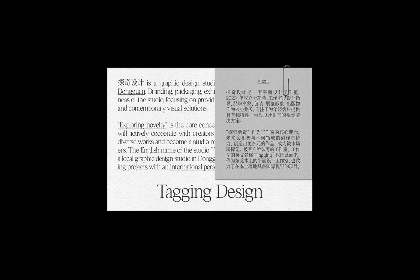
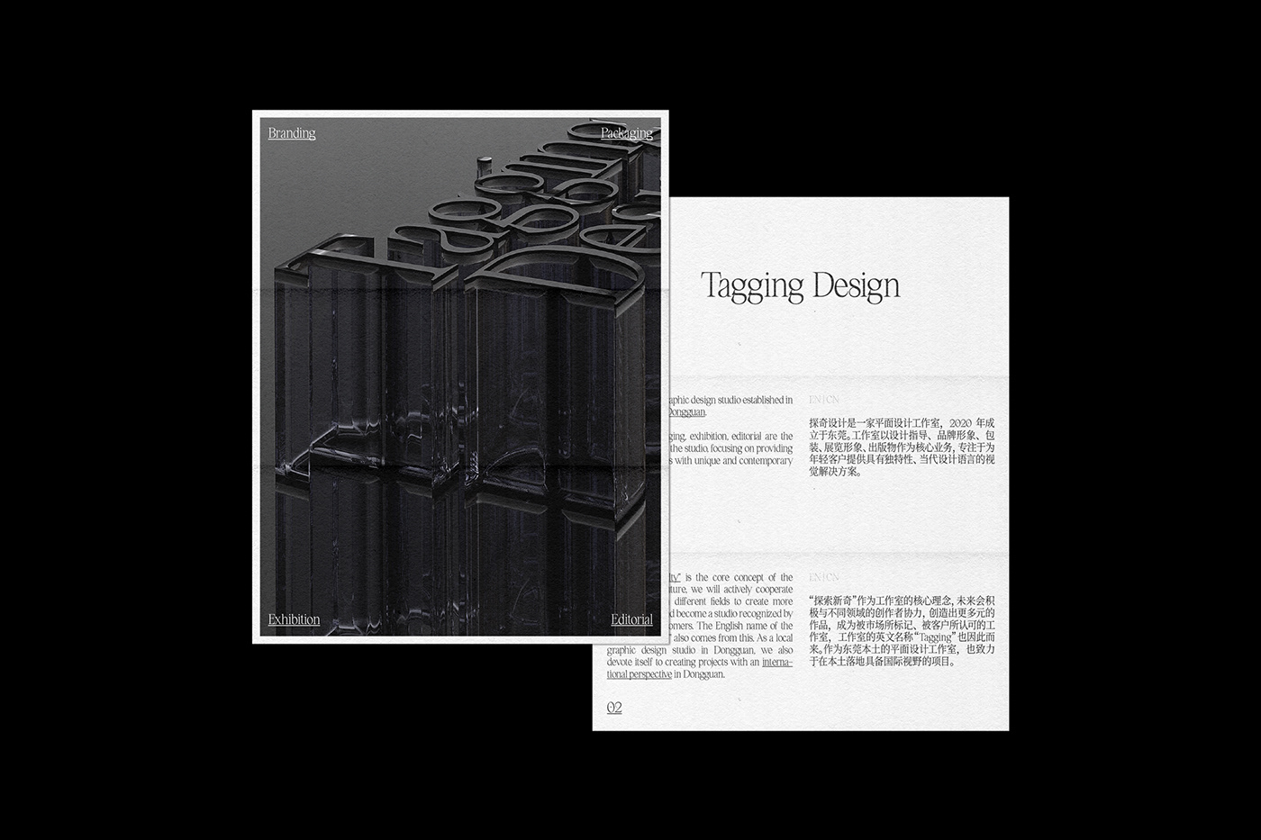
作为一个平面设计工作室的形象,传达设计气质十分重要。在这个项目中,建立在网格框架下的版式,充分地表达了“精准”、“严谨”的工作态度,也传达了“信息至上”的设计理念。宣传海报中,标志转化为了一个具备多通道的建筑物,同时也是一个实验的容器。暗示着工作室对未知的探索,对多元化的追寻,以及对于实验型设计的向往。整个形象,充分展现了工作室的气质。
As the design of a graphic design studio, it is very important to convey the design temperament. In this project, the layout based on the grid frame fully expresses the "precision" and "rigorous" work attitude, and also conveys the design concept of "information first". In the propaganda poster, the logo is transformed into a multi-channel building, which is also a container for experimentation. It implies the studio's exploration of the unknown, the pursuit of diversification, and the yearning for experimental design. The whole design fully demonstrates the temperament of the studio.
DA:Tagging Design 探奇设计
D:WB CHEN