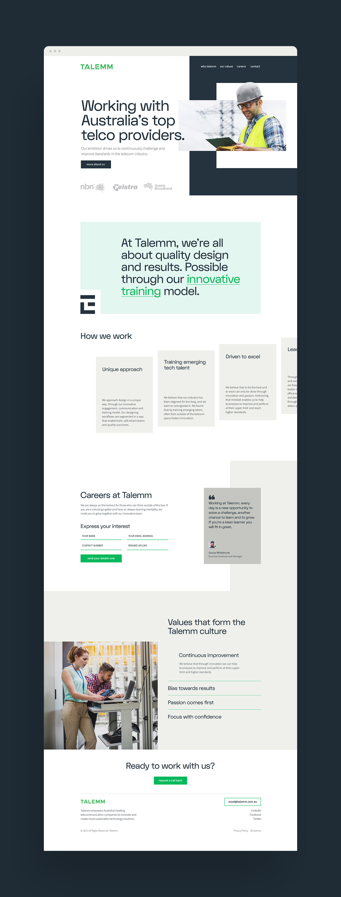
Since 2013, a boutique design house in Australia has been disrupting the telecommunications design industry. Almost a decade later the core remains the same, but a number of complementary service offerings and brands have been spawned. A new, customer-facing entity needed to take the reins and package everything into one overarching, commanding brand.
Talemm Management asked me to craft their brand strategy and announce its arrival with a new, strategically informed identity system. Part of the challenge was to position it as a telecom and tech trailblazer that they are, while not alienating the current customers or appearing too 'rebellious'. And to communicate both, the 120 years combined founders' experience within the industry, as well as capture the excitement of disrupting the outdated industry norms. We amplified the message and visuals through the positioning angle of 'Reinvigorating the industry', creating an unapologetically bold visual identity, and a commanding tone of voice.
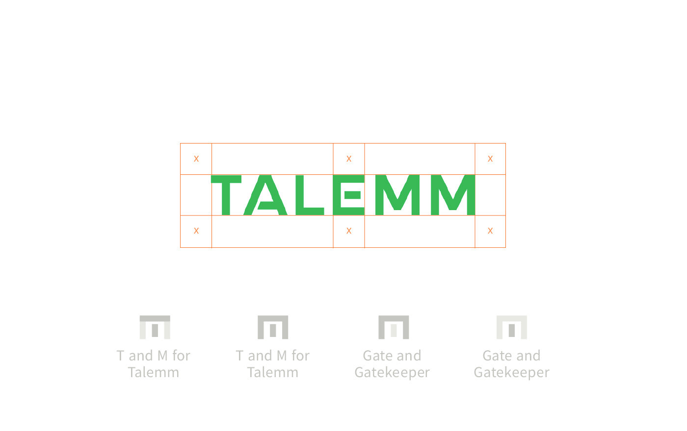
The name is based on the word 'talem' of Hebrew origin meaning ‘gatekeeper’. I crafted a customised clutter-free, crisp, and confident wordmark with a hidden 'gate' element, and sharp edges to show movement. The 'gate' graphic also becomes a consistent 'hero' element and distinctive brand asset we can use in combination with the bold colours, clean backgrounds and a beautifully bold and expressive hero typeface FK Display Alt, for a distinct, clean look.