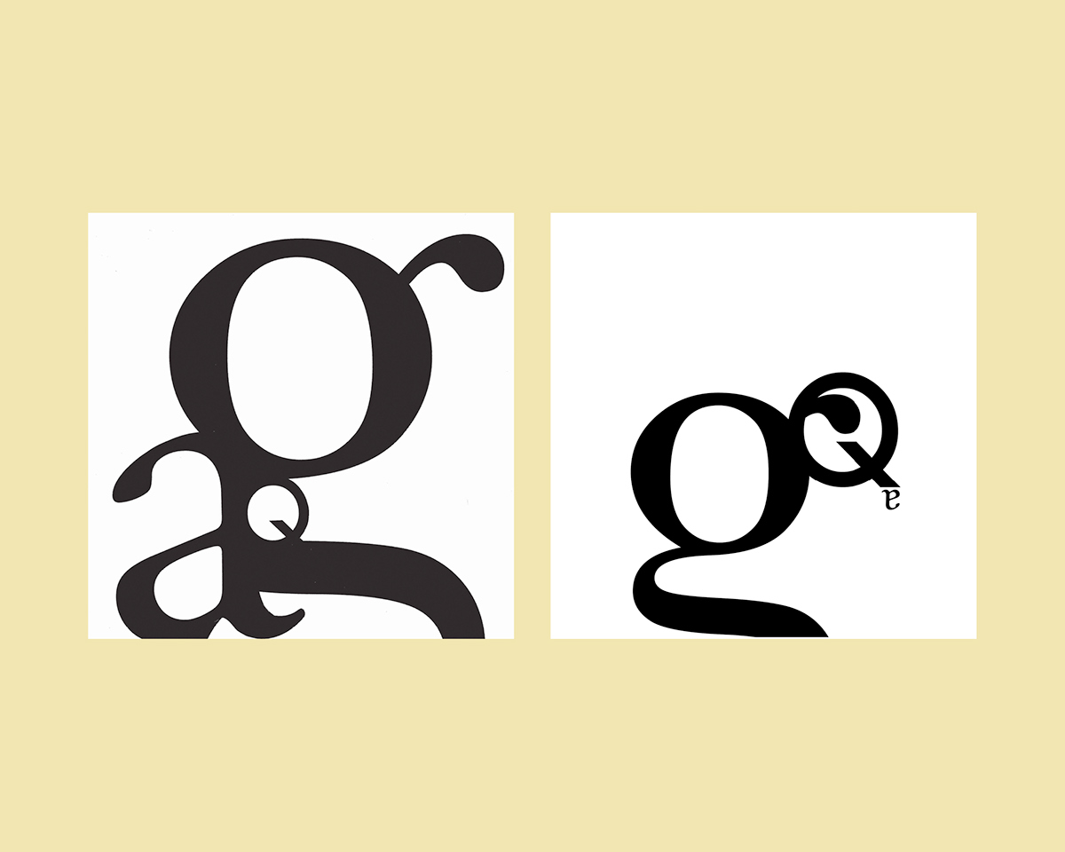
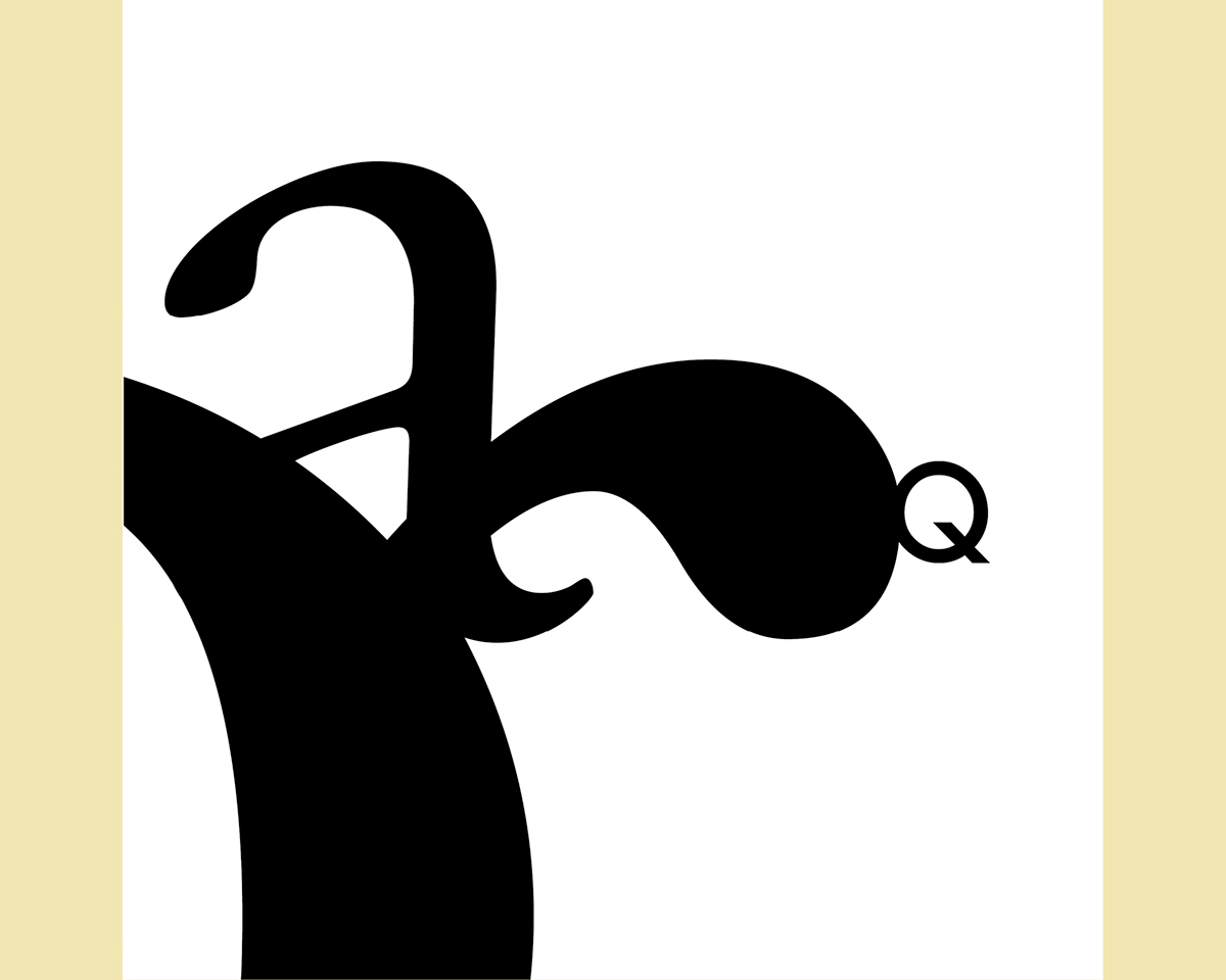
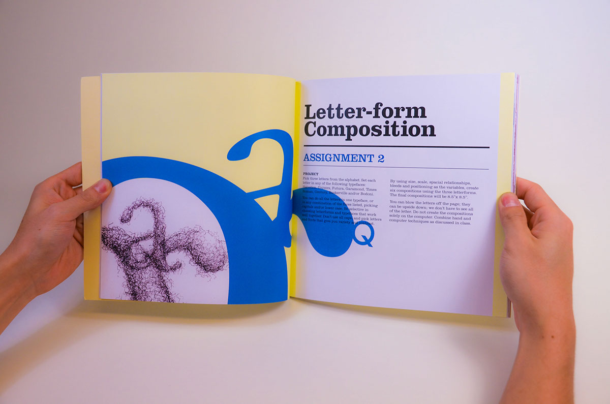
T1-Comp1, Letterform Composition
Pick three letters from the alphabet.Set each letter in any of the following typefaces: Helvetica, Univers, Futura, Garamond, Times Roman, Century, Baskerville and/or Bodoni. You can do all the letters in one typeface, or in any combination of the faces listed, picking capitals and/or lower case. Be selective in choosing letterforms and typefaces that work well together. Don’t use all caps, and pick letters and fonts that give you variety and contrast.
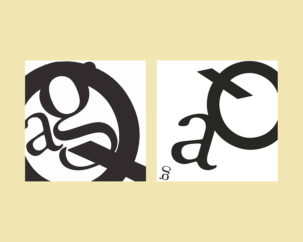
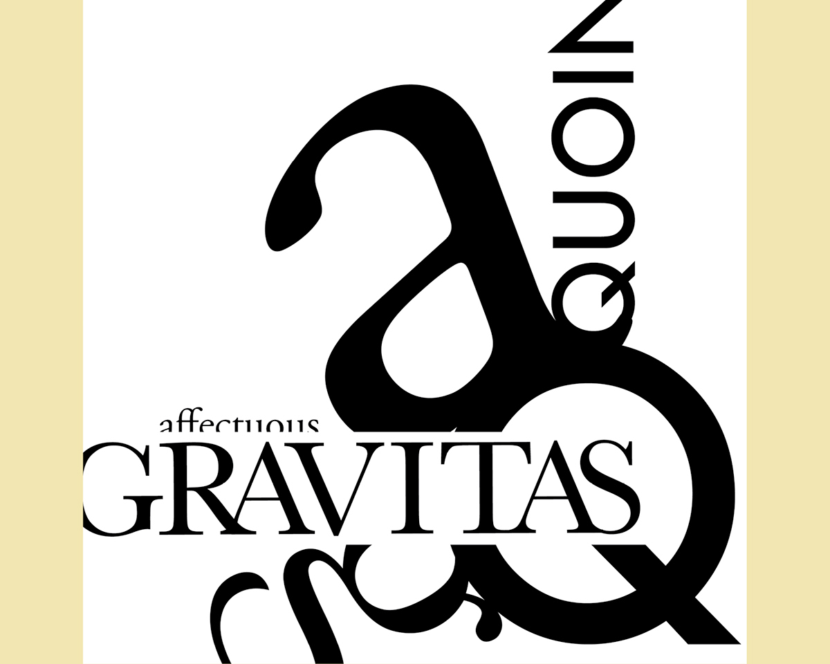
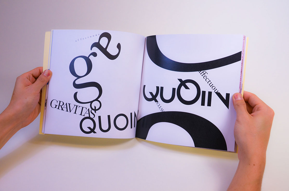
T1-Comp2, Letter/Words Composition
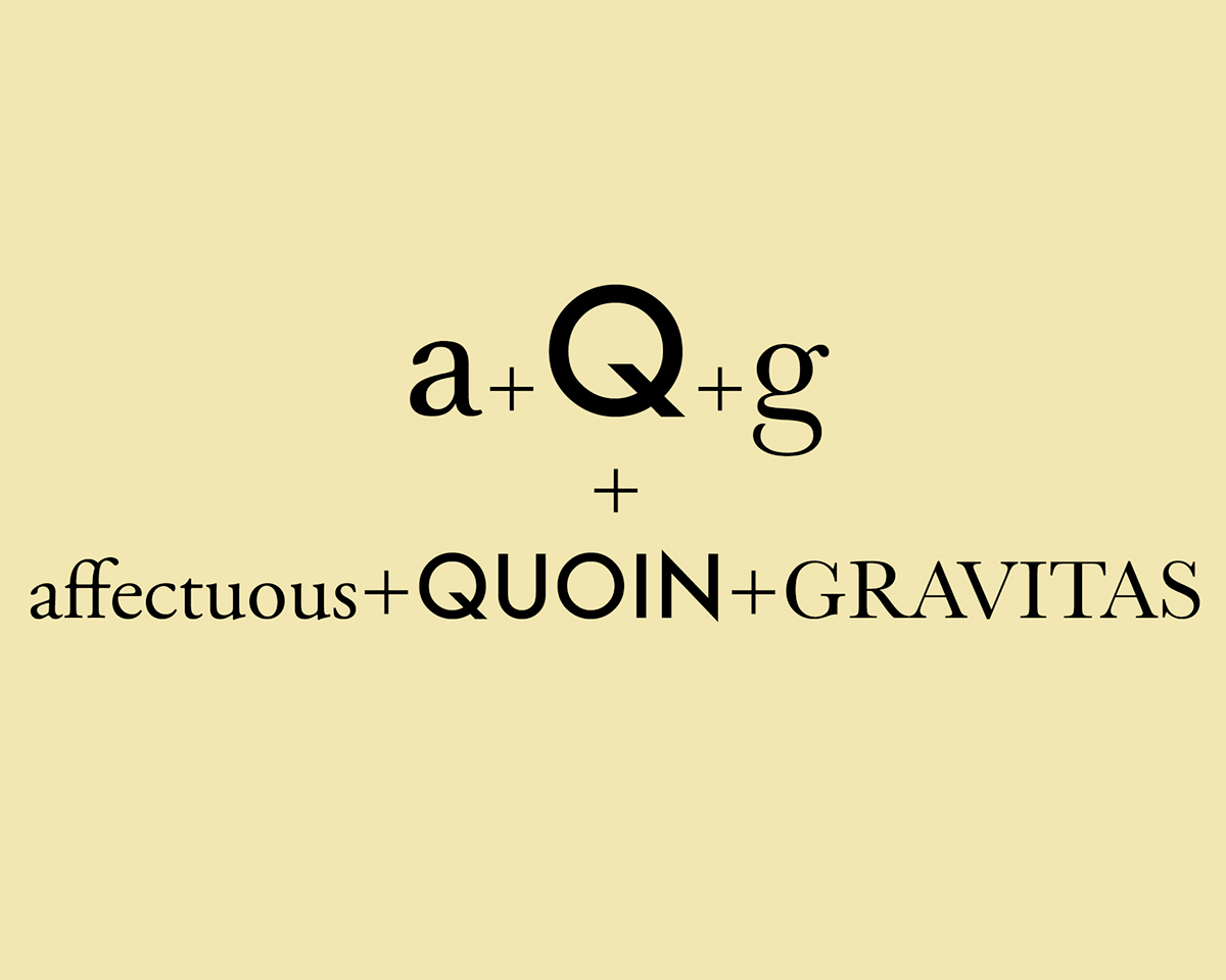
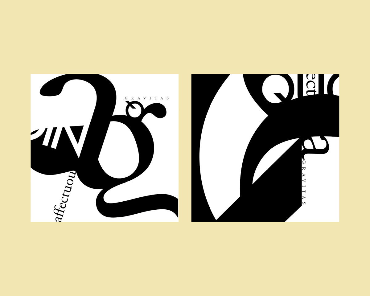
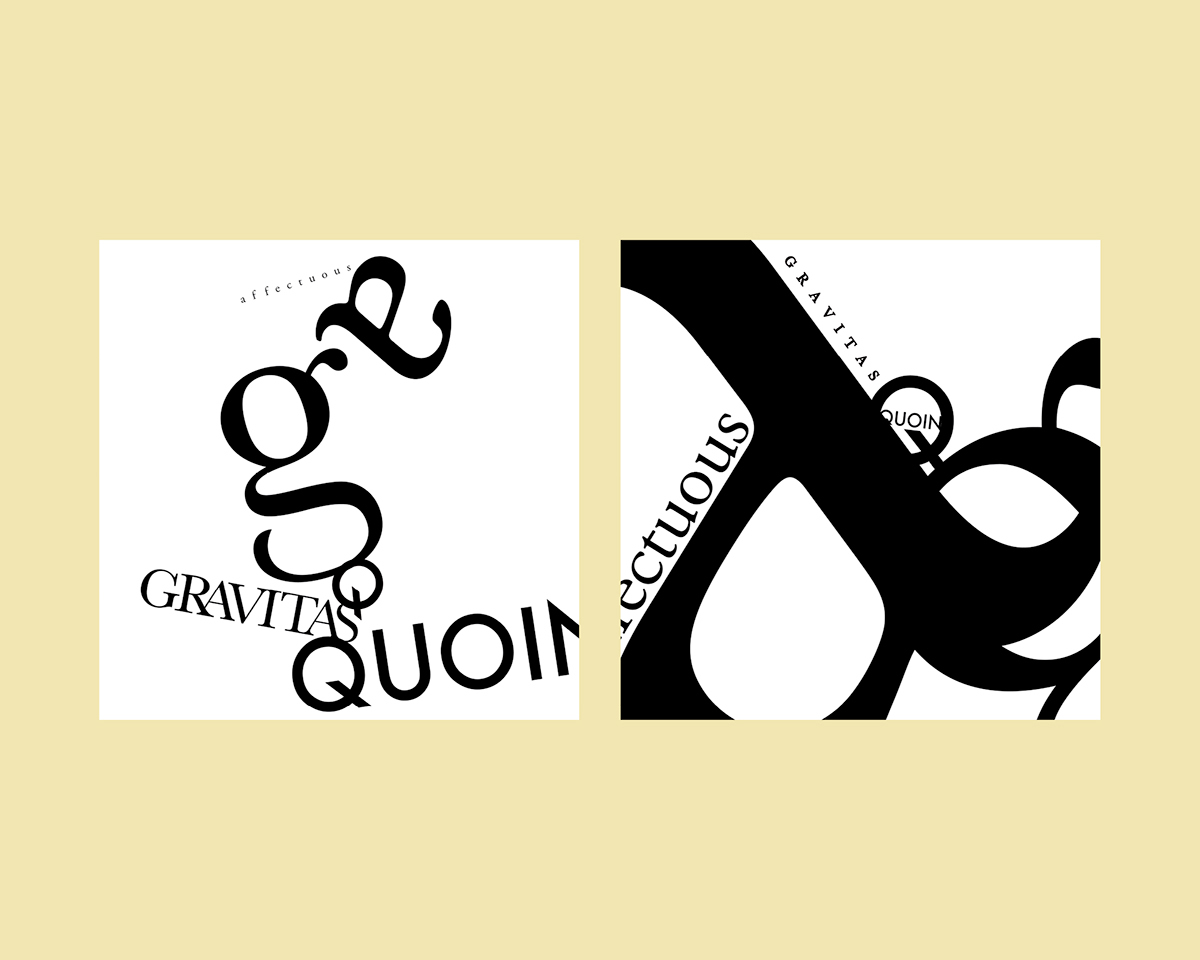
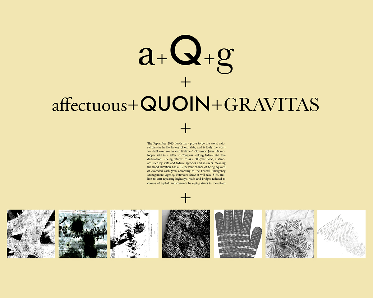
Keep the three letters you chose from the last assignment, and now choose 3 words. They can be any words and do not have to have any meaning or associa- tion with each other. Set each letter and word in any of the following typefaces in uppercase, lowercase, or a combination: Helvetica, Univers, Futura, Garamond, Times Roman, Century, and/or Bodoni (as per last week’s assignment). Do not use any decorative typefaces—only classic, neutral fonts. You can do all the let- ters and words in one typeface, or in any combination of the faces listed (don’t mix fonts within the words). Be selective in choosing letterforms and typefaces that work well together. Use the three words and the three letters to create six new compositions.


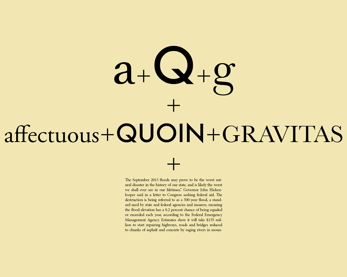
T1-Comp3, Text/Graphic Elements Composition
You will start with the same 3 letters and 3 words you used in the last assignments and now add some text (one paragraph, about 3 sentences, 4-6 lines) and a graphic element.
You will set the type using one of the approved typefaces (see earlier assign- ments). Once you pick a typeface to work with for the text, use that for all compositions. You may adjust the type size, line spacing, letterspacing and column width. You can add more text.
The text should be readable in at least some of the compositions. Other compositions may feature unreadable text (blown off the page, used as texture, etc.).

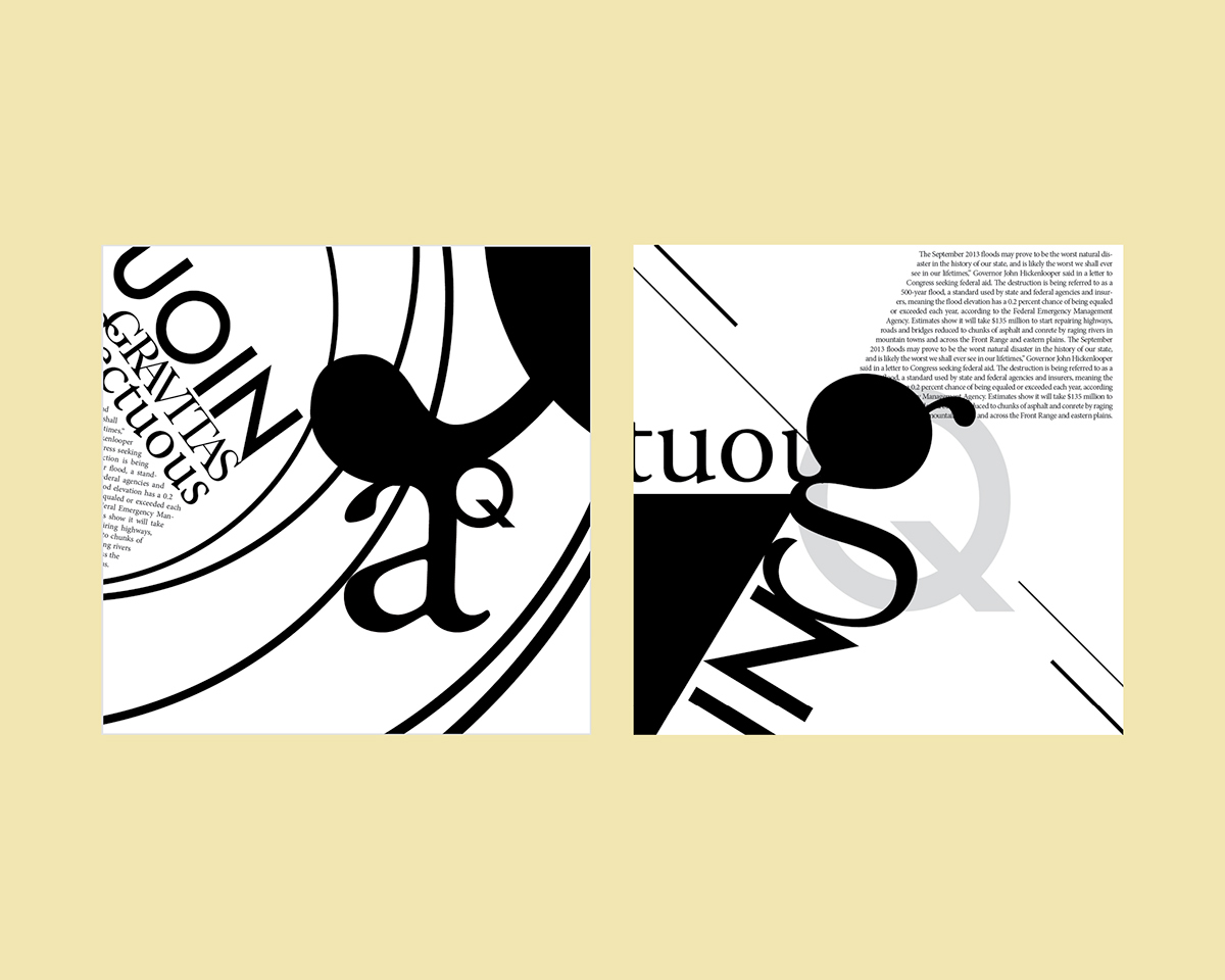

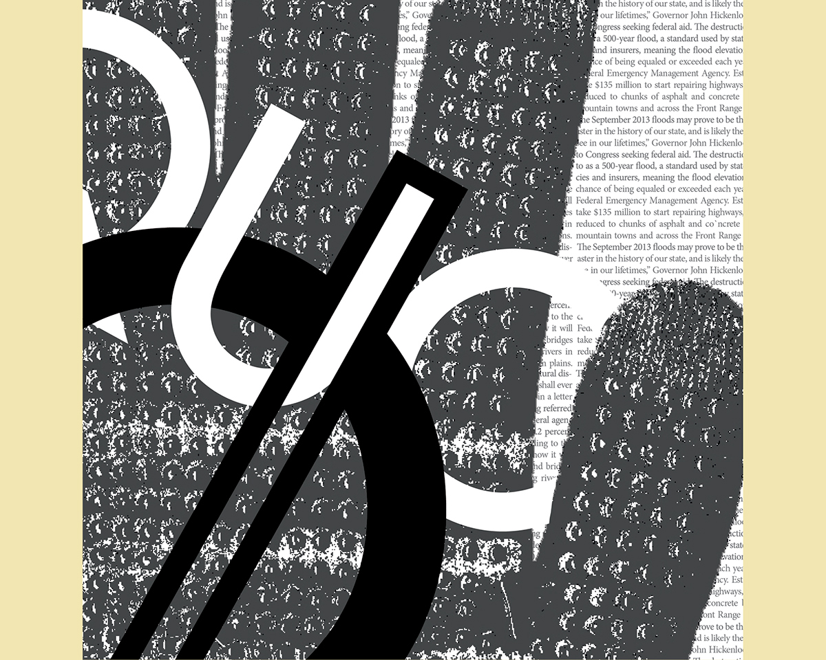
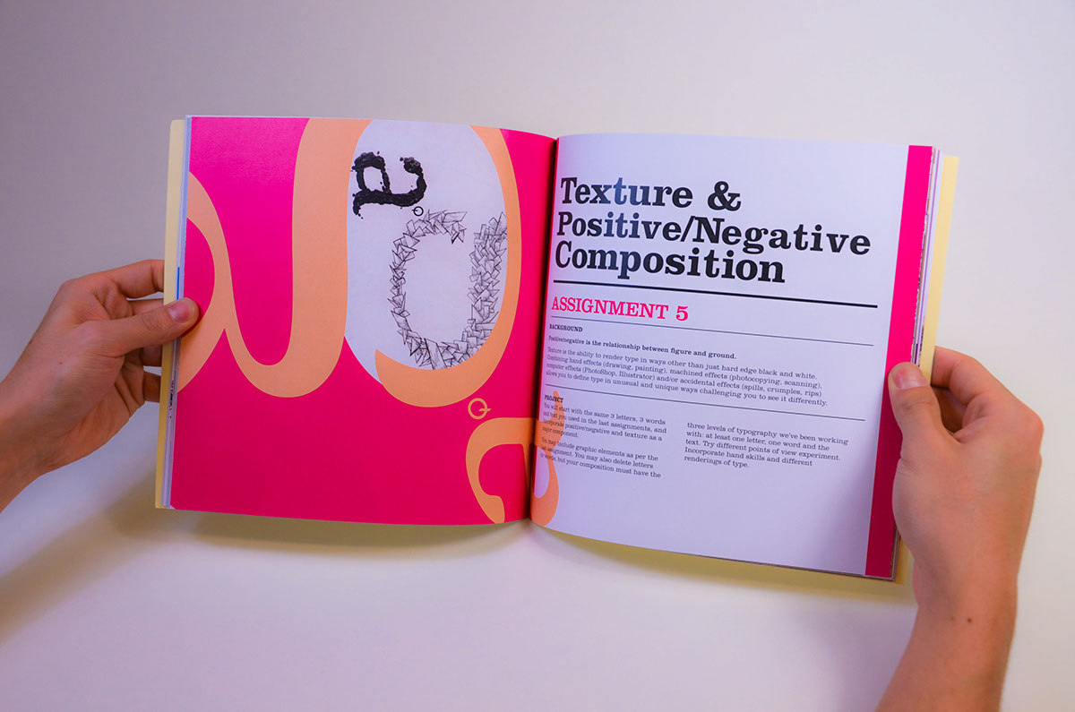
T1-Comp4, Texture & Positive/Negative Composition
Positive/negative is the relationship between figure and ground. Are there black elements on a white ground, or white elements on a black ground? Does the ground interchange from black to white? Just making a composition negative does not deal with those issues.
Texture is the ability to render type in ways other than just hard edge black and white. Combining hand effects (drawing, painting), machined effects (photo- copying, scanning), computer effects (PhotoShop, Illustrator) and/or accidental effects (spills, crumples, rips) allows you to define type in unusual and unique ways—challenging you to see it differently.
Typography exists in our world in many forms — this is an opportunity to explore non-traditional representations of typographic form.
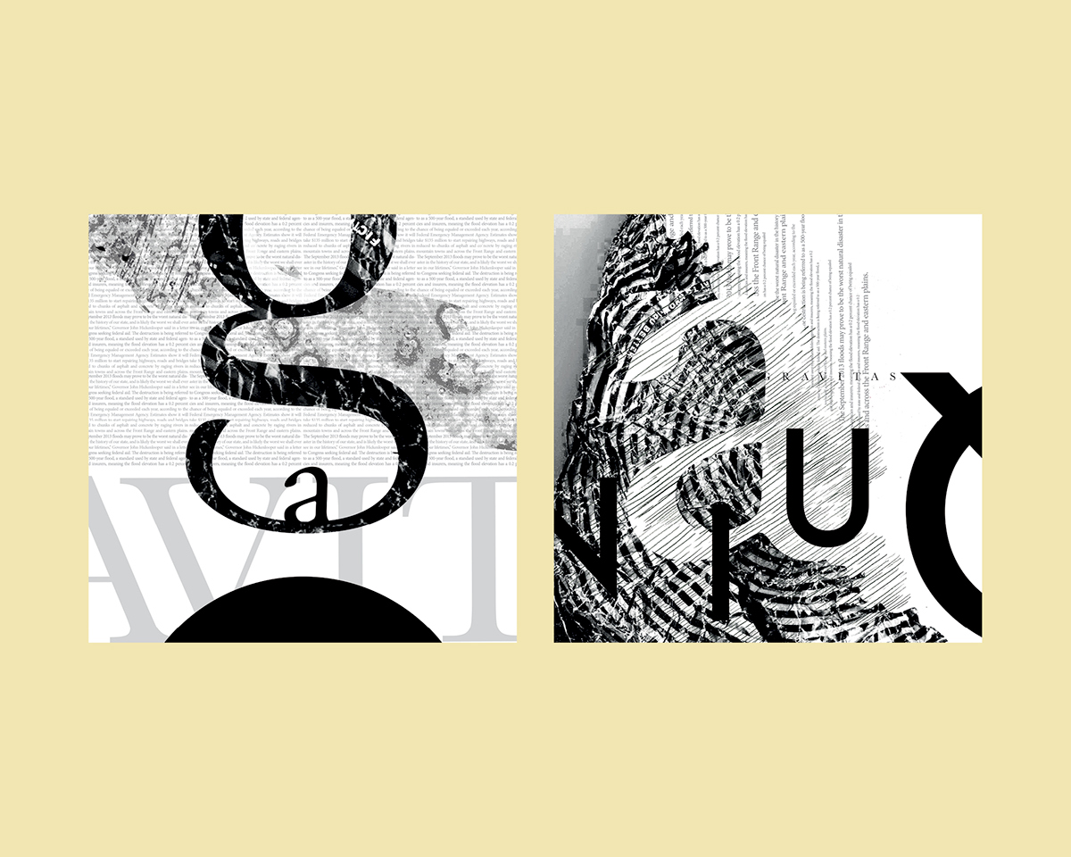
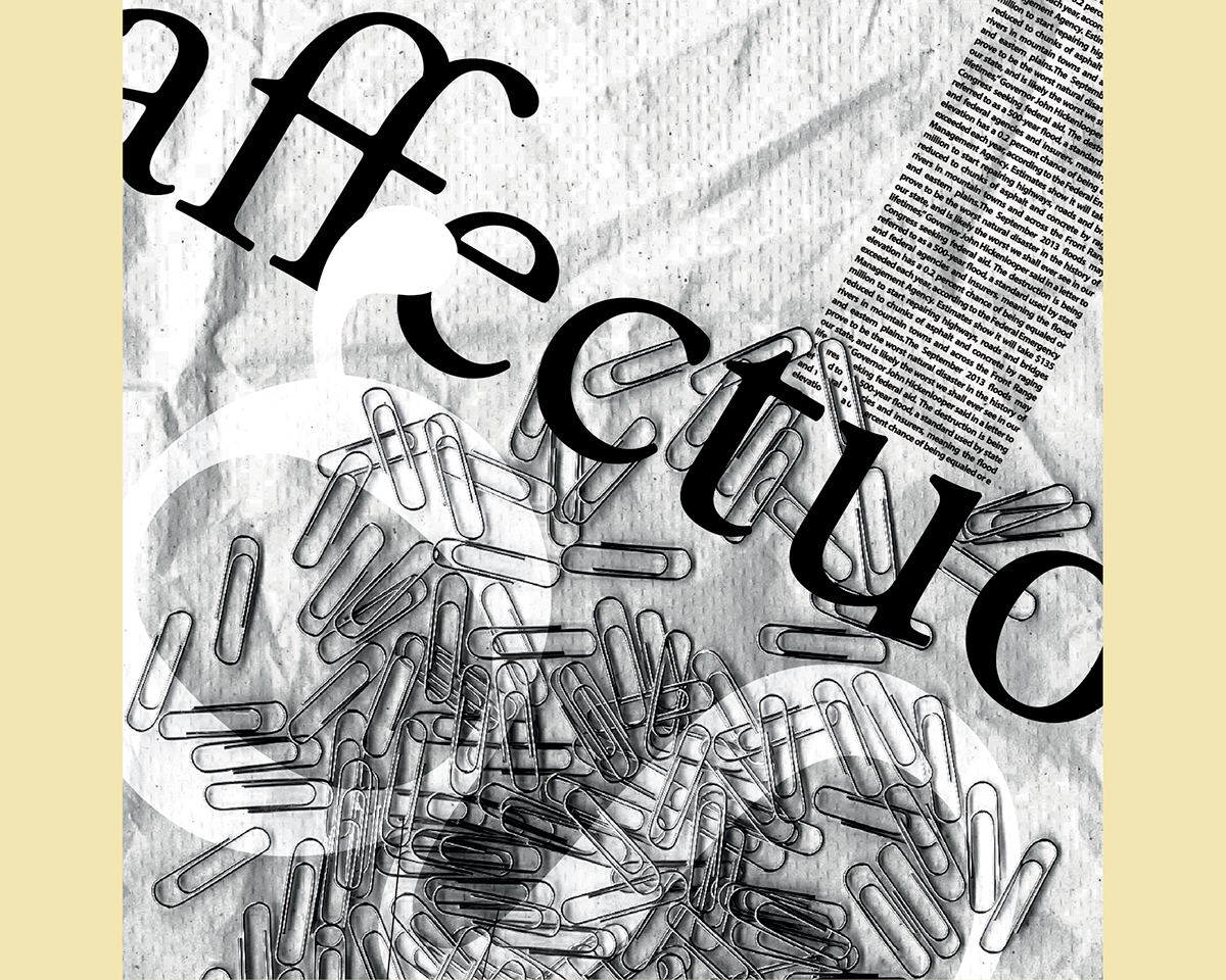

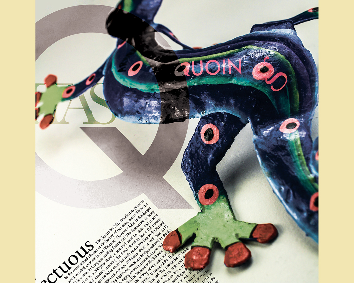
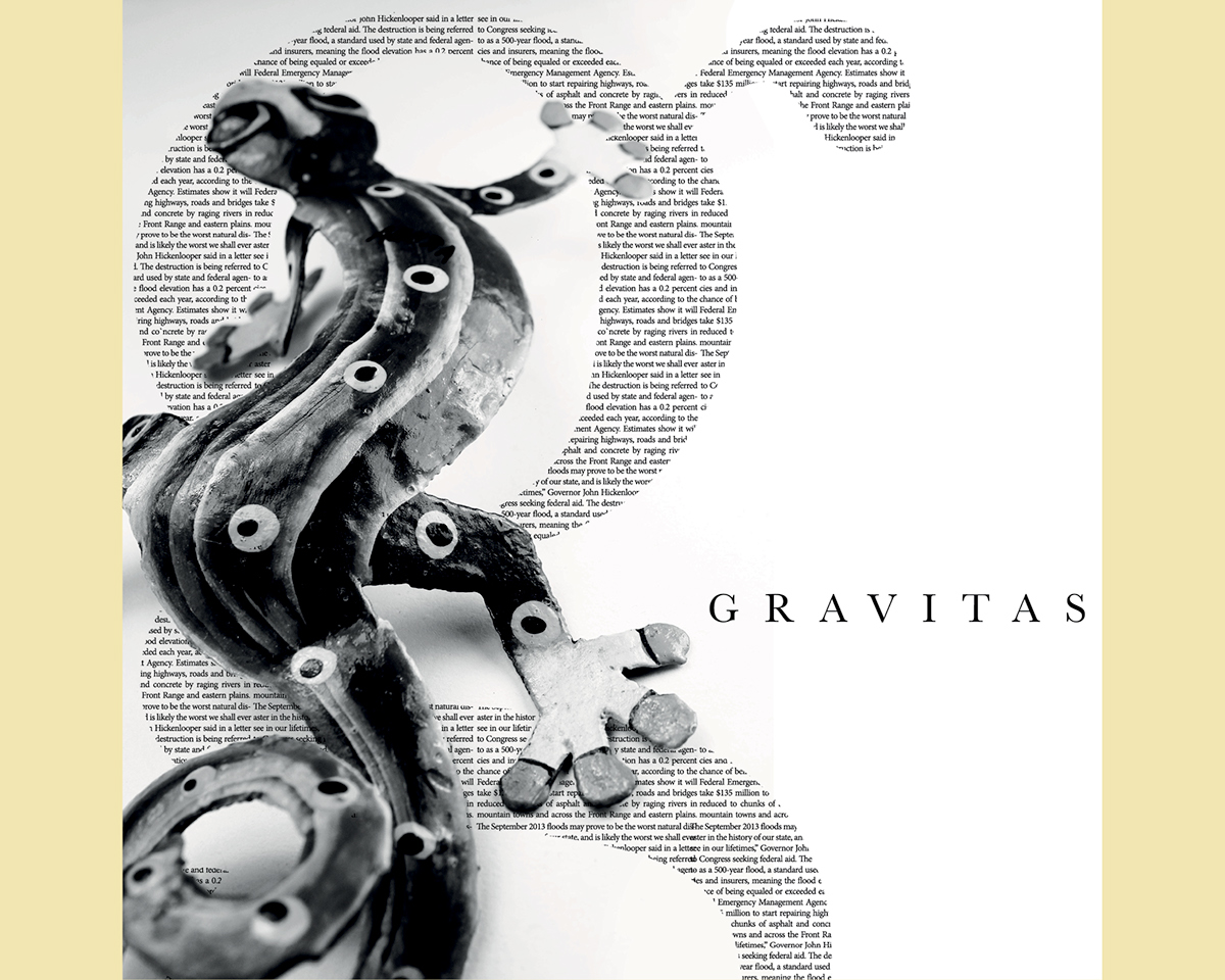
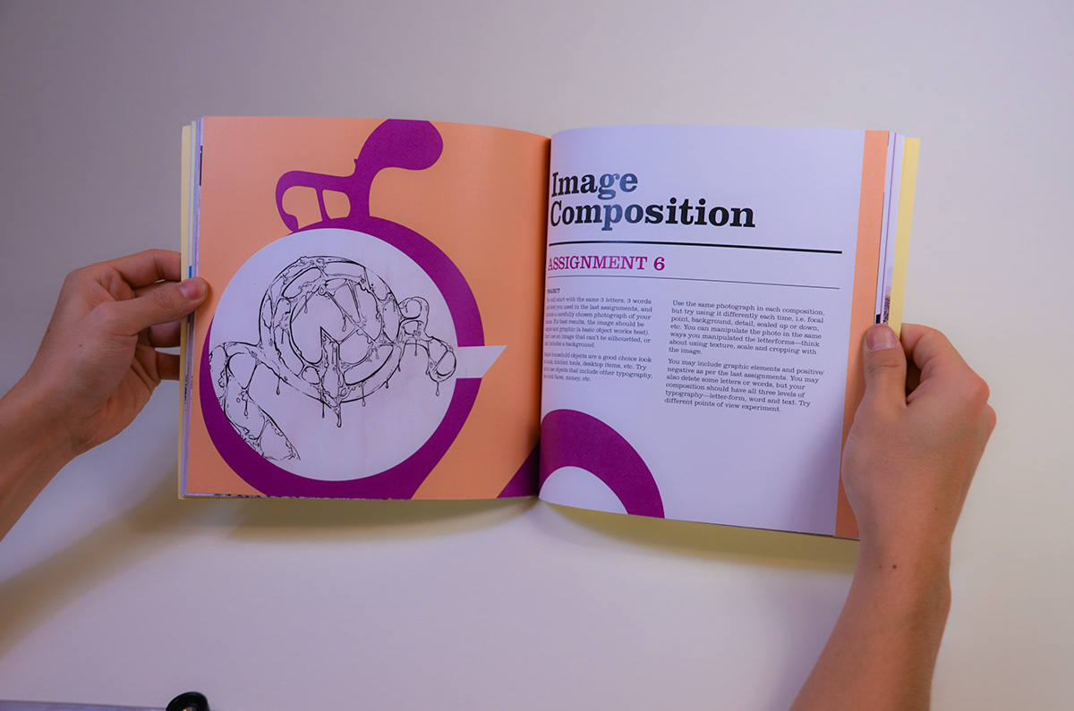
T1-Comp5, Image Composition
You will start with the same 3 letters, 3 words and text you used in the last assignments, and include a carefully chosen photograph of your choice. For best results, the image should be simple and graphic (a basic object works best). Don’t use an image that can’t be silhouetted, or that includes a background. Simple household objects are a good choice—look for tools, kitchen tools, desk- top items, etc. Try not to use objects that include other typography, like clock faces, money, etc.

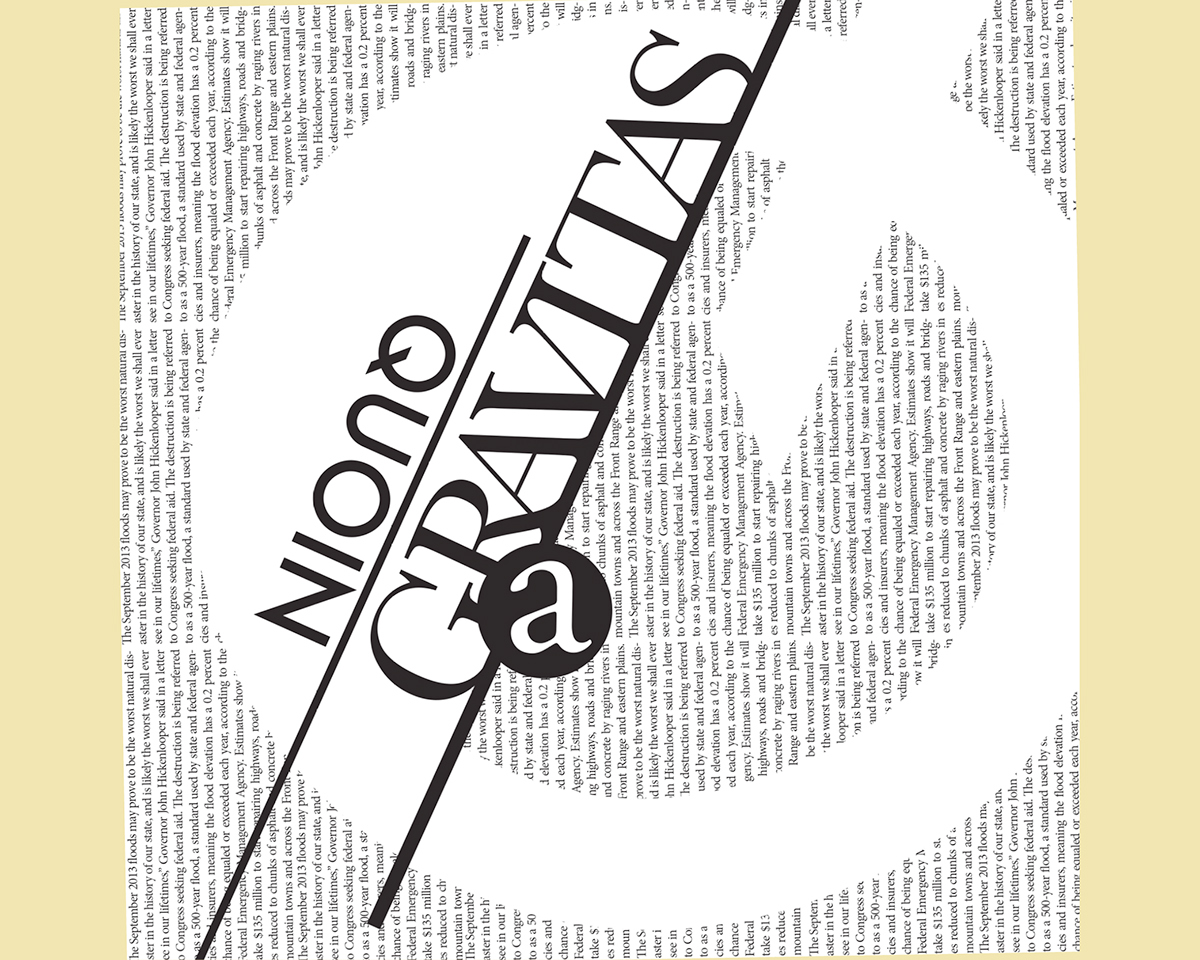
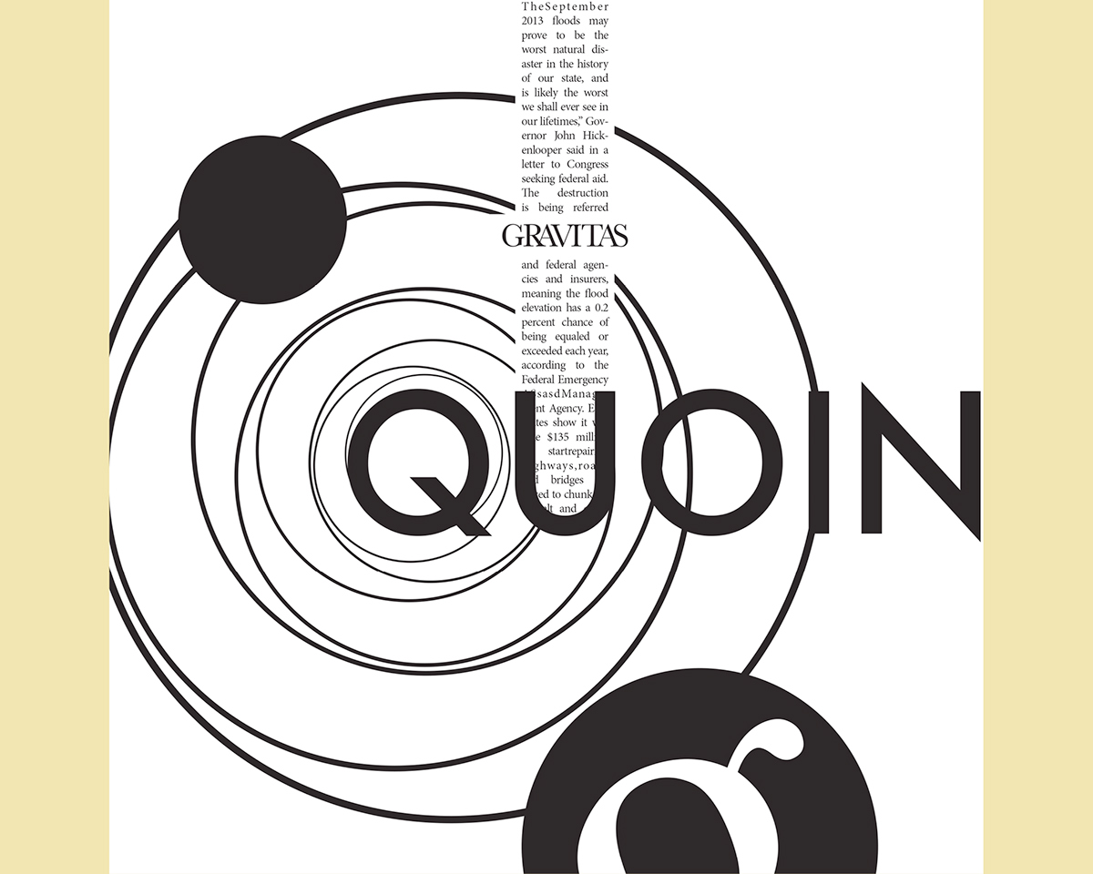
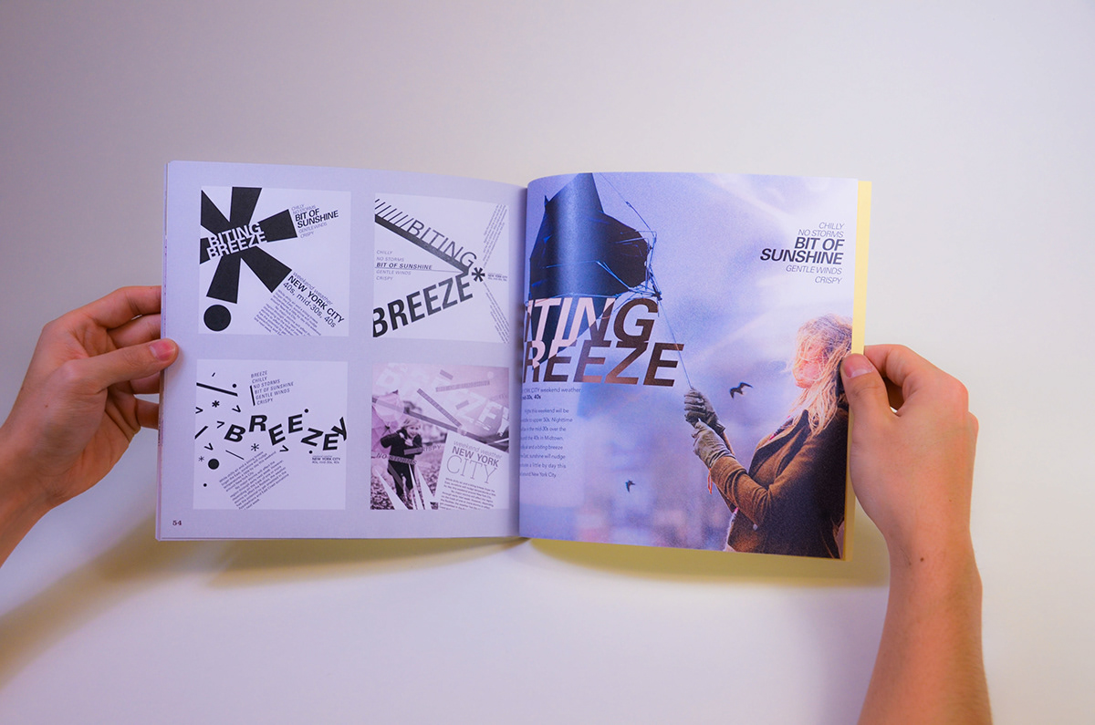
Typographic Variations Through Changing Parameters (T1-05)
To investigate the concept of visual hierarchy and its related properties such as visual punctuation, contrast, balance, rhythm, texture, and visual compensation. To understand how visual hierarchy is achieved through the alteration, manipula- tion, and orientation of typographic elements and how these elements relate not only to one another but to the whole. To translate these concepts into a prag- matic, concrete form. To apply concepts like the effects of letterspacing, leading, typographic size, weight, word spacing, orientation, grouping, spatial relationship to the communication of a message. To understand the function of the grid as an element of design.
Variation 1: Use only one font (one point size and type weight). The leading must remain constant in this variation. After you have chosen a point size to work with, determine the basic amount of leading you want to use. For exam- ple, if you choose type that is 10 points, your leading may be 12 points (2 points of leading, 10/12). In order to achieve a variation of spatial intervals, you may set your type using one unit of leading or any multiple of that unit, i.e 24pt., 36pt. Leading. Choose one orientation on the page (horizontal, vertical, or diagonal) for this variation.
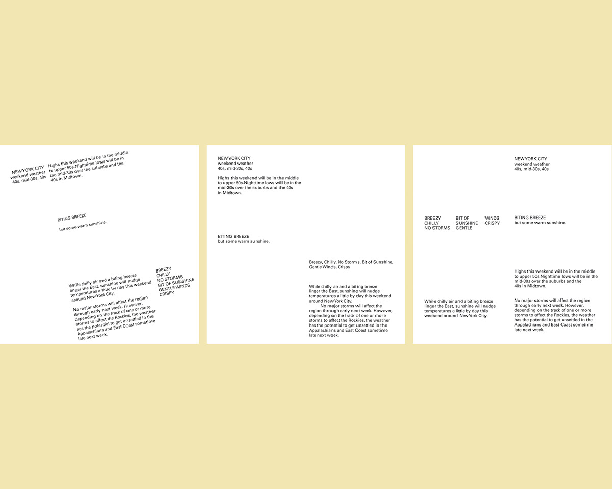
Variation 2: One point size, two different type weights, one leading,
one orientation. Options for variations 3-5: combination of different orientations, varied letterspacing.
one orientation. Options for variations 3-5: combination of different orientations, varied letterspacing.
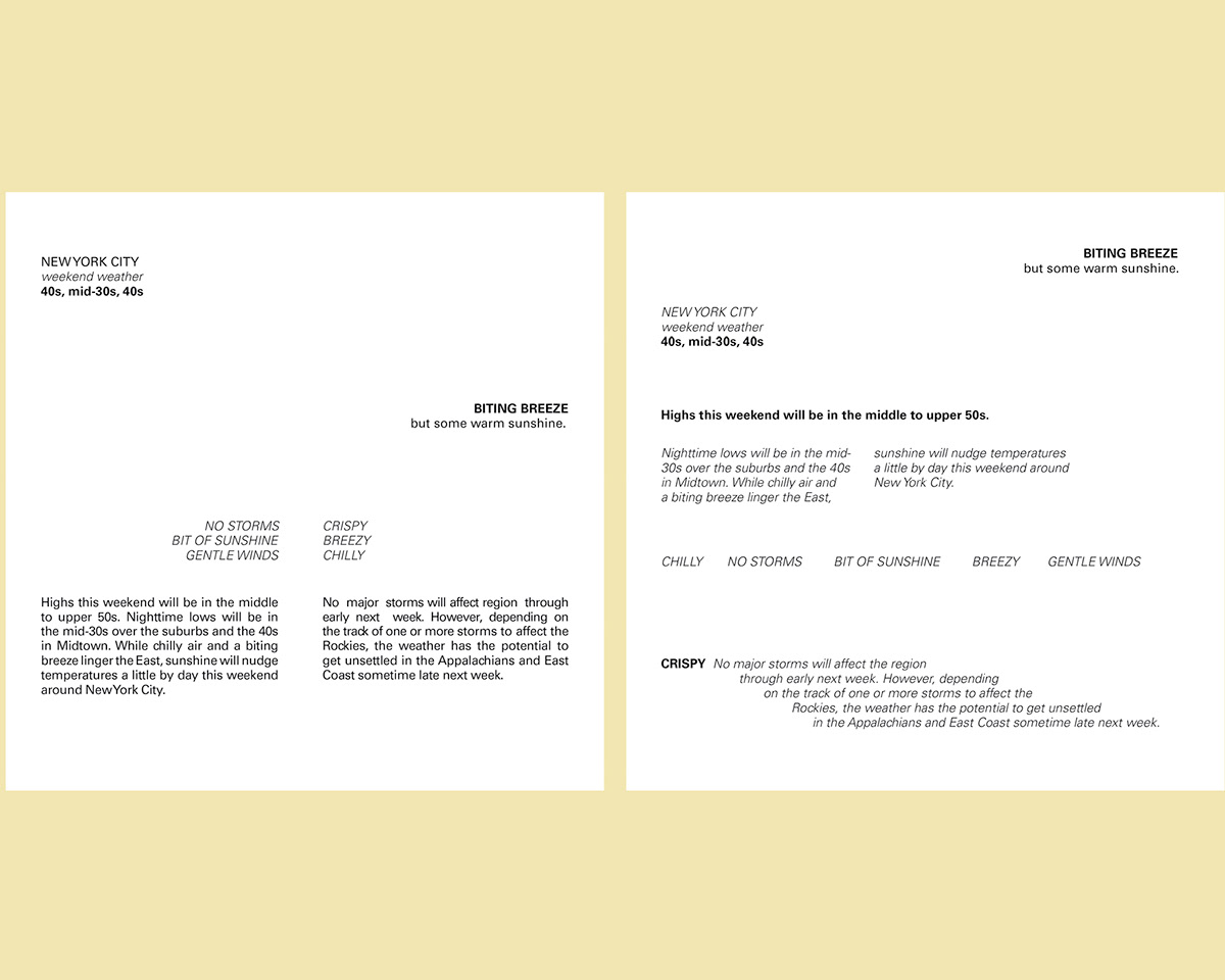
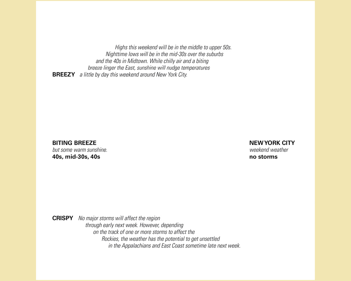
Variation 3: Two different point sizes and three different weights, one leading.
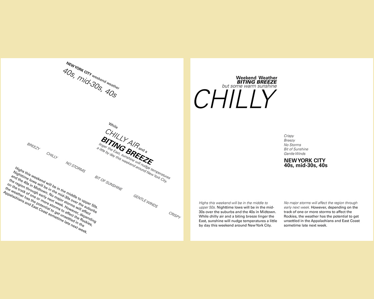

Variation 4: Different point sizes and type weights, different leadings.
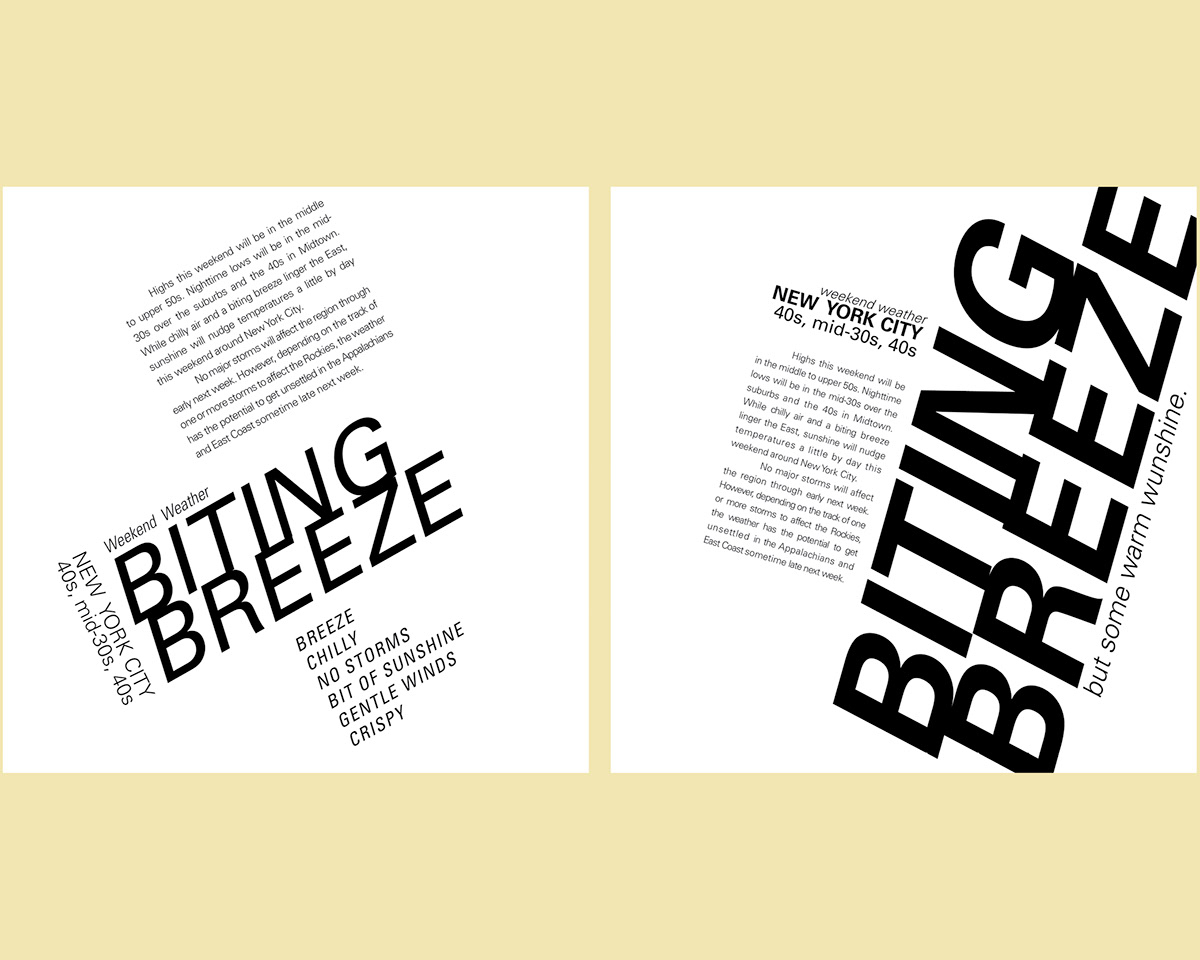
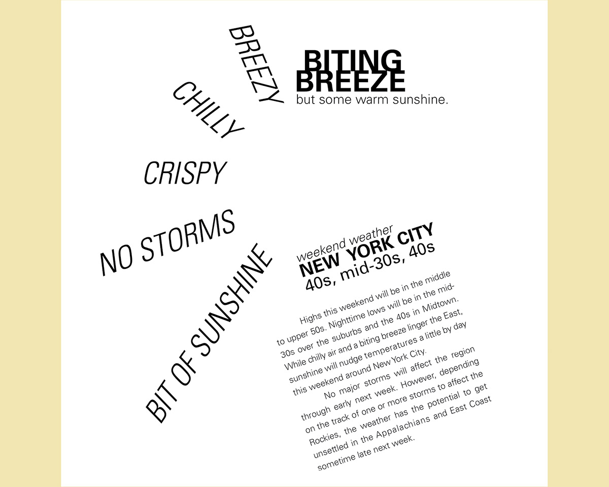
Variation 5: Different point sizes and typefaces as well as typographic
support (ie: rules and bullets, etc.). Enhance the message through interpretative manipulation.
support (ie: rules and bullets, etc.). Enhance the message through interpretative manipulation.
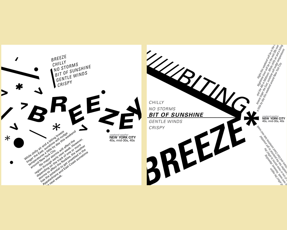

Variation 6: Different point sizes and typefaces as well as typographic support (ie: rules and bullets, etc.) plus a photograph. Enhance the message through interpretative manipulation.


TYPE in Motion:
Creating your own interpretation of what you consider to be type in motion.
So I choose my bike for both form and functionality.
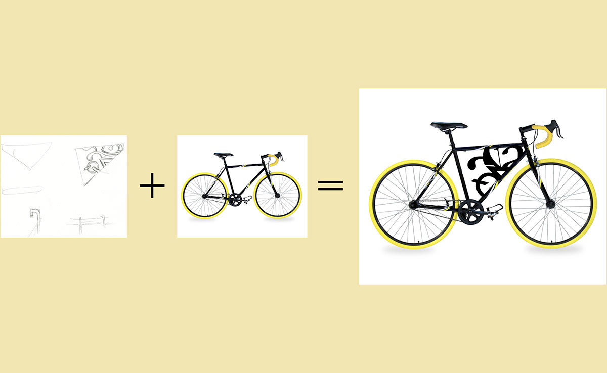

My Professor and my Bike :D.


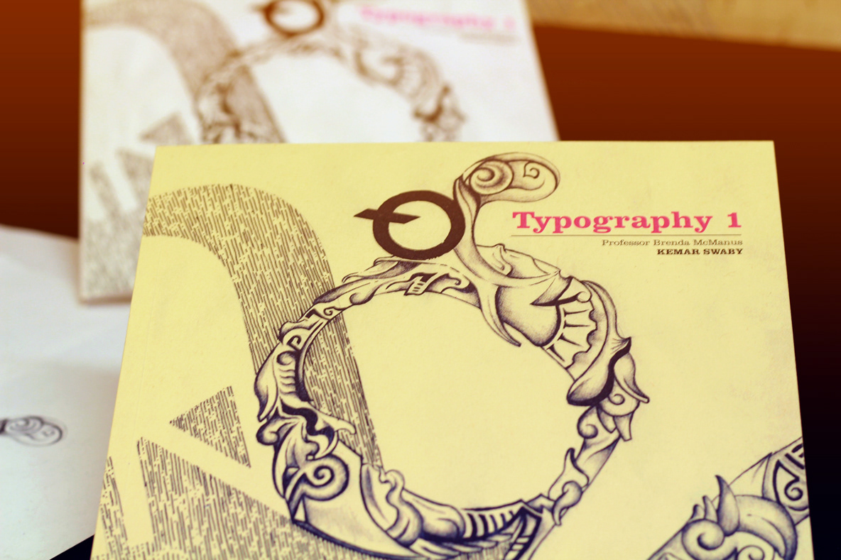
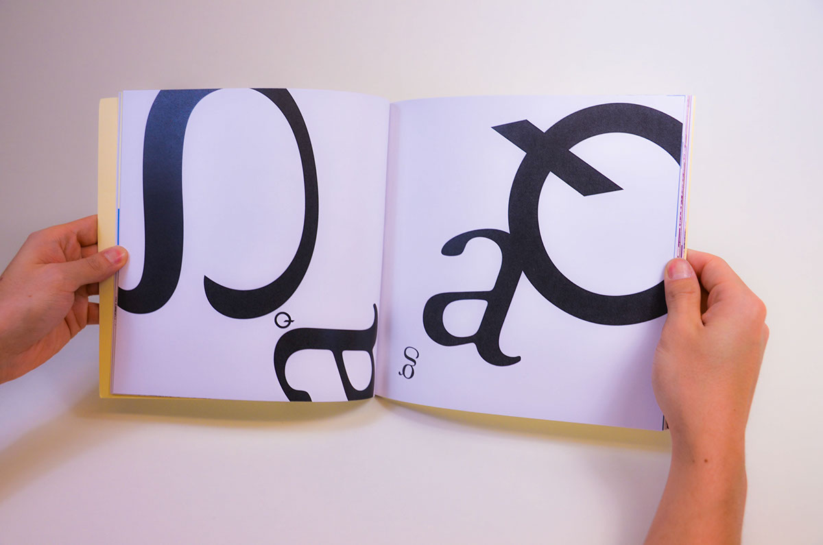
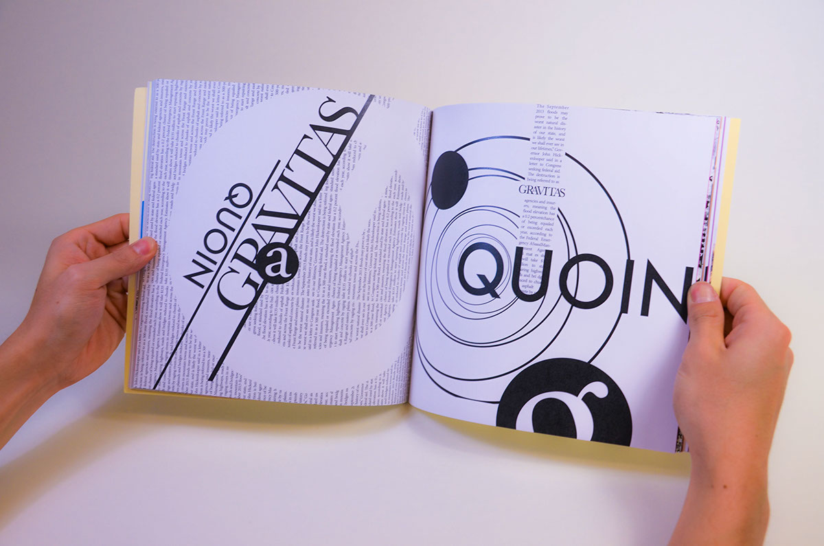
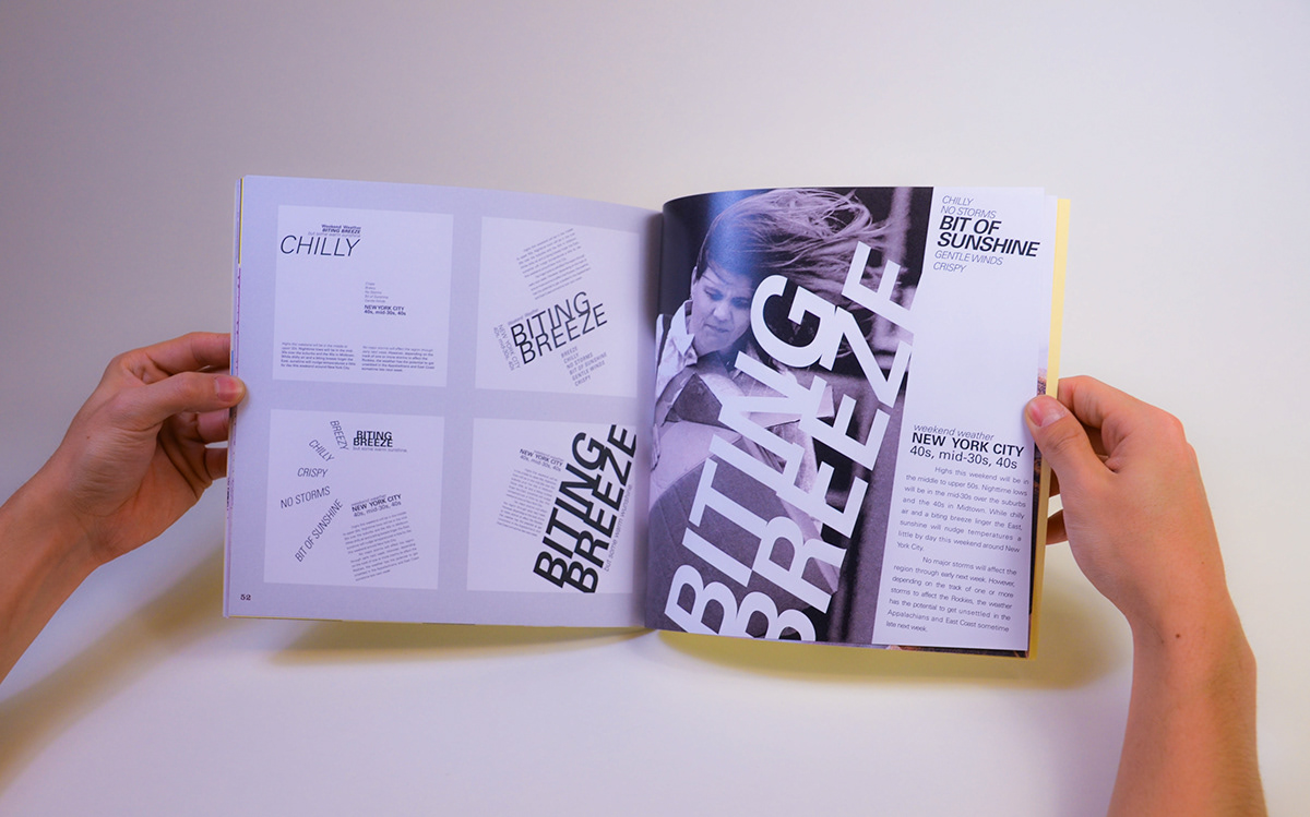
Typography 1 Final Book Production
You will create a 48 page book incorporating many of your composition assign- ments from the past several weeks. This book will be used to present your work at Survey (along with some additional presentation materials) and to hand in at the end of the semester. It will also be an archive of the composition process for you to refer to in the future, and a learning assignment for structure, flow and layout of a multi-page document.
The specifications of the book are as follows:
Format: 8.5” x 8.5”, 44 pages + covers (48 page total, or more at your option in increments of 4), soft cover perfect bound (glued spine)
File prep: inside pages as PDF, cover as separate PDF
Color: inside pages are B/W for compositions with optional color for the other elements. The cover can be B/W or color.
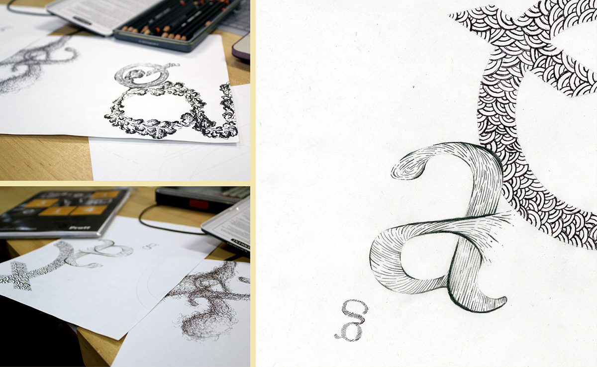
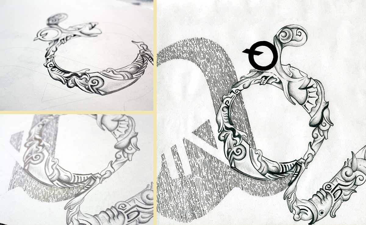
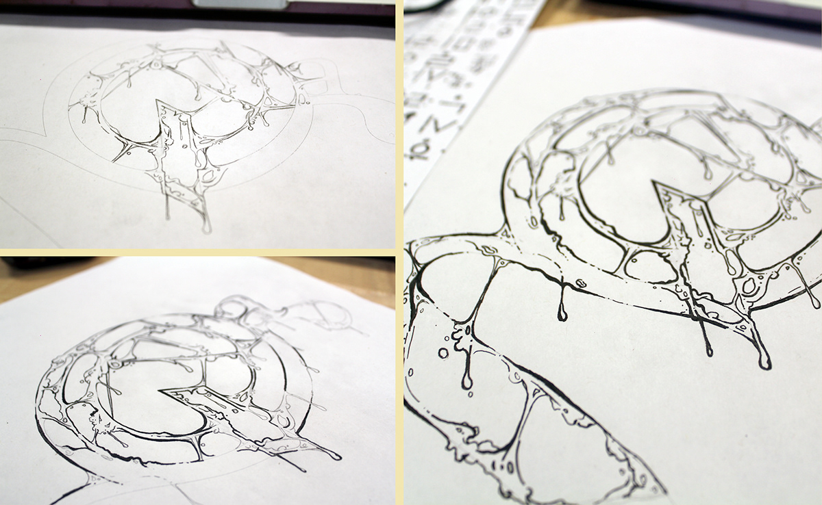
For each section of the book, created a hand down illustration of my interpretation of hand done type.