DAMN! Butter Rebrand
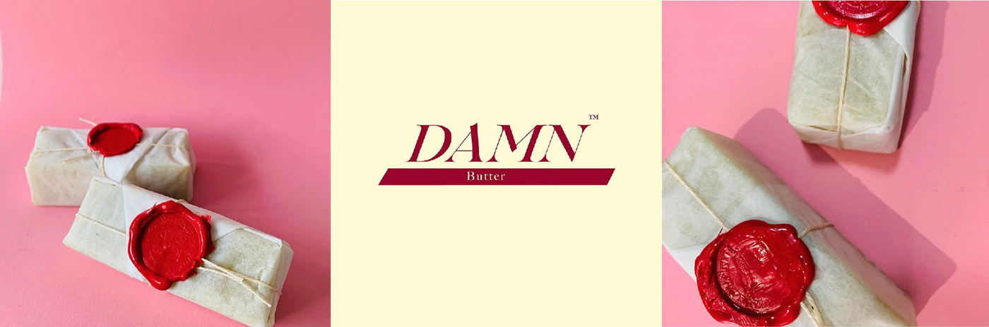
Previous Brand Image
Goal:
Providing the consumer with attractive references in a format convenient to store, distribute and handle. Previously, the product was wrapped in a waxed paper packaging that was not confortable for neither user nor manufacturer, also lacked in design and brand identity.
Problems to solve:
• Since the previous package was only waxed folding paper, the product suffered with temperature changes and handling, leading to deformations and making the brand look unappealing, also causing content loss.
• No brand image in the packaging.
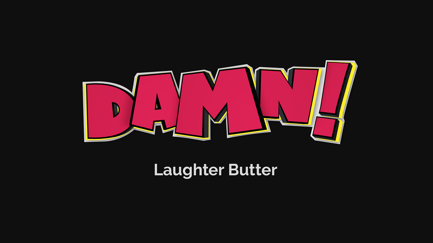
Logo Proposal
I proposed using the same logo but changing its colors depending on the product reference to make a more dynamic brand.

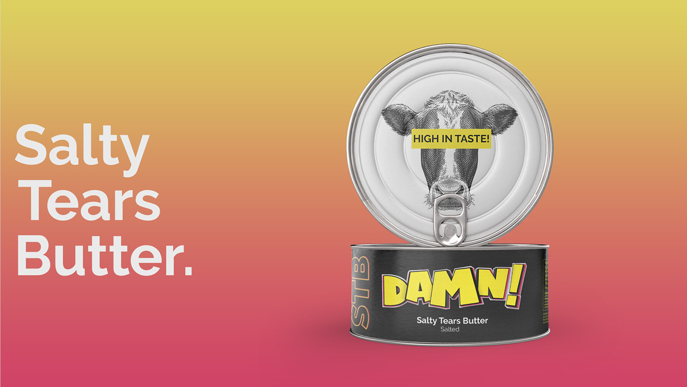
Product Family.
Damn! Butter have three references: salty, no salt and spicy.
Taking advantage of the use of the acronym TCH (tetrahydrocannabinol) and CBD (cannabidiol) to refer to the active components of the products, we´ve named the references with names that allow the use of three letters acronyms to refer to them and make direct reference to their characteristics:
• Salty Tears Butter “STB” - (12% THC).
• Sweet Dessert Butter “SDB” - (12% THC, unsalty).
• High Octane Butter “HOB” - (20% THC, spicy).