Brand development of the Bakerist
chain of bakeries
chain of bakeries
A chain of bakeries for the whole family has opened in Kazakhstan. It offers a wide range of bread for any taste. The brand expresses its passion through a new interpretation of baking traditions, use of alternative types of flour, and professional recipes for croissants.
The combination of words ‘baker’ and ‘barista’ gives the name to a place and to a new profession. Versatile experts work here to bake crispy bread and make aromatic coffee.

Logo is flexible like dough
The essence of the brand is the core concept of the logo. It implies a baker’s rigorous modern professional approach to soft fluffy bread products. The letters are in a shape
of arched vaults and resemble soft cinnamon rolls.
of arched vaults and resemble soft cinnamon rolls.

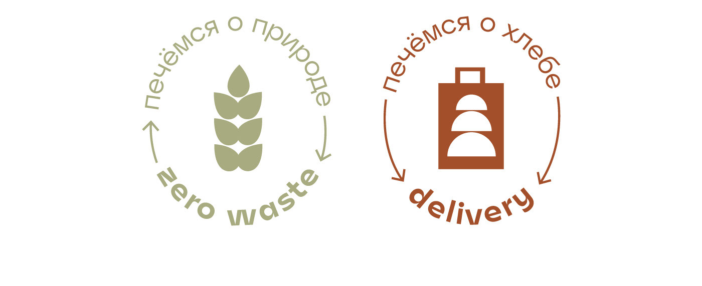
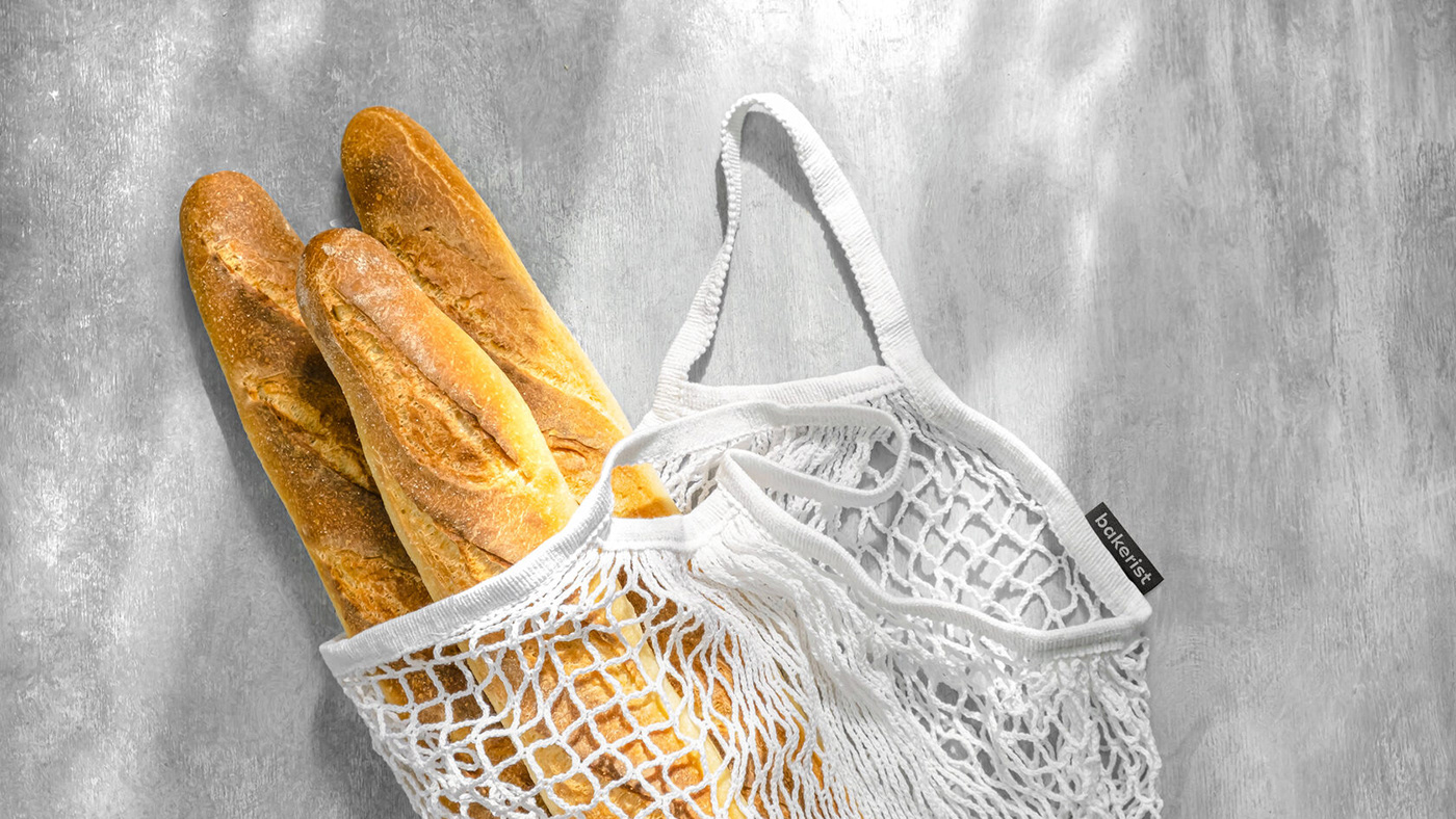
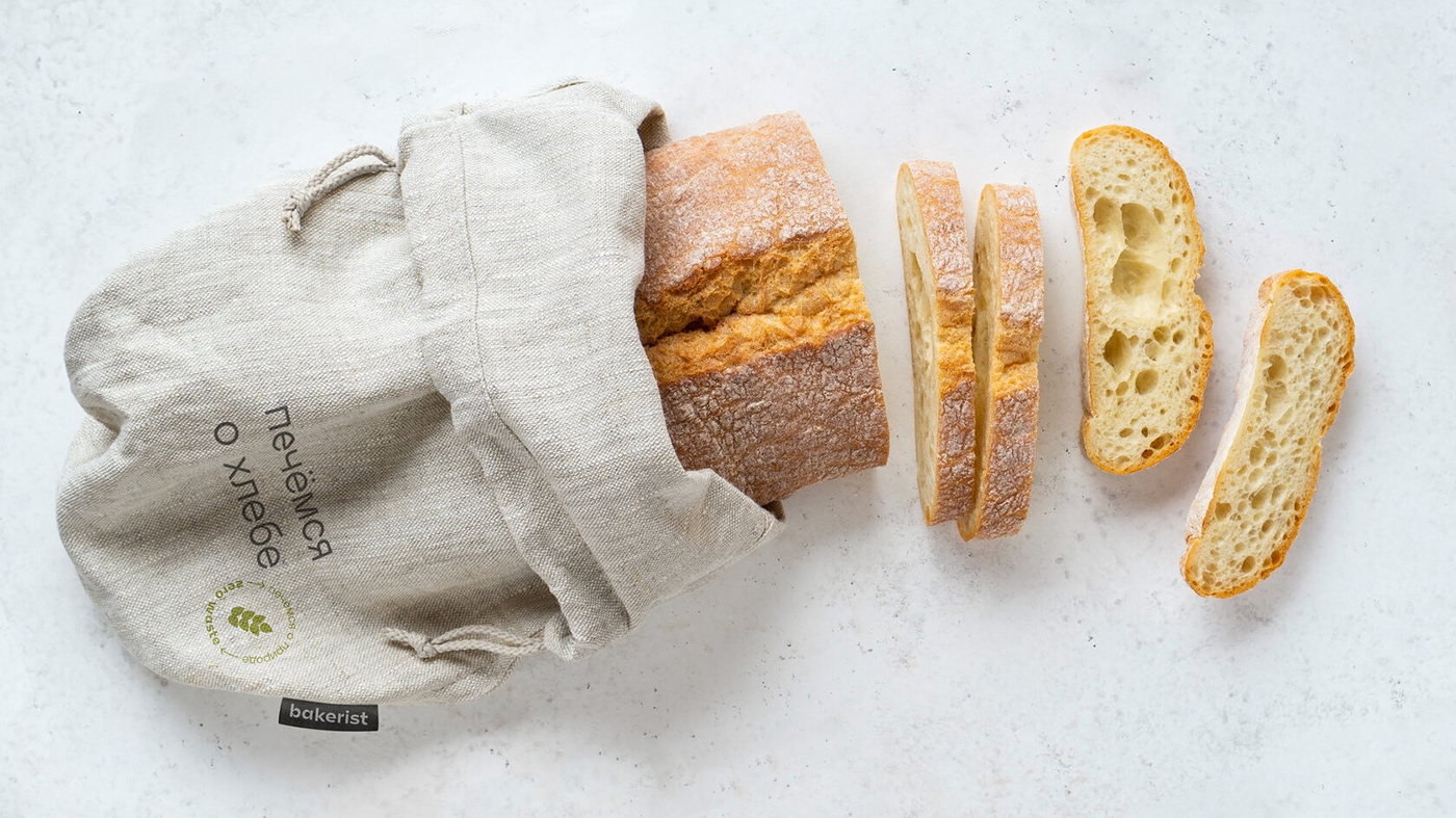
Takes care of bread and nature
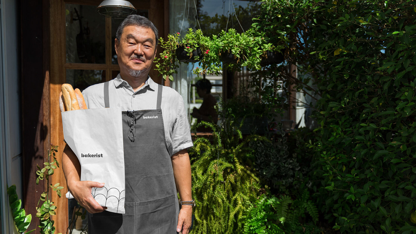
Bakerist respects the concept of zero waste. It does not overuse environmental resources or plastic packaging. The chosen materials are paper packaging and durable cotton. Single color printing reduces the use of ink. The images which depict an eco-friendly concept and delivery option are a part of the corporate identity. They are designed in the style of a stamp and are placed on packaging.
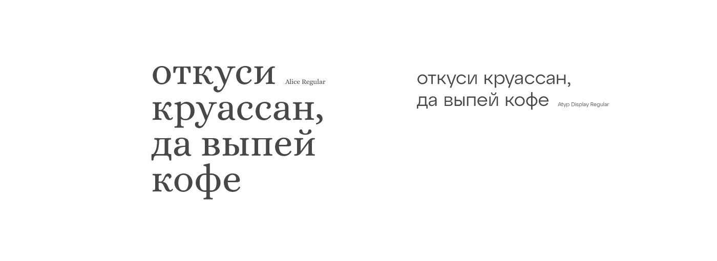
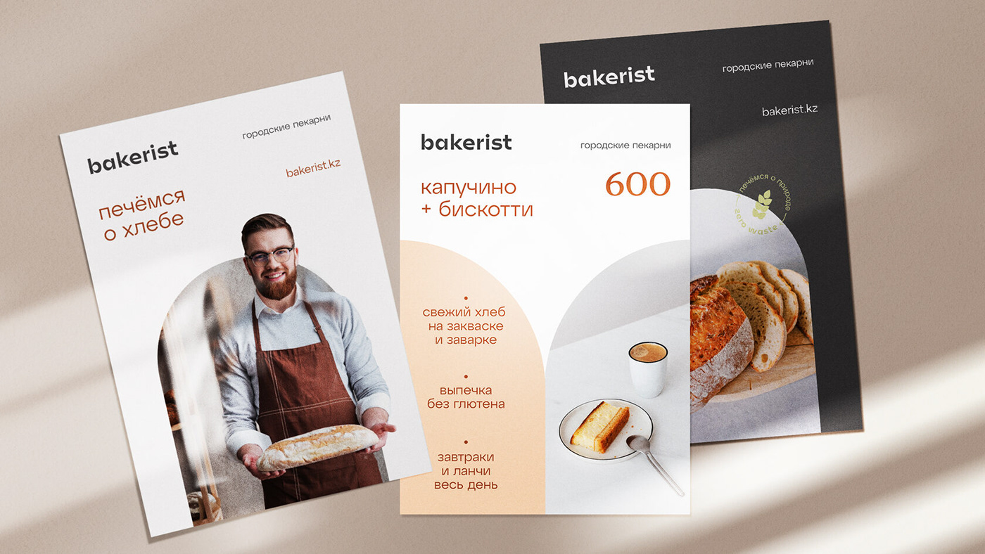
Bread typography
To convey the personality of the brand by means of text we used different fonts.
We combined gentle mannered Antigua and stylish geometric Grotesque. Soft and rounded lines of the headings resemble lush pastry which is taken out of the oven.
We combined gentle mannered Antigua and stylish geometric Grotesque. Soft and rounded lines of the headings resemble lush pastry which is taken out of the oven.
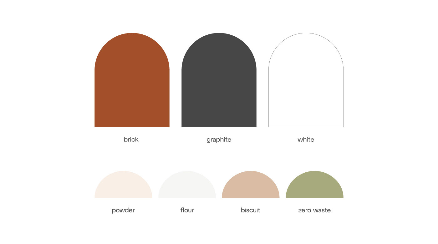
Lush colors
We wanted to convey the impression of visiting our bakery through rich primary colors
and a delicate light additional pastel palette.
and a delicate light additional pastel palette.
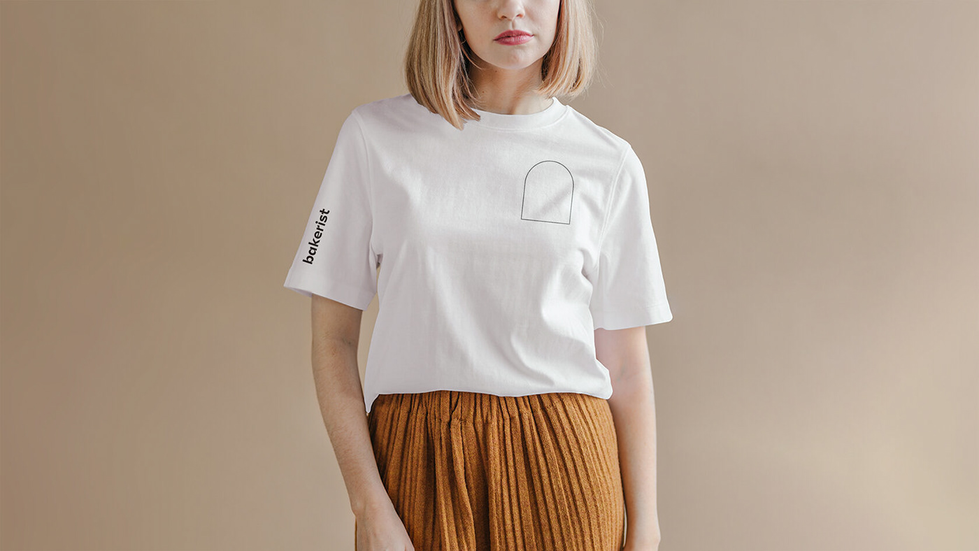
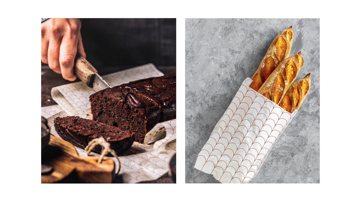
Arched vaults
Traditionally, bread was baked without a mold on the floor of the oven and was called
a hearth. Everyone's favorite crispy crust was created due to the arched vault of the oven. We used an arch as a modern and minimalistic representation of the stove in our new approach to tradition.
a hearth. Everyone's favorite crispy crust was created due to the arched vault of the oven. We used an arch as a modern and minimalistic representation of the stove in our new approach to tradition.
We place it separately or as part of a pattern that reminds us of endless fields of ears.


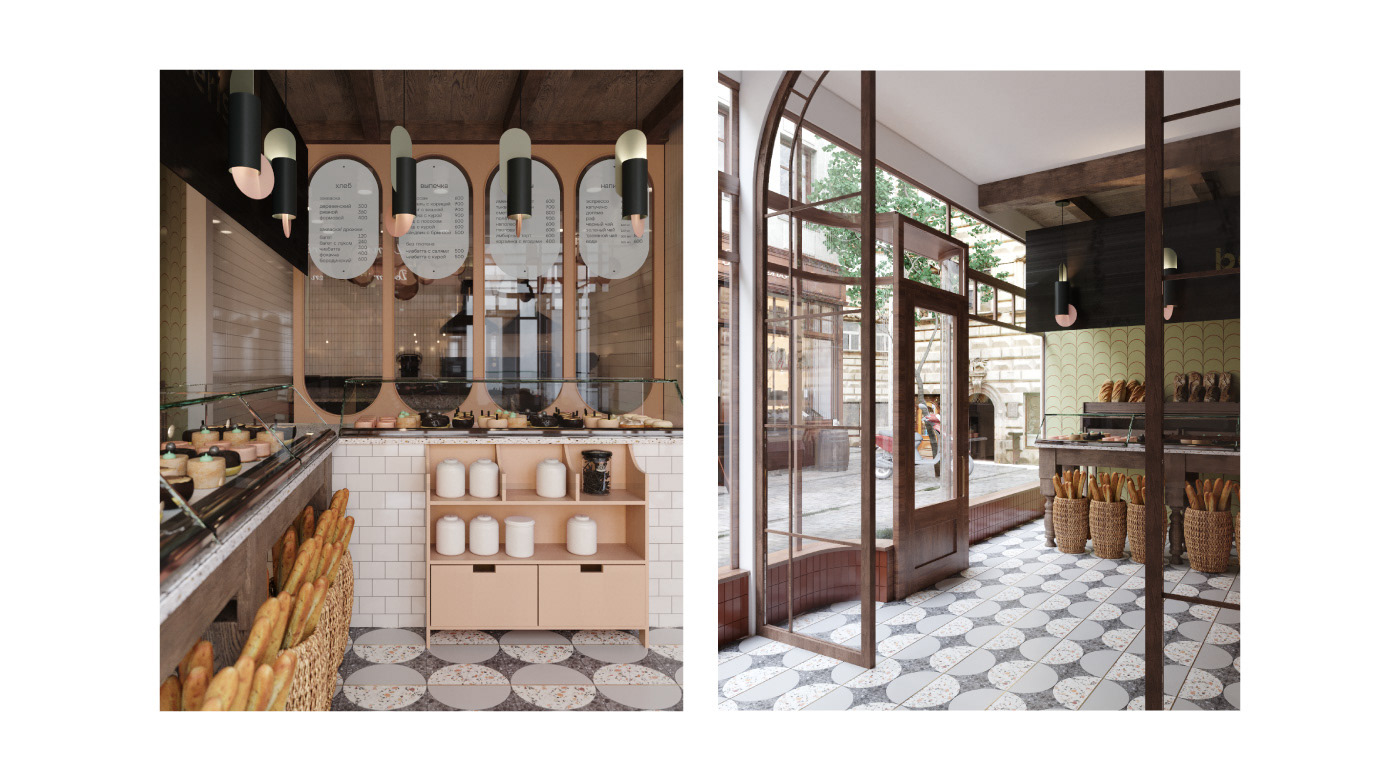
Interiors with open kitchen
We used natural materials such as wood, wicker baskets and ears to decorate the interior of the bakery. The design of the interior is performed in corporate colors and aches which appear on wall tiles. In the open kitchen guests can see how bread is baked and how cakes are decorated. The menu of the bakery is placed perfectly well in the upper part
of the arches.
of the arches.