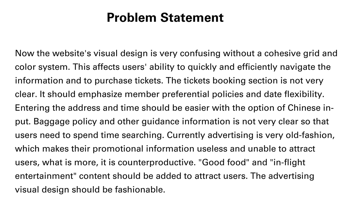
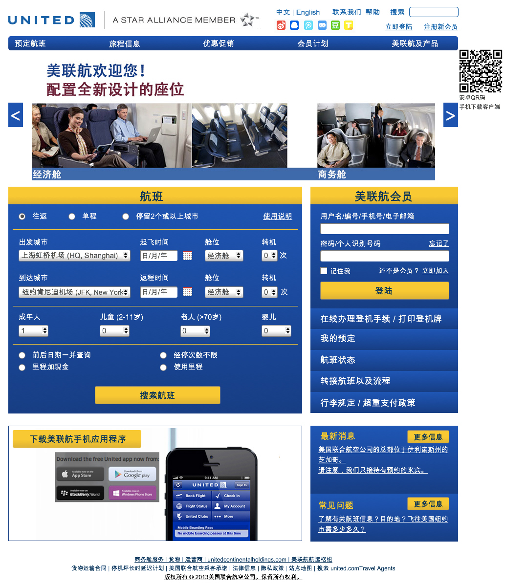
United Airlines has already started business in China. The Chinese official website is the direct translation of the United States version. There are about 50 interviewees for this project, all Chinese users, aged between 18 and 55 years old. This site does not have an organized hierarchy or overall visual style from the menu to specific flight details. Neither the header nor footer is within the overall grid system. Within the different specific blocks, there is also no very strict grid system. Although the site uses blue and yellow as the main color pallet, different blocks have different blues and yellows, and also use different gradients. Ads at the bottom of the page do not have a consistent format, it feels like they are randomly put on the site, many interviewees expressed being tired of “ads which are just for advertisement do not offer any useful information.” The entire website visual design is very confusing, not to mention unattractive, one of the interviewees even said: “it looks like a spam site.”
*This is a personal project. Noncommercial.
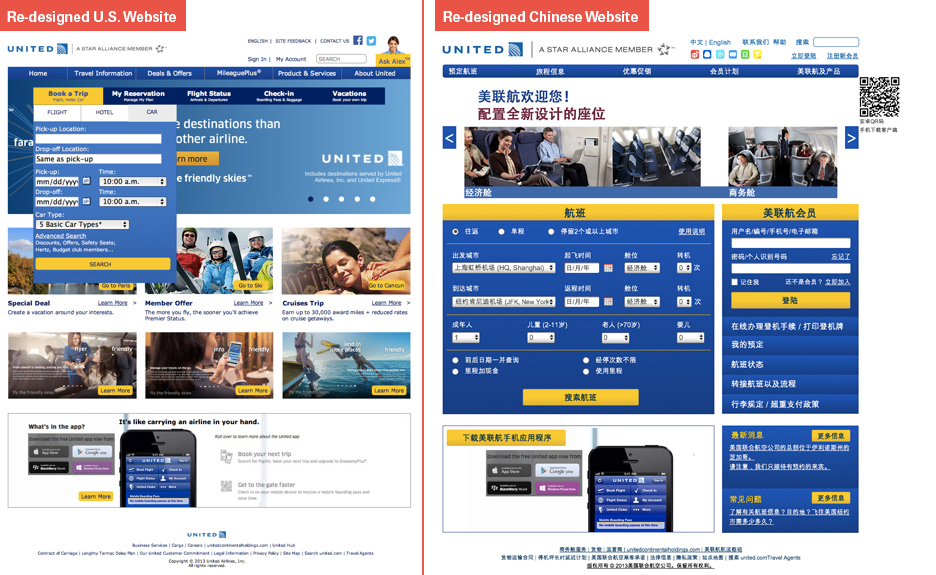
The left one is the home page United China is using now.
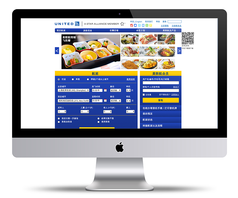
The right one is the redesigned one I created.
The right one is the redesigned one I created.

I already redesigned the U.S. website, here is the comparison. It is interesting to find that Chinese users do not mind the drop-down menus which are used in more minor functions
* More research including Competitor Analysis in the complete paper, if you are interested, drop me a line through email, we can talk about it :-)
Persona
After the interview, I analyze all the information and create the persona for United China.

Conclusion
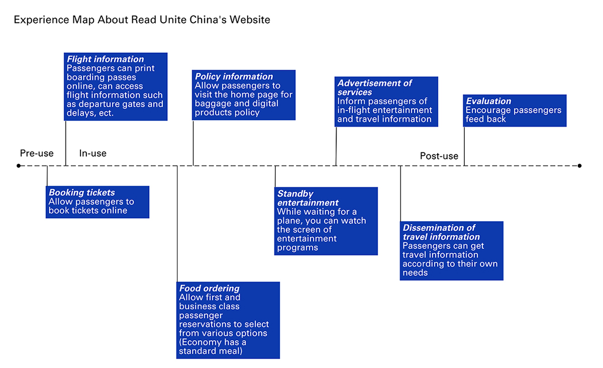
User Experience Map
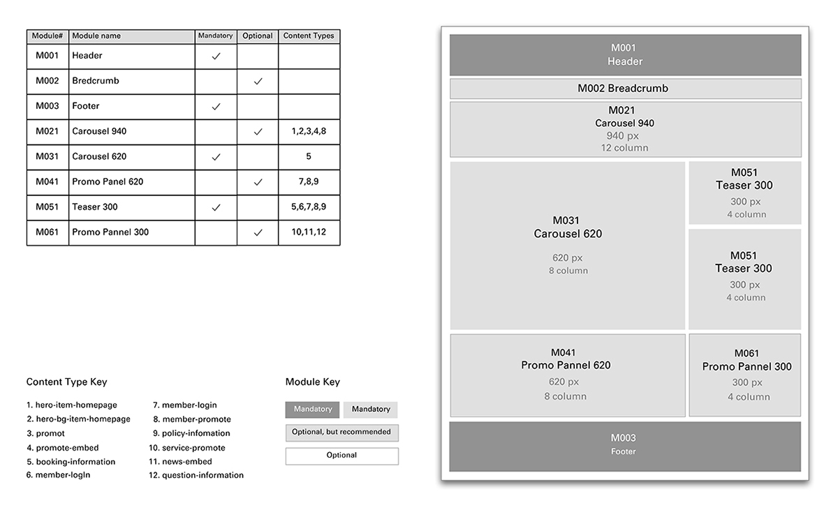
Grid System

Information Architecture
Wire-frame

The Whole Page Visual
Details
From the interviews, most users are generally concerned about the clarity of the basic information, which includes: booking the flight, online check in, reservation information, flight status, connection flight, login and baggage policy. Connection and baggage details are rarely seen on Chinese airline websites in a prominent position and users have to search them which takes time. In the interviews, close to 95 percent of the users reported they were not familiar with or often forgot these two pieces of information, especially about the policy of carrying liquids onto aircraft, and baggage size and weight limitations. 80 percent of interviewees between 20-30 years old who often purchase flight tickets online, responded that they would focus on membership points card offers, the mileage accumulation policy, and they would like to have price comparison within three days of the exact days entered, so they can adjust the travel date and save more money.


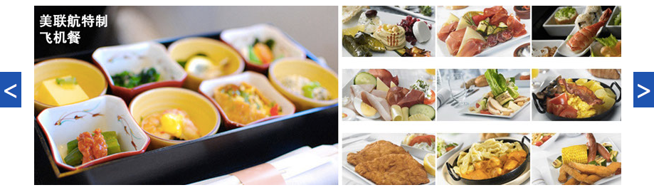
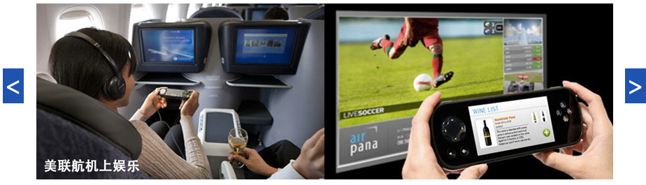
Among younger respondents, several said, if an advertisement displays very delicious free meal photos, then it will become a huge attraction to them. When other airlines don't have such advertisements, they probably will choose this one because of this promotion. Other attractions, such as in-flight entertainment, should also be included.

QR Code
Chinese users have become accustomed to a QR code on the webpage, which can help websites extend the user experience into the mobile world. In my survey, 80% young users have learned how to use the QR code and also have scanned at least once and andoid is more popular than other systems.

Social Networks Link
It is always necessary to put social links on the website for sharing.
These are popular Social Networks in China.
It is always necessary to put social links on the website for sharing.
These are popular Social Networks in China.

Prototype - Visual


Demo Video - Interaction

