


It is with great pride and joy that we present you Clubcamping's new face! *removes bandages and turns chair*


The last couple of years we've been working hard on refining our craft, growing step by step.
And we knew we needed a makeover that reflected our growth and experience.
Following our group therapist’s recommendation, we wanted to share with you part of the long soul-searching process required by this reinvention.
Please, take a look around and let us know what you think!
But first...

We had no clear concept; just some loose ideas.
We all know a concept is the fundamental premise that will articulate and guide your narrative—a compass.
So, with no compass—but a great deal of hysterical laughing—we embarked on a design journey to find nothing but our own identity.
This went just as badly as anyone would expect. Including us, except at that particular decisive moment.
A couple of months later, we had a nice and very professional graphic system designed.
But we felt it wasn't us.
Realizing we would have to adopt a completely different approach, we faced up to the decision of tossing out several weeks' worth of work as part of a bigger process.
It took countless cups of coffee and a few days of heavy contemplation before we were ready to start all over from scratch.
We lingered on the—still warm—material but knew our heart wasn't there.
Upon a last look, we noticed a tiny element. A spark, a star.
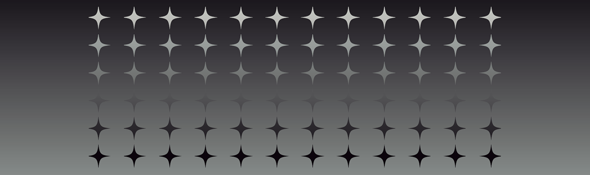
And, suddenly, everything started to fall into place.

That star or spark connected several ideas and scattered concepts we'd been toying with before, and that somehow resonated with us.
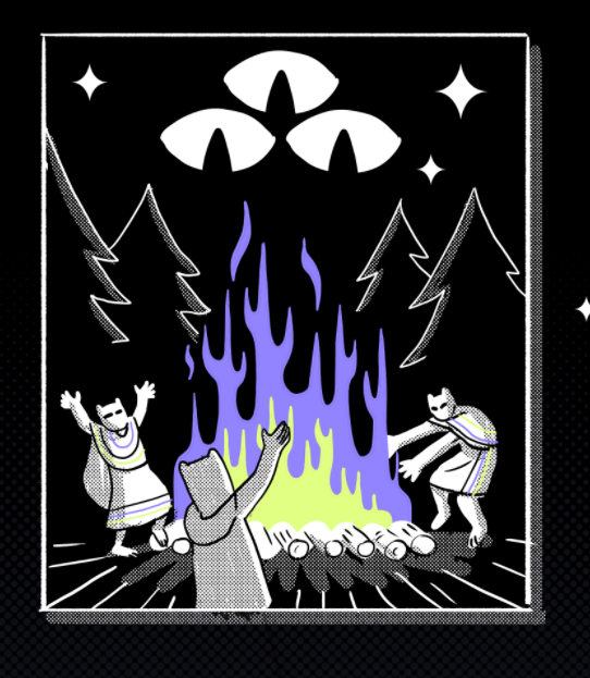
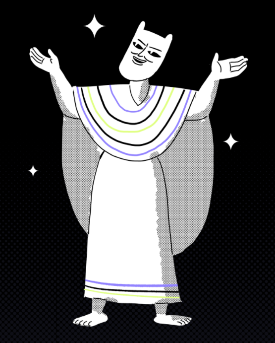
A starry sky in a forest; the night as a creative time, with all the creatures that thrive in it; the spark as a symbol of magic and mysticism.
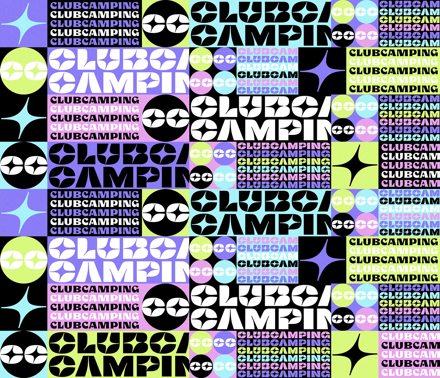
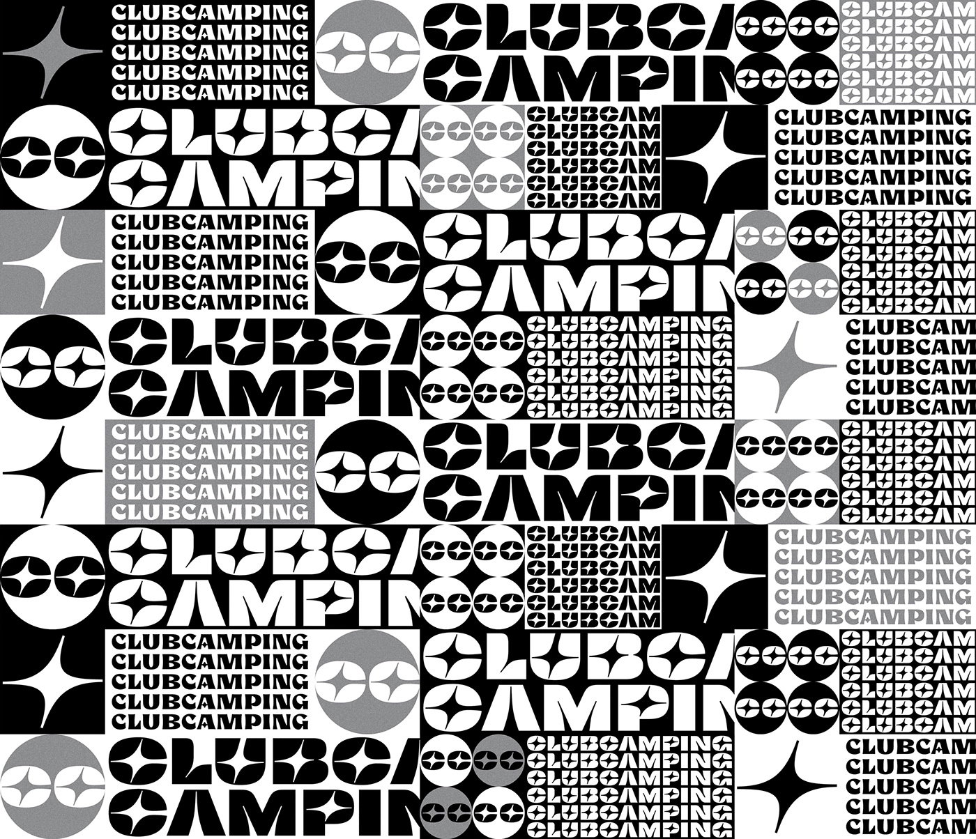
We produced some illustrations to set our tone.


We then started sketching logos, moving in whichever direction felt right, with the star as a key element.
We wanted to look mature but not too serious, playful but not childish, elegant but not dull.
So, maybe after two or three iterations on the same sketch, we ended up with something that felt like home. Something that reflected the tone and spirit of Clubcamping in a way we couldn't clearly explain but was just right.

It was the exact opposite of the previous process—so concise and spot-on.
Maybe we were starting to believe *kung fu moves*
The next step, undoubtedly, would be handing the logo to a designer who could give it an expert finish.
That's when we got in touch with the amazing design pros: YaniGuille&Co. (a.k.a. Yani&Guille).

We discussed design at length with Yani&Guille—what we wanted, what we didn't, and what they could bring to the table. We ended up with a highly elaborate briefing: “Make this look awesome.”
They were even more excited than us, which was incredibly motivating, but somehow also made us feel we were already behind schedule.
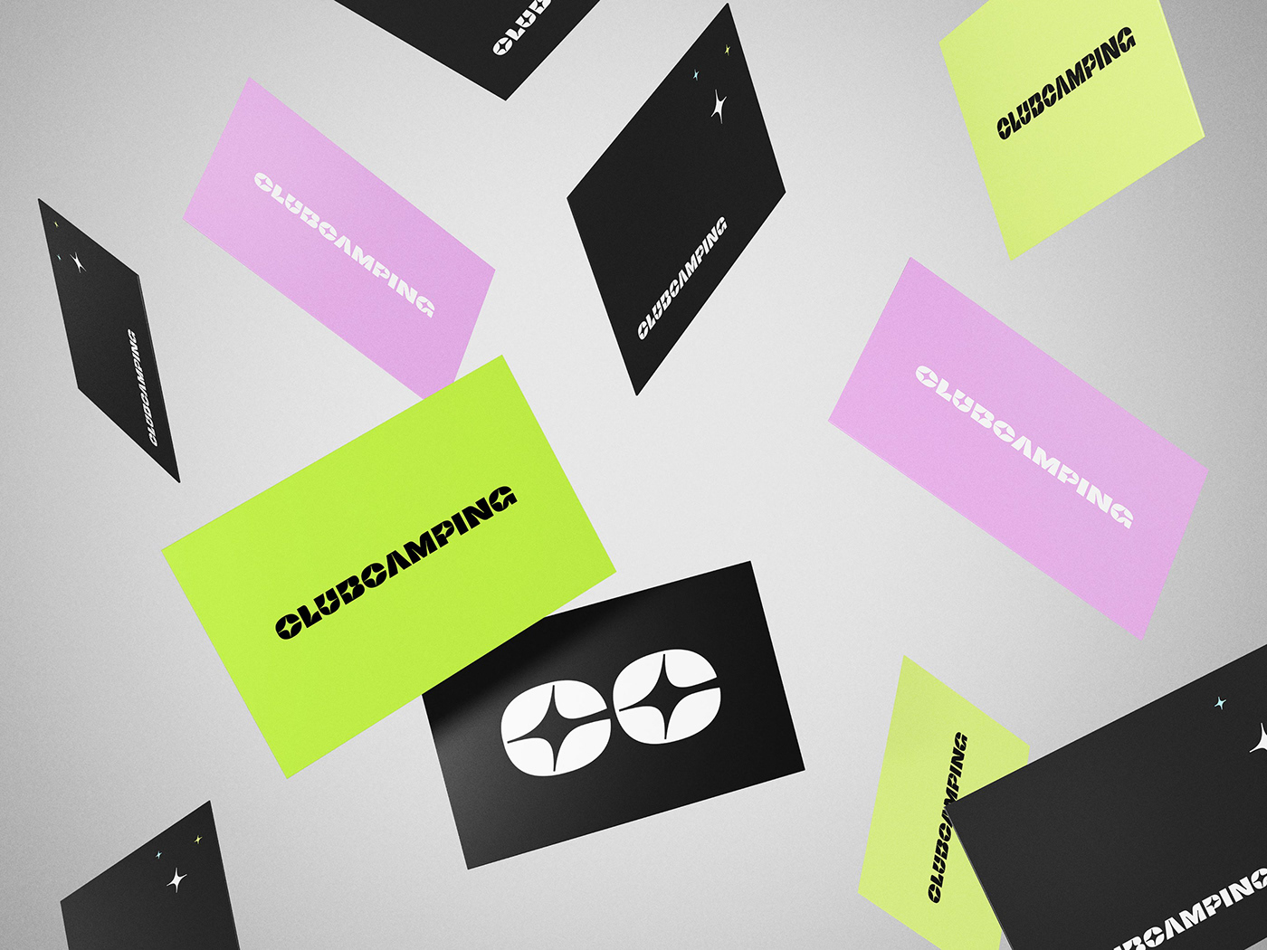
A couple of weeks later, we received their gorgeous presentation. It was pure light.


Go check their profile to explore their out-of-this-world design process!
It was exactly what we envisioned. It conveyed all the sensations and ideas we wanted to get across. Eerily similar to mind reading.
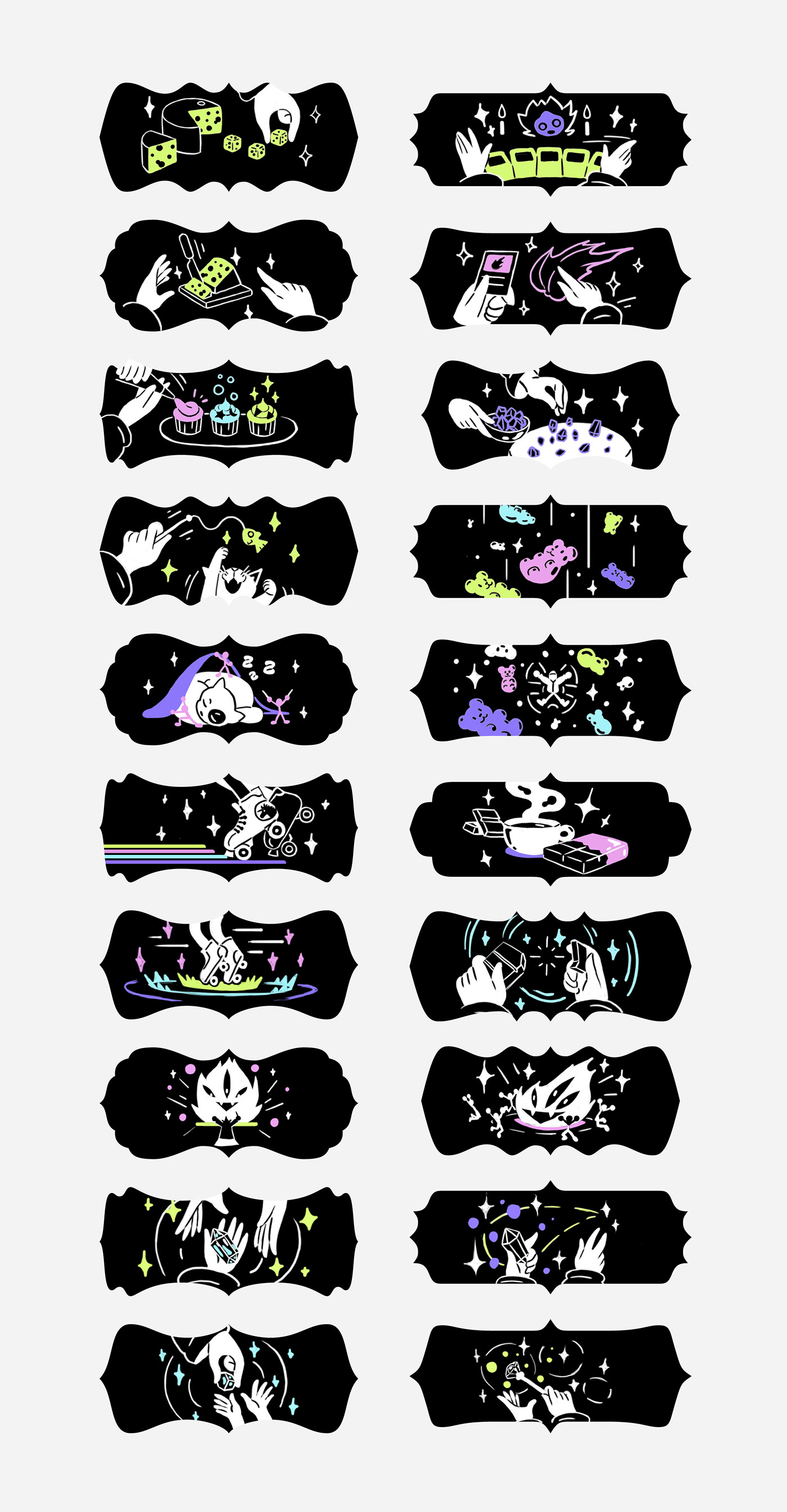
Check out some of their other designs as well.
They all look different but feel like part of the same universe. Talk about concept, baby!


From that point on, everything came out naturally. Each piece we needed flowed out smoothly and organically.

2021


