TwoºCreative is a collaborative platform for climate change solutions.
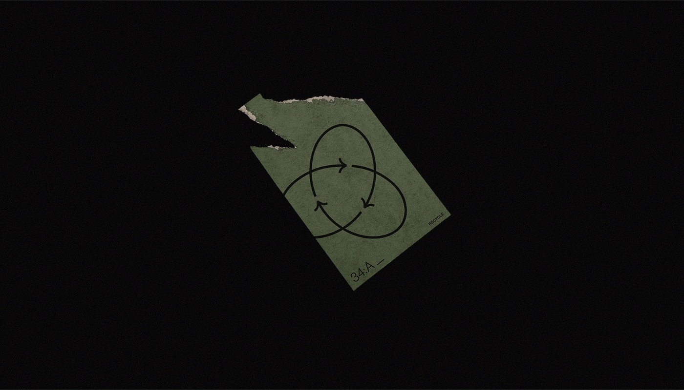
The first project by TºC → Recycle(d). A challenging initiative to lead designers around the world to create their own version of Gary Anderson's iconic recycling symbol, back from 1970. More about the project on The Brand Identity and It's Nice That.
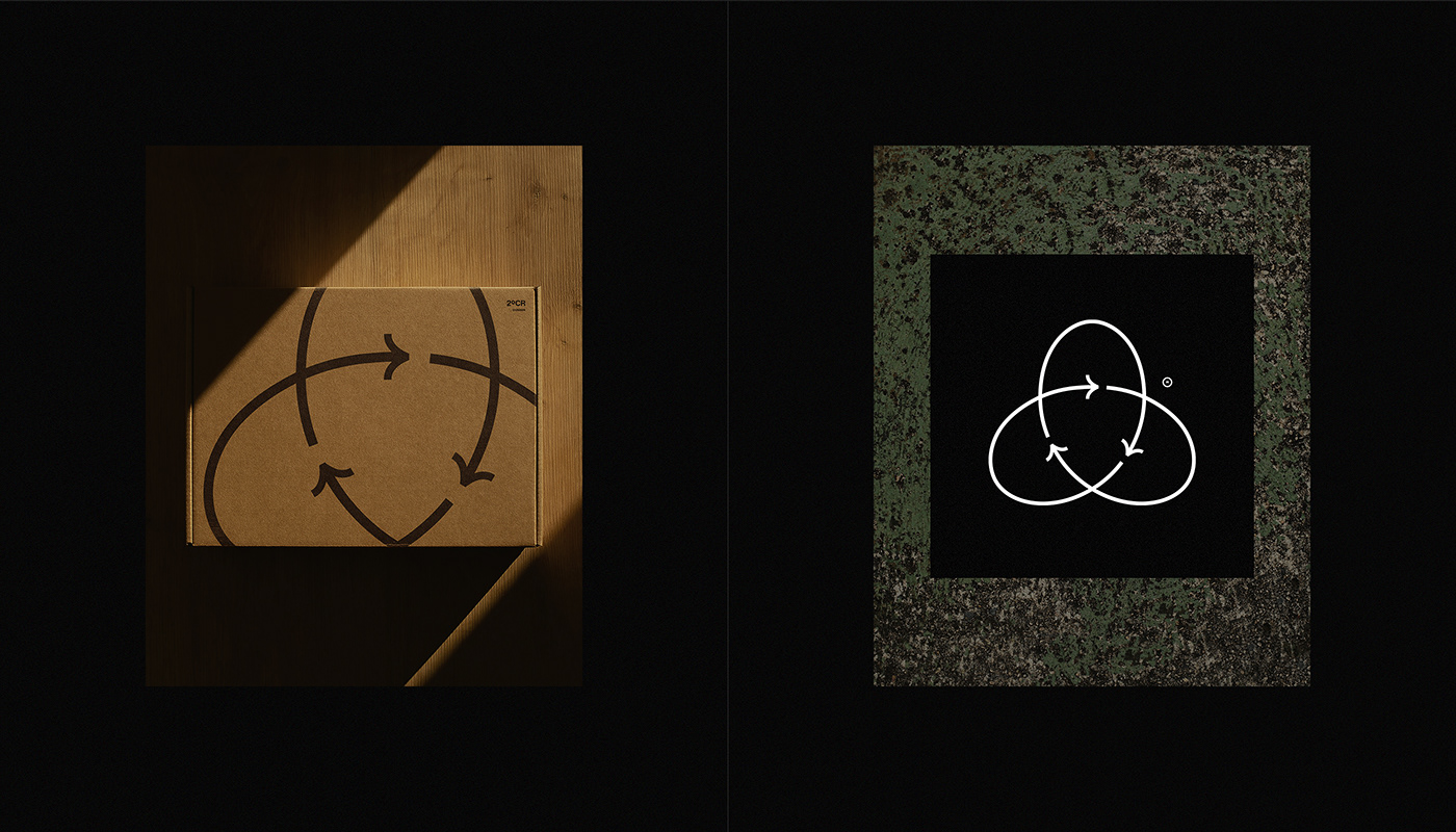
The concept for the first design is quite based on a circular visual perception — driving towards a kinetic sense.
The shaping brings some kind of a motion feeling, also close to the infinity symbol.


Second design concept keeps the circular sense — but further attached to a construction grid, leading to a remarkable contrast between its motion sense and the sharpness / accuracy from the right angles that shape the symbol on its corners.


Concept → Knot. As a noun, "a joint made by tying together the ends". This concept is based on the required connection, first between individuals, and then groups, to the environmental issues. Sweet and also kind symbol animation by Jeroen Krielaars (@calango), an opportunity to collab so unexpected as amazing.