


THE BRIEF
Coaching Angles has engaged Handle Branding to work through
a brand and website refresh looking at opportunities to which
we can re-imagine the Coaching Angles brand and further their profile.
Coaching Angles has engaged Handle Branding to work through
a brand and website refresh looking at opportunities to which
we can re-imagine the Coaching Angles brand and further their profile.
THE SOLUTION
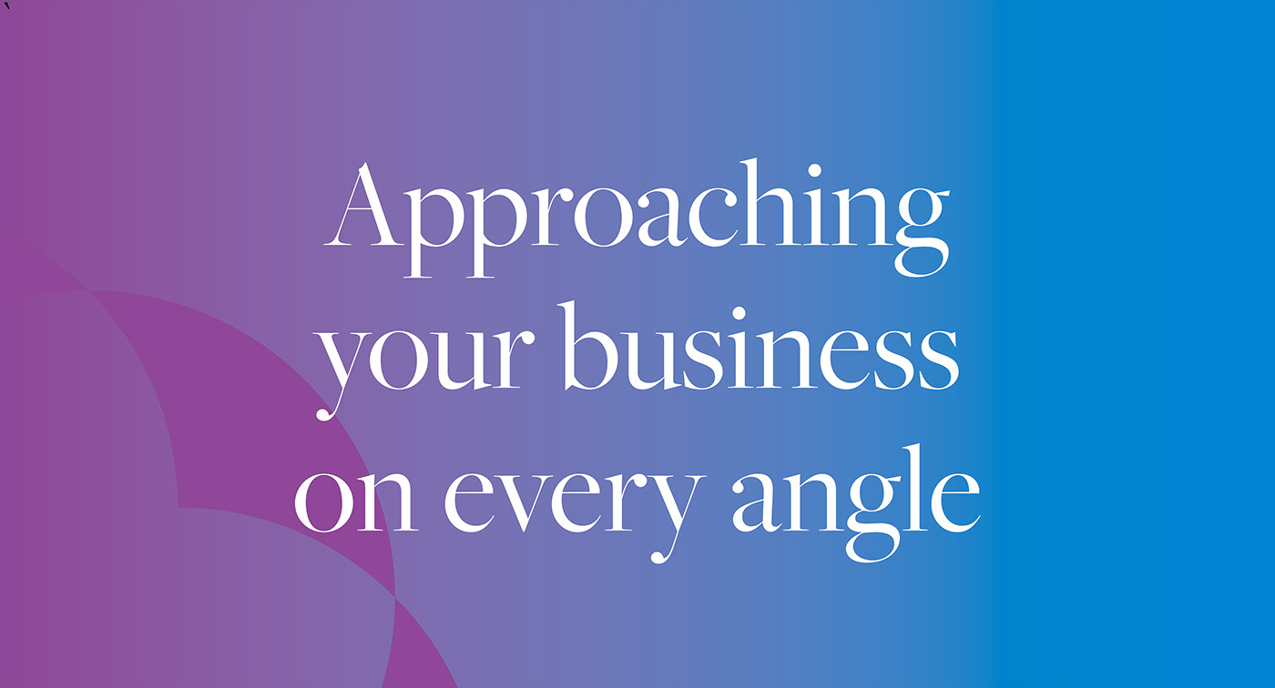
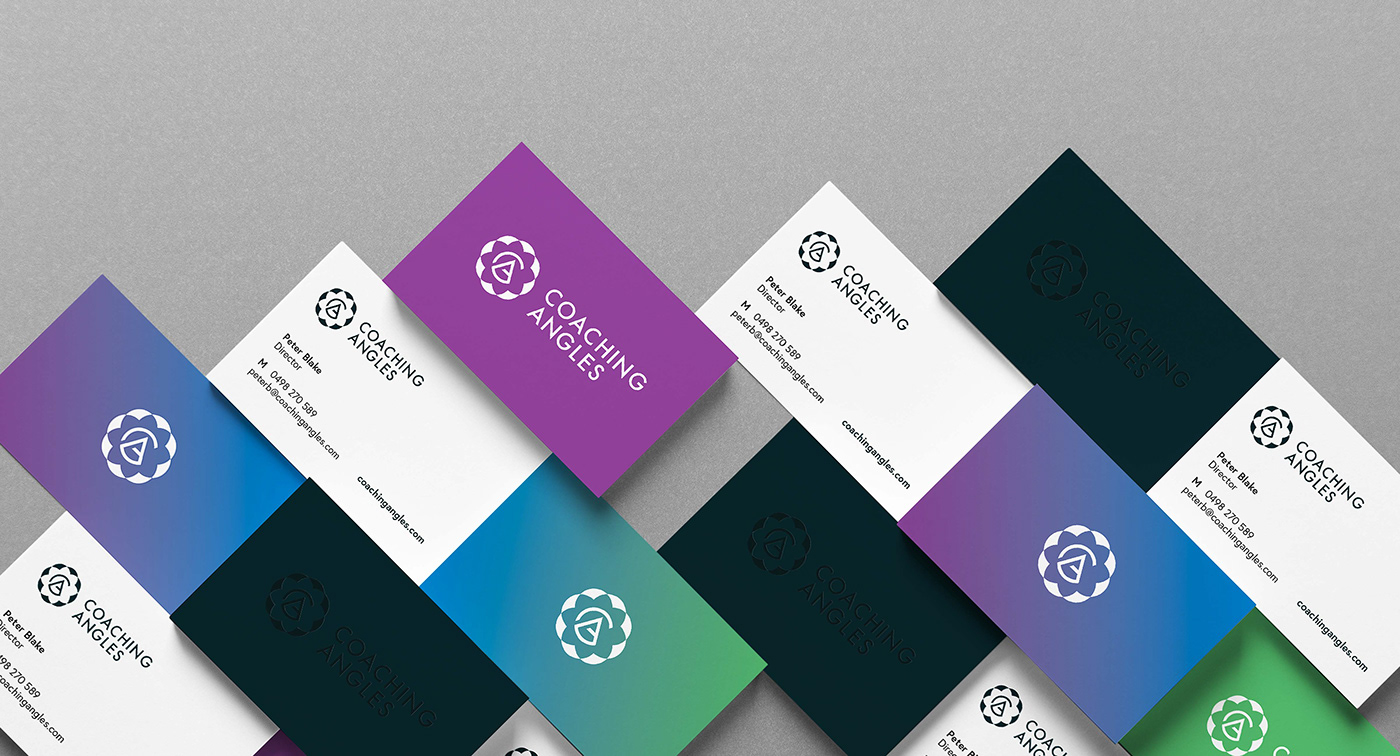
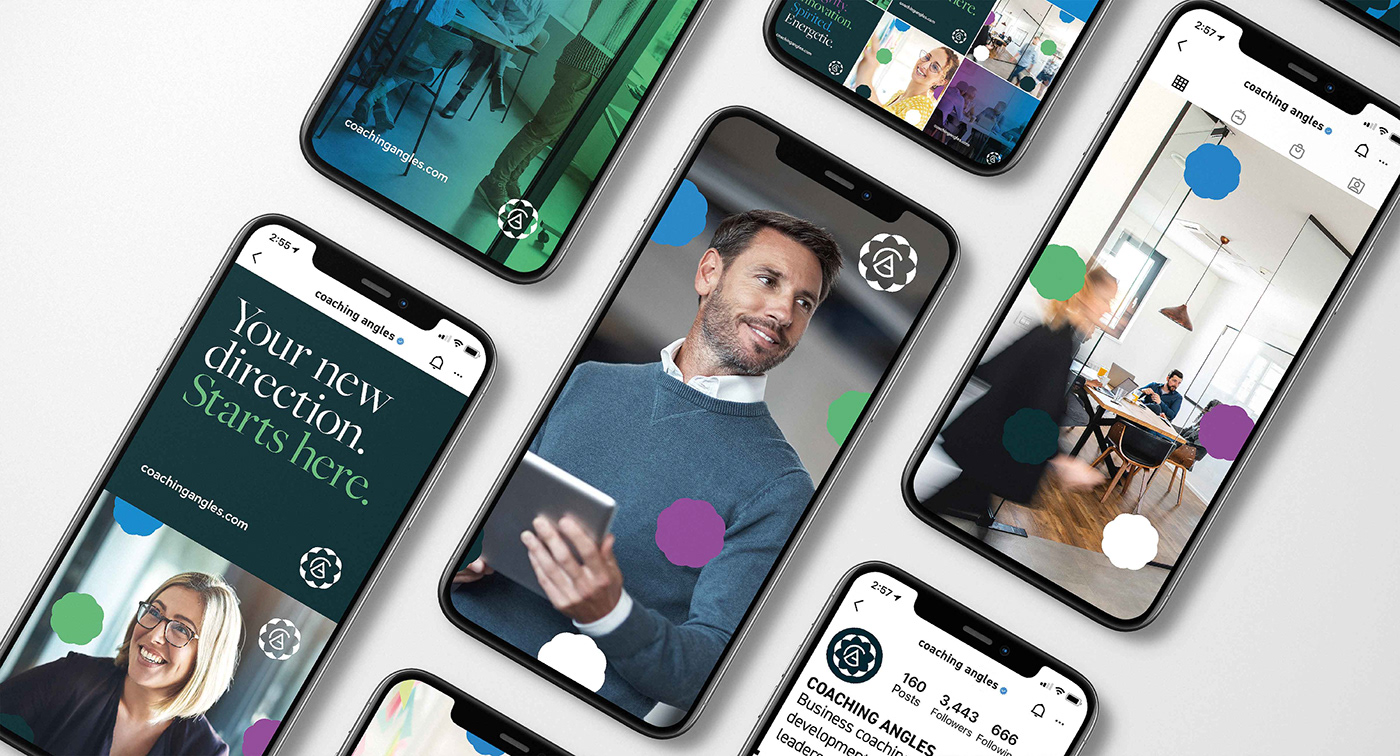
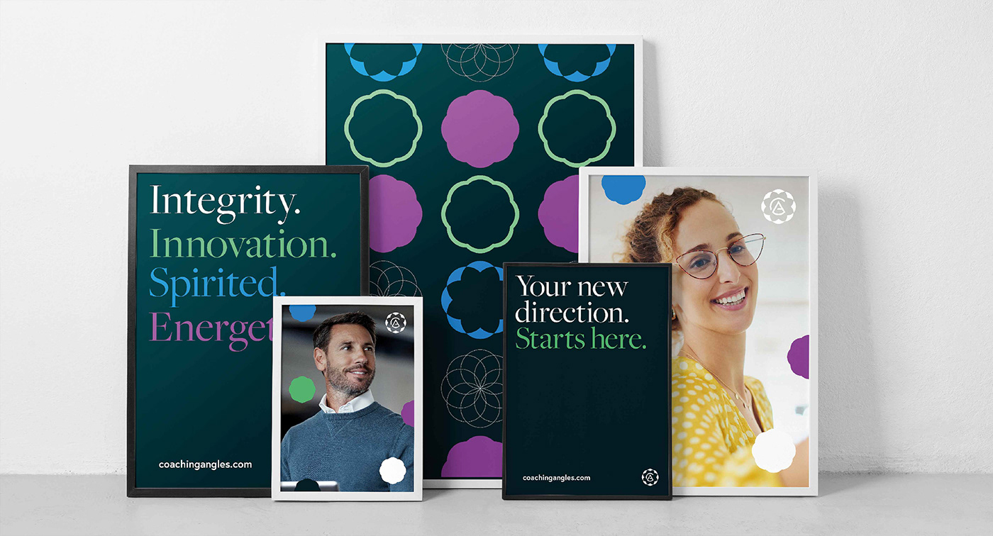
Initial inspired by the name and the services offered we saw the opportunity to re-imagine the creative and the symbolism of looking at businesses from all angles or even through a new lens. Through this symbolism we were inspired by the kaleidoscope.
A kaleidoscope is an optical instrument with two or more reflecting surfaces tilted to each
other at an angle, so that one or more objects on one end of the mirrors are seen as a regular symmetrical pattern when viewed from the other end, due to repeated reflection.
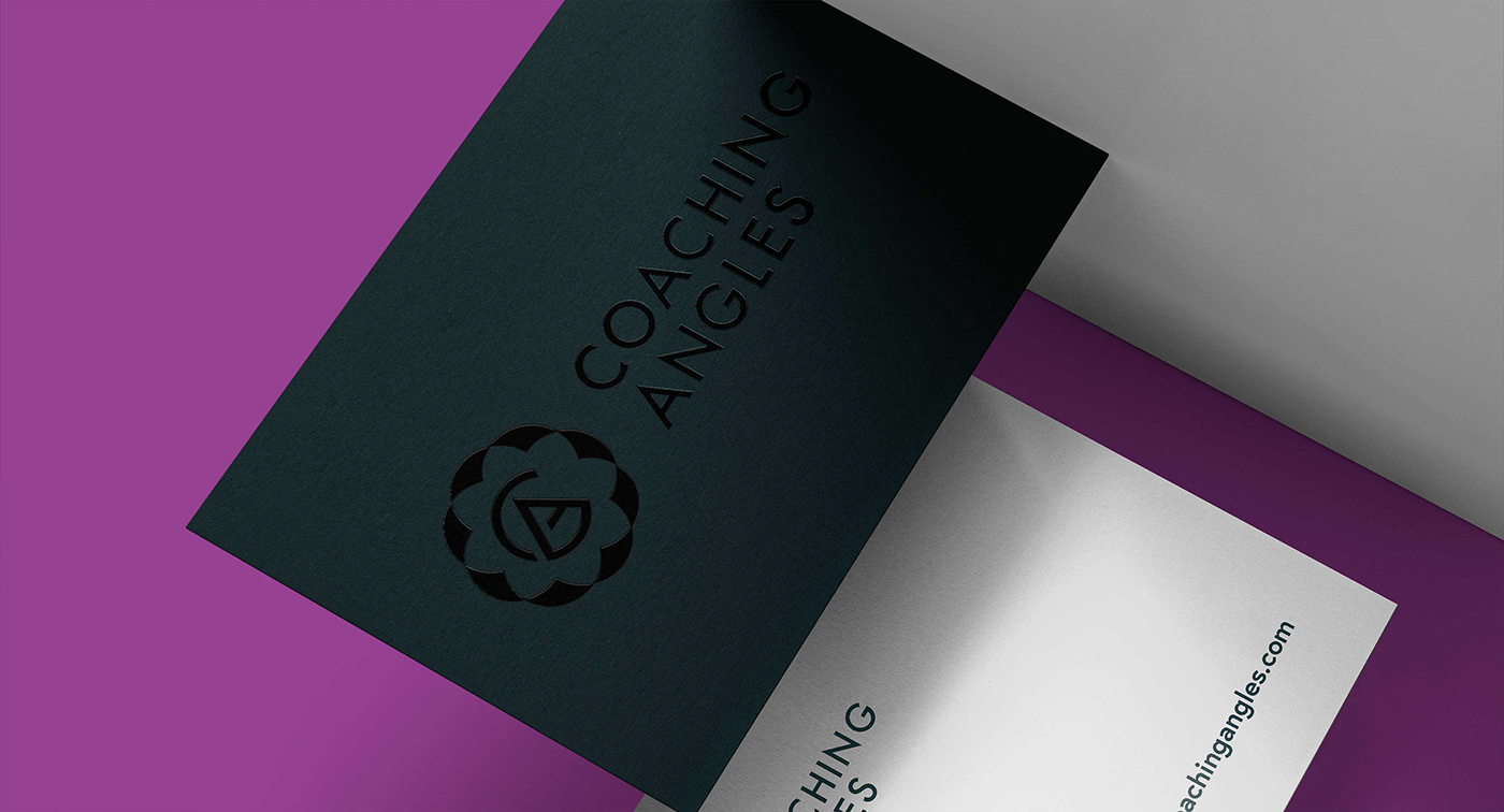
This simple symbol not only lent itself to the name but the creative.
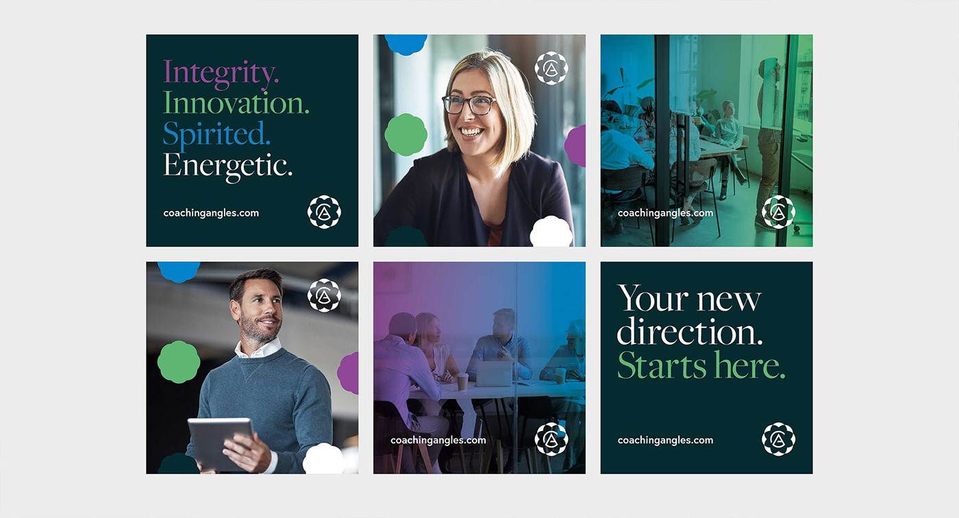
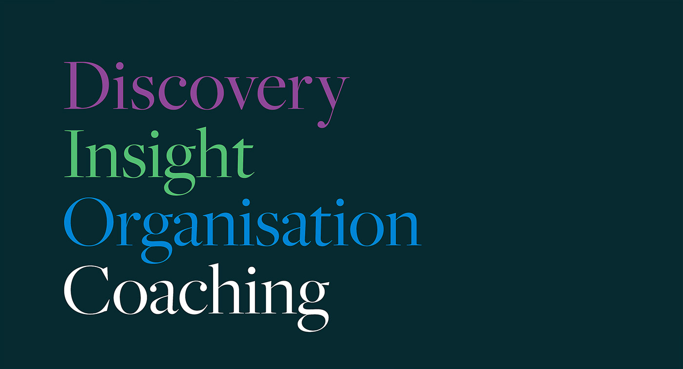
The use of angles in the copy can still be re-used, the play on words such as ever-shifting,
re-focusing, turning, twisting, moving, adjusting, mirrors, angles, line, sight, seeing the world and colour. All very relevant to your work and the change in perspective.
Initial inspired by the name and the services offered we saw the opportunity to re-imagine the creative and the symbolism of looking at businesses from all angles or even through a new lens. Through this symbolism we were inspired by the kaleidoscope.
A kaleidoscope is an optical instrument with two or more reflecting surfaces tilted to each
other at an angle, so that one or more objects on one end of the mirrors are seen as a regular symmetrical pattern when viewed from the other end, due to repeated reflection.
This simple symbol not only lent itself to the name but the creative.
The use of angles in the copy can still be re-used, the play on words such as ever-shifting,
re-focusing, turning, twisting, moving, adjusting, mirrors, angles, line, sight, seeing the world and colour. All very relevant to your work and the change in perspective.
Thank you!


