
Nettie — Pickleball Brand Identity
Nettie is a new Pickleball brand making high quality paddles and kits for casual and serious players alike. Founder Catherine Baxter came to us looking for a nostalgic and playful design sensibility that hearkened back to old racquet clubs of yesteryear. The goal was to make a visual presence that would appeal to more design-savvy consumers, without alienating casual players or serious athletes. We wanted to make the best looking, best playing, best value Pickleball brand out there.
Pickleball is the fastest growing sport in America. If you’ve ever played, you know the sheer fun of this unassuming game. Catherine Baxter discovered a Pickleball set while at her parents house. Soon she was rounding up friends, family, and co-workers to play impromptu games. It’s a game for non-athletes and athletes alike, for all ages and all walks. But Pickleball products lacked the same diversity. The pickleball gear market was clumped into high quality gear for athletes (with designs that looked straight from an energy drink can), or cheap amateur sets covered in cheesy graphics. Nettie would live in the market gap: a feel-good athletic brand that is inclusive, quality-made, and elevated in design execution.
Creative Direction and Design
Jennifer Hood
Amy Hood
Amy Hood
Scope
— Logo System
— Typography, Color
— Paddle Designs
— Packaging
— Brand Guidelines
— Typography, Color
— Paddle Designs
— Packaging
— Brand Guidelines

Visual Identity Goal:
Create a versatile logo and visual identity that:
1 ― Captures Nettie’s spirit: inclusive, fun, yet elevated. Let’s channel those nostalgic feelings of playing pick-up ball in the street as a kid.
2 ― Appeals to the taste-makers and everyday people alike who are craving fun experiences with good people.
3 ― Doesn’t recede into the sameness of dated Pickleball design, or aggressive sports design.

Wordmark and Icon:
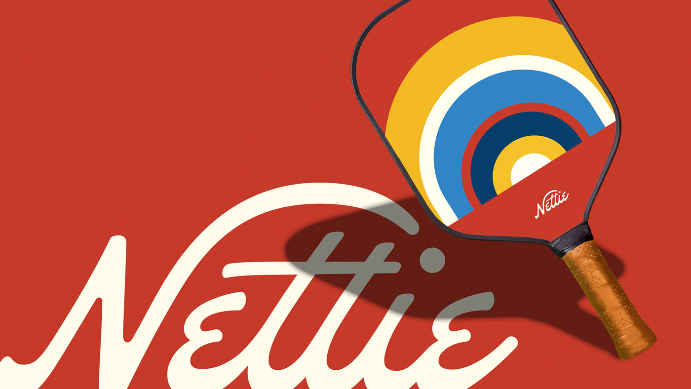
The custom-made wordmark’s italic figures add a sense of motion, with the arcing swash of the N sending a Pickleball to the tittle of the “i”. The curly “E”s were a must for the nostalgic mood. For smaller instances, the N becomes isolated and encircled for a standalone icon.
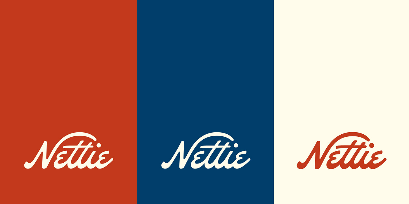


Color and Type:
We selected color and type that felt like it could belong in a racquet club from decades back. Something stark, simple, and nostalgic. New Kansas by Newlyn foundry nails the welcoming, fun, retro vibes for headlines and display text. Montserrat, designed principally by Julieta Ulanovsky, provides an anchoring sans serif presence for body copy and secondary headlines.


Pickleball Paddle and Packaging Design:
Once the building blocks of the brand identity were done, we worked on a custom set of Pickleball paddle designs for Nettie. We based the set around meaningful locations to the Nettie story: The Bainbridge paddle is inspired by the nautical flags around Bainbridge Island where Pickleball was first invented. The Pendleton is inspired by Midwestern sunsets on the Ohio River where founder Catherine grew up. The Ashbury is inspired by the famed Haight Ashbury park where we can just imagine casual games of pickleball would have fit right in. The Bedford is inspired by the Brooklyn street where Catherine spent her adult years (the lines on the paddle relate to the subway maps throughout NYC).
From the paddles to the box design, every touch-point of this DTC product needed to be intentional and social-share-worthy. So the e-commerce box got a full design treatment to elevate the client’s unboxing experience.


Ready to pick up Pickleball?
Check out Nettie here, and enjoy 10% off your first order when you subscribe to their e-newsletter!


