Landingi was a already established brand in 2020, but it needed a refresh to bring it into the ever-changing digital world. During the conceptual workshop with a client, we came up with some design guidelines and talked about a new identity. After that, we created the new logo and a cool new look. This is what we came up with:

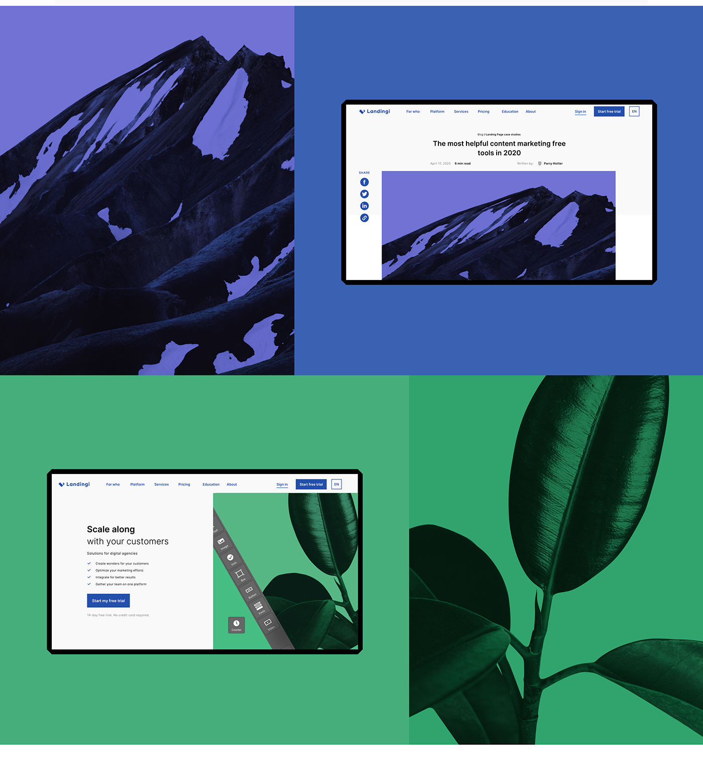
Landingi blue The primary color was an easy choice. Landingi’s flexible and easy-to-use builder mixed with professionalism as business partners resulted in choosing classic blue for brand and logo color.

Color code We used colors for different services offered by Landingi. Each feature got an icon and a color.
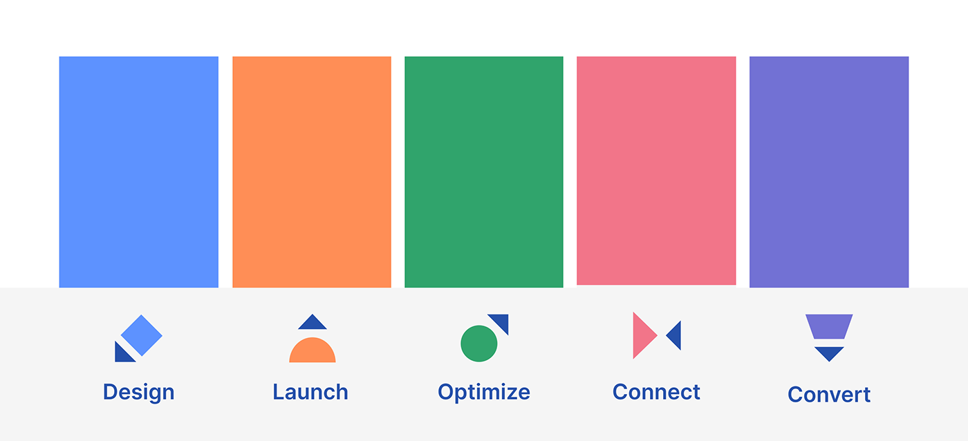

Website We used colors for different services offered by Landingi. Each feature got an icon and a color.


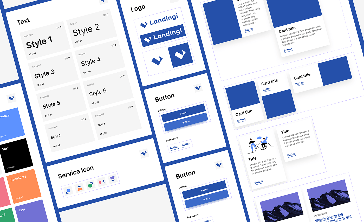
The design system is fundamental! Not only for a designer but also for a developer and a client.
Groups of variable components and styles make it easy for any designer to jump into a project and collaborate. After a finished project, we still have reusable assets for a new landing page, banner, or social media post. Using a design system saves time and helps your brand stay consistent 🧘🏻