
Wesleyan College - Graphic Design (Art225) - Spring 2021
Project 3 - Poster
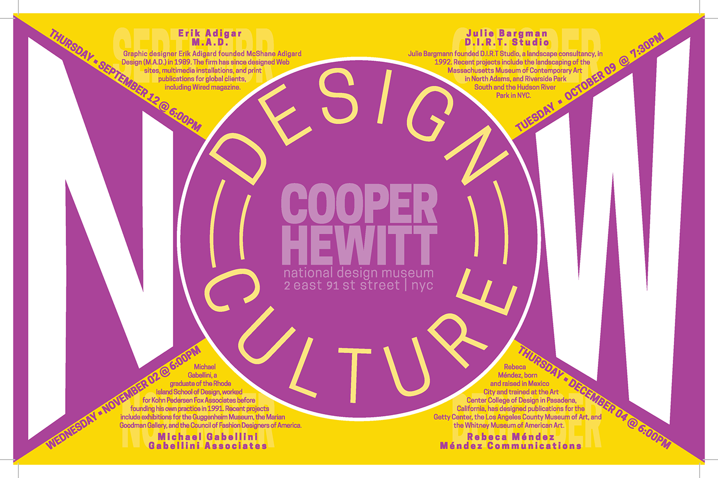
Using only shapes, text, and 2 spot colors - create a poster to convey supplied information.
Tools: Illustrator
Brainstorm and roughs


Round One Submission

Critique
The all-cap months behind the event text is distracting, hard to read event text. Date/time look like afterthoughts. Letter spacing for names are wonky. Overall great use of colors, shapes, and layout of elements - particularly the use of negative space to create effect of a third color in design while still sticking to only 2-spot colors.
The all-cap months behind the event text is distracting, hard to read event text. Date/time look like afterthoughts. Letter spacing for names are wonky. Overall great use of colors, shapes, and layout of elements - particularly the use of negative space to create effect of a third color in design while still sticking to only 2-spot colors.
Final Submission for Grade
Put more emphasis on day/date/time for each section while making the month more subtle behind the text (looks much better in print). Able to make the text for each event more prominent while keeping kerning and alignments balanced.
Put more emphasis on day/date/time for each section while making the month more subtle behind the text (looks much better in print). Able to make the text for each event more prominent while keeping kerning and alignments balanced.
Critique
Focused visual message. Good use of complimentary color palette. Emphasis is clearly on the title, though the name of the museum does compete a little. Hierarchy is fairly clear.
Focused visual message. Good use of complimentary color palette. Emphasis is clearly on the title, though the name of the museum does compete a little. Hierarchy is fairly clear.


