


YoutuMusic - An app where YouTube and Music come together
Many of us love to work with music on in the background, so this project idea is a combination of YouTube and Music. There are alternatives like Spotify, YouTube Music, etc. but I find them on the opposite ends of my sweet spot of music experience. So in this project I have explored what I think can be changed and/or improved in such an application.


1. Rough sketches - getting the idea on paper
From the get go, I had an idea for the video player to be at a non-intrusive place, while I can explore songs, and keep hearting songs when I like them. This way I could build a pool of my favorite songs. The reason behind this is YouTube has a very strong recommendation algorithm, so I could use it to query similar songs to one's I like. Spotify has a similar feature called Daily Mix, but it has a limited number of songs in the list. Same goes for YouTube +50 Mixes. With this implementation we can add any number of songs to a list and keep getting new recommendations of new songs of same style.

2. The Design pt. 1 - choosing the right assets
I used Figma to make the designs. Since I already had a pretty good idea of what and how I want to build the app with sketches from previous step, this was a bit easy with respect to designing blocks of components. The first step was to build a color scheme and an icon/logo for the project, choosing the fonts and icons and their sizes for various screen sizes.
For this I used Mukta font-family because I wanted to portray a friendliness about typography. Mukta is a well designed free sans-serif font-family available on Google Fonts.
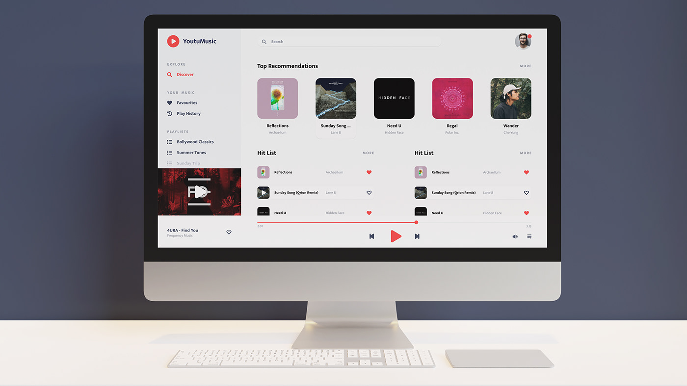
For the colors, I chose red that contrasts well with a deep dark blue. This is because blue is very close to complement of red on the color wheel. For the icons and logo, I chose all assets from fontawesome because the icons are well designed and have a rounded edges format which was a core princpal while designing the app.

2. The Design pt. 2 - designing component blocks
When designing any UI, I think of component blocks, each block has a purpose and each block can be reused as an individual module in a different project. This ties in well with the DRY principle when it comes to programming, i.e. Don't Repeat Yourself, and also helps developers of the application use new programming paradigms like Object Oriented Programming or Functional Programming.
In this project the left panel is used for navigation, there is a player controller at the bottom of the page and a search bar on top. Purposes and use of these are as follows:
Left navigation bar has various sections like explore, your music and playlists. In explore section, user can explore new music, Your music section has favorites and play history so any liked song or previously song can be searched and heard again. The playlists are auto user-generated and auto-generated so the user can jump back to their most liked songs again quickly.
I put the search on top because it would be the most used function on the website and user should be able to access it almost anywhere in the app. The controls bar has a fixed position at the bottom as this would also be a most used function and should always be on top of the player.

Queue or Up Next can be accessed by pressing the bottom right icon button on main screen. Here user can rearrange upcoming songs.

All of the modules designed for desktop can be translated to mobile as well. this would help for developing mobile apps and/or responsive web apps.

This project is open source and in development phase. You can play with UI for the project, view its source code on github or see a live demo hosted on Netlify. The app is still in development, so some functionality may break.
Thanks for viewing the project!


