Postal Bank is a new project, but definitely promising. Belarus doesn't have much experience of the postal and banking services in companion with other countries where the postal banks have already existed for decades. The goal of the project is to organize postal bank in Belarus. This project is being in underway and will be based on the basis of "Belposhta" involving foreign investment.
Art solutions have been developed on aim of the presentation of the new bank in Belarus.
For the project different style elements have been researched and developed - company name, logo, color and font. All this ensures the creation of individual corporate identity.
And also has been developed the series of posters based on visual metaphors and comprehensible symbols associated with the activities of postal and banking services.
Concept: Ales Belski
Photographer: Ales Belski
Art Direction: Ales Belski

Money in the mailbox
The poster shows a mailbox and banknotes. The idea is to show the wide availability of banking options, when the money is delivered to the home of the client and the consumer. Composition solution in this case is not overloaded with unnecessary details, the main "picture" only focuses on two main components - the "mailbox" and the "money".

Credit for 35 days
The poster shows a tear-off calendar. Used the slogan "Credit for 35 days". The number "thirty five" creates an effect of surprise and attract attention.

Money bird
The poster shows a bird, made in the style of origami banknotes. There are different meanings of the image from "the money can conquer the mountain" to "keep the money in the bank, and they can fly like a bird".

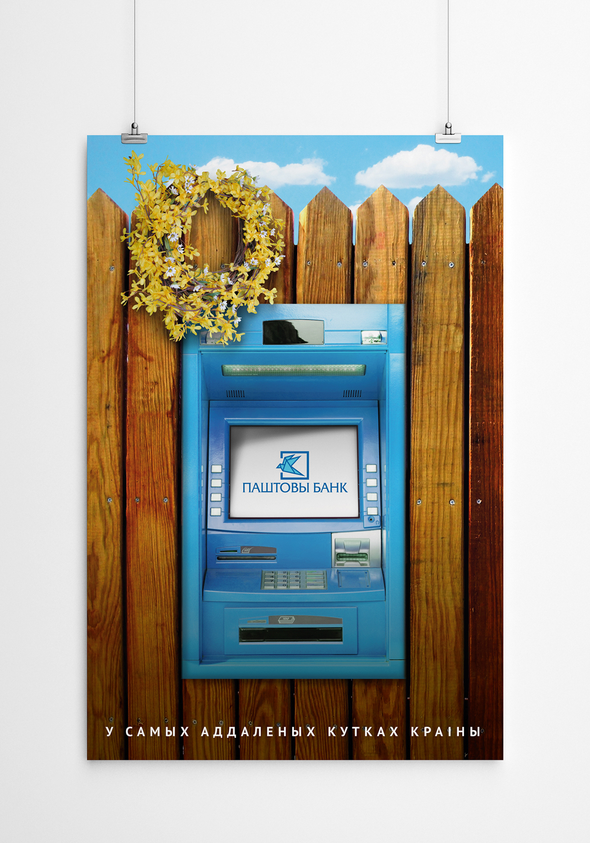
In the most distant areas of the country
The idea of the poster is to show the availability of a range of banking services in the most distant corners of our country. The poster shows a bank terminal, which is a kind of "mounted" in the ordinary rustic fence. This solution creates an element of surprise and makes the consumer to pay attention to the fact that the banking system isn't the prerogative of the city. The circlet of flowers on the fence creates a romantic touch and emphasizes the rustic style in the poster.
Above all
The poster shows a stylized bird composed of a blue sheet of paper or envelope. Used the technique of hyperbole.

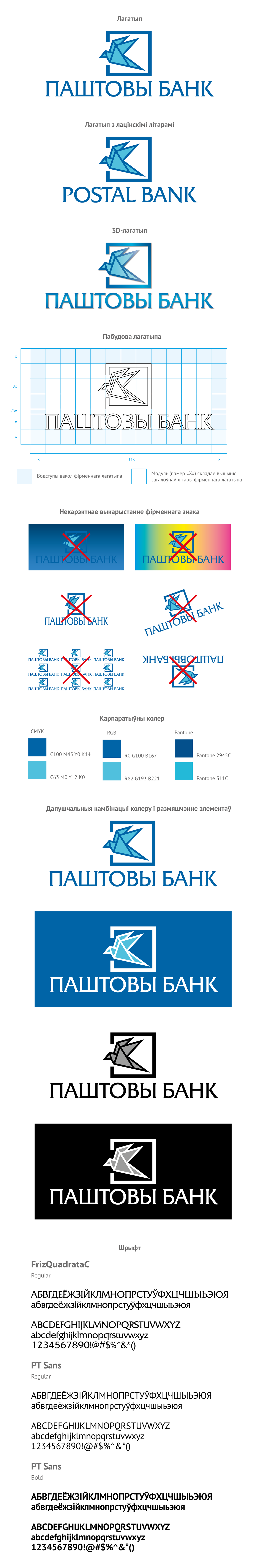
Corporate Identity
The shape of the logo forms two characters: a bird, symbolizing the letter, mail, money, and the square, symbolizing a safe and banking services.
The bird - a symbol of freedom, flight altitude. Historically, this symbol is associated with the tradition of many countries where postal items were sent via the birds, mostly pigeons.
In the logo three colors are used: white, blue and light blue. The selection of these colors is not random. The color of the Belarusian mail company is blue. Also has been taken into account the psychological component of these colors. Blue - the color of peace and tranquility, as well as the color of the reliability and stability.
White and blue colors are the traditional colors for the Belarusians. The name "white" presents in the ethnonym "White Russia", and means "pure", "independent ", which has never been under enemy. Belarus has historically formed and is known outside of our country as a land of "Blue Lakes".