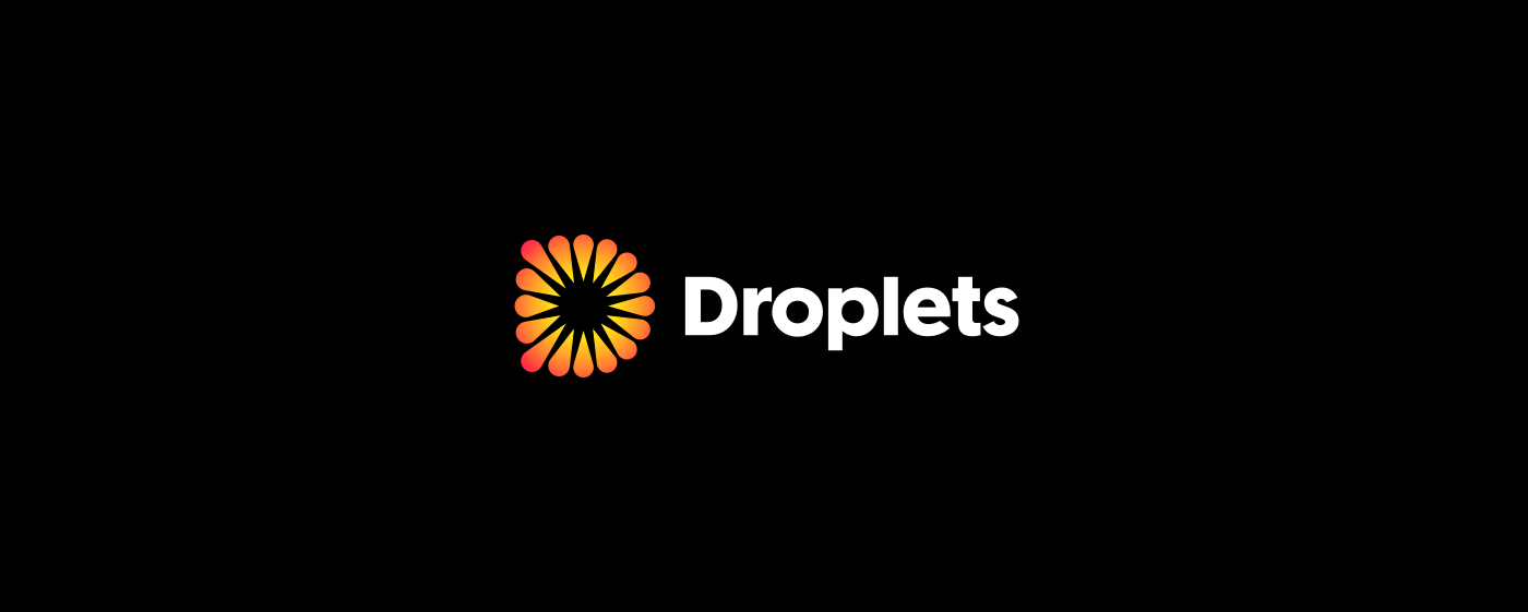
DROPLETS LOGO DESIGN
Briefing
"Our company name – “Droplets” – refers to welding drops, a large number of which make up each welded joint. Our goal as a business is to create innovative software for mobile and stationary machines, which will help to manage and control the many complex processes that accompany almost any production involving welding metals.
These droplets are supposed to be a metaphor for all those scattered processes and activities that we want to control by providing appropriate, dedicated, intuitive and easy-to-use software. Please imagine a number of mobile applications, each of which supports a specific welding issue – one of the many droplets – the sum of which gives the final result in the form of a weld that meets all quality requirements."
Sketches

Initial proposals

My attempt at interpreting a logo idea presented by the client. Somewhat viable, but not very memorable or unique. It does convey a metaphor of interlocking sub-activities, which together constitute a full welding process, but I think it could be done much better.

Another stab at the idea presented in the previous paragraph. This time, my goal was to give the overall shape a more identifiable and less random characteristic. I have managed to create a human silhouette out of the droplets enclosed in a bigger, drop-like shape, although I was at most mildly happy with the result.

Simple, geometric and elegant concept that materializes the briefing information quite well. I kept coming back to this idea over and over because it seemed to fit the bill so nicely.

Probably the most visually arresting design of the whole bunch. Could be read as a metaphor of the welding process broken down into its components and maybe even welding itself (spark or welding arc inside). Its esthetic appeal is hard to deny and the clear geometrical construction is pretty apparent. It draws attention to itself and should be easily recognizable and memorable.

The lone wordmark in the group. It is definitely the most jarring, unusual and against-the-briefing option. It could even be called experimental. It is somewhat weird, but – by the same token – quite memorable and unique. This proposal offers explicit differentiation and guarantees attracting attention.
Development
Proposal D was selected as the most promising idea for further development as it manages to blend together all of the key concepts specified in the briefing and even adds some bonus ones for good measure:

But the symbol could still be improved. My main goal was extending the corners and straightening the back stem of "D", so it would be even clearer in its depiction of the initial:

The lettering needed just some minor tweaks and most important of these was the replacement of the original "t" with a more appropriate version, which fits its direct neighbors better:

Final


My website: ruszel.eu

