CAMP TIN BOX
Brand Identity Design
Brand Identity Design
When the new owners of a former Jellystone RV campsite in the Adirondacks acquired the family-friendly property, they knew it was key to update the brand, yet still maintain an experience that felt authentic, relatable, and inviting to the current customer base.
In doing so, there was an opportunity to create a new brand that would be more widely appealing, highlighting the beauty of the surrounding area, the unique history of the property, and the camping adventures that lie ahead. So off we went!
The Re-Branding Process
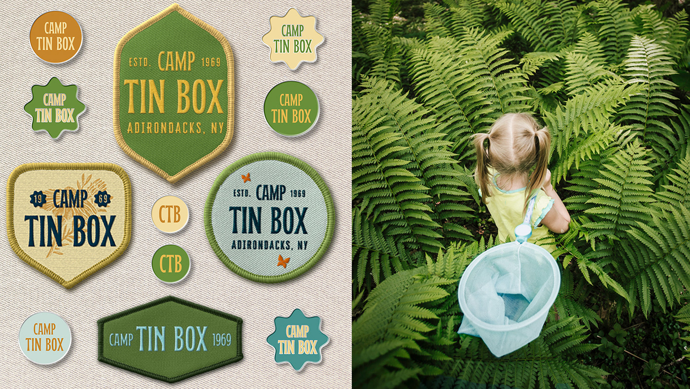
After some initial research, I discovered that the property did not start off life as a Jellystone property (this hand-off happened later in the 90's) but was built in 1969 which happened to be the same year that the Jellystone franchise was founded. This synergy meant that we had a nice way to pay homage to both the founding of the property and to to the Jellystone franchise. The resulting brand identity has elements of this early 70’s aesthetic most notably within the logo, typography and color palette as well as in the styling of some of the brand extensions such as the patches and pins. The new name, Camp Tin Box, is a tongue-in-cheek reference to the RV lifestyle.
In doing so, there was an opportunity to create a new brand that would be more widely appealing, highlighting the beauty of the surrounding area, the unique history of the property, and the camping adventures that lie ahead. So off we went!
The Re-Branding Process
After some initial research, I discovered that the property did not start off life as a Jellystone property (this hand-off happened later in the 90's) but was built in 1969 which happened to be the same year that the Jellystone franchise was founded. This synergy meant that we had a nice way to pay homage to both the founding of the property and to to the Jellystone franchise. The resulting brand identity has elements of this early 70’s aesthetic most notably within the logo, typography and color palette as well as in the styling of some of the brand extensions such as the patches and pins. The new name, Camp Tin Box, is a tongue-in-cheek reference to the RV lifestyle.
Client: Camp Tin Box
Role: Creative Director, Designer
Role: Creative Director, Designer
Creative Services:
Brand Concept & Positioning
Brand Concept & Positioning
Creative Direction: Naming & Copy
Brand Identity
Brand Guidelines
Identity System Design
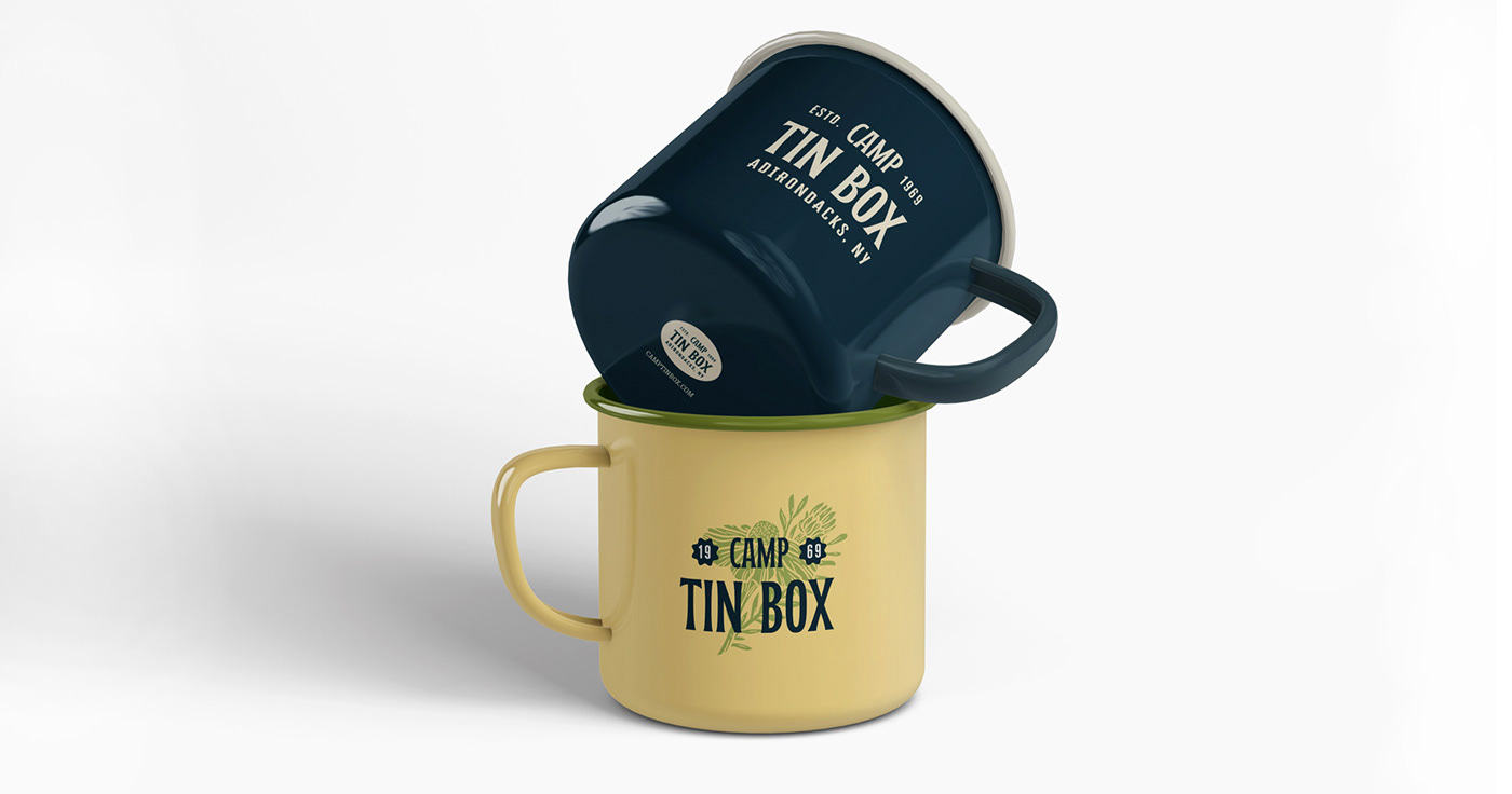
Packaging Design
Brand Guidelines
Identity System Design
Packaging Design
Merchandise Design