A furniture company with Slovenian heritage,
taking advantage of their locality while sustainably sourcing
materials and utilizing craftsmanship.


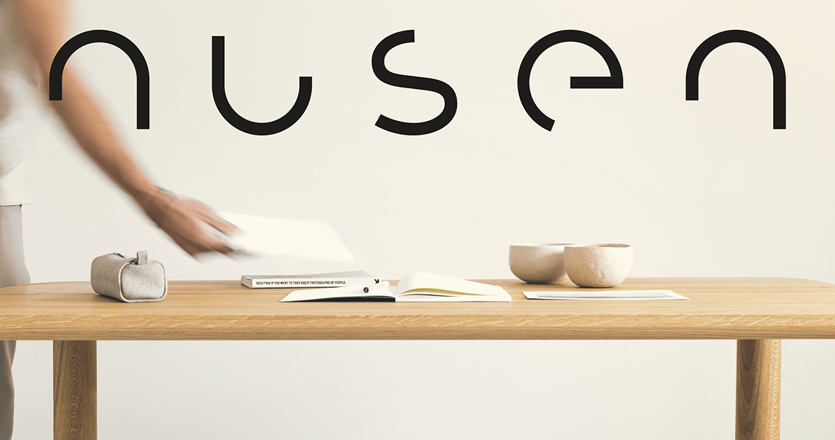
The name is a derivative of an old Slovenian word “nucen”
which describes something that is essential or necessary


We built a custom geometric word mark with careful attention
to detail such that it is stripped down just enough to be legible, i.e. essential.
The arc symbol extracted from the word mark acts as a supporting graphical element.
We put together a muted color palette to match the natural materials
used by the brand, keeping it earthy and grounded.