Brand | MOONLANE 明月里
Client: Moonlane
Design: Tagging Design
AD/D: Weibin Chen
Year: 2021
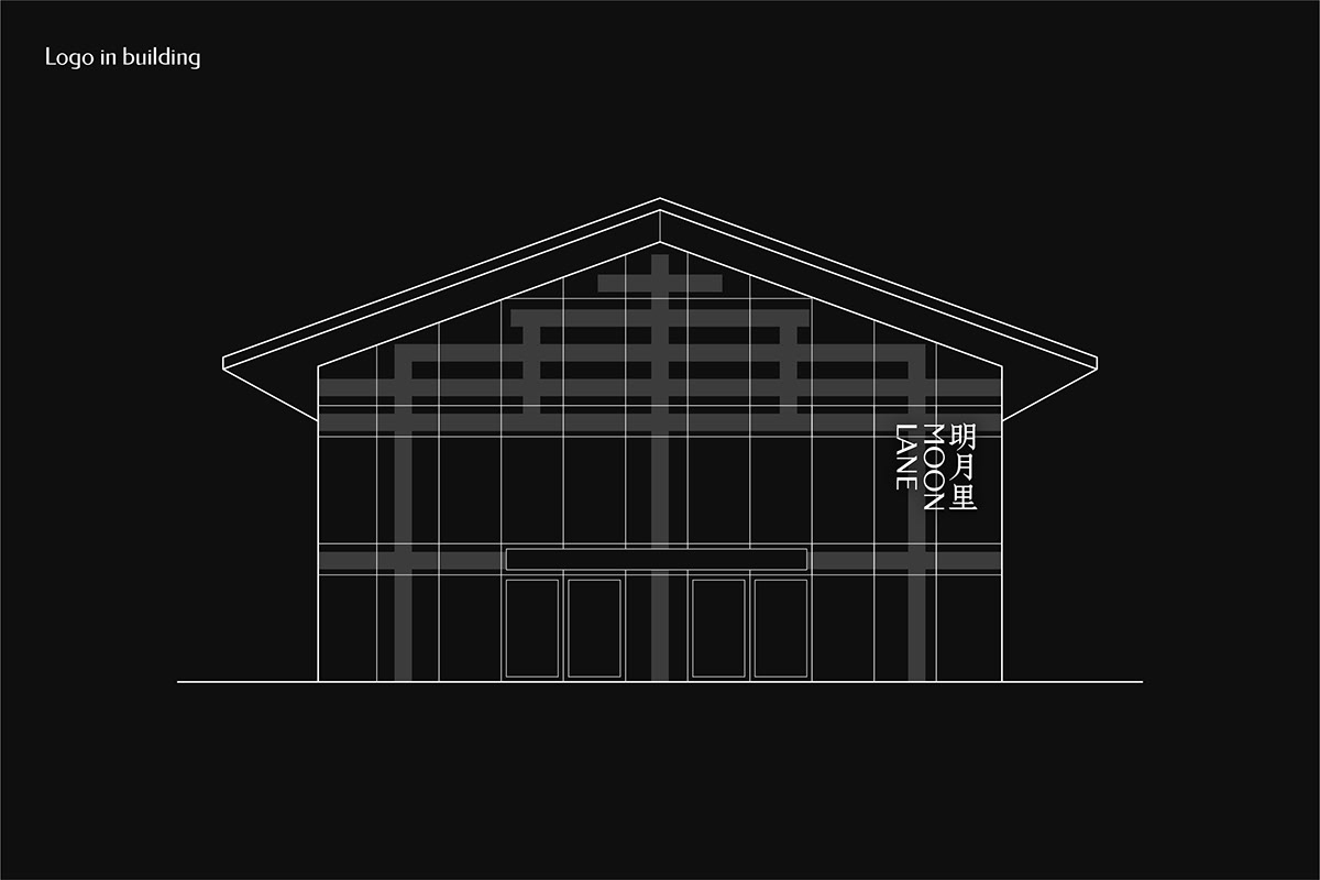
MOONLANE是一个结合文化与商业的商业街,建筑上融合现代感与中国文化,以玻璃与红色作为主要元素。
Tagging Design接受委托为MOONLANE定制的文字商标,希望在字标中体现“融合”的特点。在中文设计中,以中文书法字的韵味作为基底,通过特征笔画的复刻,在标准制图中融合正体字,创造出“明月里”三个中文。在英文上选择几何感的字形加以调整。从设计结果上看,传统韵味与现代感有不错的结合。延展设计中,因地制宜地使用横版或竖版组合,错落感与留白处理都体现了中国传统文化带给人的感受。
MOONLANE is a commercial street that combines culture and commerce. The architecture combines modernity and Chinese culture, with glass and red as the main elements.
-
Tagging Design accepted the commission to customize the word mark for MOONLANE, hoping to reflect the characteristics of "fusion" in the word mark. In the Chinese design, the charm of Chinese calligraphy characters is used as the basis, through the re-engraving of characteristic strokes, the traditional characters are merged in the standard drawing to create three Chinese "明月里". And English, I choose geometric fonts to adjust. There is a good combination of traditional charm and modernity.
-
In the extension design, the horizontal or vertical combination is used according to different conditions, flexible layout and blank treatment all reflect the feelings brought by traditional Chinese culture.