Telnavi is a Japanese spam–blocking service. Back in 2017, I designed an app for them and recently got hired for a redesign. So I had to revamp my own design.
Redesign requirements
Telnavi is a classic spam-blocker. It has a remote database of potential spammers contacts, according to which it marks some incoming calls as “unwanted” and can even block them. The app allows you to search through their database, update it or add your contacts to the spam list.
The interesting thing here is that they use 3-level gradation for spammer's harmfulness: from green to red. So not every call is 100% bad and useless, you can decide whether it's worth answering.
The initial design had worked quite well, but the client wanted to introduce new functions, and it was a great time to refresh the UI as well. Here is what they asked me to change:
1) Make the app look up-to-date but keep the consistency with version one.
2) Improve the update animation.
3) Simplify the app icon.
4) Update the AppStore screenshots.
5) Design the dark mode.
6) Migrate from Sketch to Figma.
New UI
This is an overview of the previous design:

The previous design
As you can see we had a brand accent color — the orange. I wanted to keep it but make it less prominent, especially in nav and tab bars. We also had those “harmfulness” stripes in the list of calls, which seemed redundant, burdening the UI — I got rid of them. Generally, I tried to make the app look wispy, so the icons got lightweight as well:
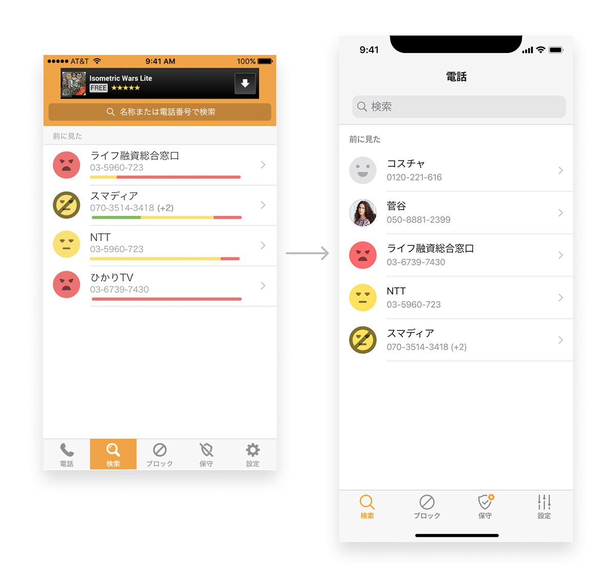
Old vs. New — Search screen
As for contact details screen, I made it look more like one from the iOS Contacts app. Also played with the “danger” stripe a bit:


There is an update screen where you can check whether your anti-spam database is up-to-date. Initially, the design was heavy-weighted with large green circles and a shield icon. Besides, the update button was green, which wasn't consistent with the brand orange we had.


Then, a small facelift was made in the settings screens:


There were a couple of empty states, which were literally empty — without any images. We decided to add life and emotions there:


The app has a special place where they are asking permissions for push notifications and contacts. We made pictures there more descriptive and added a PRO-subscription screen:
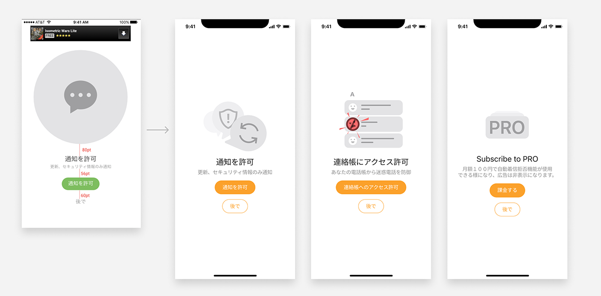
New ask for permissions screens: notifications (1), contacts (2). And a screen describing the benefits of PRO (3)
And finally, we introduced a dark mode! It wasn't a mere inversion — I tried to pick colors and icons so they looked crisp on the dark background:


This is how the app looks in the dark mode now:
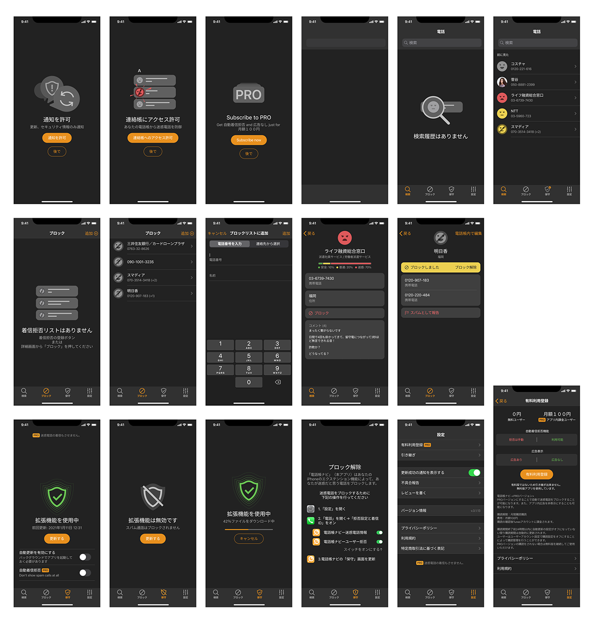
The dark mode
Appstore artefacts
The old app icon seemed heavy and outdated. I simplified it, but kept the volume and overall vibe:

New app icon
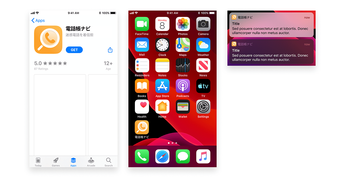
App icon preview
The Appstore screenshots were quite good. I only changed the text color to increase the contrast and updated the UI, of course:

Results
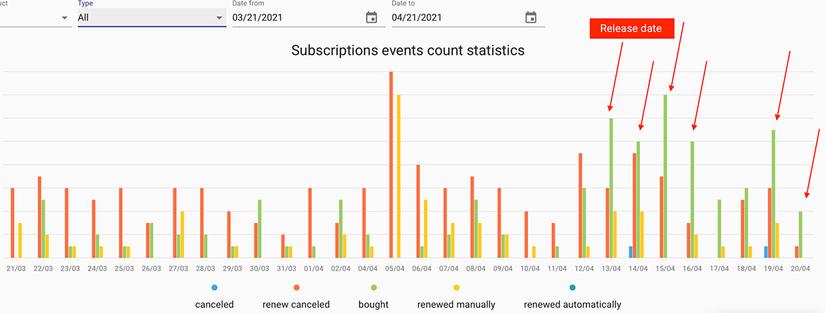
It looks like the new features and refined design have brought some results. One week after the release we found a double increase in app installations:
You can find Telnavi on Appstore and try it by yourself.
Credits
This project was managed and implemented by awesome Bogunov inc.
