


The 360th anniversary is a great holiday and an important date for Irkutsk. On the city's birthday, the streets are filled with colors, fireworks are thundering. There is a traditional festival procession with colorful costumes and moving platforms, flags, posters and concerts.
360-летие — большой праздник и важная дата для Иркутска. В день рождения города улицы наполняются красками, гремят салюты. Проходит традиционный фестиваль-шествие с яркими костюмами и движущимися платформами, флагами, плакатами и концертами.
Irkutsk is a city with a rich history. It is a city of contrasts, unique architecture and nature, but the most important thing in it is the people who live here, people of all times with their own history. They know what the city was like, what it has become now, its every street
Иркутск — город с богатой историей. Это город контрастов, красивой архитектуры, природы, но самое главное в нём — это люди, которые живут, люди всех времён со своей историей. Именно они знают каким был город, каким он стал сейчас, каждую его улочку
и достопримечательности.

Irkutsk is a city with a rich history. Unlike many Siberian cities, a number of key historical events for our country, one way or another, affected Irkutsk: these are the Decembrists, and the civil war and Kolchak, and the period of industrialization.
Иркутск — город с богатой историей. В отличии от многих сибирских городов, ряд ключевых исторических событий для нашей страны, так или иначе коснулись Иркутска: это и декабристы, и гражданская война и Колчак, и период индустриализации.


The work was based on a festive image of ribbons, a flexible and bright element became a platform for building a logo and corporate pattern.
В основу работы лег праздничный образ лент, гибкий и яркий элемент стал платформой для построения логотипа и фирменного паттерна.

We paid special attention to the selection of colors: each district of the city is unique in its own way, each has its own rhythm and mood, so each of them should be able to customize the corporate identity to suit their goals.
Особое внимание мы уделили подбору цветов: каждый район города уникален по-своему, у каждого есть свой ритм и настроение, поэтому у каждого из них должна быть возможность настраивать фирменный стиль под свои цели.
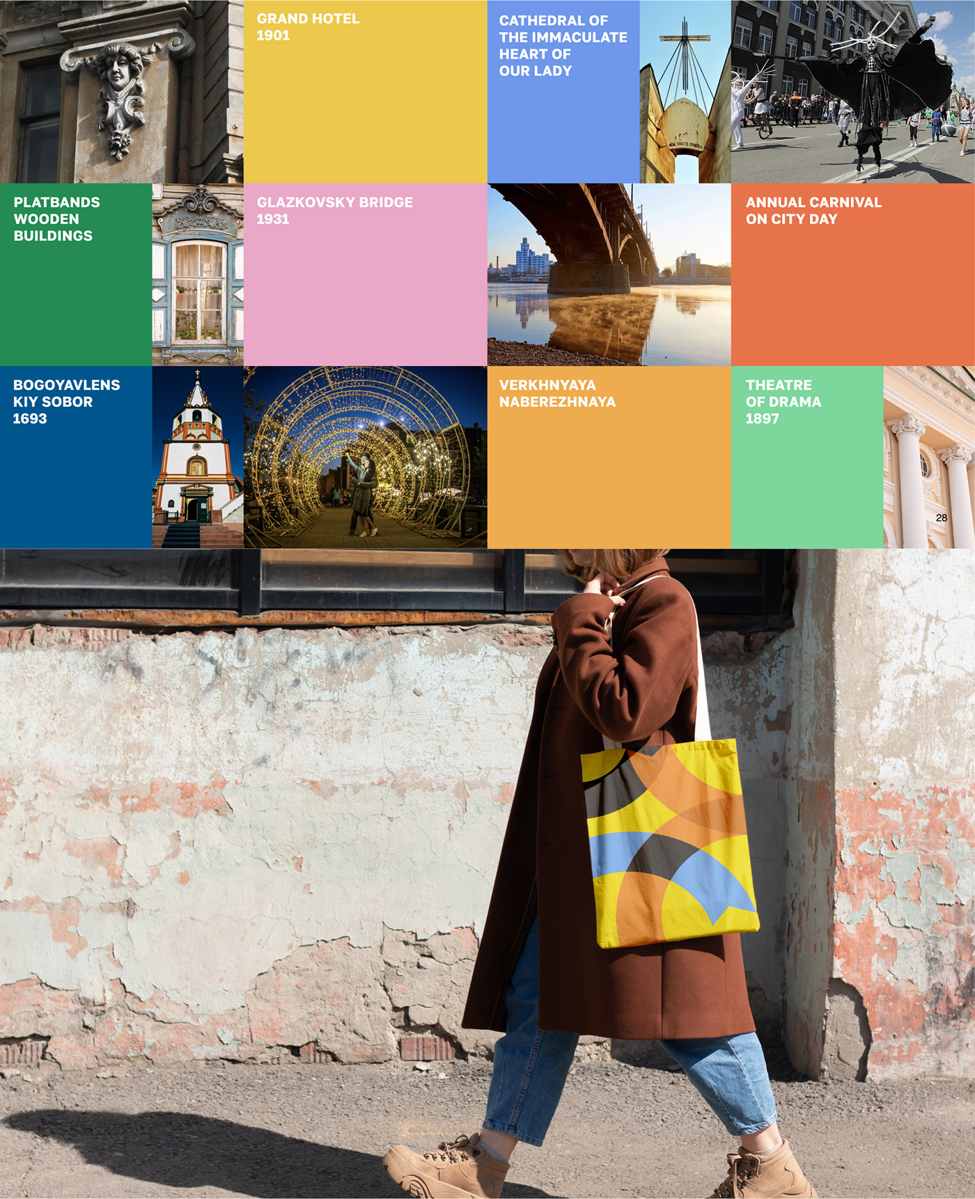
The pattern has become a logical continuation of the unique shape of the logo: here the ribbons create a unique pattern. The pattern also becomes lively and dynamic, which allows you to make the city's decorations non-standard, use colors that fit comfortably into the environment, creating a sense of celebration.
Логическим продолжением уникальной формы логотипа стал паттерн: здесь ленты создают уникальный рисунок. Паттерн тоже становится живым и динамическим, что позволяет делать украшения города нестандартным, использовать цвета, которые комфортно встраиваются в среду, создавая ощущение праздника.

It is important to understand that a city's brand is not only a visual component. The presence of a correctly built holiday brand presupposes the formation of an image of the city in the eyes of residents, tourists and people who at some point became interested in Irkutsk and its history.
Наличие правильно выстроенной айдентики праздника предполагает формирование образа города в глазах жителей, туристов и людей, в какой-то момент заинтересовавшихся Иркутском и его историей.

As a rule, it is the historical component that becomes the basis for the development of the city's brand, but it is equally important to take into account the emotional subtext. How does a person feel here, what is the city associated with, what features make it different from others? The task of the designer is to introduce additional meanings that allow to tell more fully about the place, its character, the stories of people who lived and live here, and then reflect this in the visual component.
Как правило, именно историческая составляющая становится основой для дальнейшей разработки бренда города, однако не менее важно учитывать эмоциональный подтекст. Как человек чувствует себя здесь, с чем город ассоциируется, какие особенности делают его непохожим на другие? Задача дизайнера — внести дополнительные смыслы, позволяющие наиболее полно рассказать о месте, его характере, историях людей, живших и живущих здесь, а после отразить это в визуальной составляющей.

When designing an urban identity, it is important to take into account the wide variety of people, their opinions and visual experiences. In our opinion, it is worth reflecting modern design standards, but not getting carried away with experiments.
При разработке городской айдентики важно учитывать большое разнообразие людей, их мнений и визуального опыта.

The visual image of the city should be attractive at first sight, be fresh, but understandable. Each person perceives Irkutsk in his own way, so we did not tie the corporate identity to specific sights and images of the city. The main thing is that the developed identity should evoke positive emotions, a sense of the holiday and involvement in it.
Визуальный образ города должен привлекать с первого взгляда, быть свежим , но понятным. Каждый человек воспринимает Иркутск по-своему, поэтому мы не привязывали фирменный стиль к конкретным достопримечательностям и образам города. Главное, разработанная айдентика должна вызывать положительные эмоции, ощущение праздника и причастности к нему.


