Brand | QIYUAN Design
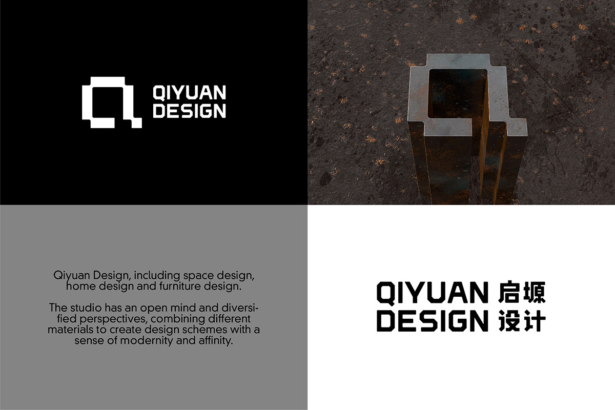
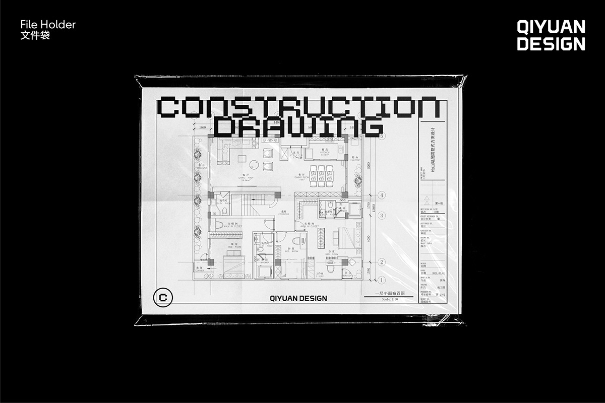
QIYUAN Design is a studio focusing on space design. The logo is combined with "open space" and the initial letter "Q". This is a symbol that conforms to the attributes of the industry and is easy to remember. Logotype retains some of the characteristics of Q, but considering the legibility, we reduced the width and simplified it.We set of auxiliary graphic characters unified with the characteristics of the logo was developed and applied to the material design.
启塬设计是一家以空间设计为主的工作室。标志以“开放的空间”及首字母“Q”进行结合。这是一个符合行业属性,且容易记忆的符号。字体标志保留Q的部分特征,但考虑到易读性,我们减少了宽度,也简化了特征。我们开发了一套与标志特征统一的辅助图形字,应用在物料设计。
Designed by Tagging Design 探奇设计
Art Direction: Weibin Chen
Graphic Designer: Weibin Chen
3D modeling: Siwang Chan / Weibin Chen
Rendering: Weibin Chen
Client: QIYUAN Design
Time: Mar. 2021


