
Said the Giant, the Project
This was a personal project I started in September and finished in August 7th. Said the Giant is my blog were I write about music and literature and I decided to take it to the next level and bring it to a fresh and modern design.
Since this was my first ever website, it was a fairly rocky road, but I learned a lot along the way, found new tools and new skills and discovered that this is something I really like to do.
The Project
Structure as a bilingual website, with two subdirectories for each language, since the content will be original for hand crafted for each language by the author (myself), using wordpress as content input method. There are two blog sections inside the blog (one for music and one for literature), structured with several "sub blog" sections for the sub categories of each section. Also, there is an "about" page, a "contact" page and a "manifesto" page with custom content, buttons and images to complete the dynamic, fun and minimalist vibe of the site.
The look is clean, minimalist and organized but with a fun and feminine twist, making the identity of the site very unique and original, to match the author's personality (me!).
A clean and dynamic image slider was added to the home page of both the Portuguese and the English subdirectories to show the latest content. Many custom text configurations were added to make each slide unique and fit to each post it shows and also very easy to edit.
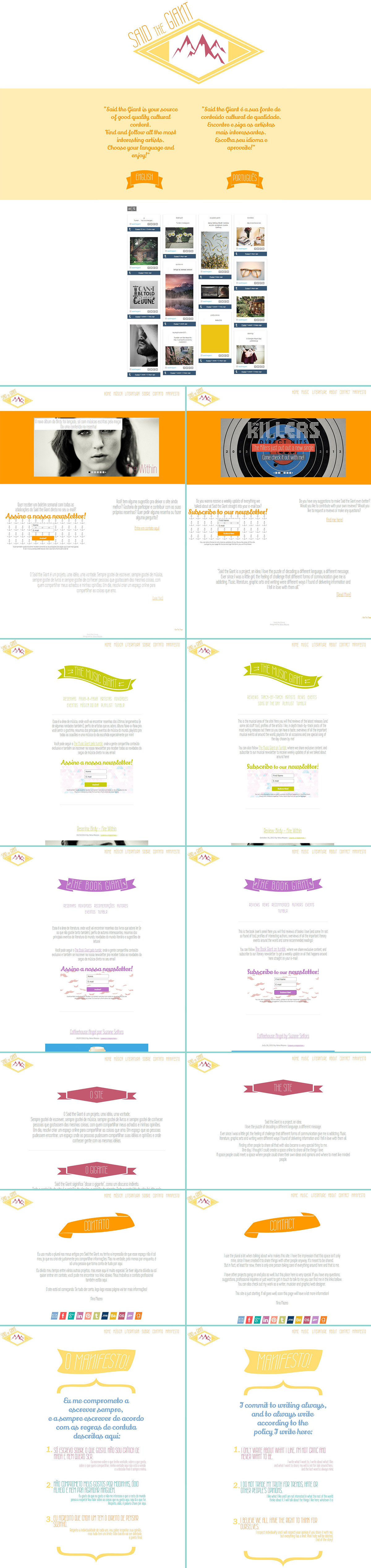
A clean and light weight social media stream was added to the main page of the site, as well as to the contact page to integrate the website with the two tumblr blogs that complete the music and the literature area. (themusicgiant.tumblr.com & thebookgiant.tumblr.com/)
A newsletter system was added to the site, structured in one newsletter for the whole content of the website and two others for each main category in both "language" sites. Many custom opt-in forms were designed for a more fun look. You can see them at the bottom of every post as well as on the home page and main page of each category of the site.
The Color Palette
The colors were chosen based on balance; first came the orange, then the green and lavender to balance it out. Little accents of turquoise brake down the stronger colors. Solid colors are used all over the website, to keep it clean and organized and focused on the content. Three basic colors were used on the website:
- #ff9900 (the "giant orange")
- #c7cb10 (the "music green")
- #bd74c8 (the "literature lavender")
- #ff9900 (the "giant orange")
- #c7cb10 (the "music green")
- #bd74c8 (the "literature lavender")
Also there were created three main "hover colors", one for each main color, as well as other custom colors for the social media icons, text and logo. The full color pallete of this project:

The Fonts
The fonts were chosen to keep the look simple, clean and readable. Three basic fonts were used:
- Wire One 400 (for titles in general)
- Source Sans Pro (for all the text and large content)
- Lilly Script (for accents of a more feminine and fluid font, to break down the sobriety of Wire One and the solid colors)
- Wire One 400 (for titles in general)
- Source Sans Pro (for all the text and large content)
- Lilly Script (for accents of a more feminine and fluid font, to break down the sobriety of Wire One and the solid colors)
The Logo
The logo was designed on a long and careful process, to make it strong and unique both on form and color (more about the logo on my next art). You can check the details here.
The End
The project took me around five weeks to be completed.
I used Photoshop CS5, Headway, Wordpress.org and some plugins to organize the website and make everything work as I wanted it to.


