


Client: Gaia Software
Project Type: Logo and Website Redesign
Gaia Software had an all-around outdated look, branding and website. They wanted to be more competitive in their market, software for the management of dialysis centers, and felt that a major cleanup was needed.
Logo
Perhaps the most crucial item when rebranding is the logo, and a lot of time and effort went into updating this one. The existing one had been created mainly for print use and had not worked well on the website. A fresh new look that was more contemporary and worked well in both print and online was provided.

Old logo


The client wanted to retain a graphic reference to the globe but that did not obscure the text. The globe tied in with the company name, Gaia, meaning the earth is a single unified system, much as their software package provided a single unified system for dialysis centers. The first concept had the earth rising behind the name, which was then simplified to the blue arc about the text.


A little later, they decided to incorporate the medical symbol for dialysis, but more of a stylistic representation, which came more to resemble a burst. The first choice for green was thought to be too dark, and the second was too vibrant, so a more middle tone was eventually decided upon. The blue in the arc and tagline was also too light, so we made it darker to keep in the same tone as the green. Several serif fonts were tried but was not fitting with the more contemporary approach, so Frutiger was used for both company name and tagline. The finalized logo also provided the color palette for the website. A version for the web navigation menu has the tagline removed so it disappears when the user scrolls down a web page, as the text became unreadable at the smaller logo size.
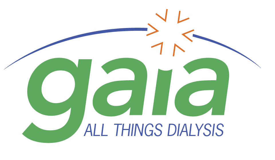
Final Logo
Website Redesign
The website had been done a number of years before, and was not generating as many requests for demonstrations and information as hoped. The content was organized poorly, and was text heavy with few graphic elements; readability suffered and the site was visually uninteresting. CTAs were at the end of a series of pages the user had to make their way through, which they often never did.
Clients sometimes feel giving more information is the better, not understanding this usually makes the user's task of finding what they need more difficult. The old site contained so much dialysis-related information people would call wanting to set up an appointment for treatment! The dozens of pages packed with great information on dialysis obscured what the company actually did, making for a high bounce rate and reduced new client contacts. We took a less-is-more approach to the redesign.
We started by boiling down the site's raison d'etre to two purposes: getting potential clients at all levels to fill out the contact form or request a demonstration, and supporting existing clients.
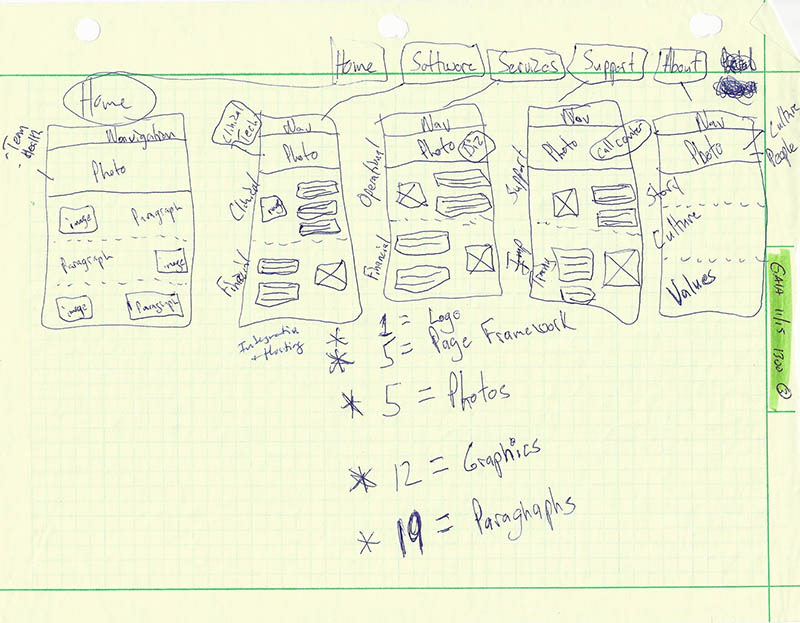
Sketches
Being clear on the site's purpose, we sketched out the site's organization and general ideas for content. We came up with needing 5 pages accessible through the nav menu (to eventually be 7) with page banners, graphics/photos, and sections/paragraphs.
The TL;DR (Too Long; Didn't Read) issue was addressed by narrowing the focus of the site to a few topics related to the site's purposes and addressing each topic on a single page. We then subdivided each page into distinct sections and edited the text in each section down to the bare minimum. We aimed to cut it down to around 3 sentences or about 100 words. All the interesting but ultimately useless treatment information was eliminated.
Quick Sketch
Wireframes
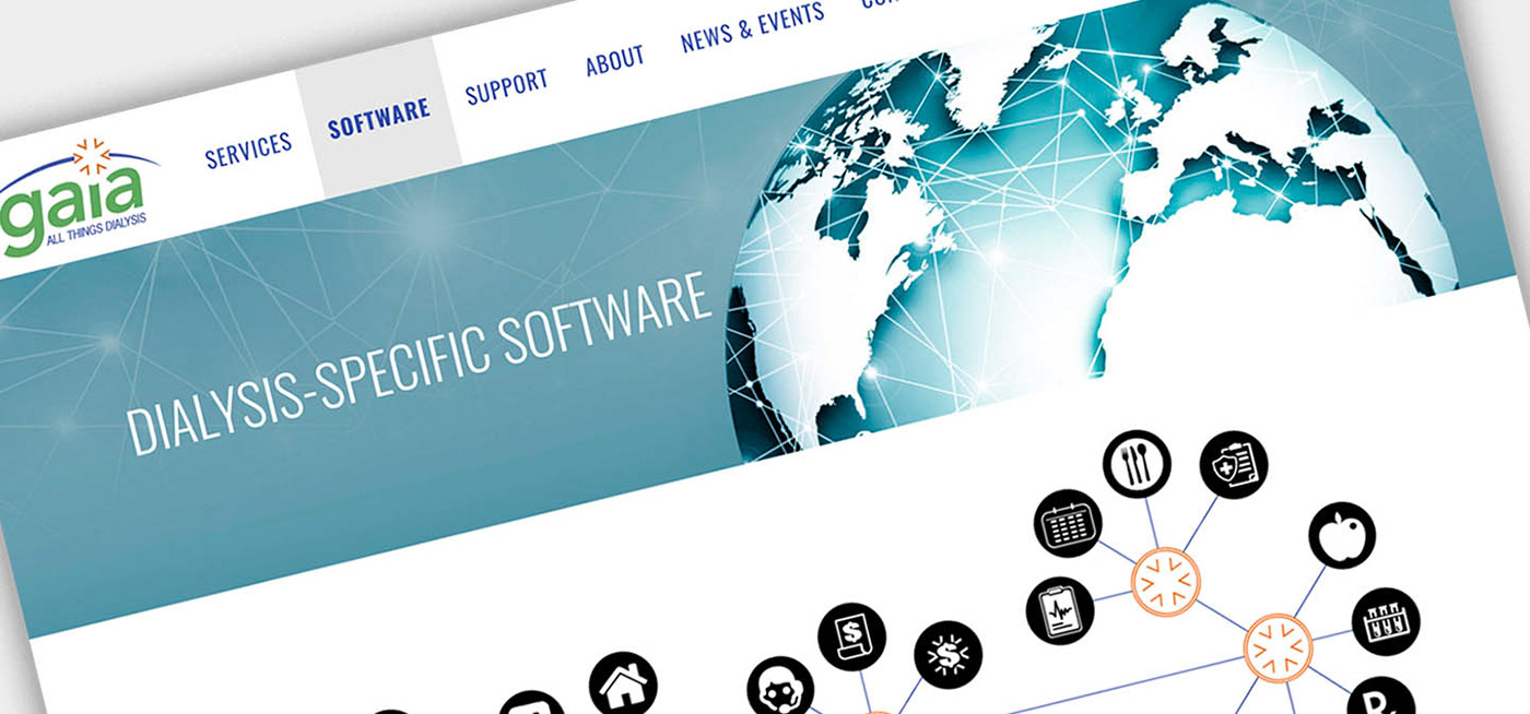
The client then went to work minimizing the text, while I started experimenting with page structures. I have 25 years experience with Adobe Illustrator, so I can put together designs quickly and efficiently. I used that tool to create some preliminary wires while still working on the branding. The homepage was to communicate clearly and immediately that this was a software company to reduce confusion about what the company did.


Wireframes of home page and ideas for category pages
I then began creating HTML/CSS prototypes mainly to show responsiveness and navigation. Once a final theme was decided on, I began refining the design directly on the website in a sandbox.


Prototypes
The existing graphics were often cartoonish clipart that were too low tech for the sophisticated software package being sold. I focused on creating colorful infographics to pair up with the revised text that succinctly presented information and created visual appeal. I also selected pictures for the banners and sections with an eye toward diversity and technical interdisciplinary teams, or having an Earth theme.
Here is an example of the evolution of the software services graphic. This appears above the fold on the homepage, and shows the services available, all under the umbrella of Gaia. The initial concepts reflect the client's desire to make clear they were not in the dialysis business but were a business that sold software for dialysis centers. Once the site itself communicated the nature of the business, the graphics were able to be focused on conveying information on a topic rather than clarifying who the company is.


The software page ended up with a single infographic that communicated the integrated modular nature of the software.
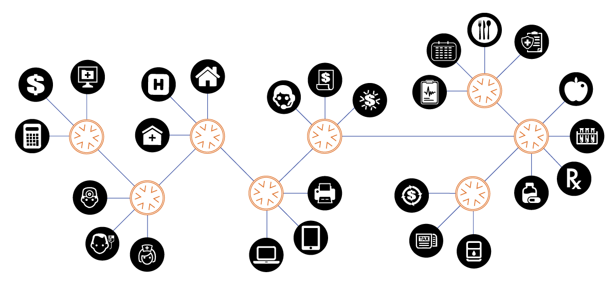
Software Page Infographic
Delivered Site
The final site clearly communicated to the user calls to action to book a demonstration, and presented a clean, organized and eye-catching interface that aided the user. The page count went from dozens to only seven, making it much easier for the user to find and act upon the information they needed. Potential clients were encouraged to contact Gaia by adding several Request A Demonstration buttons on the Software and Services pages and a large page-wide CTA banner at the bottom of the homepage. We added the News & Events and a Contact page.


Gaia has made some additions to the site since I delivered the project to them in 2017, but it is still up largely as shown in the screen captures above.


