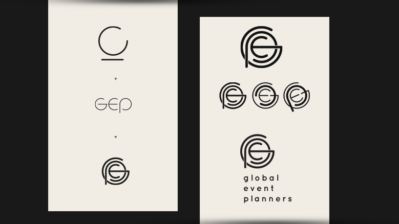
A look at process/methodology in exploring a suitable monogram that encompases literal meaning and aspires to a hitech aesthetic.
The client is a team of 3 highly-skilled industry people all with very particular preferences over colour use and application.
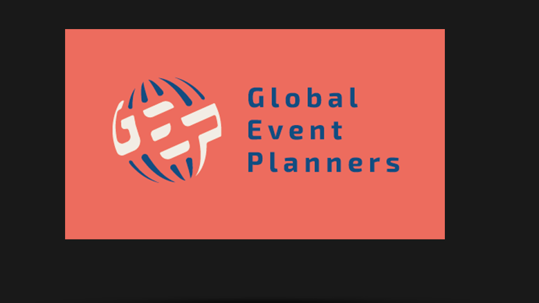
After the icon and typsetting was established and agreed upon I then had to unpack the brand into catering for the various palette decisions and how they could be used across a diverse range of applications.
The client is a team of 3 highly-skilled industry people all with very particular preferences over colour use and application.
After the icon and typsetting was established and agreed upon I then had to unpack the brand into catering for the various palette decisions and how they could be used across a diverse range of applications.